
1. Obscured Text Elements
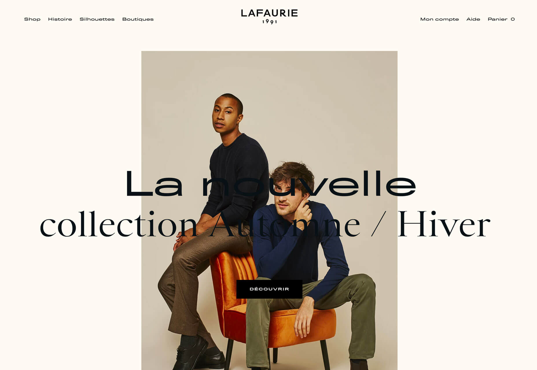
When it comes to text elements, the first thought is often readability. Not with this design trend. More design projects are showcasing text elements that are partially obscured or hidden within other elements. And while these designs look pretty cool and are visually stunning, whether it actually works might be more debatable. Each of the examples below uses this trend in a slightly different way. Granyon Party uses oversized text in a layered design – background, text, animated illustration – where the words are hyphenated and in a layer behind design elements. While the obscured text is fairly easy to read, the addition of hyphenation and a monotone color palette makes it a little trickier.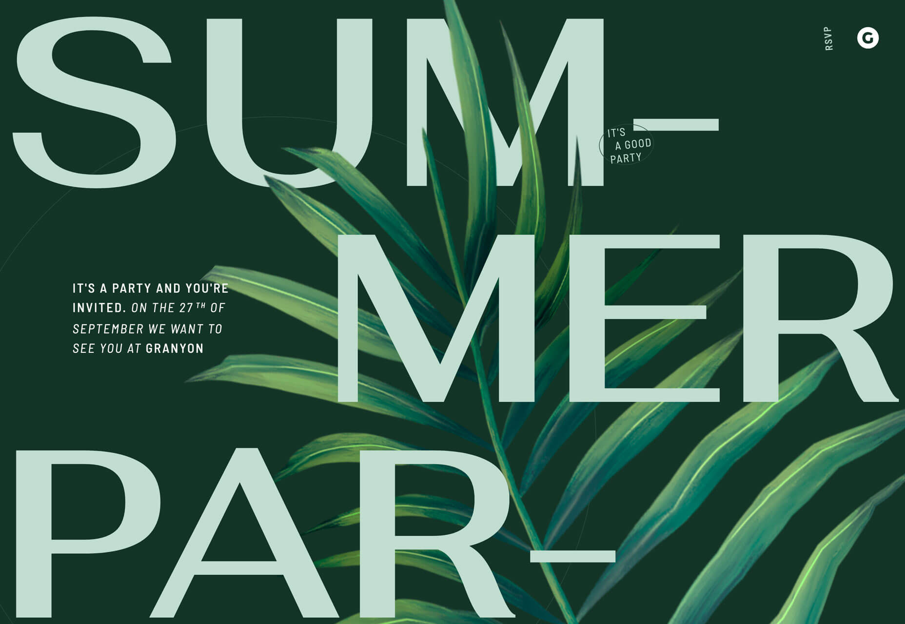 Lafaurie Paris uses black text over an image layer with dark coloring, leaving little contrast between the two. This makes the main text element a challenge in terms of readability on an otherwise visually stunning design.
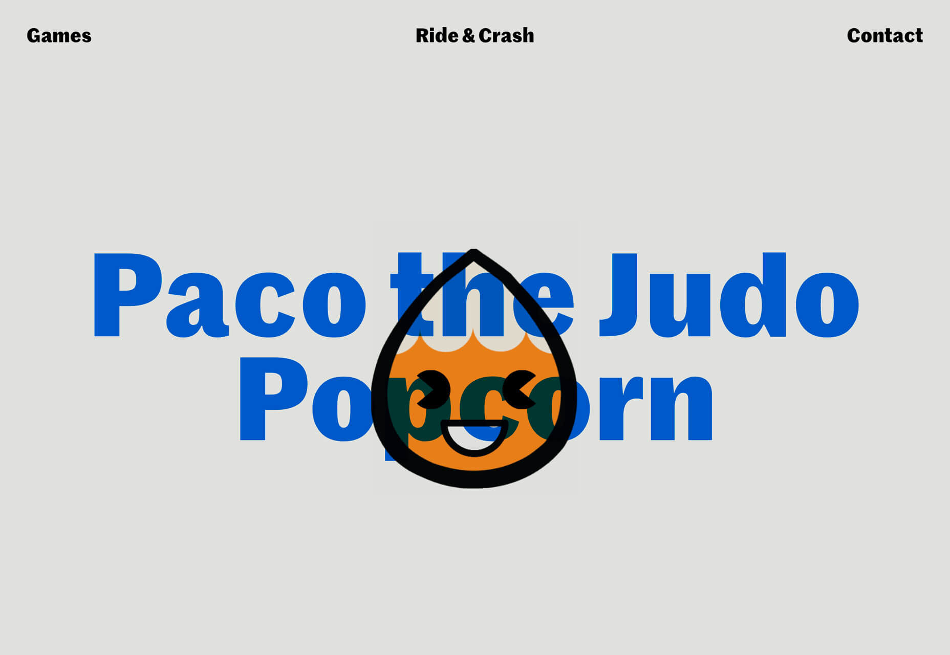
 Ride & Crash’s Paco the Judo Popcorn has a text layer that’s behind a semitransparent animated illustration. It’s not too difficult to read, but does make you stop and really think about the words on the screen. Use of space helps draw focus and make it a little easier to digest.
 With all of these examples, the design has to weigh big questions: Is the visual display worth losing readability? Will visitors understand and interact with the design?
2. Animated Spheres
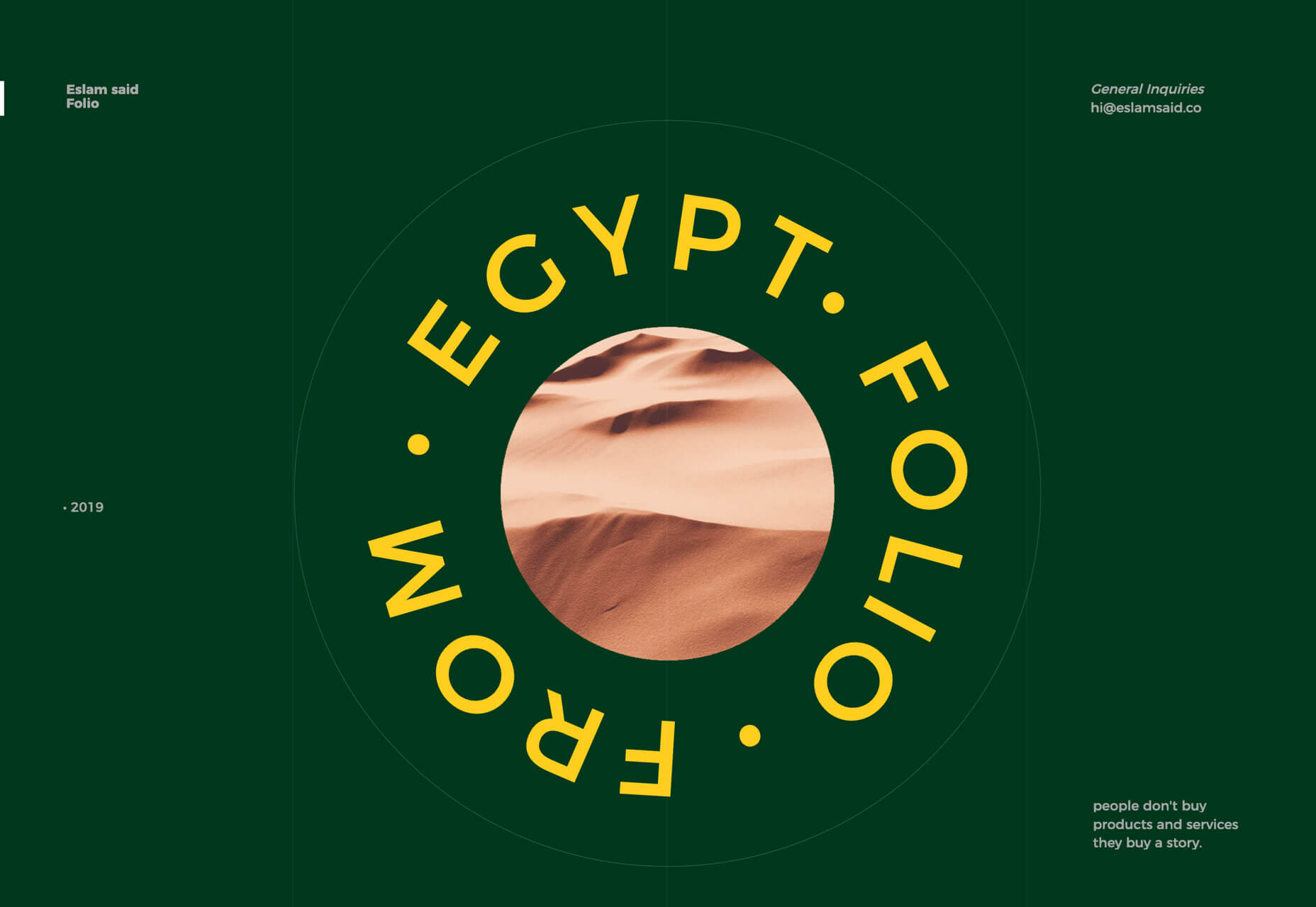
Circles have always been a popular design element. They carry plenty of symbolism and meaning and can set the right tone for projects. Circles are also a little less rigid than hard-edged elements, such as buttons or calls to action. Bigger spheres with animation are a solid way to draw users into design elements and focus the eye. This trending element might be pure decoration or serve a more functional role. 2nd Street uses large spheres down the right margin as a secondary level of navigation. The middle circles have a link and hover animation to help signal this action. The bottom circle is a decoration with movement that helps draw the eye and encourage users to move the mouse in that direction, activating the other circular buttons.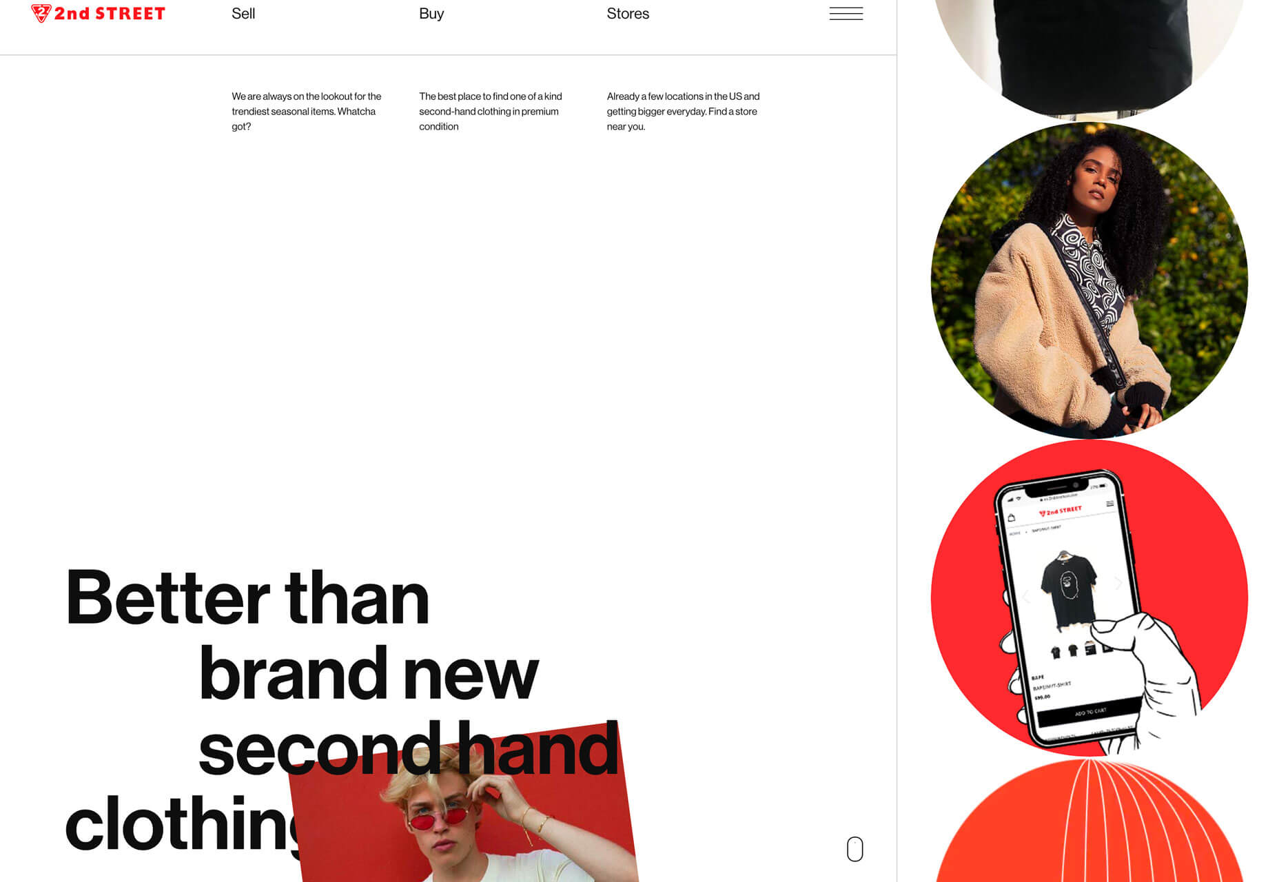 Eslam Said uses a large sphere in the center of the screen with simple movement to create visual interest in the portfolio website. The simple design and movement are hard to stop looking at with a soothing feel to them.
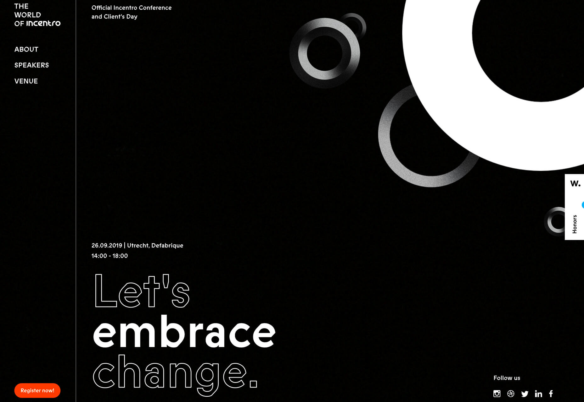
 World of Incentro uses multiple spheres with small movements and subtle animation as a decorative element. Further, the design uses a red, circular cursor to encourage engagement with the design. (If you click around this site a little, you’ll also find that it makes use of the first trend mentioned here, with different layers of obscured text.)
3. Large Left Margins
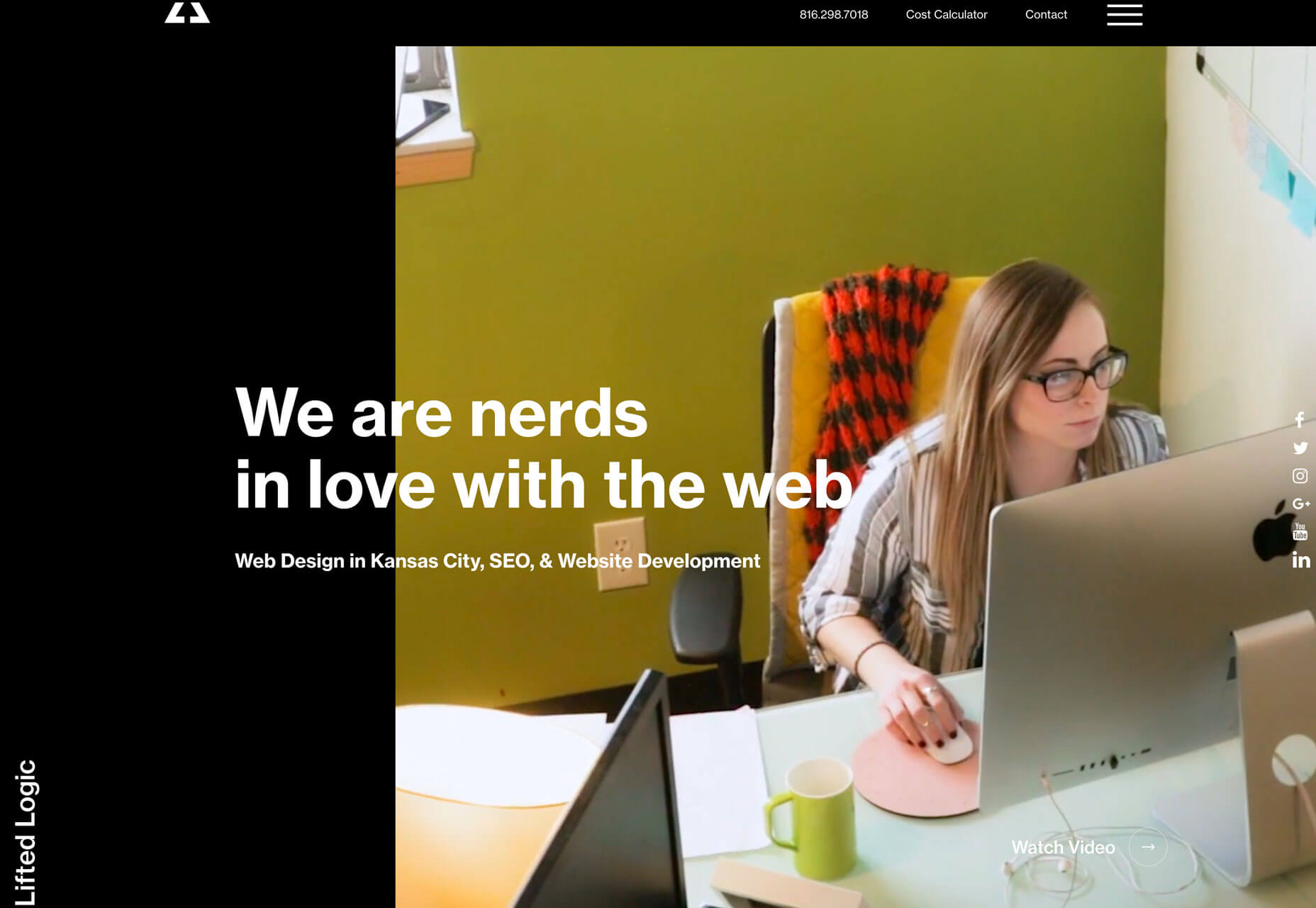
This might be my personal favorite trend, as a fan of asymmetrical balance. These designs use large left margins and areas of whitespace opposite a more visually full right side with an art element that fades off the screen. They create a beautifully imbalanced balance with visual weight that draws the eye across this screen. But this style isn’t for everyone, especially if you really like more symmetry. The challenge with this style is how elements stack on smaller mobile or vertical screens. The result isn’t often as stunning as the desktop counterpart. Ervaxx uses a simple animation paired with large bold text. The large font size offsets the weight of the animated blob on the right.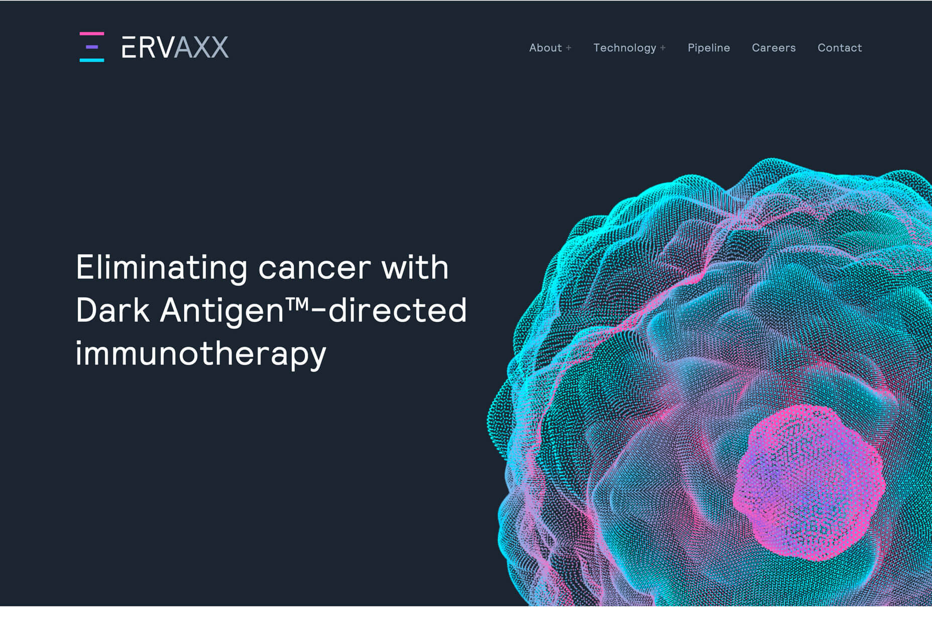 Lifted Logic carries a hero text element across white (ahem, black) space into a video. The use of space really pulls the eye across the text into the image and back.
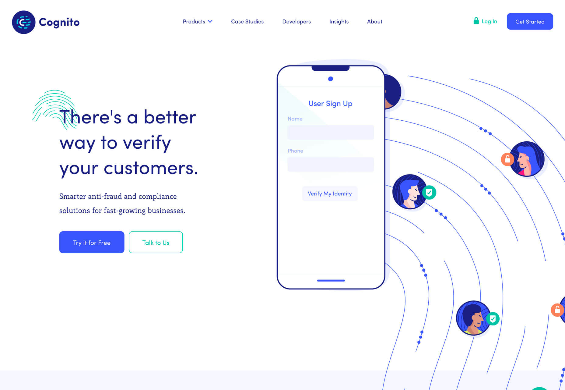
 Cognito uses balanced weights with text and line illustrations across the screen. Space, here, makes the design feel a little less busy with a lot of elements to take in at once – navigation menu, headline, secondary text, two buttons, animated illustration, and a chat box.
Conclusion
It’s possible to love the look of a trendy design, but never use the technique because you don’t find that it works with your content or in a way that focuses on usability. And that’s ok. That’s the beauty of trends; they spark conversation and push all designers to think bigger and better. Do you tend to be more of a visual or functional designer? Most of us have fairly distinct tendencies and it’s good food for thought.Carrie Cousins
Carrie Cousins is a freelance writer with more than 10 years of experience in the communications industry, including writing for print and online publications, and design and editing. You can connect with Carrie on Twitter @carriecousins.
Read Next
3 Essential Design Trends, November 2024
Touchable texture, distinct grids, and two-column designs are some of the most trending website design elements of…
20 Best New Websites, October 2024
Something we’re seeing more and more of is the ‘customizable’ site. Most often, this means a button to swap between…
Exciting New Tools for Designers, October 2024
We’ve got goodies for designers, developers, SEO-ers, content managers, and those of you who wear multiple hats. And,…
15 Best New Fonts, September 2024
Welcome to our roundup of the best new fonts we’ve found on the web in the previous four weeks. In this month’s edition…
By Simon Sterne
3 Essential Design Trends, October 2024
This article is brought to you by Constantino, a renowned company offering premium and affordable website design
You…
A Beginner’s Guide to Using BlueSky for Business Success
In today’s fast-paced digital world, businesses are always on the lookout for new ways to connect with their audience.…
By Louise North
The Importance of Title Tags: Tips and Tricks to Optimize for SEO
When it comes to on-page SEO, there’s one element that plays a pivotal role in both search engine rankings and user…
By Simon Sterne
20 Best New Websites, September 2024
We have a mixed bag for you with both minimalist and maximalist designs, and single pagers alongside much bigger, but…
Exciting New Tools for Designers, September 2024
This time around we are aiming to simplify life, with some light and fast analytics, an all-in-one productivity…
3 Essential Design Trends, September 2024
September's web design trends have a fun, fall feeling ... and we love it. See what's trending in website design this…
Crafting Personalized Experiences with AI
Picture this: You open Netflix, and it’s like the platform just knows what you’re in the mood for. Or maybe you’re…
By Simon Sterne
15 Best New Fonts, August 2024
Welcome to August’s roundup of the best fonts we’ve found over the last few weeks. 2024’s trend for flowing curves and…
By Ben Moss


