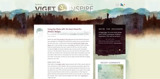
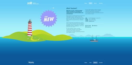
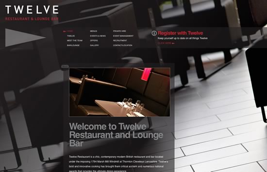
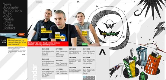
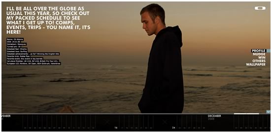
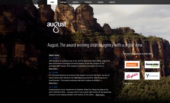
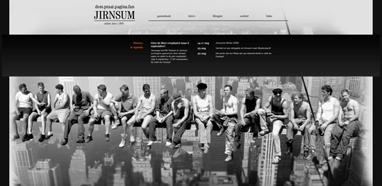
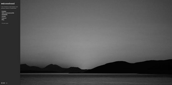
Large backgrounds make a very impressive visual impact on websites. A web designer has the possibility to play with different design variables that are usually used by photographers, such as depth of field or focus. The background does not have to be just photos, but also any other large illustration or even video.
In this article you will learn about the different large background styles and how to use them. You will also find out about the impact that large backgrounds has on bandwidth and site performance in general. Finally you will learn how to properly implement large backgrounds.
Large Background Styles
Essentially there are many different styles, but the most commonly used styles on websites are:
* Photographs as backgrounds
* Graphics and illustrations as backgrounds
* Animations as backgrounds
Photographs and illustrations are most widely used, animations are still experimental, but as bandwidth is becoming cheaper and Internet connection speeds are getting faster, more websites can afford to use these.
Common Mistakes Using Large Backgrounds
One of the most common problems with large backgrounds is that they have to conform to many different screen resolutions. A web designer should test the website's design using as many different screen resolutions as possible, to avoid one of the common mistakes that is associated with using large backgrounds.
Particularly a web designer should experiment with different browser window widths, because many users don't expand their browsers to the full screen size, even though they may have a large resolution display.
Let's look at the most common mistakes that a web designer should avoid, when dealing with large backgrounds.
Images are in Center, Tiled or Scaled
It's not wrong to use a centered, tiled or scaled image as a background, in fact it's even recommended in order to keep the symmetry of the website, however misusing these techniques could give the impression of an average or mediocre design to the website's visitors.
Let's examine the picture below of a website. This screenshot was created at a 1024x768 screen resolution:
As you can see, at this resolution, there is nothing wrong with the design, however let's see how it looks at a 1680x1050 resolution:
The image used in the background is centered. It looks like a regular image on a website and doesn't blend into the background. Avoid using background images in this way, by making sure that the photo is large enough in width for the most commonly used screen resolutions. The best solution is to blend the images' corners into the background, so that users with larger screen resolutions won't notice it.
Cutting an image for use as a background can be tricky, if you don't know how the each browser will actually render and replicate the pieces of the image.
Every browser can replicate images and use them on the web pages or as backgrounds, with the help of CSS (cascading style sheets).
An image is repeated by using the CSS background property in order to define the image and specifying how to replicate it. For example:
body {
background: url("images/sample.jpg") repeat-x;
}
The above code inserts the sample.jpg image as a background into the body element and repeats it horizontally. The attribute repeat-x sets the repetition of the image along the X axis. You can use the following repetition styles:
* repeat-x to repeat the image horizontally
* repeat-y to repeat the image vertically
* repeat-xy to repeat it both horizontally and vertically
* no-repeat do not repeat the image
These are the following CSS code examples for each method:
body {
background: url("images/sample.jpg") repeat-x;
}
body {
background: url("images/sample.jpg") repeat-y;
}
body {
background: url("images/sample.jpg") repeat-xy;
}
body {
background: url("images/sample.jpg") no-repeat;
}
Also note that you're not limited to setting the background image to the body element. You can set it to any element on your page.
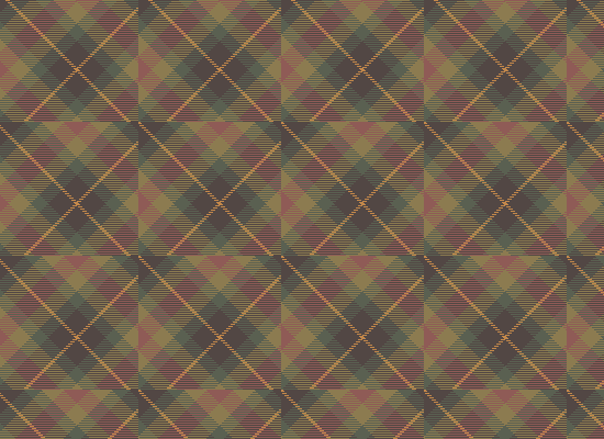
In order to correctly tile an image, you must ensure that the edges of the image are consistent with the pattern, therefore creating a seamless background on the website. For example, the image below shows how a pattern, which is titled, is cut incorrectly. You can see the edges of each individual image:
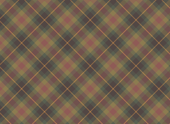
In order to create a seamless background a web designer must cut the picture in such a way that the left edge blends into the right edge and the top edge blends into the bottom edge, like in the image below:
You can see the edges of the individual images seamlessly blend into one another. This image was created from pattern below:
When scaling an image, the most important factor is image quality and the target resolution. Also a web designer should take into consideration the different image formats that are optimized for each particular style of image.
The most widely used image formats are:
* GIF - graphic image format
* Jpeg - joint picture expert group
* PNG - portable network graphics
GIF is an image format that is optimized for simple graphics, such as text or simple shapes, circles, lines, etc. It is not suitable for photos. For example:
Sample GIF, image size: 3,3KB
Sample Jpeg, image size: 13,5KB
You can clearly see that the Jpeg image format is not suited for graphics. This format should rather be used for photos and the GIF format should be used when dealing with graphics.
In the case of large images it's essential to optimize an image as much as possible in order to save bandwidth (more about bandwidth later in this tutorial). Avoid scaling up small images, because the resolution of the image will drop significantly as you can see on the screenshot of a website below (try viewing this on a large resolution display):
The problem with the above example is that the website automatically scales the image according to the screen resolution which causes the background image to become pixelated when viewed on large resolution displays.
Impact of Large Backgrounds on Bandwidth and Site Performance
Large backgrounds usually equate to large file sizes which can lead to a huge impact on bandwidth and also user experience.
The bandwidth is the amount of data that is be moved from on place to another, specifically from the server to the client. By using large graphics, a website's load time can increase significantly.
It is therefore essential to optimize your images by using the appropriate image resolution and format, as well as optimizing the website's other resources such as CSS and Javascript files.
Let's look at the following example:
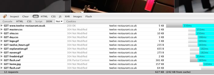
Here is this website's net usage report:
There are 12 requests and a total of 627 KB is downloaded. This means that each time someone visits the website 627 KB is downloaded, adding to the total bandwidth of the website. If the website has an average of 50 visitors per day, this will total 31,350 MB per day.
By using the Firebug plugin for Firefox you can see your website requests and get an idea as to how to optimize it.
Tips & Tricks
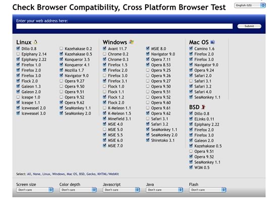
Don't neglect large resolutions and resolutions on which you can't test the website. You can use services such as Browsershots to test your website using different screen resolutions, browsers, etc.
High resolutions are not everything to considerwhen you design websites, you should also consider smaller screen resolutions. What if a large background website is viewed from a mobile phone? A web designer should design for every browser, in order to present the website to a large audience. These days more and more visitors tend to browse the web with devices such as the iPhone and other smartphones.
Sometimes you may wish to target specific web browsers based on the device that the visitor is using or based on screen size alone, by using a specific style sheet. With the help of a little Javascript code you can create a style sheet switcher or you can use already made code for this. A List Apart has a great tutorial on how to create a style switcher.
Another trick is to use a mobile phone emulator, which is a piece of software in which you can see how your website looks on a particular mobile phone. For example you can use the iPhone emulator Firefox add-on.
Optimizing your backgrounds is essential using techniques such as CSS sprites.
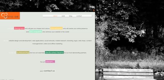
If the photo that you want to use in the background of your website is too small or will look awkward, then create the whole design around the photo. For example:
As you can see the photo is small on purpose, which adds to the whole design.
Another tip is to create single color wide space on the photo itself, then use this color to paint the rest of the background, therefore making a seamless blend between the photo and the actual background.
Here the image is centered, the left and right edges are a single grayish color and the rest of the background is filled with this color.
As a best recommended practice use large images, above 1700 pixels in width to cover almost 95% of the display sizes available today.
Showcase of Large Backgrounds
Did we miss any good examples? Feel free to add them below.

