 Although there are lots of posts that evaluate different design blogs, I haven't seen many that focus specifically on corporate websites.
Therefore, I thought it would be fun to take a look at the homepages of the Top 30 technology companies (the order of this list was determined by the InfoTech 100 from Business Week), and assign them a PASS or FAIL rating based on the quality of their homepage design.
Click on the screenshots to check out each website.
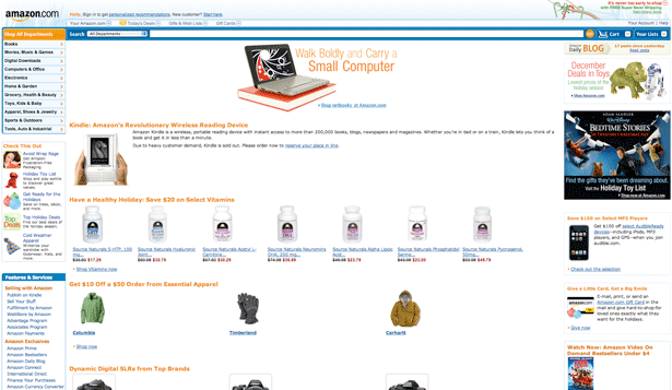
1. Amazon.com: PASS
Although it may be a little cluttered for my taste, it would be short-sighted to say that the Amazon.com homepage is a FAIL. Amazon has created a company that has landed at the top of the InfoTech 100, and the fact that one hundred percent of their sales are made online shows that they understand how to use their website to attract and retain customers.
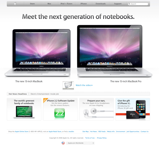
2. Apple: PASS
As an Apple user, I may be a little biased, but I honestly don't think that anyone could look at the Apple homepage and say that it fails in terms of design. The homepage is uncluttered, provides easy to use navigation and gracefully showcases several of Apple's products.
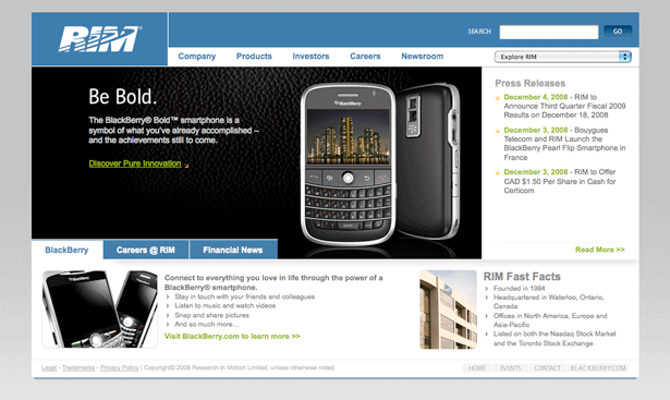
3. Research in Motion (RIM): PASS
Let's be honest; the RIM homepage is not going to win any awards for being innovative. However, while this may be true, the homepage does get the job done. Not only does it provide links to all of the relevant topics of interest, but it also showcases their latest product. If I was a school teacher, the RIM homepage would probably get a B- (while the Apple homepage would be at the top of the class with an A+).
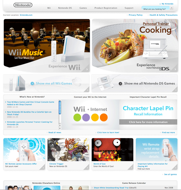
4. Nintendo: FAIL
Okay, I already know that this is going to be a controversial one, but I have to give the Nintendo homepage a FAIL. While I do like the color scheme of this homepage, there are simply too many elements in the layout. Since it already looks like they are trying to replicate the Apple homepage, Nintendo needs to take another look and realize that they could benefit by cutting out about 75% of the homepage elements below the navigation bar.
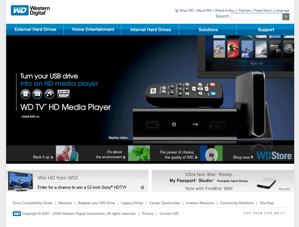
5. Western Digital: PASS
This homepage falls into the same category as the RIM homepage. It's definitely not pushing any envelopes, but at the same time, there's nothing wrong with it. This is a corporate homepage we are talking about, and not only does the menu make navigating the website easy, but I like the fact that they use the main area of their homepage to promote a single product (instead of making Nintendo's mistake and trying to cram as many products onto a single page as possible).
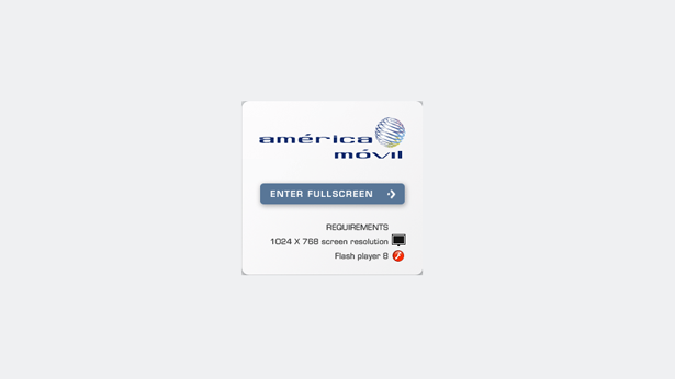
6. America Movil: FAIL
Although this isn't technically their homepage (it's the first page of their website, but you have to click "Enter Fullscreen" to visit their actual homepage), I do not appreciate a website that forces me to go into a fullscreen mode. Unless I'm watching a movie, I do not want a window to be in fullscreen. Not only it interrupts my flow of browsing, but it's going to cause problems for people who don't have a 1024x768 resolution.
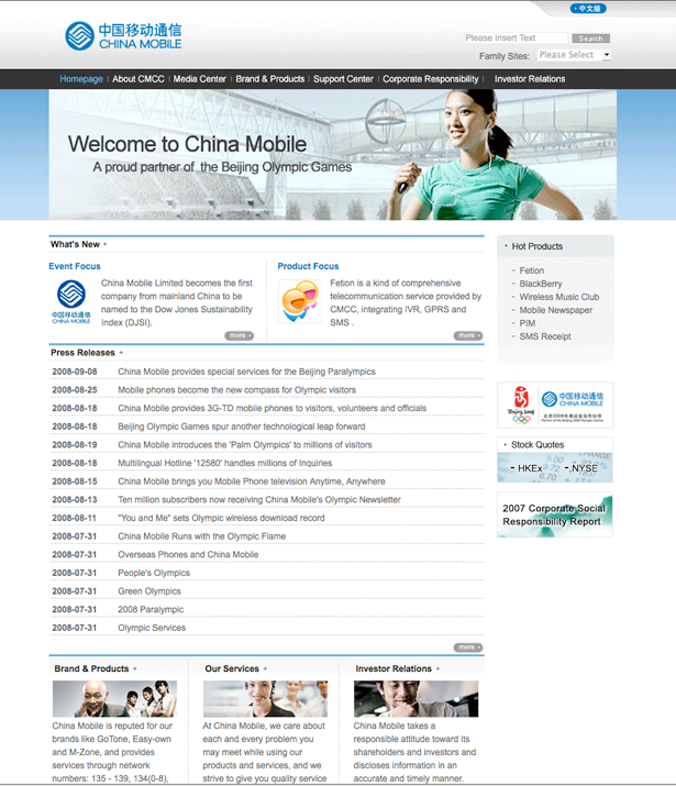
7. China Mobile: PASS
First of all, kudos to China Mobile for having their website in multiple languages. While I think they could cut the size of their Press Releases area in half (and do a better job at emphasizing the "Hot Products" on the right side of the page), the China Mobile homepage successfully accomplishes the basic goals of a corporate homepage.
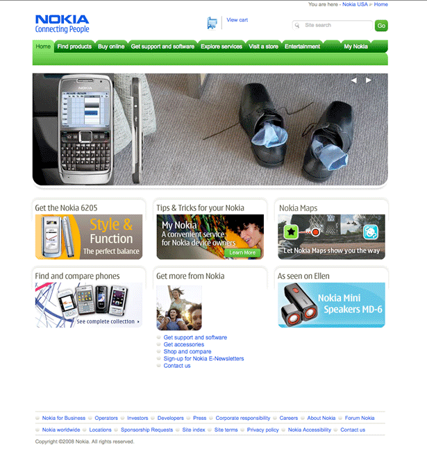
8. Nokia: PASS
I really like the fact that Nokia puts all of the necessary navigation elements (links and search box) at the top of the page, and then uses the main real estate of their hompeage to showcase their latest products (the large box actually scrolls through several different products). Additionally, they finish things off with a few other boxes that lead to destinations of potential interest (such as capitalizing on the new "Twilight" trend).
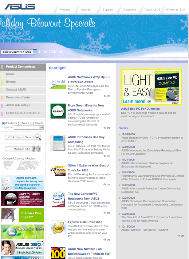
9. ASUSTeK Computer: FAIL
Although you can't see it in the screenshot, there are simply too many moving elements on this homepage (including the left and middle columns). Unlike the main area of the Nokia homepage (which scrolls through several different elements), the main area of this homepage is animated, but it simply loops the same offer over and over. Additionally, there's too much clutter on the homepage for a user to figure out what they actually want to do.
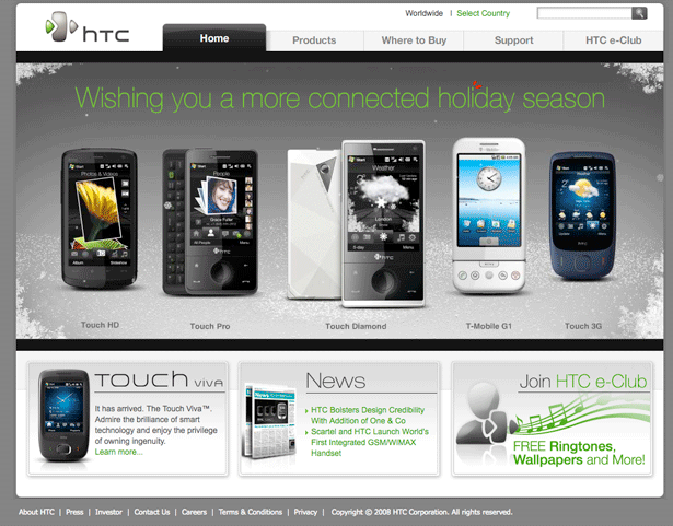
10. High Tech Computer (HTC): PASS
If I was going to pick my two favorite homepages out of the first ten companies on this list, Apple would be #1 and HTC would be #2. The homepage is relatively uncluttered, and (in addition to the navigation) simply displays four main elements (three of which are to popular products/offers).
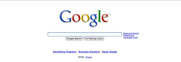
11. Google: PASS
If you need proof that minimalist designs are more effective than cluttered ones, just compare the stock prices of Google and Yahoo. Google is a search company, and from the second that you visit their homepage, you know exactly what you are supposed to do with their website.
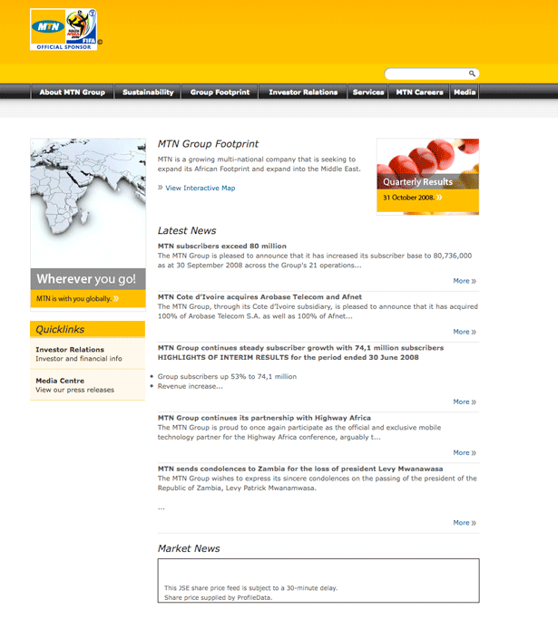
12. MTN Group: PASS
It's definitely not my favorite homepage on this list, but it gets the job done. In addition to providing visitors with easy to find navigational links, MTN Group promotes all of the latest news that's related to their company.
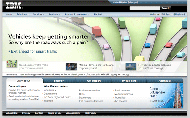
13. IBM: PASS
I actually have to admit that I was little surprised with the IBM homepage. Given the reputation of the company, I was expecting an extremely bland homepage, but theirs actually has a little flair. I also like the fact that each of the main navigation links is actually a drop-down menu, which makes it easier for users to find exactly what they want.
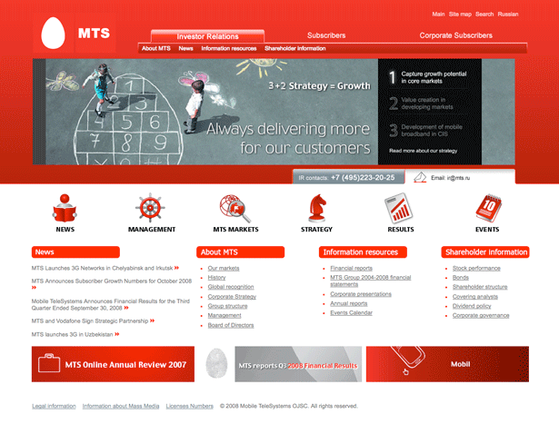
14. Mobile Telesystems: FAIL
I want to like this homepage. However, there is simply too much red in the design, which results in an overwhelming experience when the page loads. On top of that, Mobile Telesystems really needs to increase the size of their fonts for their navigational links.
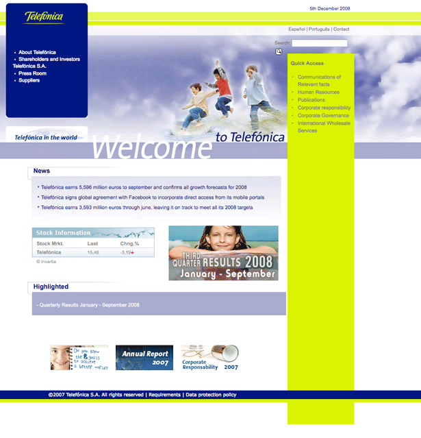
15. Telefonica: FAIL
I don't think I need to go into much detail about why this design is a fail. I guess that it's a decent attempt at a design, but it simply doesn't come together well. Telefonica's needs to scrap this design and start over from scratch (it wouldn't hurt them to get a little inspiration from some of the top homepages on this list).
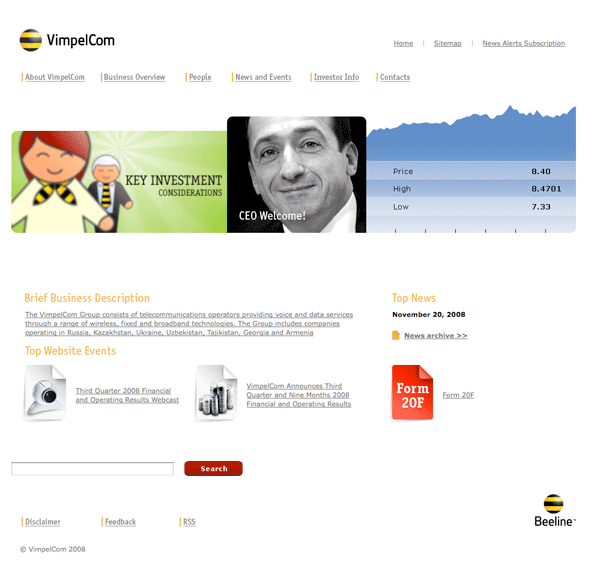
16. VimpelCom: PASS
Like several of the other websites on this list, VimpelCom could benefit from increasing the size of their font. Also, I'm not sure why the paragraph under the "Brief Business Description" is one long hyperlink. However, those are both minor details, and I otherwise like the design of this homepage. I think their use of ample white space helps to bring attention to their main content.
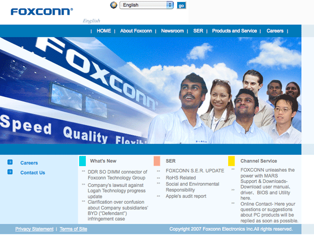
17. Foxconn (Hon Hai Precision Ind.): FAIL
Although I will give them credit for making it easy to switch their site between English and Traditional Chinese, this homepage just doesn't do it for me. I think what really turns me off is the badly done header. If they could come up with a more attractive header and improve the link structure below the header, Foxconn might be able to move into the PASS category.
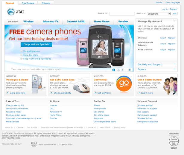
18. AT&T: PASS
Even though they have a lot on their homepage, AT&T is a company that offers a lot of different products and services, so I don't think their homepage is overwhelming or too cluttered. Additionally, I also like that their main content area highlights several of their best offers.
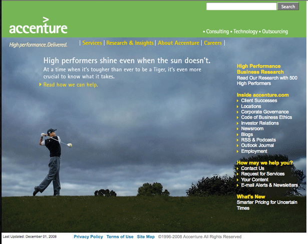
19. Accenture: PASS
Not the most exciting homepage (although I do like the picture of Tiger), but like several of the other homepages on the list, it gets the job done. This probably doesn't come as a surprise, but my one suggestion would be to increase the font size of the links on the right side of the page (I think a lot of designers underestimate the importance of having text that is large enough for people of all ages and monitor sizes to read).
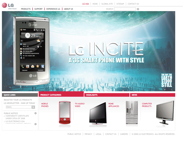
20. LG Electronics: FAIL
I like this homepage. However, I have to give it a fail because even though I have a fast Internet connection, it takes this page forever to load. Not only do you have to wait to load the "Select Your Region" page, but then there's another delay before the actual homepage loads!
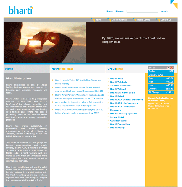
21. Bharti: PASS
I think that the picture on this page is a pretty cool. I also like their one sentence mission statement about 2020. I would recommend formatting the description of their company differently, but other than that, this a pretty good corporate homepage.
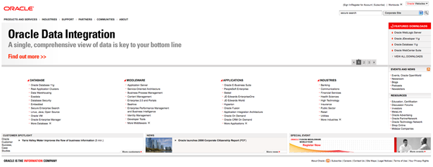
22. Oracle: PASS
I like the use of white space, and unlike the Mobile Telesystems homepage, Oracle successfully uses red in their color scheme without going overboard. My only suggestion would be to move the bottom navigation (Customer Spotlight, News and Special Event) above the list of links, and to potentially prune down the total number of links in those four columns.
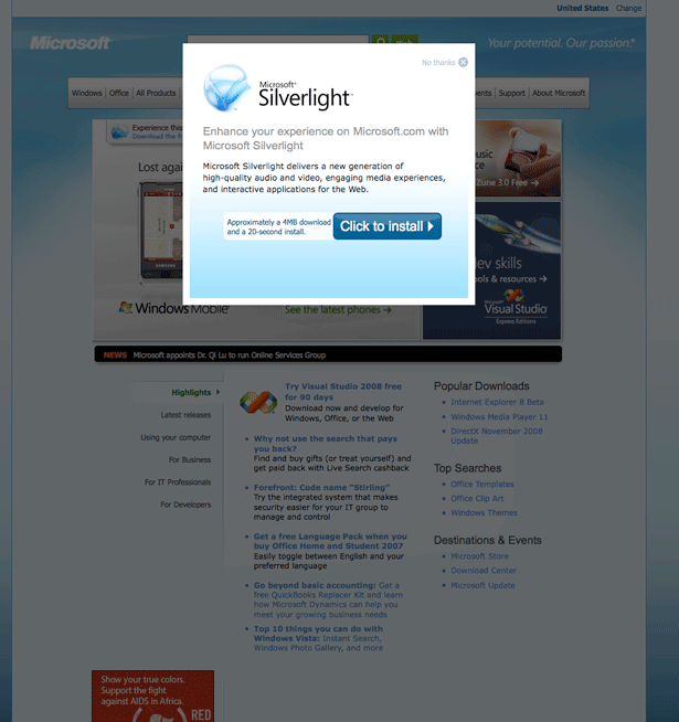
23. Microsoft: FAIL
As an Apple guy, I was hoping I would get to fail Microsoft. Although I remained objective, I'm glad that I get to give them a FAIL. The reason is because of the "Microsoft Silverlight" pop-up that automatically appears when their homepage loads. Just like America Movil forcing a full screen, I don't want anything to pop-up while I'm browsing (especially when it forces me to click the Install link or the No Thanks link).
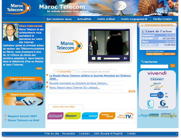
24. Maroc Telecom: FAIL
Since I'm not one of their target customers, I don't mind the fact that I can't read what's on the homepage. However, I do have to FAIL this page because they are trying to cram too much into a small space. If they would actually take advantage of the full page and spread apart their layout, they might actually be able to earn a PASS.
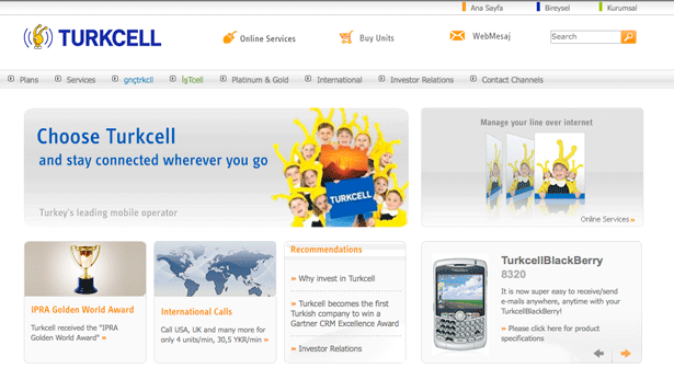
25. Turkcell: PASS
As you have probably noticed, I really think that this general type of layout is one of the most effective for corporate homepages. It gives companies the ability to highlight the main elements of their company, and generally draws visitors deeper into the website.
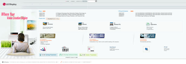
26. LG Display: FAIL
This homepage suffers from the same problem as the Maroc Telecom homepage. Instead of spreading things out, they have crammed all of the elements of their layout into a small space. They don't necessarily need to remove any of the elements from their homepage, but they do need to spread out the elements that are there.
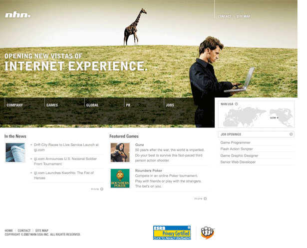
27. NHN USA: PASS
I really like the bold header that is a part of this layout. It really grabs your attention, and the five links that are integrated into the header make navigation easy. I would suggest potentially changing the navigation links from grey to black, but other than that, this is a great looking homepage.
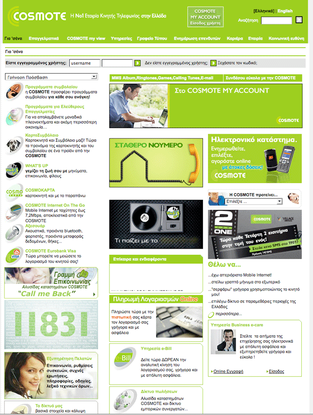
28. COSMOTE: FAIL
Like the Maroc Telecom homepage, this isn't getting a FAIL for being in a different language. The reason that it's receiving a fail is because it is way too cluttered. There are simply too many elements jammed into this layout. Additionally, I'm really not a big fan of how much they used bright green in this layout.
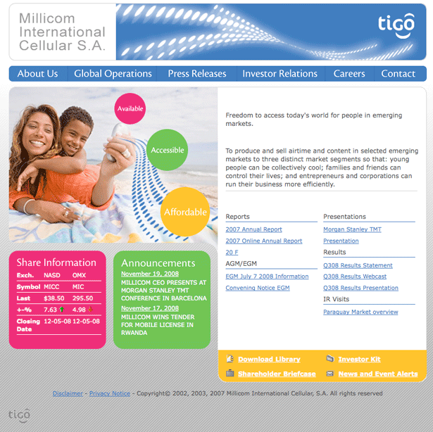
29. Millicom International Cellular: PASS
Especially when you consider the fact that this is a corporate homepage, the design is quite nice and bright. The navigation is easy to use, and the main area of the layout is divided well between information about the company, links to documents for investors and a couple elements with additional information.
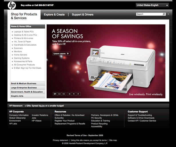
30. HP: PASS
Not every website can get away with a black background, but the HP website pulls it off successfully. Their use of big images in the middle of the page seems like a really effective way to grab visitor's attention and get them onto specific product pages.
I obviously know that not everyone is going to agree with my opinion on every website, so feel free to drop your thoughts in the comment area below...
Cover image by Shutterstock
Written excusively for WDD by Tyler Banfield of COPYmoz

