 Simply put, usability is making your website easy for your visitors to find the information they need when they need it.
A common misconception about usability amongst web companies is that usability is expensive. Yes, there are multi-national companies that spend thousands of dollars on usability tests and research, but for an everyday company usability is achievable without the knowledge of usability experts or without expensive equipment for testing.
Web designers have an even easier job to do, just by reading usability articles they can accumulate a fairly good knowledge about usability basics and how to implement them on a website.
1. Include a Tagline
A tagline is a statement or a motto that represents a company's, or in our case a website's, philosophy and mission. It should be the most obvious element on a website's front page and it should clearly describe the website in one phrase. Statistics show that a website has just 8 seconds to capture a visitor's attention for them to browse the site further. Without a clear tagline a website would have a hard time keeping visitors long enough to browse the inner pages.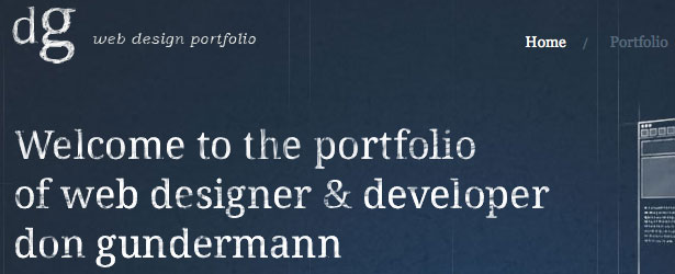

2. Implement Site Search
As with taglines, site search is a very important element on a website. When users are looking for something they typically look for a text field where they can enter their search term. According to Jacob Nielsen's web usability tips, make this search box 27 characters wide in order for the text to be clearly visible and easy to use. Place the search text field on the top of your web page, because users tend to search a website according to the F pattern, meaning from the top left to the bottom right. Include a search button and clearly specify the search text, don't use text such as Go or Submit, because these expressions tend to mislead your website's visitors.

3. Don't Use Extensive Graphics
Abusive use of design elements and graphics are always bad for a website, they just mislead the site's visitors. Only design to improve the web page not just to decorate it. From a usability point of view, less is always more.4. Use Site maps
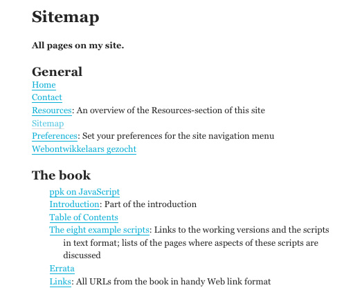
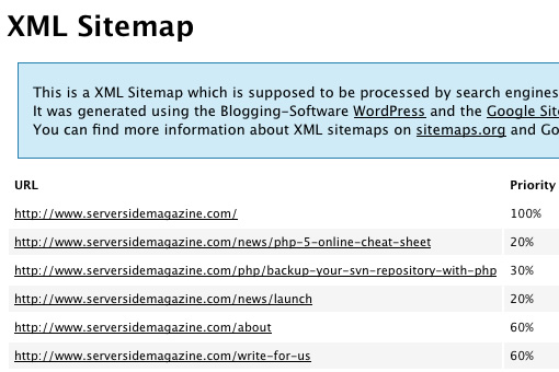
Site maps are a relatively new website feature that improves web page navigation and also search engine optimization (SEO). Site maps in essence are a structural representation of a website's pages and architecture. It can be a document in any form, or a web page that lists the pages on a web site, typically organized in hierarchical fashion. Recently, search engines like Google, Yahoo and MSN have started offering a Sitemap protocol which is similar to a website's site map page, but the data is organized in XML format. There are Sitemap XML generators that create these documents for a specific URL.5. Don't Break the Workflow
By workflow we mean every operation that a user is doing on a website. For example filling out a form, registering on a website, browsing categories, archives, etc. Don't break these workflows, let the user cancel any operation. By not letting the user cancel an operation, we're forcing them to finish it even if they don't want to. Not every operation on a website is obvious for users, guide them through the specific workflow by using descriptive tips. (e.g. when filling out a form). Javascript links usually break the workflow, so it's not recommended to use them on your website. Another mistake is not changing the color of visited links, this results in breaking the navigational design. Let users know where they've been and where they are on a website.6. Create Easily Scannable Web Pages
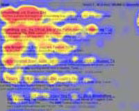
Easy to read web pages plays an important role in maintaining visitors' loyalty, keeping them on your site and reading your content. Usability tests show that the majority of users don't read web pages, they scan them, looking for titles, bold, emphasized text or lists. Eye tracking studies conducted by Jakob Nielsen show that users read content that resembles an F shape, meaning that the reading starts from the upper left of the web page, next it moves down a little starting from the left again.- Users won't read a web page content word by word, they will extract important paragraphs, bold text, etc.
- The first two paragraphs are essential on a web page. These must contain the most important information that your visitors are looking for.
- Sub headings and lists stands out from the regular paragraphs. Use these elements to notify users on important information.
7. Don't Design Misleading UI Controls
By user interface (UI) controls we mean web page elements, components and widgets that a user can interact with (e.g. a button, drop-down list). Don't design graphic elements that looks like a button, but is not. We often see text that is underlined and looks like links, but are not clickable. By not having the action that the users were expecting, they would think that the site is broken and eventually leave. One other important usability tip regarding UI controls is consistency: Make sure that your UI controls are consistent. Yahoo, as the above image shows too, is a good example of consistent UI control design. Every tab on the page looks and behaves the same, every link is underlined on mouse over, every button looks the same, etc.
8. Give Meaningful Feedback
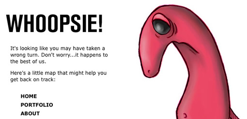
Meaningful feedback is essential for a website. This is the communication channel between the site and the users, with the help of feedback we let the users know what's going on on the site. In case of an error on your web page, don't just print Error occurred, instead write meaningful error messages which tell the user what went wrong and what actions they can perform from there.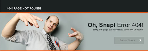
 Feedback works in both ways. When a user fills in a form they are essentially giving you feedback. Don't make the users have to fill in the same information twice. For example if a user has registered on a website and needs to fill in a form at some point, don't ask for their name or any other information that they have already supplied, because these details already exist somewhere in a file or database. By simply getting these details automatically we are simplifying the whole process.
9. Do Not Overuse Javascript
With the advent of Javascript and the AJAX technique, web designers and developers can create responsive, transparent websites, but as with all new technologies there is a cost. In our case the cost is browser inconsistency. Not every user has an up-to-date web browser. They also might not have Javascript enabled by default. By using Javascript on a website extensively we block out these users. Instead use unobtrusive Javascript and graceful degradation.10. Avoid CAPTCHAs
CAPTCHA stands for Completely Automated Public Turing test to tell Computers and Humans Apart. Even the name sounds complex. The most general form of CAPTCHA is text embedded in an image and by testing visitors we can separate human users from spam bots.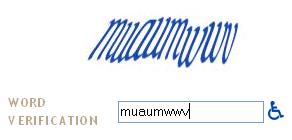 The problem with CAPTCHAs are that each form of human verification method triggers a complex process in the users' brains (e.g. figuring out the distorted text, adding two numbers, etc).
Another problem with CAPTCHAs are the inconsistencies regarding different cultures. For example Chinese symbols, numerals are different from most western letters and Arabic numerals. Chinese people have a much harder time using CAPTCHA ‘enabled’ online forms.
Summary
- Always include a tagline which should be the most obvious element on a web page.
- Implement a 27 characters wide site search and place it on top of your website.
- Don't use extensive graphics and design elements.
- Include a site map page and register a sitemap XML document in search engines.
- Don't break a user's workflow. Allow every action to be canceled if necessary.
- Create easily scannable web content and place the most important information on top of your web page.
- Don't design graphic elements that looks like a button, but is not.
- Present meaningful feedback and don't forget that feedback works both ways.
- Use unobtrusive Javascript and graceful degradation.
- Avoid CAPTCHAs, use more usable methods instead.
WDD Staff
WDD staff are proud to be able to bring you this daily blog about web design and development. If there's something you think we should be talking about let us know @DesignerDepot.
Read Next
3 Essential Design Trends, November 2024
Touchable texture, distinct grids, and two-column designs are some of the most trending website design elements of…
20 Best New Websites, October 2024
Something we’re seeing more and more of is the ‘customizable’ site. Most often, this means a button to swap between…
Exciting New Tools for Designers, October 2024
We’ve got goodies for designers, developers, SEO-ers, content managers, and those of you who wear multiple hats. And,…
15 Best New Fonts, September 2024
Welcome to our roundup of the best new fonts we’ve found on the web in the previous four weeks. In this month’s edition…
By Simon Sterne
3 Essential Design Trends, October 2024
This article is brought to you by Constantino, a renowned company offering premium and affordable website design
You…
A Beginner’s Guide to Using BlueSky for Business Success
In today’s fast-paced digital world, businesses are always on the lookout for new ways to connect with their audience.…
By Louise North
The Importance of Title Tags: Tips and Tricks to Optimize for SEO
When it comes to on-page SEO, there’s one element that plays a pivotal role in both search engine rankings and user…
By Simon Sterne
20 Best New Websites, September 2024
We have a mixed bag for you with both minimalist and maximalist designs, and single pagers alongside much bigger, but…
Exciting New Tools for Designers, September 2024
This time around we are aiming to simplify life, with some light and fast analytics, an all-in-one productivity…
3 Essential Design Trends, September 2024
September's web design trends have a fun, fall feeling ... and we love it. See what's trending in website design this…
Crafting Personalized Experiences with AI
Picture this: You open Netflix, and it’s like the platform just knows what you’re in the mood for. Or maybe you’re…
By Simon Sterne
15 Best New Fonts, August 2024
Welcome to August’s roundup of the best fonts we’ve found over the last few weeks. 2024’s trend for flowing curves and…
By Ben Moss

