Type is one of the most-used elements of the web. Think about it. Unless you are YouTube or Flickr, chances are your site visitors are coming for your text content - not the fancy packaging that surrounds it. So why are web designers still treating text like a secondary element?
Good typography brings order to the page and increases legibility. It allows people to process information faster.
A more scannable, readable site means happy visitors. Happy visitors return often, buy products, leave comments, and share the site with friends. See why it might be worth thinking about?
I could blather on forever about how far typography has come on the web, and how far yet it has to go. I have frequently bounced between web and print design. When you're going from InDesign to TextMate, the limitations of web type are crystal clear.
But plenty has been said about what web type can't do. This isn't going to be another rant. Instead, let's focus on a 5 easy fixes for the typographic eyesores that abound across the Web.
1. Use A Reset Stylesheet
Stupid, but true: No two browsers use the same presentation defaults. Differences in padding, margins, headings, and indentations are rampant. If you want your page layout to be more consistent across browsers, it pays to start with a CSS Reset stylesheet.

Two I recommend:
Yahoo's CSS Reset Stylesheet
Eric Meyer's CSS Reset Stylesheet
2. Watch Your Measure
Measure refers to the length of a single line of type. A longer line = a longer Measure. Studies have shown that for optimal readability, running text columns such as your main body copy should be somewhere between 45 - 75 characters (30 - 50 ems) including spaces. This is one of the reasons that fluid designs (ones in which the columns expand and contract to fit the browser width) are harder on the eyes.
Additionally, your leading should increase with the length of your Measure. Leading is the amount of white space between lines of text, and is controlled via the CSS line-height property. If you need to use an extra-long Measure, make sure your leading opens up.
Likewise, if you have a small column such as a sidebar with a short Measure, your leading should be tighter. I find the default value most browsers assign is a little too tight. A line-height of around 1.4em works well for most body content.
3. Tend To The Space Between
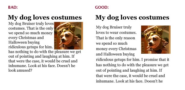
It's not just about your text - its about the space that surrounds it. Too little space makes text hard to read, but so does too much. The key is to find a simple balance that guides the eye from one element to the next.

One of the common mistakes new designers make is to fill every inch of space. White space refers to the empty or "negative" space around your content, and it is crucial. Take a look at a well-designed magazine such as Dwell or Good and you'll see that even though it costs the publisher money to print each page, they leave abundant amounts of white space around the text. The page will be in balance and your eye will move from space to space effectively.
In addition to adjusting your line-height (as mentioned in #1), try increasing your padding and margins. Unless you're trying to pull of a crazy visual trick, there should always be a good amount of white space around your text. Don't let it butt up against other elements, especially images. Let your content chunks (headings, paragraphs, sidebars, etc.) breathe.
Mark Boulton wrote a very informative article about White Space for A List Apart, check it out.
4. Don't Go Font Crazy
A good rule of thumb for any designer is: use no more than two font faces in your design. Two font faces can look very stylish. A List Apart uses variations of Georgia and Verdana to create an elegant and polished look. But continuing to add font faces to your interface creates unnecessary confusion. Similarly, avoid using too many font sizes, colors, or treatments on a page or in a paragraph or they will compete with each other instead of adding emphasis as intended.
Although font stacks and technologies like sIFR and Typeface.js allow you to specify just about any font you want as the default, resist the temptation to go wild with the body copy. Decorative fonts are best kept to headlines because they affect readability. Think about it - when is the last time you picked up a paperback novel set entirely in Comic Sans?
When creating font stacks, pay attention to the size of your pairings. Some fonts that look similar render at very different sizes. Verdana and Arial are a great example of this. Typetester is a great tool for comparing core web fonts and creating a successful stack. Another useful tool called Font Stack Builder shows you what percentage of users will see each variation.
Regardless of what fonts you decide to use, make sure they are not teeny tiny. I know its hard... tiny text looks cool. But think about the poor, squinting users! Keep body text above 10 or 12 pixels. If you insist on teeny tiny, at least use relative sizing for all those IE 6.0 users who otherwise couldn't make it larger. Read Wilson Miner's article on font sizes for a great take on the debate.
5) Don't Neglect The Details
The client provided the content. Adding it to the site is just a matter of copying and pasting, right? Wrong, wrong, wrong. This is a trap web designers fall into all too often.
Even those of us who diligently add heading tags, format each paragraph and organize bulleted lists with care forget some important typographic details. Many (including me) missed out on formal typography training, so you can't blame us entirely. But the devil is in the details. Its time we embrace these basics:
Use smart quotes
What’s the difference between smart quotes and dumb quotes? Smart quotes (also known as book or curly) are curved and have both an opening and closing style. Dumb (straight) quotes are usually straight up and down. An apostrophe is typographically just a single quote so the same problem applies. A dumb quote (also called a prime) should only be used between measurements. For example, 6'4" uses double and single prime quotes.

Unfortunately our keyboards default to prime quotes. Microsoft Word and other text editors just correct them for us as we write. Adding smart quotes to HTML pages requires more work from the web developer because you need to use markup to produce opening and closing quote symbols. I see the same problem with em and en-dashes, ellipsis, trademark and copyright symbols. Coders take the easy way out by replacing them with hyphens, multiple periods, a large TM and the infamous (C). Using the right symbols does make a difference visually. Do it right and make editors everywhere smile.
How to make smart quotes:
#8216; = opening single quote’ = closing single quote“ = opening double quote” = closing double quote
I know - no one wants to spend all day hunting down quotes. Luckily, tools like SmartyPants and Textism can do much of the legwork for you by automatically formatting text that includes smart quotes and the like.
Read "The Trouble with EM and EN" from A List Apart for more detail on the subject and the UTF-8 character encoding for most common special characters.
One caveat - lots of CMS text editors (like the one this site uses) won't let you implement smart quotes without extra plugins. Sad, but true.
Stop putting two spaces after a period. Please! It's not necessary and its actually rather annoying.
On your links, use border-bottom: 1px solid instead of text-decoration: underline. Underlines can run through the descender characters (g, j, p, q, y) making them hard to read, especially when using smaller font sizes.
And while it has nothing to do with typography, running a quick spell check never killed anyone. Even if all you did was copy and paste, a spelling error that slips through to a live site reflects badly on everyone involved.
Pay attention to those 5 fixes and your site designs are sure to improve. Remember that these are just a starting point. Good typography is a learned skill just like anything else, and it requires study and practice. Always keep an eye out for sites that are getting it right and make note of what they are doing. Need inspiration? Check out the sites below for examples of great web typography and post examples you find to be inspirational.
Inspirational Type:
Written exclusively for WDD by Mindy Wagner.
What do you think of these simple ways to improve your typography? Do you implement them on your websites? We'd like to hear from you!


