 Anyone can cobble together a few photos and textures and create a humdrum montage.
To elevate yours beyond this it takes a few simple tricks using Photoshop's awesome array of tools.
Do it right and the style has got dozens of applications from static navigation or graphics, through to animated banners and interactive collages.
I’ve picked a musical theme, as the style works really well for band graphics or music based sites.
This tutorial explains how to create a great Photoshop montage in 19 steps, so let's get started and have fun with it.
Step 1
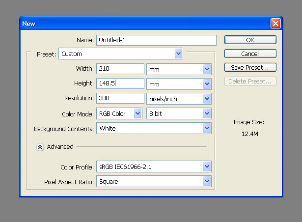
Although the goal is to apply the graphics to a website, I find it’s best to work in 300dpi as it allows for a more detailed approach to work.
For the purpose of this tutorial I’ll set up the canvas as A5 landscape (210mm x 148.5mm) at 300 dpi working in RGB mode.
Step 2
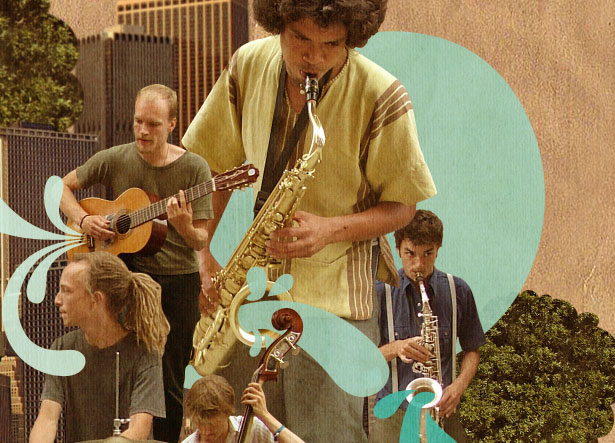
Get this image of a band from sxc.hu (a great resource for free stock photography, always check usage rights) or another image of your choice.
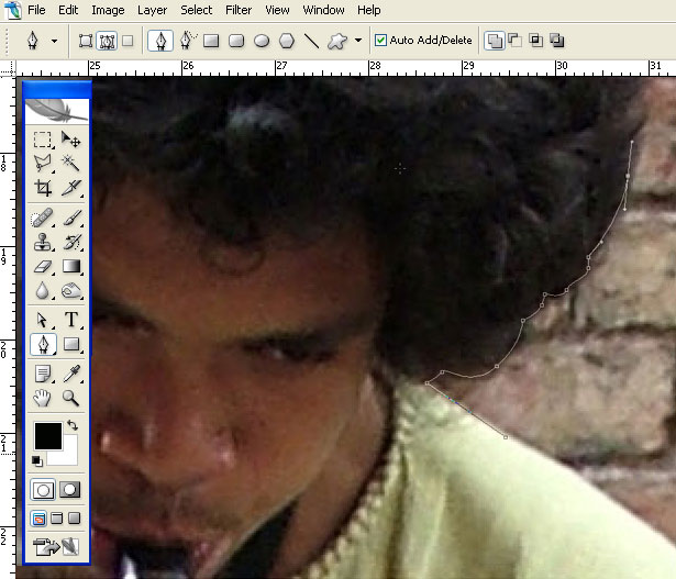
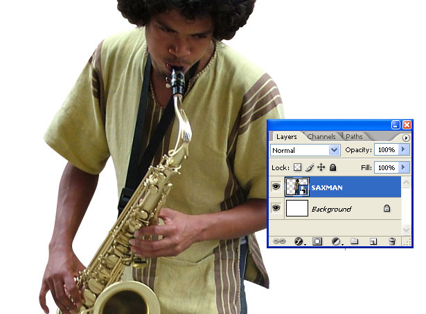
We need to cut out the Sax player in the yellow. We don’t need to be ultra precise here so don’t worry about the hair too much. Use the Pen Tool, set it to Paths, zoom into 300% and start drawing around the Sax man.
Step 3
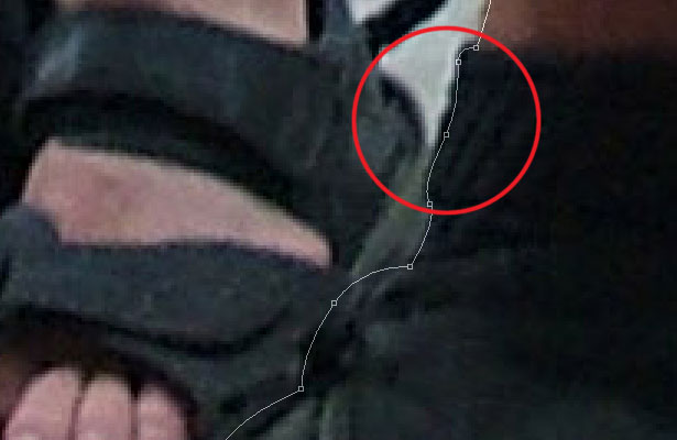
Since we’ll eventually be scaling down these graphics to screen resolution, you can afford to miss out some of the smaller details and be a little loose.
Finish up and close the Path by linking the two open end points.
Step 4
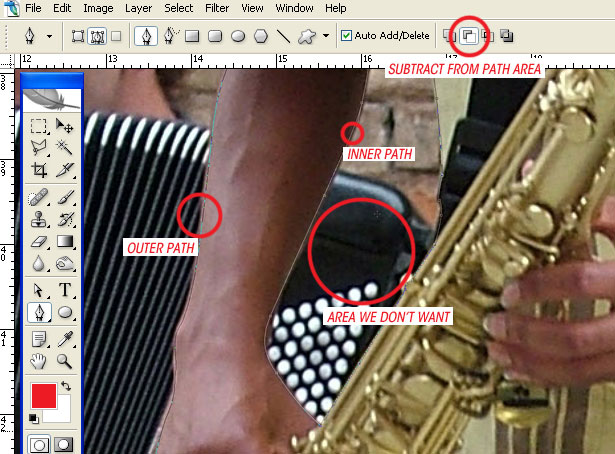
Don’t forget to use Subtract from the path area when subtracting from an area of a closed Path.
Step 5
Create a selection from your finished path (Window > Paths – then Ctrl+Click on the Path thumbnail) and copy and paste it into your empty canvas.
As we’re making a montage it’s good practice to label all layers (I’ve gone for ‘SAXMAN’, I love block capitals for some reason, seems more organized) and turn them into Smart Objects (Layer > Smart Objects > Group into New Smart Object).
Smart Objects allow us to resize and resize without affecting the quality, although you still can’t blow it above its physical size too much without losing quality.
Step 6
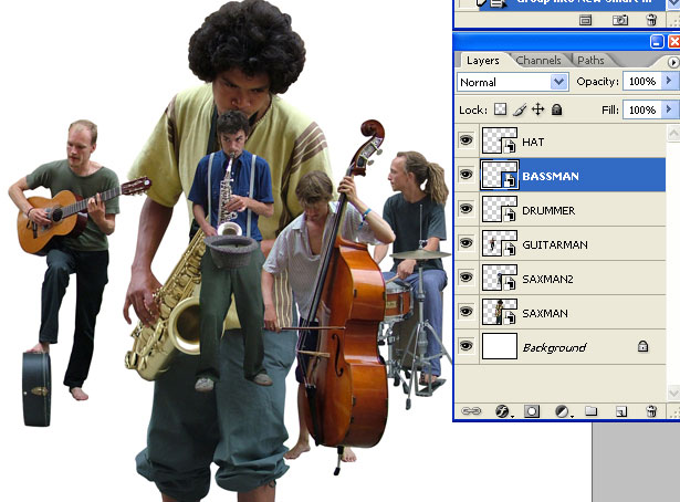
Now get this band image and cut the other band members out in the same way and paste them into your document. Relabel all the layers (SAXMAN2, GUITARMAN, DRUMMER and BASSMAN) and turn them into Smart Objects.
Step 7
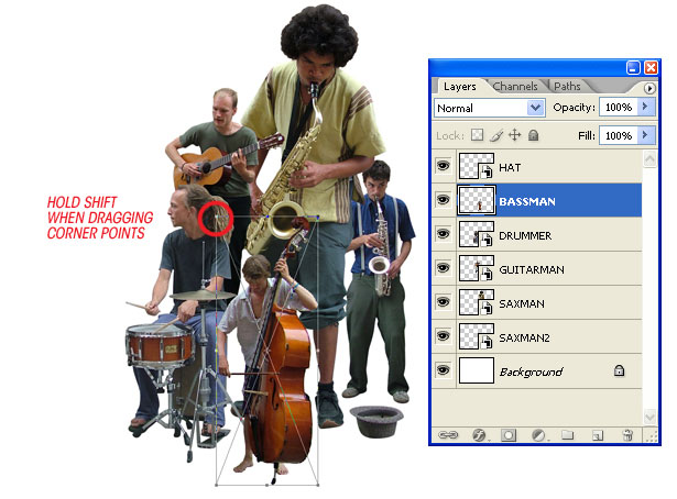
Resize and rotate all the elements until you have a strong focal point for the composition.
You can move layers up and down the layers palette to foreground and background as well. Select a layer you want to transform and press CTRL+T to bring up the Free Transform bounding box.
Hold Shift (to maintain aspect ratio) and drag the corner points to resize.
Step 8
We need a background, so I got this one from sxc.hu, but you can use any other background you like.
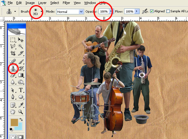
The background I chose wasn’t big enough to fill the image so I selected the Clone Tool and a massive (353 pixel diameter), soft-edged brush to clone it.
Keep redefining your source point by holding ALT and clicking somewhere on the texture. If you mix up your source point you’re less likely to clone repetitive patterns within the texture.
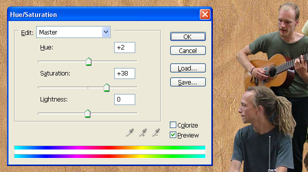
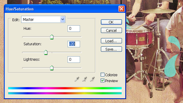
When you’re done, press CTRL+U to bring up the Hue/Saturation window and set-up as in the screenshot below.
Step 9
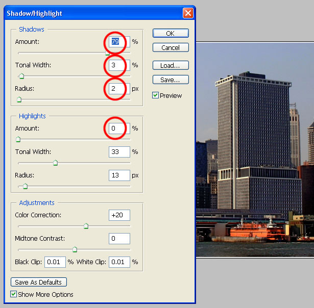
Grab yourself a skyline photo like the one I used from sxc.hu. The shadows are a little harsh so go to Image > Adjust > Shadow/Highlight and set it up as in the screenshot below.
Cut it out as before and paste it into your working document, renaming the layer BUILDINGS.
Don’t cut around every little mast or antenna, get the basic building shapes and square it off at the bottom.
Step 10
Now that the buildings are cut-out, we can see that there is some visual distortion on the right.
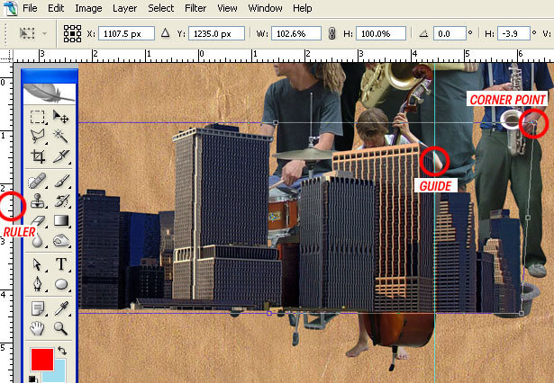
Press CTRL+R to bring up the rulers if they’re not already visible and drag a vertical guide from the left side ruler.
Then, with the BUILDINGS layer selected, press CTRL+T to bring up the Transform bounding box.
Hold CTRL+SHIFT and grab the top right corner point to drag it independently (but affixed to a horizontal plane) until the building matches the vertical guide.
Step 11
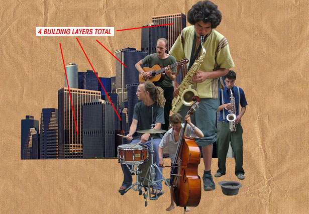
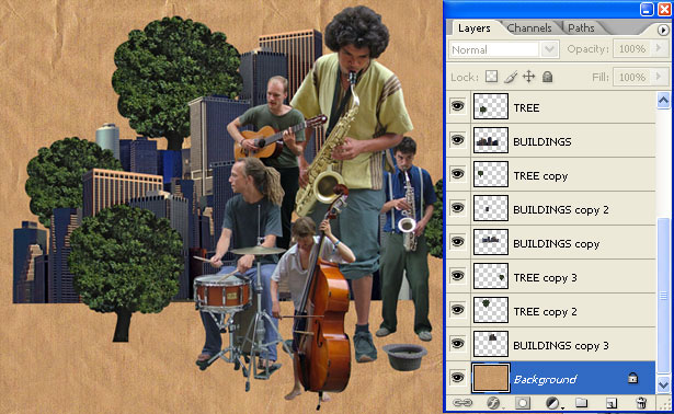
Arrange the buildings behind the band layers. Try flipping them horizontally and re-sizing to mix it up. Select all the layers on the layers palette and go to Layer > Rasterize > Rasterize all layers.
Step 12
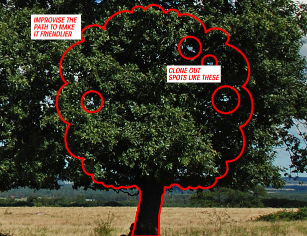
Get this Tree sxc.hu and draw a cartoon tree-shaped path around a section of it. Then use the Clone Tool to clone out the areas of sky that can be seen through the leaves.
Copy and paste the tree into your document and position it amongst the buildings.
Step 13
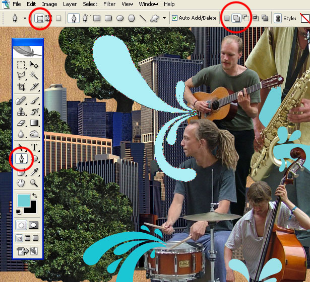
Time to add a little colour. Select the Pen Tool and set it to Shape Layers rather than Paths.
Pick a complimentary foreground colour, this can be changed later on if you’re not happy with your first choice.
Now start drawing, think of ways to make the Shape Layer interact with your photos. If you want to keep it simple, click the Add to shape area (+) icon when drawing shapes that go together. This will keep them on the same layer.
Step 14
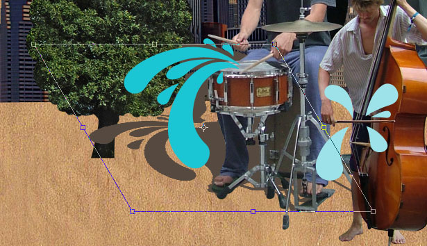
We’re going to add some shadows to the foreground elements (Band layers, Shape layers). We’ll tackle just one layer and then you can repeat the process for the other layers.
Let’s take the DRUMMER layer. CTRL+Click the DRUMMER layer thumbnail to create a selection. Do the same for the DRUMMER Shape layer.
Create a layer underneath the DRUMMER layer and fill it with colour number #56493f (type this into the Color Picker window under the R, G, B values).
Press CTRL+T to bring up the Freeform Transform box, hold the CTRL key and drag the top middle point down and to the left like a 5 O'clock shadow.
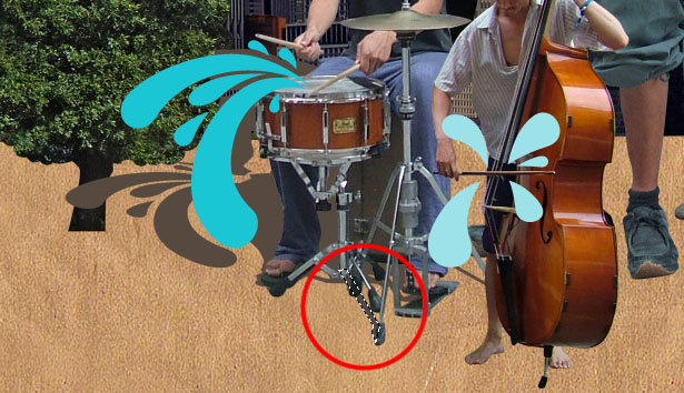
The hi-hat stand legs don’t match up, so erase what looks out of place using the Eraser Tool and redraw with the Polygonal Lasso Tool, then fill with the same colour.
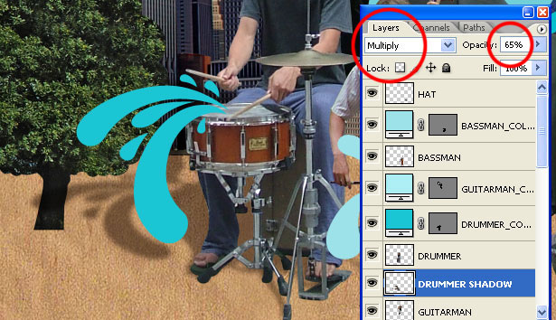
Apply a 5 Pixel Gaussian Blur to the Shadow layer, then set the Layer Blending Mode to Multiply. Reduce the layer opacity to 65%.
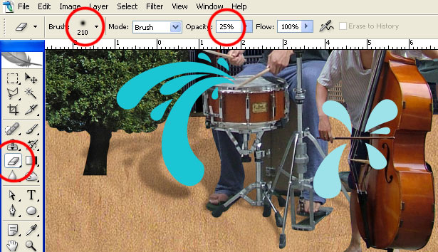
Finally take a soft-edged eraser, set the brush opacity down to 25% and feather the far end of the shadow.
Step 15
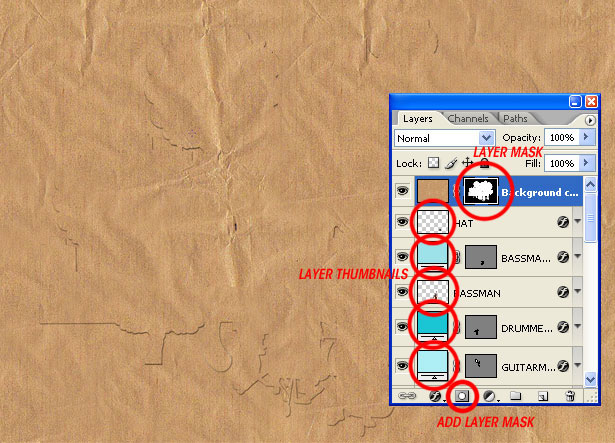
Duplicate the Background layer (select it, then go to Layer > Duplicate layer) and drag it to the top of the Layers palette.
Then CTRL+SHIFT+Click on all the layer thumbnails except the Shadows, Background and the Background duplicate you just made.
This should create a selection from your layers, from this selection apply a Layer Mask to the Background duplicate layer.
STEP 16
Change the Background, duplicate layer Blending mode to Soft Light, then duplicate the layer and change its mode to Color. Reduce this second duplicates (Color) opacity to 20%. This will fuse the elements a little better.
Finally, reduce all the coloured Shape layers' opacities down to 90%.
Step 17
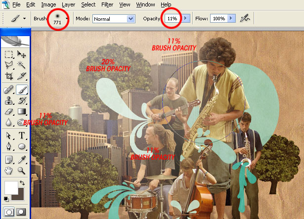
Create a new layer at the top of the Layers Palette and call it GLOW. Select the Paintbrush tool and use a large soft-edged brush loaded with white to draw in some hazy glow.
Rather than dragging the brush around the canvas, stamp it down, changing the opacity as you draw out from where you started.
Step 18
Create another new layer above that called YELLOW GLOW, take the same brush loaded with Yellow (ffcc00) and draw where you drew before. Change the Layer Blending mode to Overlay.
If you’ve overdone these layers, just pull the Layer Opacity back a touch.
Step 19
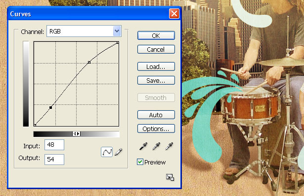
Finally, add a few Adjustment layers at the top of Layers Palette. The first is a Curves layer (Layer > New Adjustment Layer > Curves).
Then a Hue/Saturation layer.
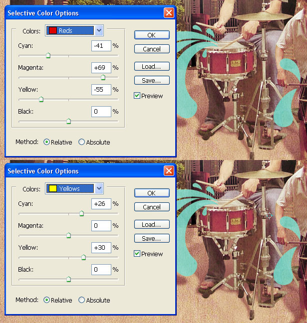
Finally a Selective Color layer.
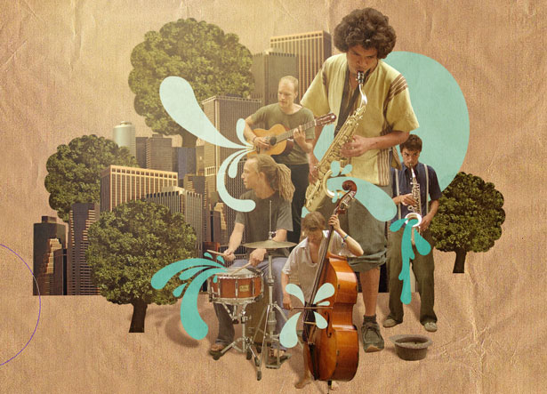
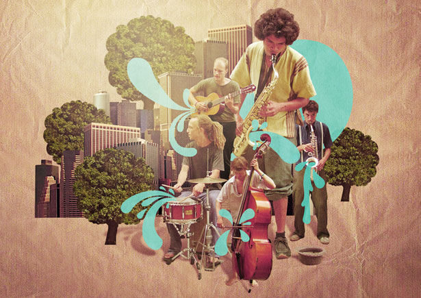
Final image
Written exclusively for WDD by JamesZilla. He's an illustrator and graphic designer from the UK.
Have you followed this tutorial? We'd love to see your results, please post them in the comments' section.

