 Whether it's your portfolio, a blog, a marketing web site, or a collection of games, we all want to attract visitors to our website and to ensure that they have a pleasant experience.
Usability measures the level of a user's experience and can be characterized by how easily a given task can be completed; whether it's done with prior knowledge, or by having the user learn a new way to interact. I think Jakob Nielson probably explained it best when he said:
"Usability is a quality attribute that assesses how easy user interfaces are to use. The word "usability" also refers to methods for improving ease–of–use during the design process."
In this article I hope to give you some form of a usability checklist, covering topics from form design to simple navigation tips that you can apply to any Web project.
1. Creating active navigation
Letting the user know what section of the site they're in, or what category they're navigating through can be give a huge usability boost to any site. Active navigation is one of those usability concepts that are almost automatic at this point. And we all have our own way of creating it.
The ideal situation for creating active navigation is to do it server-side, because it massively cuts down on the amount of HTML and CSS needed. If generating an active state server-side isn't an option, manipulating your body element to style each navigation element directly is also a fine choice.
As a third option, you can easily create active navigation with JavaScript.
Your active navigation state should always be different from your hover state.

2. Clickable labels & buttons
When you take the time to mark up a form properly a user can click a label to activate the associated form element and there's a really easy way to show it off. This is a great piece of functionality built right into HTML. Unfortunately, very few users know about this natural gem of user interface.
Letting the user know a label is clickable only takes a line or two of CSS (depending on how you write it) to change the cursor from the default text insert to a more clickable and friendly pointer.

By now everyone's well aware that submit buttons are clickable. I've always thought it was weird that this - obviously clickable - element doesn't use the same cursor as a link. So I like to apply this bit of CSS to buttons as well:
label, button, input[type="submit"]{cursor:pointer;}
3. Linking your logo
Not linking a logo to your site's home page is one of the more frustrating things I've come across on the Web. I can't understand why someone wouldn't so this. It's so easy, and by now, it's safe to say, users expect it.
Linking your logo is so common nowadays that many sites are finding that having a link labeled "Home" isn't useful anymore, as users are just clicking the logo to navigate to the home page.
Sites such as Facebook, track user clicks by adding the "ref" parameter to each navigational element. Below is an example of how Facebook links their logo:

4. Increasing the hit area on a link
About a year ago, Ryan Singer from 37Signals wrote an article about how they padded link targets for better mousing in Basecamp. This is another small usability trick that you can use by simply adding some padding around links to make the clickable area larger.
This is a great addition to any site and it can help prevent misclicking on a link, which can often be a little frustrating. It also helps a lot in mobile Web design, where users click with their fingers and really need that extra large hit area on a link.

5. Adding focus to form fields
Applying focus to a form field is a growing trend in UI design. It lets the user know that what they just did caused something to happen (did that make sense?). It's a quick and easy way to pass useful, unobtrusive information onto the user. Saying something like: "Hey! You just clicked here." Can be very useful.

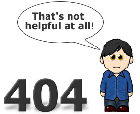
6. Providing a useful 404 page
Making the user feel comfortable is very important and displaying a big Apache error message on the screen isn't the best way to accomplish that. A useful 404 page can go a long way and it doesn't have to contain the numbers "4" or "0", as they aren't very helpful to anyone other than the developer. Besides this, no one really needs to know the error code for anything that happens behind the scenes. Users just want a site to work the way they expect it to.
On the off chance a user does find themself on a "Page not found", it's much more helpful to lead them somewhere where they might be able to locate the information they're looking for, by providing some apologetic text, a search box, or suggest some possible destinations. But try not to put the blame on the user for landing on a wrong URL.
Blogussion wrote a great article about creating an informative 404 page that lists some very good tips and even some code for those WordPress users among us.
7. Using language to create a casual environment
Writing on the Web is a big topic right now. It's like we're going down some giant checklist dealing with issues: HTML, CSS, progressive enhancement, accessibility, writing for the Web, and the all encompassing "Web standards".
We're hearing a lot about writing on the Web and it seems to keep changing. From the days of Steve Krug telling us to cut our content in half to using bulleted lists wherever possible.
Now we're all supposed to write like we're talking to a friend and it all goes back to making the user feel like they're in a comfortable environment. When you keep the copy on your site casual, it makes a user feel less stressed, so even when they do encounter something confusing they can still feel a sense of relaxation and informality as they search for their answer.
8. Applying line height for readability
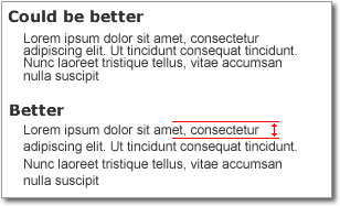
Line height is one of the things that can be directly inherited from physical media, such as books and newspapers. These sources have been around for hundreds of years and have had plenty of time to master readability and line height. So the next time you're stuck on this, don't be afraid to crack open a textbook and check it out.
This is an aspect of Web design that can be easily overlooked and easily abused. I usually start off with a line height of about 1.4em and adjust it from there, based on the design and content.
9. Utilizing white space to group elements
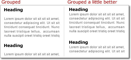
Grouping items together is one of the easiest ways to show association. You can do it with images, borders, or just plain old white space. Using white space to group elements creates natural associations between related elements that, even when read at a glance, can be easily picked up by the user.
As the eye scans a page, a user will naturally read the headings first. This happens a lot with top 10 lists (::ahem::). Hopefully, the content is interesting enough to grab some attention and entice the user to read a little more closely. You push users in the right direction by designing your content in a way so that things that are related actually look like they're related.
10. Being accessible
By being accessible, I don't mean Section 508 and ADA compliance. Accessibility, in this case, means being there for your users when they have a problem (responsiveness).
If usability is all about trying to make sure your users don't get frustrated and leave, responsiveness is your last line of defense against losing that user to one of the millions of competitors who are a short click away.
Ultimately, you can do all the testing that you want and follow all of the usability advice that you can get your hands on, but everybody is different. Users will get confused and lost and eventually need some help. The amount of time you leave a user confused can be the difference between someone who will come back and someone who won't.
When talking about accessibility, many people default to a conversation about the visually impaired, but accessibility extends far beyond that. For example, you have to make your web site accessible to users with bandwidth restrictions (dial-up connections, cell service, slow networks) and older browsers (some companies won't let employees upgrade browsers).
If we do our best to make our sites as accessible as possible and respond quickly to questions we can create an overall experience that will leave the user constantly wanting more.
Customer service matters... even on a blog.
Written exclusively for WDD by Tim Wright, web designer/developer and blogger. You can find more of his writing at CSSKarma or follow Tim on Twitter.
Do you follow all these principles on your websites? How can we create a better and more usable web? We'd love to hear your comments...


