 Designers of e-commerce websites today face a number of challenges in attempting to build a user experience that increases the likelihood of visitors making online purchases.
To battle fierce online competition and overcome the apprehension of skeptical shoppers, designers can take a number of steps to improve the usability of their online stores.
Since 1995, Amazon has established itself as the world's leader in e-commerce. Its success is not a fluke, nor is it merely the result of being in the right place at the right time.
Amazon's success is the direct result of a strong user shopping experience.
In this article, we will discuss a number of features of the Amazon shopping experience that will, either in principle or practically, offer a model worthy of imitation by e-commerce developers today.
A Two-Fold Purpose Made Clear
The Amazon shopping experience begins, of course, on the home page, where the user is visually notified of the website's two-fold purpose:
Product Search and Online Purchasing
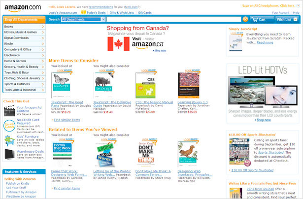
When you scan the Amazon home page (screenshot above), what stands out? Amidst the perpetually cluttered layout, a few clean, distinct elements immediately catch the user's eye: the navigation section in the upper-left, and the search/shopping cart controls near the top.
Below is the same screenshot with those elements emphasized by graying out the rest:

With these elements highlighted, we see how Amazon's simple two-fold purpose is achieved:
- The user is able to quickly find and purchase products
- The seller is able to quickly process online purchases and make a profit
Because Amazon is so well known, only the rare visitor wouldn't know that both of those things (i.e. product search and online shopping) are available.
But Amazon's team of designers and architects have made sure those two elements in the website's structure are prominent and usable.
Designers, clients, project managers and developers involved in building e-commerce websites could follow this example by clearly emphasizing product search and online purchasing from the very beginning of the user's experience—whether for first-time users or returning customers.
Content Tailored to the Current User
Once they have established the website's product search and online shopping capabilities, users will most likely want to take advantage of those features right away—starting with search.
Amazon uses cookies to keep a user logged in, and that user's shopping habits are tracked and stored server-side.
This is a good enhancement, because it dynamically customizes the user's experience based on prior searches, page views, wish-list additions, written reviews and, ultimately, purchases.
Related Items Displayed
One example of customized content is seen on the home page, which modifies the main content based on how the user (whether logged in or not) has interacted with the product search feature:
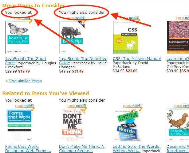
Recommended Items Based on Prior Activity
This same type of customized content appears on subsequent visits, as long as browser cookies are kept intact:
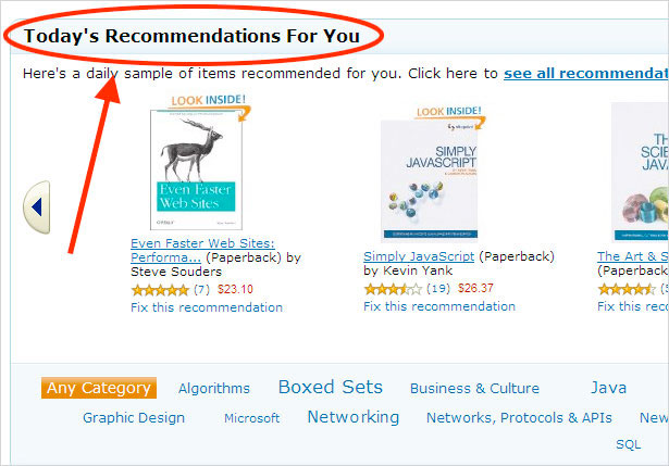
As Amazon does, a good e-commerce website will track client-side behavior (on the server-side) to ensure that subsequent visits of each user are increasingly tailored to their tastes and habits.
This increases the likelihood that the user will make a purchase, and in some cases it will speed up the purchasing process.
More significantly, it exposes the user to a wider range of products and services that tie in to their areas of interest.
Various "Why Shop With Us" Reminders
The Amazon shopping experience is littered with reminders of why the user should purchase a product from Amazon rather than from some other source (online or otherwise).
A few examples are shown and discussed below.
Prices Compared to Suggested Retail
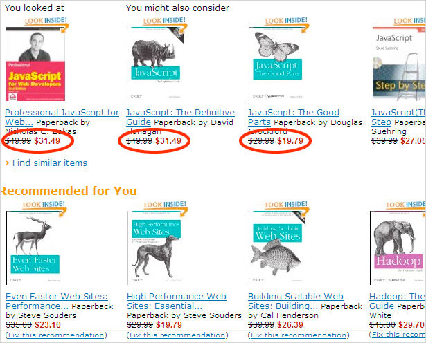
Each product displayed above has not only the discounted price offered by Amazon, but also the MRSP (manufacturer's suggested retail price, or "list price").
This simple feature, which is instantly understood by the user because of the strike-through text, is seen with virtually every product on Amazon.
It says to the user (not in so many words), "Here's why you should buy this item from us". This is a simple but strong sales incentive that has no doubt boosted Amazon's revenue.
User Notified of "Free Shipping" Early On
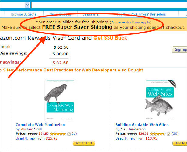
Another good example of the "Why shop with us" reminder is shown in the image above. After the user has added some items to their shopping cart, a large distinct yellow banner appears at the top of the screen, telling the user that they now qualify for free shipping.
The banner also helpfully includes a link to any restrictions that may apply.
Logically, the notice of "free shipping" should come as a step in the "shipping options", but that process occurs after the user has shown a commitment to the items in their shopping cart.
So, displaying this yellow banner as soon as the user's cart qualifies for free shipping increases the likelihood that they will follow through on their purchase. Again, the yellow banner in effect states, "Here's another good reason to buy from us".
Life-Like Book Previews
One of the reasons a shopper may pass up an opportunity to purchase online is that they cannot assess the quality of a product.
But an up-close preview of a product—one that is comparable to actually holding the item in your hands—can help remove some, if not all, of this hesitation.
The "Look Inside" Feature
Books are one of the most frequently purchased items on Amazon, so it's no wonder that the Amazon development team has built the feature that it refers to as "Look Inside".
The "Look Inside" feature lets shoppers view certain sections of books: usually the front cover, table of contents, first pages, index and back cover.
This can be extremely helpful because shoppers will usually be able to tell from a glance at the table of contents or introduction whether a book suits them.
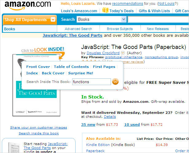
As seen in the screenshot above and some of the images further up, the "Look Inside" feature (which is available for countless books) is accessible from any page that has thumbnails of book covers and from the product pages of individual books.
Hovering over the thumbnail image on the product page opens a menu of the book's sections.
The "Search Inside" Feature
The preview menu for the "Look Inside" feature also has a small box labeled "Search Inside This Book", which lets the user search the entire book, not just the sections available for preview.
When the user selects an option from the "Look Inside" menu, a lightbox pops up, giving the user a product preview that is almost as good as holding the book in your hands.
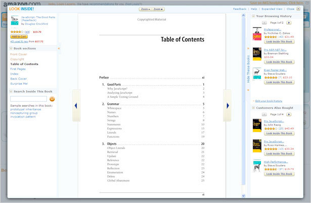
As shown above, the "Search Inside" feature is also included in the lightbox and offers even more functionality. The image below shows an example of what happens when the user performs a search.
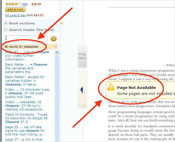
The "Search Inside" feature returns results from any page in the book but notifies the user if the page is not available for previewing.
The search engine is even intuitive enough to include the plural forms of singular words, which is best practice. Although I found this feature to be a little buggy, it's still a good option to have when researching a book.
E-commerce developers today may not have the budget or technical resources to include such a feature on their websites, but you can ensure during the concept phase that products are given as much exposure as possible.
Customizable History and Recommendations
Earlier we discussed how "Recommended Items" appear in certain sections of the Amazon website. Some of those sections, as well as the shopper's entire product viewing history, can be modified. Take a look at the image below.
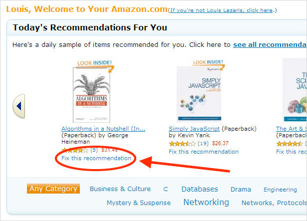
Each product listed on the shopper's personal Amazon page under "Today's Recommendations For You" can be edited.
Clicking the "Fix this recommendation" link brings up a window that explains exactly why this item was recommended and that gives the shopper the option to change it.
Usually, an item is recommended based on a prior purchase or tracked shopping habits. The shopper can tell Amazon not to recommend any more items based on that factor.
Another customizable feature is a history of all of the products that the shopper has viewed. This option is not always easy to find but appears at the top of the user's personal page. An example of a user's browsing history is shown below.
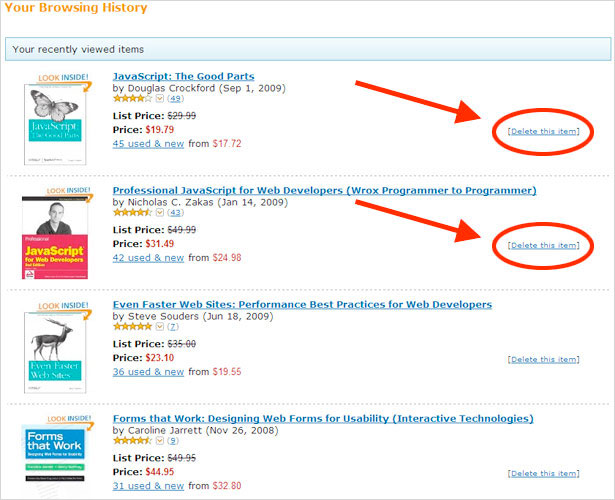
The items are displayed in order of when they were visited, starting with the most recent. And each item has a "Delete this item" option, similar to what you would find on a shopping cart page.
When an item is deleted, the page reloads and the list is updated. This feature would be more effective if it were done with AJAX, but it is still a useful enhancement.
In the right sidebar on the same page, the user sees a list of search terms and categories that they have recently viewed:
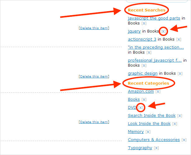
Clicking on the "x" beside each item, the user can delete any item in their search or category history. This is a client-side feature, so the results are instantaneous: the user doesn't have to wait for the whole page to reload when they delete an item.
These customizable (or editable) features ensure that the shopping experience isn't burdensome to the user. If they receive recommendations that they aren't happy with, the user can modify them, which will improve future visits.
E-commerce developers can follow this example by allowing any dynamic user-tailored content to be as customizable as possible. This ensures that users do not feel as if content is being forced on them through advertising or promotional incentives.
Well-Placed Navigation Elements
Critical to the success of any online store is the ease with which users can navigate sections. Basic store categories, user pages, shopping cart pages, purchase pages and the like should all be easy to access at almost any point in the shopping experience.
Amazon does a good job of this, as shown by the numbered sections in the screenshot below.
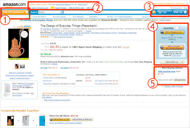
Hovering over the "Shop All Departments" button (#1) triggers a drop-down menu that displays all primary store categories, giving shoppers easy access to other products. This navigation element is exactly where the user expects it to be: in the top-left corner of the screen, below the logo.
Beside the logo (#2) are a few less important links, such as ones for logging out, personalized recommendations and the user's personal Amazon page. This section is not extremely prominent but also appears where it should be: at the top, either above or at eye level with the logo.
The next element (#3) is the section containing the "Cart" and "Wish List". Shopping cart functionality is almost invariably located in the top-right corner of an e-commerce website's layout.
And whenever a user views a product page, they are invited to add the product to their shopping cart or wish list (#4). Users naturally look for this functionality exactly where Amazon has placed it: to the right of the product and product details.
Finally, Amazon invites users to view "used & new" versions of the same product in the Amazon Marketplace (#5). Selling products in its marketplace obviously does not increase Amazon's revenue in the short term, but it likely reaps long-term rewards, because simply knowing that this option is available makes many shoppers choose Amazon as their primary destination—even for used goods.
Amazon does this because it knows enough to put the user's interests first and recognizes the long-term benefits.
You'll also notice that the elements that stand out the most among the five we've highlighted are the ones that have sharp colors, gradients and subtle 3-D effects.
That is certainly not a coincidence: Amazon wants to draw the user's attention to where it counts.
The placement of navigation elements is critical to the success of any website. Amazon sets a very good example in this regard, doing what users expect and ensuring that the most important elements are accessible at all times or as needed.
The Shopper Should Always Feels Comfortable
This is important for any e-commerce website and is done well on Amazon.
To increase the likelihood that a user makes a purchase, you have to ensure they are comfortable at every stage of the shopping experience. Amazon accomplishes this beautifully by giving the customer full control at all times.
Easy to Filter and Compare Customer Reviews
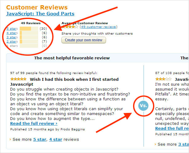
The screenshot above compares two opposing customer ratings and reviews (shown on either side of the "vs." graphic). The user can also filter customer reviews by rating. Why does this make them feel comfortable? Because the user is about to spend their hard-earned dollars on this product and would feel more comfortable being able to easily access both positive and negative reviews.
Gaining thorough knowledge of a product through customer reviews, both good and bad, gives the shopper peace of mind and helps them make an informed decision.
The user is not pressured into purchasing an item but rather feels that the decision of whether to buy a product is completely under their control.
Extra Shopping Cart Options
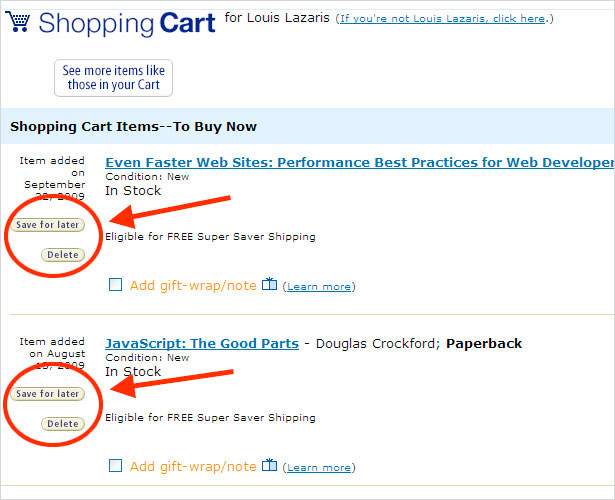
As shown above, a few options are included on the shopping cart page that make the user feel comfortable. First, if a user changes their mind about a particular purchase, they have the option of deleting it from their cart.
But deleting is a rather final act, so they have the alternative of saving it for later, too. You could call this a "soft delete": it removes the item from the shopping cart but keeps it on the user's shopping cart page under a list of saved items, where the user can easily add it back to their cart at any time.
Change or Delete Items on Shipping Page
The user's control continues in subsequent steps of the purchase. Take a look at the next image.
The user sees this when selecting a shipping option, which likely means they are already committed—or nearly committed—to buying the product.
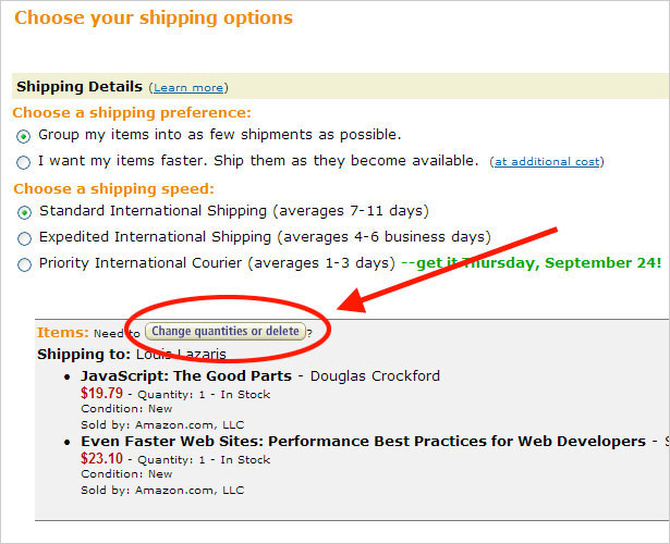
When choosing a shipping method, the user is given the option, with a fairly prominent button, to "Change quantities or delete". Upon seeing the shipping methods, the user could very well need these options, so having the button available now is helpful and reassuring.
Reminder That "Continue" Does Not Mean "Final Decision"
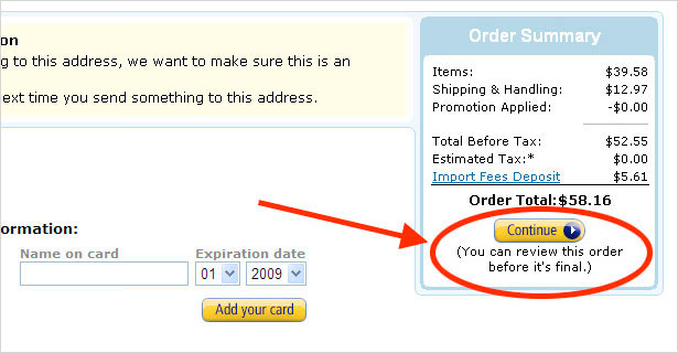
After the user has added a product to their cart and selected a shipping method, they review a summary of their order and click a button to "Continue" with their purchase. That button takes them not to a confirmation of their order but rather to one final page where they actually make their purchase.
To ensure that the user knows this is not the "final" step, a helpful reminder is put directly below the "Continue" button, informing them that the final order will be confirmed after one last summary.
E-commerce developers could learn from the example set by Amazon's empathetic user experience by understanding the various concerns and apprehensions that a user might have at each stage of the shopping experience.
Developers should add enhancements to the shopping experience that make the user feel comfortable and in control.
Conclusion
In no way could we cover all of the advantages of the Amazon shopping experience in this article.
But the few strong features we have discussed should suffice to help you understand how the architects at Amazon have shaped the online experience.
Lessons Learned from the Amazon Shopping Experience
- The focus of an e-commerce site should be product search and online buying.
- Whenever possible, content should be unique for each user.
- Create sales incentives by giving "Why shop with us" reminders.
- Give products as much exposure as possible.
- Don't make the user feel as some products/services are being forced on them.
- Make important sections easily accessible at the appropriate time.
- Make the shopper feel comfortable and in control at all times.
The Amazon shopping experience is not perfect. It has its flaws, which is the subject of another article. But the good greatly outweighs the bad.
And of course technical and budget limitations will keep some of the enhancements mentioned here out of reach of some e-commerce developers. But by following the underlying principles of these best practices, you will be able to implement various usability enhancements that are within your project's budget and specifications.
Applying these principles will ensure that your online store delivers a rewarding experience to the buyer and a good bottom line to the seller.
Further Resources on E-Commerce Usability
- Advanced E-Commerce
- Interaction Design Pattern Library: E-Commerce Sites
- Ten Ways to Improve the Usability of Your E-Commerce Site
- Did Poor Usability Kill E-Commerce?
This post was written exclusively for Webdesigner Depot by Louis Lazaris, a freelance writer and web developer. Louis runs Impressive Webs, where he posts articles and tutorials on web design.
Have you found other usability benefits and e-commerce best practices in the Amazon shopping experience? Share your comments below.


