 An image’s dimensions on screen are measured in pixels: width and height.
An image's quality is determined by less tangible factors: composition, mood, style, contents. But none of that matters if people get impatient waiting for the file to download.
Web images change in file size when compressed. Smaller files are faster to download, which makes for a better browsing experience.
But clear pictures make for a better experience, too. How much—and what kind of—compression should we apply? Are there alternatives to these messy trade-offs?
Here we look at some surprising facts about preparing image files for the web.
Making pages load fast is crucial to keeping the attention of visitors. They’re fickle folks these users, easily disappointed if they don’t get immediate results. When they click a link, they want the target right away.
One of the biggest bottlenecks on web pages is the size and quantity of images. The obvious solution is to use fewer images. But other techniques can help us get the most out of every pixel.
Pixels Are Information
The old cliché that a picture is worth a thousand words is true. Think of a pixel (short for “picture element”) as a unit of information.
More pixels mean more data, which affects both the viewing and resampling of an image. Just as more words can make a paragraph more descriptive, more pixels can make a picture more informative. (Of course, using the right words leads to a better paragraph, just as using the right pixels leads to a better image.)

Photo courtesy of Jan Busby.
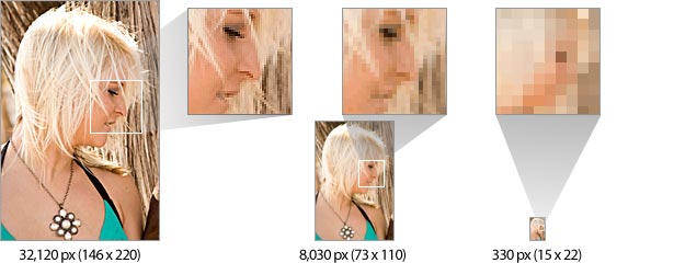
Smaller images don’t merely take up less space—they tell less of a story. Above, the same image at three different sizes becomes progressively harder to “read.”
The largest photo clearly shows the model’s eyelashes, teeth and strands of hair. The mid-sized photo loses those details. How long are those lashes? Is she smiling? It’s hard to tell. The smallest photo still resembles a person, but only with some imagination. A picture of a human face at fewer than 400 pixels is usually unrecognizable.
Although small images are harder to see, their size isn't always a problem. Simple icons with simple messages don’t need many pixels. Many pixels may be needed to show a person’s portrait: their expression, characteristics, clothing and background. But a thumbnail link to the next portrait in a series has only one thing to say.
The question is, what’s the fewest number of pixels required to communicate “Click this to see the next image”?

Above, each of the arrows communicates “Next.” Graphics A and B are both very legible and convey the same message, but graphic A uses four times as many pixels to say the same thing.
At the other end, graphic E isn’t an arrow so much as a gray and black blob. It doesn’t have enough pixels (i.e. enough information) to be a recognizable shape.
If graphics A and B use more pixels than necessary, and E fails to communicate, then graphics C and D have just enough pixels to suggest a right-pointing shape. Sixty-four pixels are just barely enough to create an arrow shape (or to play Space Invaders).
The goal in sizing an image, then, is to make it large enough in file size to tell a story and small enough to download quickly.
Finding the “Ideal” File Size
Many factors affect legibility (or the clarity of information expressed in pixels): contrast, subject matter, the photographer or artist's experience, lighting, detail, background noise and available space on the page. These all determine how small or large an image should be.

In the end, choosing the right image size is a judgment call. But compression is more than a trade-off between image quality and file size. Understanding how various forms of compression work can affect how you prepare your images.
Technically, a digital image is a set of pixels arranged on a grid called a bitmap. In a straight uncompressed bitmap, each pixel has its own description: pixel #1 has a particular mix of red, green and blue; pixel #2 has a different mix; and so on.
Compression algorithms reconstitute a bitmap, using less information to describe the same number of pixels. Most images on the web belong to one of two compression types: JPG or LZW (Lempel-Ziv-Welch, named after its inventors).
LZW Addresses Both Image Quality and File Size
GIF and 8-bit PNG images use LZW compression to minimize file size. LZW groups identical colors in an image per row.
A file in this format has a precise list of every color in it. Rather than record the values of red, green and blue for each contiguous row of pixels, this color palette enables the file to call for “color #1.”

Above, LZW compression assigns a color to 15 pixels in a row. Without LZW compression, each pixel would need its own color information. Redundant information increases file size. But LZW is effective only when rows contain many consecutive identical colors.

Above, the top group of pixels has many interruptions. The compression algorithm can't go more than two or three pixels without having to create a new group of colors. Because each group must be recorded in the file, eight records are created in the GIF and PNG files.
The second group is much better: only four groups of concurrent colors means half as many records in a GIF or PNG file.
As a result, GIF compression works better horizontally than vertically. If you have the choice, make the details horizontal. This is even more important than overall dimension: a narrow image with horizontal stripes tends to compress better than a wide image with vertical stripes. With LZW compression, it’s the details that count.

Above, saving in GIF makes a big difference when the image is turned 90°: horizontal stripes require only 16% of the bytes required by vertical stripes.
LZW is said to be “lossless” because the format itself doesn’t alter the image. JPG is different.
JPG Clumps Complicated Details
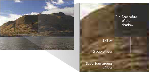
JPG works best for live photographs, as it was designed to. This compression scheme clumps pixels into groups of around 8x8 by mixing their colors slightly.
More compression means that the pixels in a 64-pixel clump will become more similar. Then JPG tries to relate four groups of 8x8 pixels to each other. Then it groups those groups into another 2x2, and so on. This technique is called “lossy” compression because it introduces changes to the file.
The changes that JPG compression introduces to images are called artifacts. Naturally, more artifacts make for better compression but poorer image quality.

Above, a JPG saved at 0%, or full compression, makes its clumpy artifacts obvious. Hard edges and sharp contrast are JPG’s first signs. For example, the edge of the mountain against the cloud loses focus, and the right-hand shadow “jumps” to the edge of the nearest convenient 8x8 clump.
Fortunately, most photos retain enough information to minimize the problem. People are good at recognizing shapes, even if the shapes are slightly distorted.
Photoshop’s 19% trick
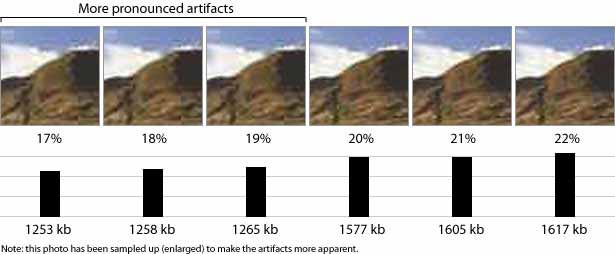
Here’s a tip for Photoshop users: Photoshop’s “Save for Web” feature has two parts that suddenly change the compression. Image → Save for Web lets you choose the amount of compression as a percentage: 0% is the lowest file size, 100% the highest. The difference between quality and file size becomes more pronounced between 19 and 20%.

Notice the sudden drop in file size in the above illustration. If image quality is less important to you than downloading time, then compressing no higher than 19% will achieve the best quality for the lowest size. But if image quality is more important, then saving a JPG at no lower than 20% achieves the lowest size for the best quality. You’ll find a similar point at around 30 to 32%, though less drastic.
The differences in this 100x100 image are only a few bytes. But the savings add up, especially in larger photos.
CSS Sprites
Being files, all images on a web page must be requested from the server. Those requests give the server extra work to do. If you have many small images—icons, for example—that have a similar color palette, then CSS sprites can improve loading time.
A CSS sprite is a single file that holds many images within it. Using the width, height and background-position properties in CSS, you can make slices of the file appear in divs, links and other HTML elements. So, a single file fulfills multiple roles on the page. The advantage? Only one file to download. The disadvantage? It requires a little planning.
Add something here
Confirmed
Cancel
Sorry, access denied
Next page
Edit a photo
Power up
Green tag
The icons above (and the ones in this sentence) come from only one file: ![]() . CSS will put an image and its dimensions in a
. CSS will put an image and its dimensions in a , but each element must be repositioned to fit. Using the :hover pseudo-selector makes the math worth the effort, because sprites can enhance links and other elements on mouse-over. Try it below:
As you can see, the same image provides two states for the four icons. The only trick is in preparing the graphic file in advance and figuring out each icon’s coordinates.
![]()
(“Silk” icons courtesy of FamFamFam.)
As of this writing, both Yahoo! and Amazon use sprites for their frequently downloaded navigation labels.
Choosing the Right File Size
Not every pixel in an image is critical, but a designer's neglect of file size often increases with the number of images on the page.
An image that could be 5% smaller isn’t a worry. Two images aren’t much more of a worry. But what about five images? Ten? At what point should the designer begin to worry about image compression? Everyone has a different threshold. Some don’t care at all.
Worrying is hard to do when a few extra kilobytes have no consequences. But ignoring compression becomes a gradually more serious problem that slows down websites and drives away visitors in the long run.
Written exclusively for Webdesigner Depot by Ben Gremillion. Ben is a freelance web designer who solves communication problems with better design.
What techniques do you use to get the most from your web images? How likely are you to spend time shaving off extra bytes? Share your thoughts in the comments below.


