 Lex parsimoniae is the Latin expression of what is known in English as Occam's Razor, a philosophical rule of thumb that has guided some of the world's best and brightest minds (including Isaac Newton).
It is named after the 14th-century logician and theologian William of Ockham.
But what the heck does Occam's Razor have to do with web design? I'm glad you asked. To put it plainly, Occam's Razor states that the simplest explanation is usually true.
For our purposes, to use Occam's Razor is to do something in the simplest manner possible because simpler is usually better.
In this article, we'll show you how to use Occam's Razor to create better websites and to enhance the user experience, both for yourself and your clients.
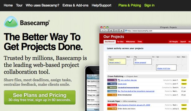
Before we dive into the details, let's look at a real-world example of Occam's Razor as used by a company whose simple and effective products you are certainly familiar with: 37signals.
A Real-World Example
37signals founders Jason Fried and David Heinemeier Hanson are the brains behind some of the web's most interesting products and technologies. Among their small yet influential ranks, they practice and preach a simplicity akin to Occam's Razor.
It has served them well over the past decade. What began as a three-person Web design consulting firm in 1999 now has three million worldwide users of its software products (which include Basecamp, Campfire and Highrise). Basecamp alone generates millions of dollars for the company, and the company employs just 16 people. Did I mention that they are responsible for developing the wildly popular open-source programming framework Ruby on Rails? Here's a quote to drive it home (from Rework, the duo's latest book):
Lots of people hate us because our products do less than the competition's. They're insulted when we refuse to include their pet feature. But we're just as proud of what our products don't do as we are of what they do. We design them to be simple because we believe most software is too complex: too many features, too many buttons, too much confusion.
This business case makes clear, and Jason Fried would probably tell you so himself: doing things the simple way makes perfect business sense. It's more than logical: it's smart. Here's how to make simple work for you.
Simple Web Design
Designing simply for the web is about removing barriers. If a user wouldn't know where to click, tell them. If there are too many navigational choices, eliminate some. If the background image distracts from the message, tone it down.
In architecture, a cool design should not compromise the strength of the structure or make it difficult to get from point A to point B. Similarly, a cool web design shouldn't compromise the clarity of the message you are trying to convey or make it difficult for the user to navigate from page A to page B.
When your goals are specific—such as converting visitors into customers or getting users to initiate contact—anticipating and eliminating potential obstacles is crucial, especially during the design phase. Too often designers build something cool without first figuring out how to achieve their goals or anticipating how easy the design will be to navigate, which can lead to constant redesigns, perpetual tweaking, lost time and lost money.
Simple goes hand in hand with easy. The next time you open Photoshop to begin a new design, ask yourself questions like these:
- Would a non-designer or non-programmer find this interface confusing?
- Do I need all of this information along the top that pushes the newsletter sign-up form below the fold?
- How easy will users be able to access the information they want?
- Are there too many choices?
- Will this interface be usable for my target audience, a 70-year-old person or someone with partial blindness?
You get the point.
Simple designs are good for another reason: differentiation. If you want your website to survive in a niche dominated by over-the-top glitz and glam, create some contrast by building a simple layout.
Simple Coding
A buzzword floating around the web right now related to coding is "lightweight," which is just another way of saying "simple."
It's common knowledge that simple code loads faster and generally encounters fewer problems. If you could implement a solution using lightweight code rather than a bloated alternative, the choice would be obvious. What keeps developers from doing it then?
Bloated code has two main causes. One is laziness. People love to copy and paste. Code libraries such as jQuery and frameworks such as the 960 Grid System are useful, but they have fostered a lazy mentality, which can lead to bloated code. How can you be sure your website is as simple as it can be if someone else has written the code?
Just as a mechanic should be familiar with what's under the hood, so a developer should be familiar with the code running their website. What if something breaks? How would you fix it? Just because a solution works doesn't mean that it is the simplest or best way to handle your case.
The other cause of bloated code is lack of knowledge. Many designers and developers—even some who claim to be advanced—have become stuck using programs like Dreamweaver to code their websites, and they sometimes rely on them to produce code for them.
Sure, these programs can produce code, but they don't always do it efficiently; they simply execute a command based on what they were programmed to do. Instead, by using tricks such as CSS shorthand, you can optimize code for faster loading times, which will ultimately improve the user experience.
Simple E-Commerce
When it comes to selling online, simplicity should knock content right off the throne and assume its rightful place as king of the realm of e-commerce. Why? Because what you're selling won't matter if making a purchase is too difficult. If making purchases is easy, fewer shopping carts will be abandoned and more sales will be made.
So, what can you do to make online shopping simpler? While each experience should be unique and tailored to the needs of the company and its users, there are a few easy ways to boost the effectiveness of an online store:
- Make the search box prominent. Searching will probably be the preferred navigation method of many users, especially if you offer hundreds or thousands of products for sale.
- Don't waste people's time by making them duplicate information. For example, make it easy for users to indicate that their shipping address is the same as their billing address by adding a simple check box to the form.
- Don't crowd products too closely together.
- Don't annoy shoppers with unexpected pop-ups and hover tips. There's a fine line between hand-holding users and trusting them to do things on their own.
Simple Web Copy
The majority of websites rely on text to share their services, products and ideas. Doesn't it make sense to phrase things so that they're easily understandable? Remember, simplicity appeals to everyone regardless of their sophistication or ability.
The familiar KISS acronym (keep it simple, stupid) should hang on a giant plaque above the desk of anyone responsible for web copy. Your website is accessible from just about every corner of the globe, which means that simple copy is the best way to target the widest possible audience.
Forget about dictionary-style definitions and cramming keywords down people's throats (those taste good only to search engines). Say what needs to be said as briefly as you can. Trying to sound smart on the web is just plain stupid: you'll leave readers confused, and a more interesting website is always just a few clicks away.
Simple Business Practices
Sometimes you can make things simpler and easier for you and your client; other times you can make things simpler and easier for just one of you. If you have to choose, favor your client.
Online shopping carts are abandoned when things get too complicated; so too do clients abandon working relationships that are too difficult to maintain.
Ask yourself questions like: How easy am I to contact? How easy would it be for me to pay my own invoice? (If you wouldn't want to pay your own invoice, think how daunting it must be for your clients, who aren't tech-savvy.) If your customers have to press three buttons and wait on hold before speaking with you, perhaps you should rethink your phone system.
Conclusion

I can't write about simplicity without mentioning Apple. Simplicity has real value, and it can be measured in cold hard cash. That much is clear to Apple's CEO, Steve Jobs, whose personal net worth now tops $5 billion. He has delivered some of the world's coolest, most user-friendly gadgets.
Simplicity is built into the iPhone and iPad; each device features only one button on the front. The MacBook is made from a single piece of aluminum. And simplicity is why so many designers imitate Apple's website (the white space, the navigation, the large photography).
Apple even extends simplicity to its packaging. When I recently replaced my Dell workstation with an iMac, my jaw dropped as I shifted my gaze between the single power cord coming out of the back of the Mac to the pile of cords snaking along the floor next to the old Dell. That's the power of simplicity. The team in Cupertino, California, puts Occam's Razor into action and reaps the benefits.
You might ask... why would an advanced designer or developer want to simplify? Isn't that regressing? I would say that while beginners must use a simple product because that's what they are capable of handling, this isn't necessarily the best case for simplicity. Pros choose to impose constraints on their work so that they can create a better product.
It might be time to rethink the way you design for the Web. Experiencing a website shouldn't just be easy: it should be painless. Make navigation effortless so that users focus more on the content than on how to access it.
Written exclusively for WDD by Chris McConnell. He is an entrepreneur, designer and author who co-founded the design firm Brandeluxe and writes regularly on his blog, Freelance Review. You can also connect with Chris on Twitter.
Do you apply the Occam's Razor principle in your designs? Why or why not? Share your opinion below...

