 Illustrated additions to websites can lend even the plainest theme an extra level of visual interest and complexity.
Illustrations vary widely from one site to the next. Some look hand-drawn (whether they are or not) while others are obviously digitally rendered.
Below are more than thirty great website designs that feature illustrations.
Most common are illustrations in headers and backgrounds, often of site mascots or characters.
But illustrations are used in other ways, too. If you have a favorite illustrated site that isn't mentioned here, please let us know in the comments.
Sites with Digital Illustrations
These sites have illustrations that are obviously digital. Smooth lines and bright colors are hallmarks of this style, though not everything featured below conforms to these standards.
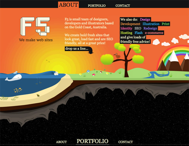
F5
The F5 website uses a whimsical digital illustration for their background. The bright colors and cartoonish characters are typical of digital illustrations. What's not visible here is that the illustration continues down the page, revealing different layers.
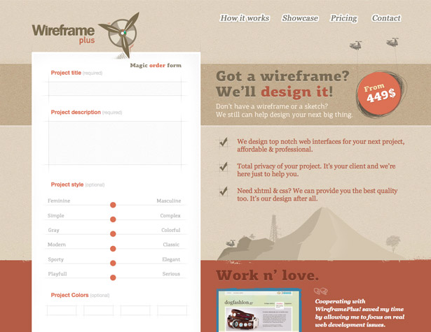
Wireframe Plus
Wireframe Plus uses a monochromatic background illustration for their site. It's subtle, but really adds some extra visual oomph and makes the site stand out even though the color scheme and typography are fairly standard.
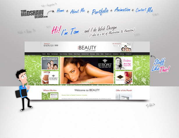
Tom Bradshaw Design
Tom Bradshaw Design uses illustrated-style typography throughout the site, as well as a cartoon character mascot, who appears on each section of the page (it's a one-page site).
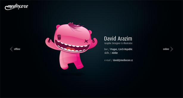
Mediocore
Glossy digital illustrations like this one aren't seen very often, and stand out from other sites. This one stands out even more since it's positioned against a black background and uses the only bright colors on the page.
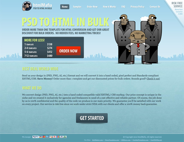
htmlMafia
The illustrations here are sort of a mix between digital and hand-drawn styles, though the gradients used put them more firmly in the digital category. This is a great example of how illustrations liven up a site and give a more dramatic impression.
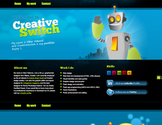
CreativeSwitch
The robot illustrated here is actually animated on the website itself, albeit subtly. Additional illustrations are used throughout the site.
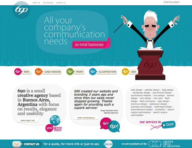
690 Design
Tying illustrations into the copy of a website is a fantastic strategy. Here, the tagline text discusses harmony, and an orchestra conductor is used for the illustration.
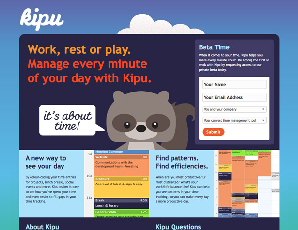
Kipu
Simple, vector-style illustrations make a very bold impact. Using a more muted color palette for them, as above, makes them blend more seamlessly into the rest of the site.
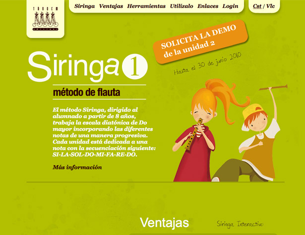
Siringa 1
These characters are another example of digital illustrations that have a hand-drawn feeling to them. Combined with the color scheme, these illustrations give the website a laid back, friendly feeling.
PixelBaecker
There's a lot going on in this vector-style illustration, from the guys working in the hole underground to the bird up in the tree. Stylistically, it's a pretty typical vector illustration, though the execution is wonderful.
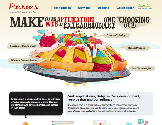
Pieoneers
Using illustrations to talk about benefits or offer up other information, without turning it into an info-graphic, is a great strategy. It's a fun and interesting way to convey information that's more likely to engage your visitors. Plus, the combination of a pie and a flying saucer here is just outstanding!
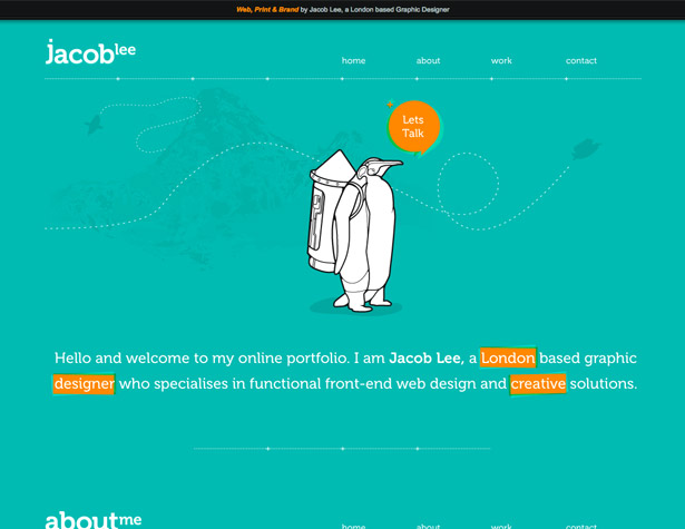
Jacob Lee
The penguin illustrated here almost looks hand-drawn, but it's just a little too polished and smooth. The stark white coloring (or lack thereof) really stands out against the colorful background.
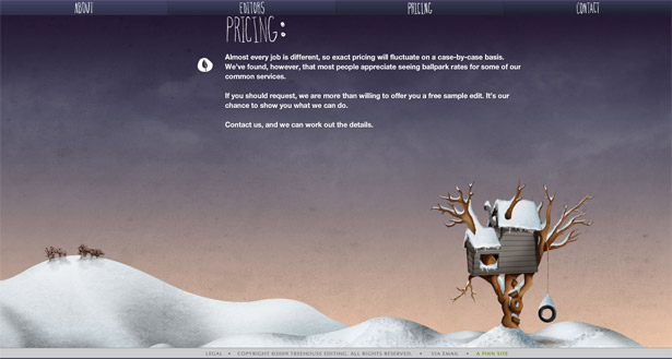
Treehouse Editing
The illustrated background here changes from page to page, and has subtle animations. But it's a beautiful piece of artwork, worthy of a second look.
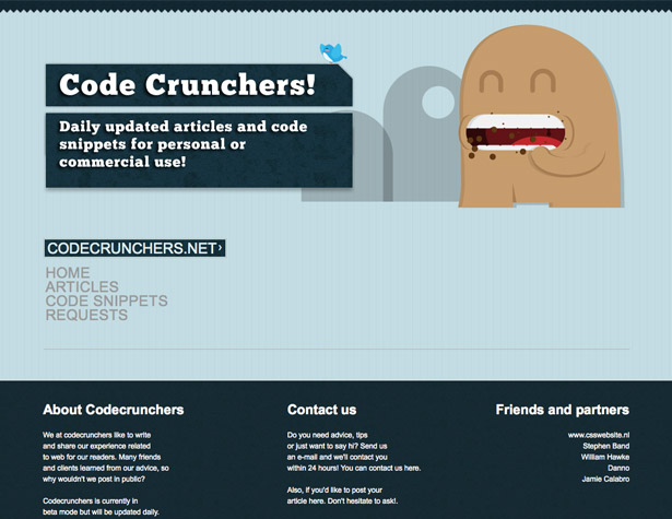
Code Crunchers
The most common digital illustrations are simple characters or monsters like this one. And as a mascot, it works perfectly with the name of the site.
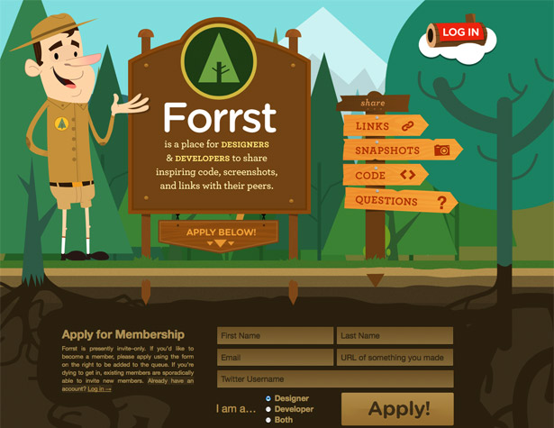
Forrst
Illustrated backgrounds like this one are becoming more common. The complete integration between the content and the background is what really makes this one stand out.
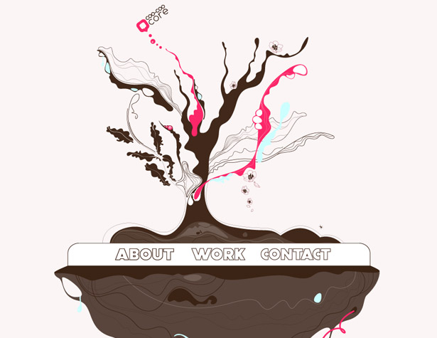
Coo/Coo Core
More abstract illustrations like this give a site a more modern feeling. This one is just abstract enough to do so, while still being recognizable as a tree.
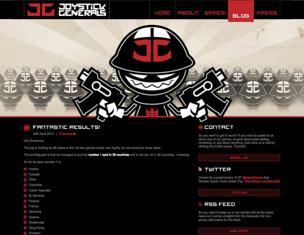
Joystick Generals
The repetition of the basic character in the background of the header adds an extra layer of visual interest to what is a relatively simple illustration. The color scheme used here is simple, but when combined with the grungy background, looks fantastic.
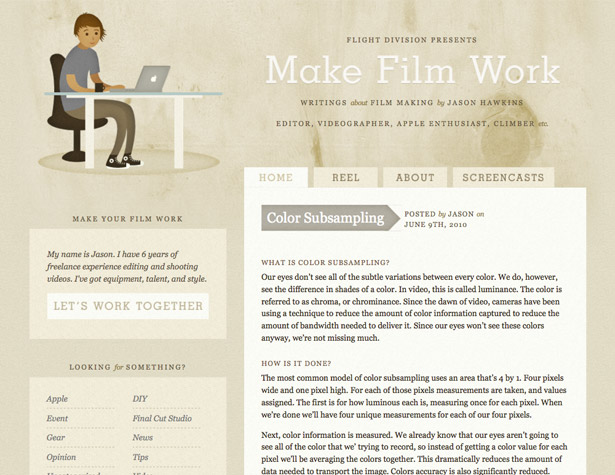
Make Film Work
Illustrations are seen less often on grunge-style sites, probably because it runs the risk of creating visual clutter. But the simple illustration here, with its muted color scheme and subtle texture, work great in a more minimalist grunge design.
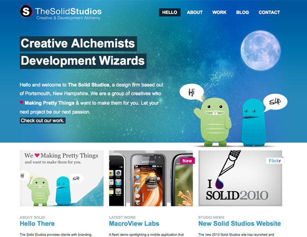
The Solid Studios
Another great example of simple digital monsters used in a design. These guys are casual and fun, and make the website feel the same.
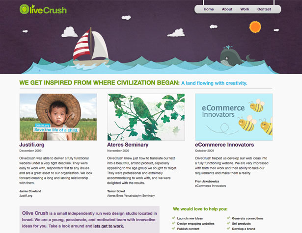
Olive Crush
Headers are one of the most fool-proof areas to use illustrations. Through creative use of drop shadows, this header illustration almost looks 3D.
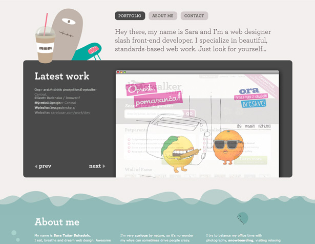
Sara Tusar
Another great example of monsters, this time in a header design. They're subtle, echoing colors from the rest of the website, but lend a more personal touch.
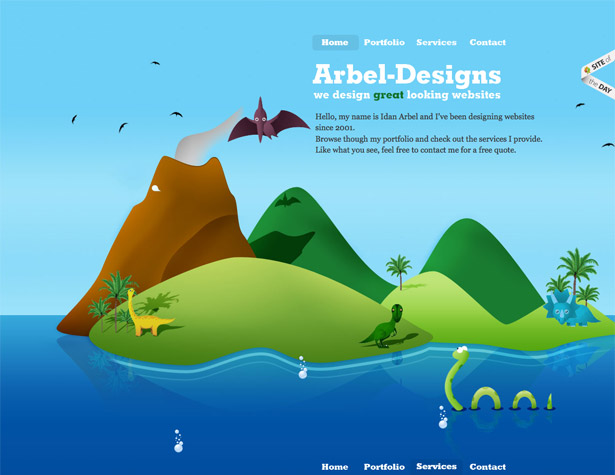
Arbel-Designs
The Arbel-Designs website uses a multi-layered illustrated background, starting in space at the top of the page, and progressing deep underwater. This style of illustrated background works great on single-page sites.
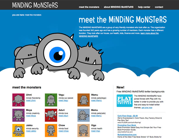
Minding Monsters
These are some of the simplest vector characters in this post. They're very cute, though, and are fully incorporated into the site's design. In fact, they're the whole point of the site.
Sites with Hand-Drawn Illustrations
Hand-drawn illustrations are less common in web design, but there are still some fantastic examples out there. They range from fine-art drawings to doodles, and everything in between.
Steve Schoger
Simple sketches like this one work great for any site, but especially when they replace a typical designer (or any professional) photo. They're also a great alternative for those who are camera-shy! Letting the background texture show through to give a skin-tone is a nice touch.
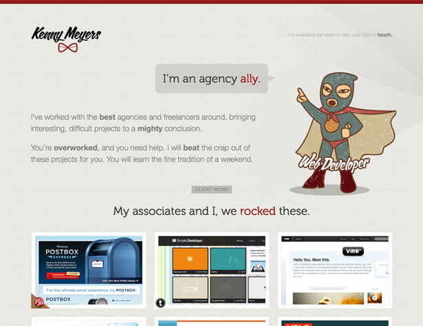
Kenny Meyers
An illustration of a superhero on what is otherwise a fairly minimal site can help instill confidence in your visitors without resorting to a "corporate"-feeling site design. Echoing colors from elsewhere on the site ensure that the illustration blends in seamlessly.
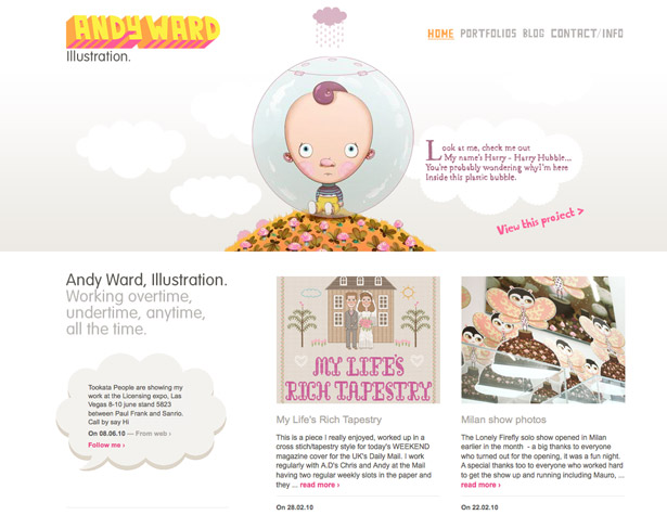
Andy Ward
It only makes sense for an illustrator to include illustrations on their site. Andy Ward uses a slideshow of his illustrations in his header, but they're incorporated in such a way that they become a part of the design itself.
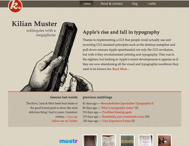
Kilian Muster
A more formal, fine-art style line drawing like this one offers a nod to tradition; in this case: traditional typesetting methods. It's simple but bold enough to really make an impact.
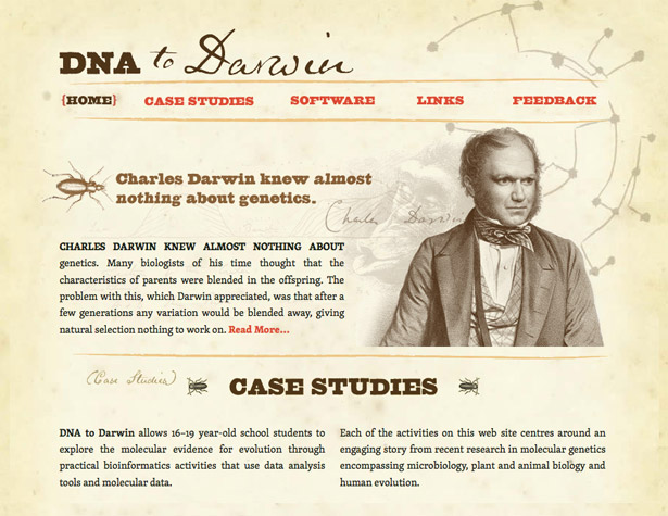
DNA to Darwin
Another great example of a site that uses formal line drawings to create a sense of history. The layered illustrations make it all the more interesting.
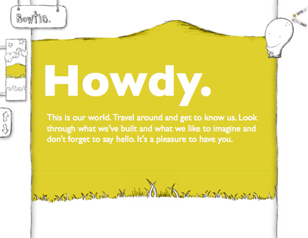
Bowtie
A more casual hand-drawn site, complete with hand-drawn monsters (or is that an alien?). The site uses a multi-layer background illustration, starting in space and ending up in the sea.
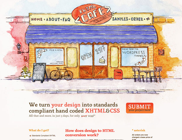
xhtmlCafe
A hand-drawn illustration combined with watercolors creates a fantastic, and informational, header on the xhtmlCafe site. The sketched elements within the painting give it a more stylized feeling than a straight watercolor would have.
Attack of the Web
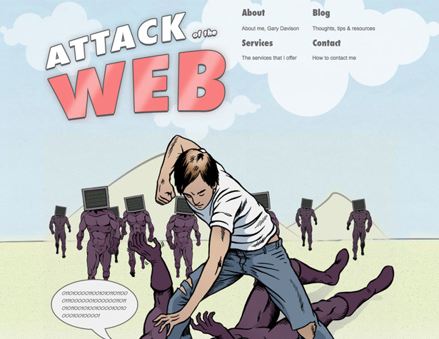
What would a post on illustrated websites be without an example of comic book-style illustration? Everything from the line thicknesses to the textured coloring is reminiscent of your favorite comic or graphic novel.
Janko at Warp Speed
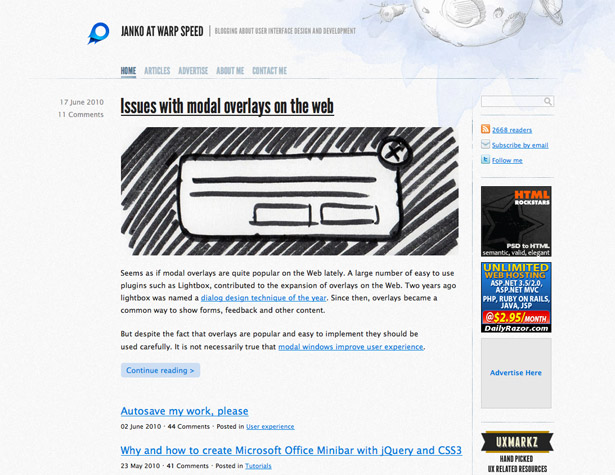
A simple illustration in the header here is subtle and understated but adds a huge amount of aesthetic appeal to the site's design.
Written exclusively for WDD by Cameron Chapman.
If you have other favorite illustrated websites, please share them in the comments!

