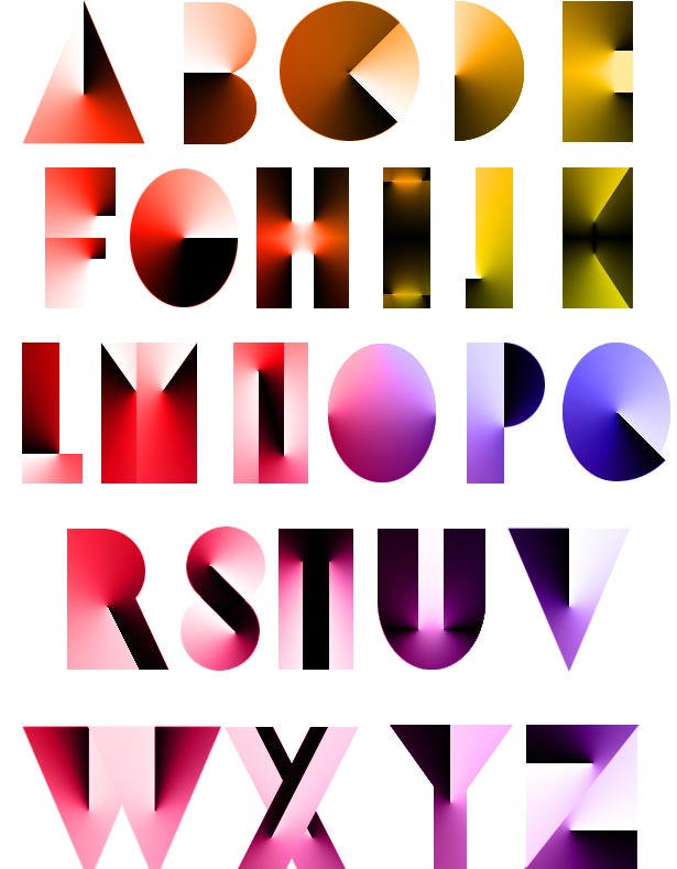
 The angle gradient tool is an overlooked gem tucked away in Photoshop’s toolbar.
Often passed over for its more popular sibling, the linear gradient tool, angle gradients create clockwise blends of color around the point a user clicks.
The angle gradients create clockwise blends of color around the point a user clicks.
Most people stop there. But when combined with other techniques and some creativity, the angled gradient has some surprising uses.
Have you overlooked it? Look again...
How it works
Angle, radial and diamond gradients joined Photoshop when Adobe published version 5.0 in 1998. Like all types of gradients, angles rely on how the user clicks and drags. In this case, the direction one drags creates a line on which the “ends” of the gradient lie. The colors in a gradient flow around the point at which the user clicks.

Above, three AGs show how different colors and angles create different results. The third example has no well-defined line because both of the “end” colors use the same blue. Red, found in the middle of the gradient, is most evident in the opposite direction that the user dragged.

Above, the middle gray appears at the top of the image—far from where the user moved their cursor—while the start and end colors line up in the direction that the user dragged. Other gradient options including opacity blend mode work the same for all gradient types.
Creating radial highlights and shadows

Although festive bunting is common for any celebration, red, white and blue bunting is synonymous with Fourth of July celebrations. Above, pleats are created with an AG that lies on top of the bullseye-like stripes. The gradient layer is set to 80% opacity, Soft Light mode, to let it create highlights and shadows without ruining the colors beneath.
Notice that the “white” stripes and stars aren’t really white. Light grey ensures that the gradient’s light areas have some impact throughout the bunting.
The gradient’s center is a focal point
The fine point at the center of an angle gradient is one of its hallmarks. Since people are naturally drawn to the sharp, in-focus parts of an image, the center should be placed wherever attention is necessary.

Above, the center of the gradient was deliberately set behind “b,” the word’s only ascender. Alternatives to the right put the gradient’s center above, below or to the far right of the word. This draws some attention away from the word itself.
How to draw attention without being ignored
Angle gradients don’t always have to be obvious. Paradoxically, many gradients are most useful when they’re least evident. For example:

Above, angle gradients recreate murky light seen from under water. But the first things people see are the letterforms. Careful layout helps these gradients set the tone, not steal the show. Here’s how it works.

- Type is set and appropriate colors are chosen.
- Two angle gradients are set on the layer above the text.
- Notice that none of the gradients’ centers overlap the text. Avoiding these focal points is crucial to keeping attention on the text, not the gradients.
- The gradients are clipped to the text (Layer > Create Clipping Mask) and their blend mode is set to Overlay. Experimenting with color and other blend modes will create more (or less) subtle combinations.
Specular highlights and metallic textures
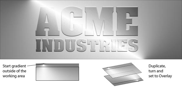
As a trend, the metallic look comes and goes. Simple linear gradients make them easy, but a pair of angle gradients make them pop.

The sheen above doesn’t look typical because it isn’t. Two angle gradients reinforce each other along a reflective stripe that neither could create alone.
Several techniques make it work. First, a gradient begins deliberately outside of the document. The gradient layer is duplicated (Layer > Duplicate Layer ) and flipped (Edit > Transform > Rotate 180°). With both layers’ blend modes set to Overlay, the result is a sheet of polished steel not easily replicated with a stock effect.
Double—or more—any angle gradient with Curves
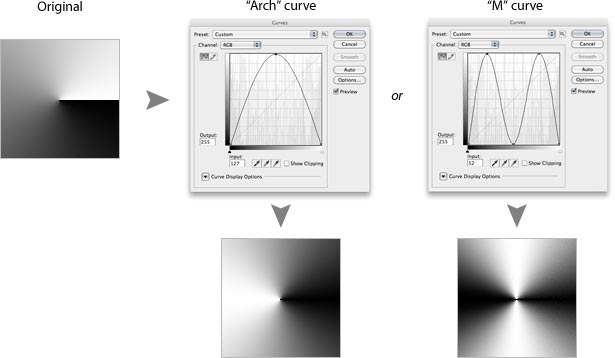
The Curves control (Image > Adjustments > Curves) is a great way to play with any kind of gradient. The more complicated a curve becomes, the more features a gradient gains.

Above, two types of curves begin to alter an otherwise straightforward angle gradient. This technique can be applied more than once to the same image for increasing complexity.

Above, from left to right, an “arch” curve is reapplied to the original angle gradient to create many spokes. Understanding that a gradient, angle or otherwise, is just a tool opens up many new possibilities.
“That’s not what gradients are for”
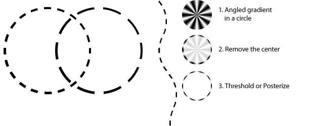
Often, seemingly limited tools are the most surprising—if they’re used as one tool in a set. Straight dotted lines are easy to create with the Marquee tool. Circles are trickier, unless you use an angle gradient.

Above, dashed lines with nice, even curves don’t require vector paths or exotic plugins. Although the image begins as a many-stepped angle gradient, applying Threshold (Image > Adjustments > Threshold) turns shades of grey to black and white. Using a lower or higher threshold level results in fewer or more dashes.
As a tool, angle gradients are surprisingly versatile. A good way to discover new uses is to ask “what if?” For example, what would happen if we applied these dashed-line steps to a square instead of a circle? How about a star? What if the gradient wasn’t centered?
Thinking outside the icon
In spite of its simplistic icon, the angle gradient tool is useful in some cases. Still, it’s a tool, not a solution; a foundation, not a trick. The ability to see beyond the obvious takes practice, but the reward is to take “what good is it?” as a challenge, not a snub.

Written exclusively for WDD by Ben Gremillion. Ben is a freelance web designer who solves communication problems with better design.
Have you found any creative uses for a little-used Photoshop tool? Share your ideas in the comments below.


