 For years, web designers have been using graceful degradation principles to make sure visitors in older browsers can at least see the content on their websites, even if they don't see it exactly how the designer intended.
Graceful degradation let designers design for the newest and best browsers without completely alienating those using older browser versions.
And just because those with older browsers often got a less-than-optimal user experience didn't deter designers from placing their focus squarely on the newest technologies and techniques, rationalizing that those using older browsers were either used to it or should just upgrade.
Progressive enhancement gives us a better option. Rather than focusing on browser technologies and support, PE focuses on content.
As most designers would certainly agree, content is the most important part of virtually any website project. But a lot of designers don't fully understand progressive enhancement, how it works, and why it's a better model than graceful degradation.
Read on for answers to those questions and information on how to use progressive enhancement on your next website design project.
Who Benefits from Progressive Enhancement?
A lot of designers think progressive enhancement only benefits those users who are using outdated browsers, but other users benefit, too. Mobile browsers are the most likely to take full advantage of progressive enhancement. The reasons for this are two-fold. First, mobile browsers that don't support CSS or JavaScript can still display the content of your site. While most modern smart phone browsers support at least one of those, not all browsers for basic cell phones do.
The second way that mobile browsers benefit is that sites built with progressive enhancement can more easily incorporate a mobile version. After all, the foundation HTML will work regardless of the CSS layered on top of it. So creating a separate stylesheet for mobile browsers doesn't require a whole lot of extra work.
Screen readers also have a much easier time if the base HTML is well-structured and semantic. This makes your site much more accessible for those who employ screen readers. Search engines can more easily scan well-formatted HTML than poorly-coded pages, which can mean much better search engine placement for your site.
Other Benefits of Progressive Enhancement
Beyond the immediate benefits of improved user experience, sites built with progressive enhancement are generally easier to maintain than other sites.
Because the basic content and functionality is kept completely separate from the visual elements of the page, making changes to the appearance of the site shouldn't even affect the way the site functions or the content it includes. Re-theming your site is that much easier because of this. All you'll need to do is change your CSS files.

And honestly, we shouldn't overlook the benefits of a site being viewable in the widest number of browsers out there.
While not everyone will get an identical experience, the fact that someone using an outdated or obsolete browser can still view your site's content can lead to more visitors or customers. Sites that take an approach that starts with progressive enhancement don't need to do any extra work to make this possible.
Build From the Inside Out
Progressive enhancement doesn't focus on browser compatibility in the same way graceful degradation does. Instead, it focuses first on the content, then on presentation of that content, and then on any scripting. This way, regardless of the device or browser a visitor is using, they'll be able to see your content without any issues.
Progressive enhancement can also have benefits for accessibility and even search engine optimization. By starting out with well-structured, semantic HTML, you'll be providing a good foundation on which to build the design of your site. And this basic HTML is easily interpreted by screen readers and search engine spiders.
Put Content First
Whenever you're starting a new website project, you should first concentrate on the content structure. By creating well-structured, semantic HTML as the base of your website, you'll have an easier time with the presentation level of your design.
Well-thought-out HTML has the advantage of not needing presentation layers to make sense. That means screen readers, search engine spiders, and those on basic mobile browsers will be able to view your content without any distracting formatting issues.
You can see, above, how MSNBC keeps all their content in roughly the same order even without the CSS. The site is perfectly usable even without the presentation layer.
While the structure of a site will be dependent on that particular site's content, there are some guidelines you should use for basic sites.
Start with the header, then the main navigation, followed by content. After your content, you'll want to put any additional sidebar information or links, and then your footer information.
In this way, the identifying information for your site is displayed first, followed by navigation (in case someone wants to go directly to a different page, like your contact or about page), and then it gets straight to the content, which is likely what most people are on your site for in the first place. Adapt this model as necessary for your site, but always keep in mind exactly what is going to be of the most interest to your visitors, and place that as close to the top of the code as possible.
Make sure that any functionality on your site is possible in this basic layer. That means forms and apps should be usable with just the HTML and server-side scripting. While it's likely that functionality won't be as well-presented as you'd like or as user-friendly, it should be usable at a minimum.
Presentation is Next
Once your HTML and basic functionality are all set, you'll want to turn to presentation elements. The vast majority of browsers, including many mobile browsers, support CSS (though not all of them support every aspect of CSS, especially CSS3). The presentation level should enhance the content. It should make it easier to view and use, and improve the user experience.
To some extent here, you can have more than one layer of CSS enhancement. The first should focus on basic styles that are recognized by virtually any modern browser. Your layout, typography, and color scheme should all be included in this layer, along with other stylistic choices.
Then, add another layer on top of that which takes advantage of more advanced properties that might not be supported by every browser out there but will add to the user experience for those using browsers that do include support.
JavaScript Should Be Last
Sometimes it seems like JavaScript is used in virtually every new website created. JavaScript can greatly contribute to the usability and user experience of a website or web app.
Ajax has revolutionized the way a lot of sites work, and has made a huge difference in what we now do online. But your website or app should work without JS. There should always be an HTML or server-side scripting alternative, especially when we're talking about general websites rather than web apps.
Make sure your site is usable without JavaScript. While most web users have JS enabled in their browser now, there are still cases where JavaScript is undesirable. Not every mobile browser out there has good support for JavaScript. It's often not accessible for screen readers. And there are some people out there who still don't have JavaScript enabled in their browsers.
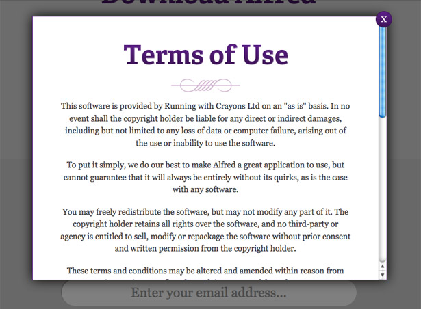
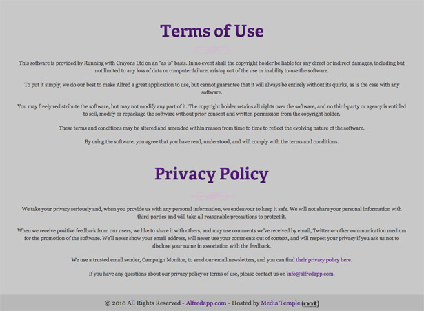
As you can see from the screenshots below, there's no functionality lost between the JavaScript-enabled version of the Alfred app website and the one with JavaScript turned off. The only real difference is that the Terms & Conditions are anchored at the bottom of the page rather than opening in a modal window when the link is clicked. But in either case, they're linked and fully readable.
Here's the fully-functional version of the site, with the modal window.
Here's the version with JavaScript disabled, with the Terms & Conditions appearing just above the footer. It's still linked from the same place in the content.
Implementing Progressive Enhancement

We've talked about PE on a theory-level above. But let's get into the practical aspects of implementing it on a website project. The first thing to do is figure out the information architecture for your site.
Look at the content available and how it should be organized. Create some wireframes for how you want to show the content, the placement of different elements, etc. Prioritize them at this point, by what should appear closest to the top of the code (the most important elements) and what can go lower down.
This information architecture step is vital with progressive enhancement. Once you know what needs to go where, you can start coding. Make sure you set up your HTML code in the correct order, according to what's most important. This isn't necessarily going to coincide perfectly with the order in which things appear on your completed, styled website, but it probably won't be too far off (header at the top, content in the middle, footer at the bottom).
Make sure the HTML you're coding here is semantic. Use proper <h1>, <h2>, <h3> tags, etc., as well as properly naming the divs in which your content appears. This not only makes it more accessible, but also makes maintaining your code and coding your CSS a lot easier.
You'll also want to code in any functionality at this point using server-side scripts. While your final site may use Ajax for primary functionality, it's still important to have a server-side backup, just in case.
Once your basic HTML is finished, you'll want to move on to the presentation layer. Go about this to a large extent as you would the design of any website project. But make sure when you get to actually coding the CSS that you maintain the idea that not every CSS property will work in every browser. Make sure that even if some of your selectors don't work, your overall presentation will be unaffected.
A little bit of graceful degradation might be appropriate for some of your CSS, for those cases when you really want to use a specific technique that isn't widely supported. There's nothing wrong with using it selectively, in special cases. But the goal here is to rely on good, standards-based coding and semantic markup to make graceful degradation unnecessary.
There's been some debate over whether using multiple stylesheets for progressive enhancement is a good idea. Separating out the different aspects of your presentation (layout, typography, color, etc., as well as different stylesheets for things like print or mobile layouts) can make sense, especially if your stylesheet is long or complicated.
Separate stylesheets make it easier to find a specific element, and can make it both easier and more complicated to maintain the site. After all, if you just want to change a color, it's easier to open up your color stylesheet and find all the instances of that color, and know you haven't missed anything. But let's say you want to change the color and typography of a specific type of element on your page (like all your H1s, or your sidebar links). You'll need to open multiple stylesheets in order to make the changes. Whether you use multiple CSS files or not comes down more to personal choice than anything else.
Once your CSS is all coded and everything's been tested, it's time to add any client-side scripting. At this point, your site should work with or without JavaScript. But adding JS can greatly improve user experience and satisfaction. Once you've added all the necessary scripts, be sure to test the site again with that scripting turned off, just to make sure everything still works acceptably.
Convincing Your Clients
When working on your own, personal website projects, progressive enhancement is something you can implement without a problem. When dealing with clients, however, it can get a bit trickier. A lot of clients are still stuck on the idea that their website needs to appear exactly the same in every browser they've ever used. Ever.
Explain the benefits of progressive enhancement to your clients. Tell them that it's faster and less expensive for them to have you design the site with progressive enhancement in mind, and that their visitors likely won't care either way, as long as the content is available.
If they still resist, tell them you'll have to adjust your quote accordingly to compensate for the extra coding time and effort required.
In many cases, when a client sees that progressive enhancement will save them money with no detrimental effect to their visitors, they're more than happy for you to design their site in that manner.
Accidental Progressive Enhancement
I'm sure there are some among you who are reading this article and thinking, "But this is how I design websites anyway!" A lot of designers out there design their websites around the content, making sure every layer is functional before adding another layer.
Their HTML is well-structured, their CSS works as a whole unit but still looks fine even if one or two elements doesn't work properly, and even without client-side scripting, everything still works.
Some designers have naturally taken a progressive enhancement-styled view of web design. For those designers, this article seems like old hat.
But for those of you out there who take the opposite approach, either with graceful degradation, or just designing for the lowest common denominator and not bothering with more advanced techniques, consider progressive enhancement for your next project.
Written exclusively for WDD by Cameron Chapman.
Do you automatically design sites with progressive enhancement in mind? Or do you prefer taking a graceful degradation approach? Please share your strategies in the comments!


