 Textured backgrounds in website design are common, especially in grunge designs. But they're used in a variety of other design styles, too.
Textures can add visual interest to an otherwise-minimalist design, or can add that extra bit of detail that really makes a design pop.
Paper textures are by far the most common, but other regularly-seen textures include stone, concrete, rust, and fabric. And they're not just used for backgrounds, either. Some sites incorporate textures into every aspect of their design, while others just use them for accents.
Below are more than thirty great website designs that make use of textures. Feel free to share your favorites, whether featured here or not, in the comments...
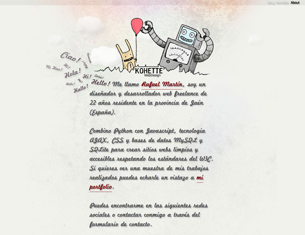
Kohette WebDesign
A stone-textured background is set apart with subtle coloring in the header. The texture repeats throughout the background.
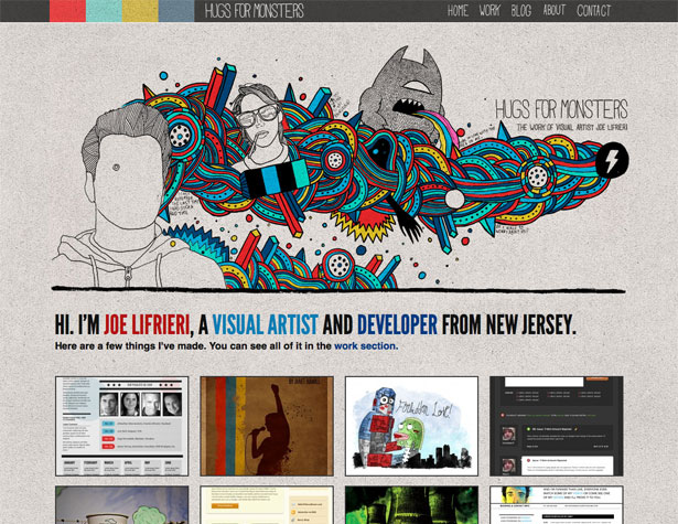
Hugs for Monsters
Hugs for Monsters uses a bold stone texture throughout the background on their site. Incorporating it into the header adds a sense of cohesiveness to the site.
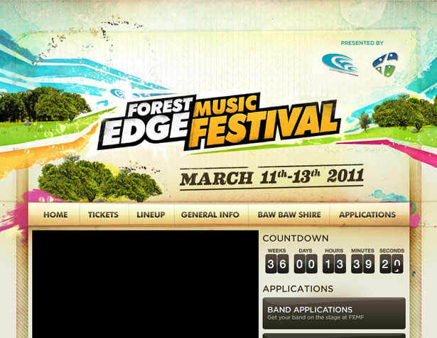
Forest Edge Music Festival
The Forest Edge Music Festival site is a striking and colorful grunge design, with multiple textures used throughout. A cardboard texture is the most prominent, though there are also more subtle paper textures.
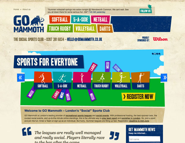
GO Mammoth
The grungy paper texture in the background here is echoed in other page elements, including the navigation menu. It adds visual interest to what would otherwise be very modern aesthetically.
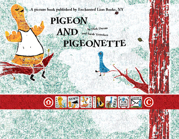
Pigeon & Pigeonette
The heavy textures used here almost resemble a sponge-painted wall. Heavy use of textures like this should be done with caution so as not to overwhelm the content. Here it works because the content is very minimal.
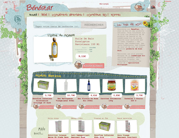
Benestar
The Benestar website uses a mix of paper, fabric, and wood textures, along with a variety of subtle patterns. It creates a very rich, multi-layered design.
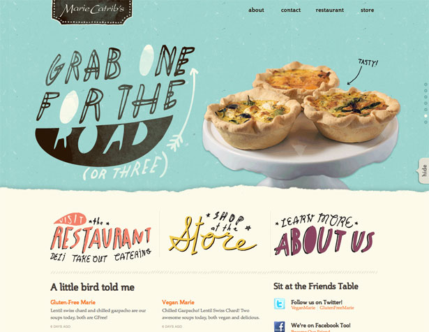
Marie Catribs
Repeating similar textures across a site, as is done here with handmade paper textures in various colors. The hand-drawn elements further accent the paper texture.
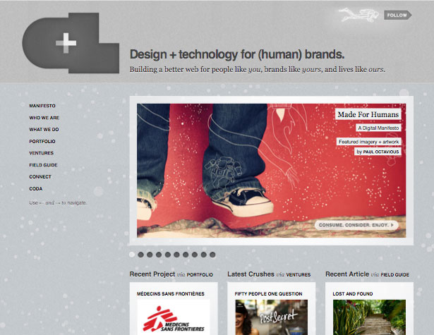
Crush + Lovely
Subtle textures like those used here can have a very rich effect on a minimalist site design. Mixing textures while maintaining a monochromatic color scheme enhances that effect.
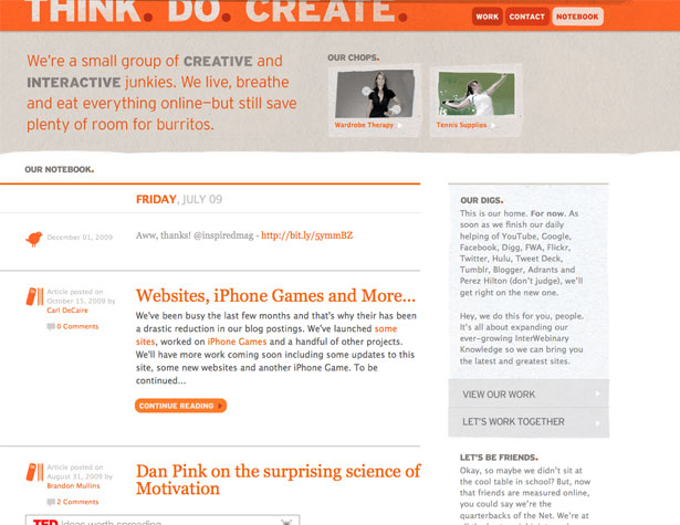
Think. Do. Create.
Textures don't have to be used throughout a site to make an impact. Here, paper textures are just used in the header and sidebar, leaving the bulk of the background white.
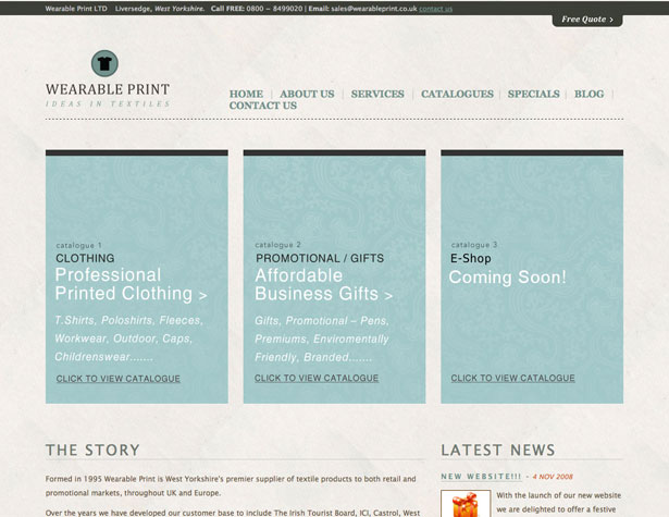
Wearable Print
When subtle textures are combined with subtle patterns, the end result is refined and elegant, with that extra something that makes a design stand out.
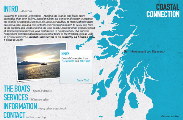
Coastal Connection
A heavy paper texture, like the one used here, makes a big difference in the aesthetics of a site. Without the texture, this would be a very minimalist site.
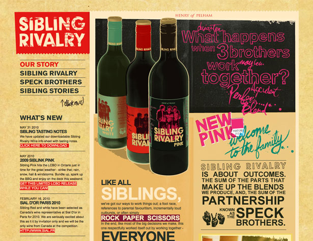
Sibling Rivalry
Another example of a grunge-style site that makes heavy use of paper textures.
What Katie Does
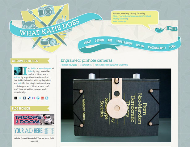
What Katie Does is another site that combines a subtle paper texture with a repeating pattern (both in the background and header). Other design elements echo the paper motif.
The Hipstery
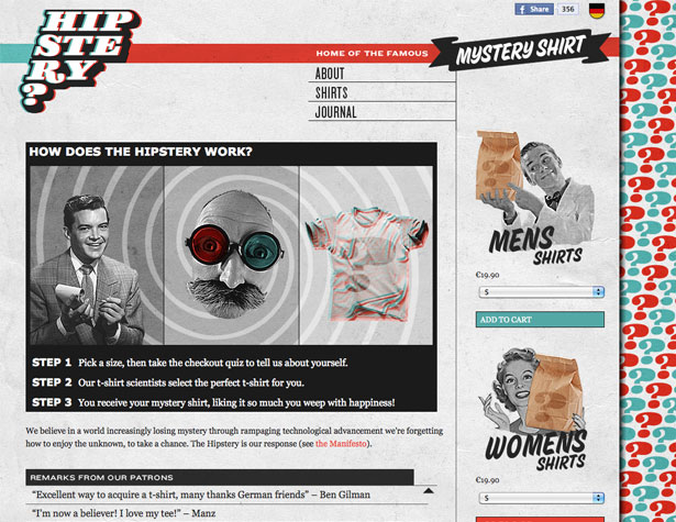
The Hipstery uses a paper-textured background behind their main content, as well as behind the background pattern. It adds to the vintage feel of the site.
Doublenaut
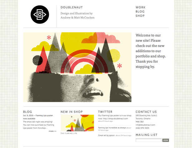
This background combines a pattern and a texture, in the form of what looks like weathered graph paper. It adds extra interest to a site that is otherwise very minimalist.
Digital Podge 2009
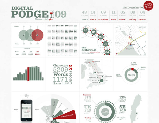
Another site that uses a paper texture for its background. Subtle but effective.
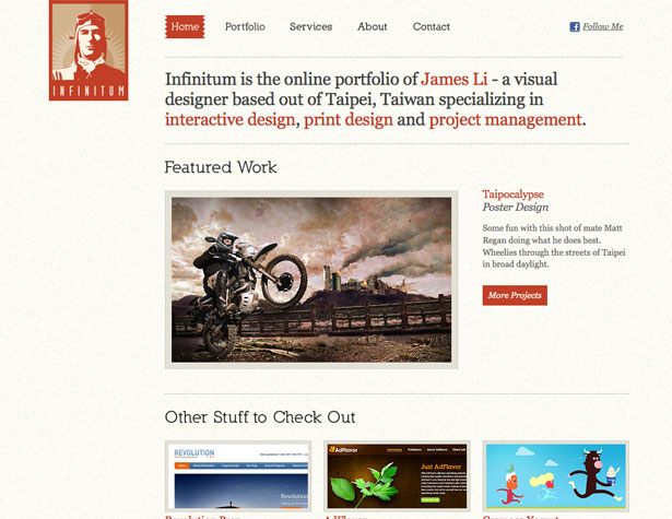
Infinitum
A light, stone-textured background is subtle enough to be used directly behind text. Be careful using bolder textures in such a manner, though.
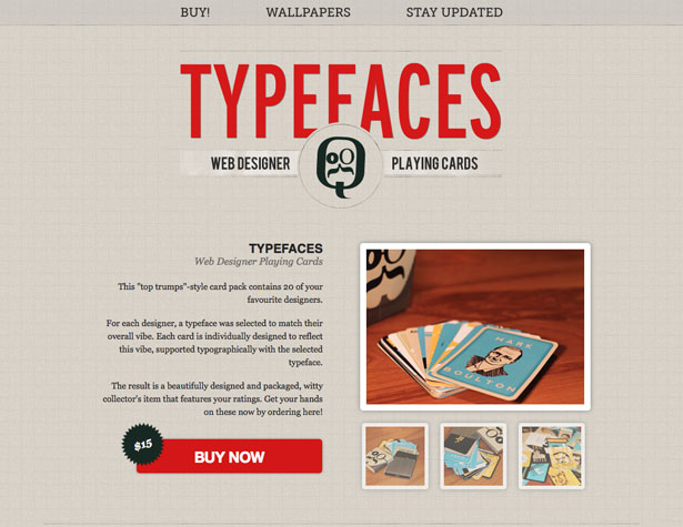
TypeFaces
Another graph paper-textured background that's subtle enough to have type placed directly on top of it.
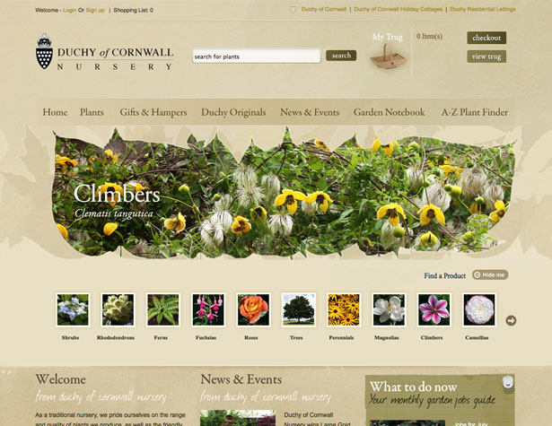
Duchy of Cornwall Nursery
Using different shades of color on effectively the same background texture adds depth and interest to a design.
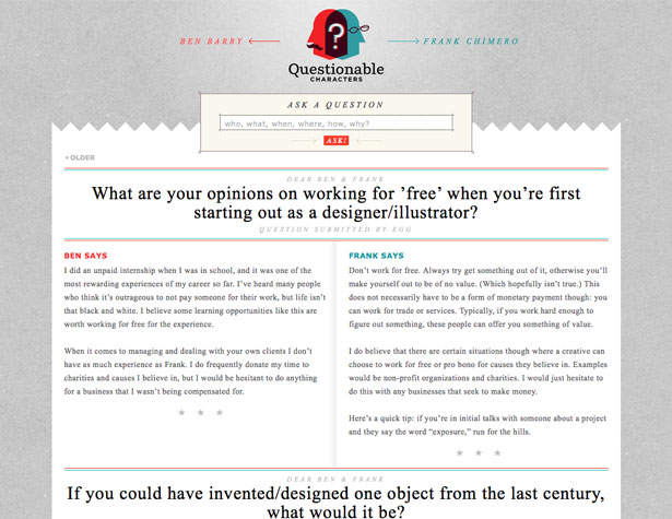
Questionable Characters
The concrete-textured background here adds a ton of visual interest and is a bit unexpected considering the rest of the site utilizes paper-themed elements.
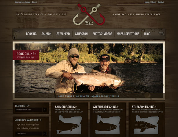
Sky's Guide Service
Here's a site that utilizes a number of textures, including wood grain and paper. They've added elements like staples and water stains to further accentuate the textures.
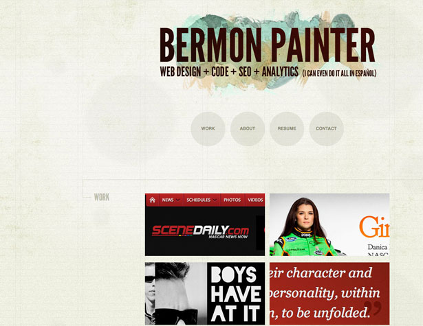
Bermon Painter
A slightly different ruled paper background, complete with water stains and weathering. It's subtle yet adds a lot of aesthetic value.
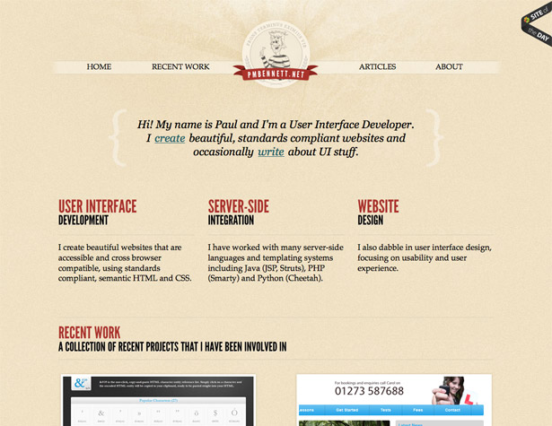
Paul Bennett
Another site that uses a subtle paper texture for the background with text placed directly on top.
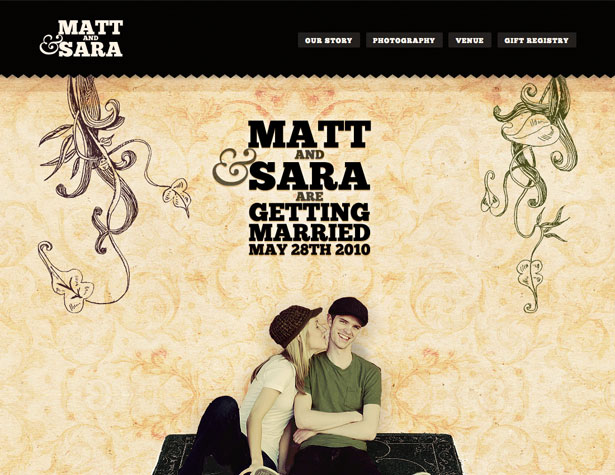
Matthew & Sara Are Getting Married
The textured wallpaper-style background here is something a bit different than is normally seen. It's sort of a combination of a texture and a pattern, and works brilliantly.
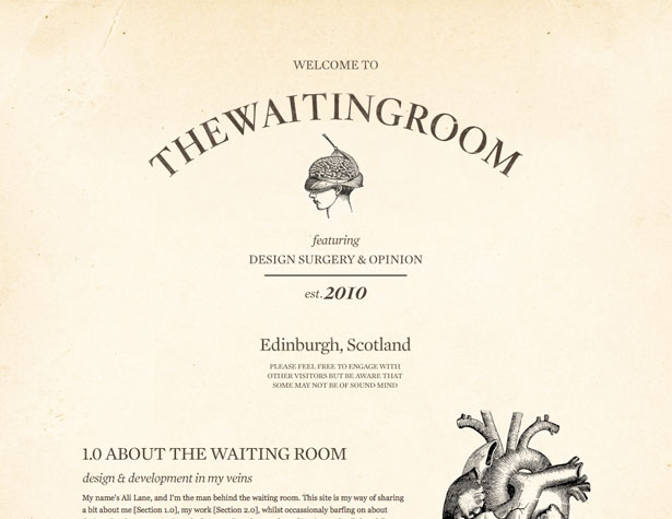
The Waiting Room
Vintage-style sites gain a lot by using weathered, antique-looking paper for their background.
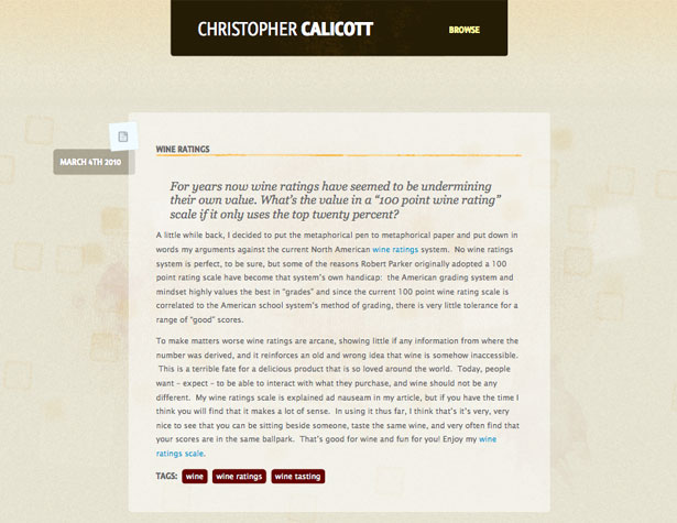
Christopher Calicott
Another textured background that also adds a bit of a pattern in the form of subtle squares. The transparency in the main content area further highlights the texture.
Design Development & the Pursuit of Happiness
Another fantastic example of a paper-textured background, this time with a more gray tone than many of those seen above.
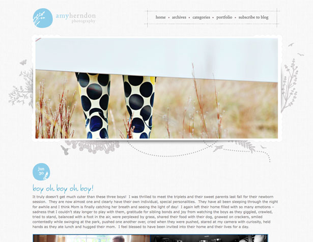
Amy Herndon Photography
The background here is a monochromatic canvas texture. It adds to the natural look of the site, and has a very organic feeling.
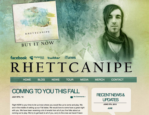
Rhett Canipe
Rhett Canipe's site uses a variety of textures for a grunge look. Mixing watercolor effects with textures makes for a much richer design.
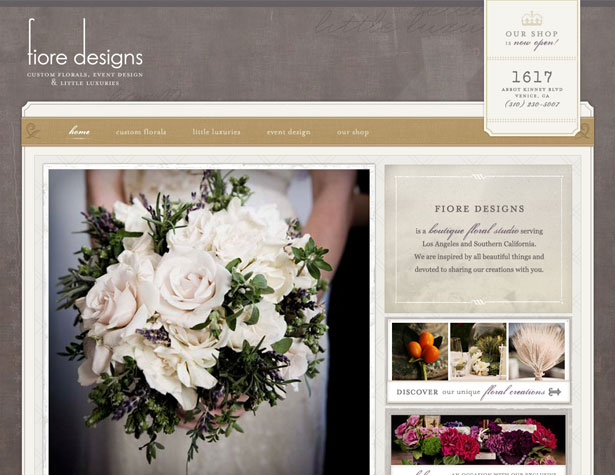
Fiore Designs
Fiore Designs incorporates a variety of textures: the background is a grungy linen and paper textures are used throughout the main design elements. It's a very visually interesting result that feels very elegant and exclusive.
Every Time I Die
The bolder stone texture used throughout the Every Time I Die site adds to the overall grunge look. Stronger textures like this should be used with caution, as they can be overwhelming if not incorporated properly. Here, the bold colors and graphics compensate for it.
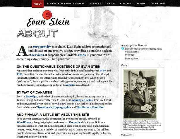
Evan Stein's Internet Studio
A grungy, layered paper texture in the background here is another example of a strong texture. The simple color scheme here, though, keeps it from being overwhelming.
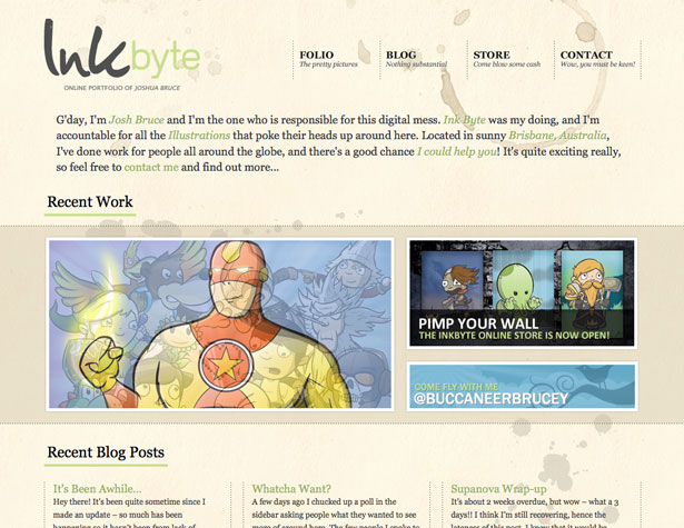
InkByte
The InkByte site uses a stained paper texture for its background, which looks great without overwhelming the content.
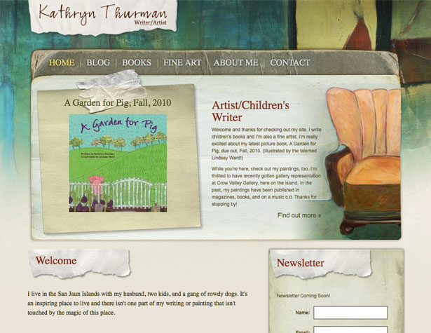
Kathryn Thurman
A variety of paper and cardboard textures throughout the design of this site give a vintage and grungy feeling to the design.
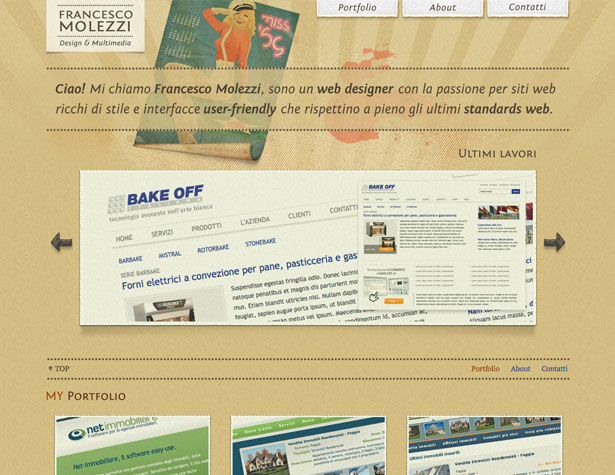
Francesco Molezzi Design & Multimedia
Another subtle paper textured background, which makes the entire site appear more retro, despite the fact there's only one really retro-looking graphic on the page. Notice also that other textures are subtly incorporated, including a denim texture in the header and more paper in the top navigation.
Written exclusively for WDD by Cameron Chapman.
Have your own favorite website designs that use textures well, or maybe some tutorials that talk about good use of textures? Please share them in the comments below!

