 Have you ever looked at a website and felt that you could tell whether it was likely designed by a man or a woman?
Studies have shown that men and women tend to have very different approaches in the way that they use design elements such as colors, shapes, objects and fonts - sometimes even having complete opposite views.
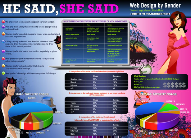
In today's post we're showcasing an infographic, designed exclusively for WDD, which depicts some of the different approaches men and women tend to take with their designs.
The graphic shows the different tendencies for each gender covering areas such as typeface colors, the use of straight lines and favorite colors.
This graphic is by no means a rule or generalization for web design by either gender, but it does give us a very rough insight as to how each gender views design and it may even help to influence design decisions when creating a website that targets a specific demographic.
For a full large resolution image, click on the image below:
Thanks to our friends at CreditLoan for this great infographic.
Do you consider gender preferences when embarking on a website design? How does it affect your work? Please share below...


