 Having recently started reading a little more on design principles, I came across an interesting principle called the 80/20 Rule, also referred to as the Pareto Principle, Juran's Principle, the Vital Few and Trivial Many Rule, and the Principle of Factor Sparsity.
This principle, which I'll refer to in this piece simply as the 80/20 rule, when considered in the context of website and web app design can have a profound effect on the user experience, and ultimately on the effectiveness of the content or functionality of your website or web app.
In this post, I'll first provide a basic definition, then I'll consider some specific examples of how the 80/20 rule proves beneficial, and then I'll summarize some lessons that can be gleaned from having knowledge of this rule.
What is the Rule?
The 80/20 rule was originally observed by Italian economist Vilfredo Pareto, and the actual principle was named the Pareto Principle by Joseph M. Juran.
Below are definitions from two different sources. First from the book Universal Principles of Design:
The 80/20 rule asserts that approximately 80 percent of the effects generated by any large system are caused by 20 percent of the variables in that system.
And next, from Wikipedia:
The Pareto principle... states that, for many events, roughly 80% of the effects come from 20% of the causes
So immediately you'll notice that this is not always a principle that we as designers have direct control over, but rather it's a principle that we observe as occurring almost naturally.
With knowledge of the existence of this principle, or pattern of occurrence, we are then equipped with valuable information to make decisions that will help improve the usability and effectiveness of our designs.
Never Mind the Hypothetical Nature of the Rule...
Yes, there are critics and those who feel the 80/20 rule is nothing more than a hypothesis or overly-general theory that doesn't always apply.
But putting that aside, the concept itself is certainly of benefit to those working on user interfaces and functionality that requires examination and optimization — even if the rule is more like 70/30 or 90/10.
How Can We Apply it to the User Experience?
In any website, web app, or software environment, the 80/20 rule tells us that 20% of the functionality and features in any one environment will be responsible for 80% of the results, or actions taken within that environment.
In some cases, figuring out what constitutes the 20% that has such a large impact is easy. Web analytics stats, form submissions, and session cookies, can all be used to track user behavior. Analysis of those items will help us determine which areas of the UI are interacted with most.
On the other hand, smaller tasks that are not tracked using those methods may be harder to analyze. In this case, usability studies can be conducted where users are observed as they interact with your website's UI.
Some Examples That Recognize the 80/20 Rule
Whether it's intentional or not, there is plenty of evidence that UI and UX designers are considering the value of this principle.
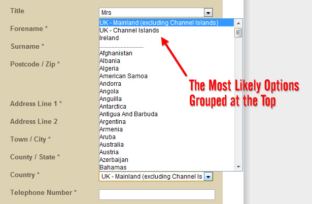
Take for example a simple UI element like a drop-down list of countries presented in a registration form. Most site developers or content creators recognize that 80% of the time, certain countries will be selected.
So although it would seemingly be bad practice for such a long list to break the alphabetizing of the list, the 80/20 rule allows that convention to be broken by putting the most selected countries at the top, as shown in the screen-grab below from Fenn Wright Manson's checkout page:
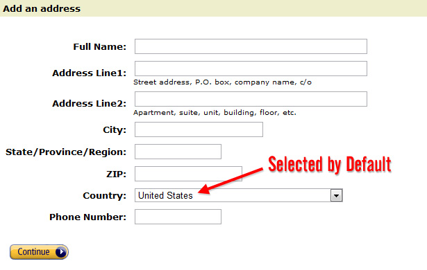
In other cases, as when adding a new address to your address book on Amazon.com, the default choice is the most selected country — in this case, the United States:
Here's another example, this time from a U.K. based business called North Rock Gallery, which has the U.K. option selected by default:
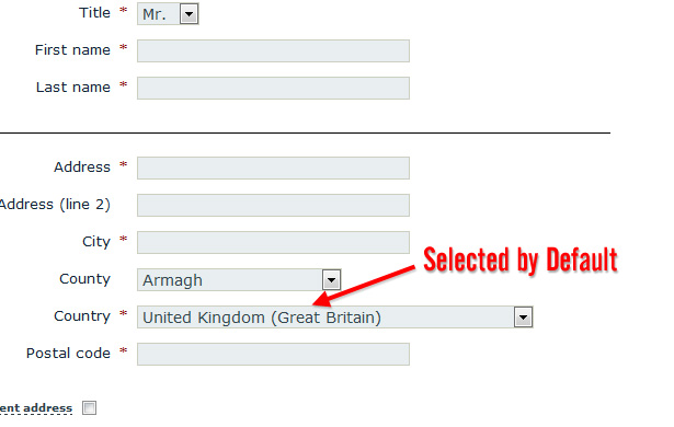
These simple examples above show the importance of optimizing for the functions and options that are used or selected most often.
Where Do User's Look?
The F-Pattern reading and scanning habits of web users have become pretty established by now. Of course, the F-Pattern is not always an indicator in every market, but it is a pretty good starting point for considering where your users will look when they interact with your designs.
Take a look at the heatmaps shown below from the well-known Alertbox article linked above:

Assuming this is a good indicator of where a user's eye is focused, this supports the concept of the 80/20 rule. The most intense areas on the map could represent the 20% of the page that the user's eyes interact with 80% of the time.
From that knowledge, as designers, we can make decisions that will help enhance and optimize the areas that the user is going to be habitually drawn to.
Of course, the design will often be the determining factor of where the user looks, so this suggestion should just be a basic guide and not necessarily a dogmatic way of deciding what falls under the 20%.
Mobile Design Trends and the 80/20 Rule
Recently with the explosion of mobile devices worldwide, some designers and developers, most notably Luke Wroblewski, have been encouraging mobile-first web design. That is, when designing and developing a website, the mobile version should be done first, instead of the other way around, to attain certain benefits.
In a traditional website or web app, certain areas of your site will naturally fall under the 20% that are most often used and interacted with. When a mobile site is designed, focus is placed on that 20% (or thereabouts).
So while the mobile version of a website might have its own 20% most-used options, in relation to the full content available on a traditional website, the mobile version will normally have only the most important functions.
Here's a simple example below using the PETCO.com website:

Shown above is the full version of the site, in all its cluttered glory. While there are some call-to-action areas, and it's certainly not the worst design in the world, overall it's not very focused and there are too many options.
Compare that to the mobile version, below:

By contrast, the mobile interface shown above is simple and helps the user get to the most important areas first, without overwhelming them. Whatever options and content areas are most used in the full version are the only options available in the mobile version.
Thus good focused mobile web apps are great examples of designers channeling their energies on the most important aspects of their projects, staying focused on the functionality and content (the 20%) that's used most of the time (the 80%).
Lessons Summarized
Having understanding of how the 80/20 rule works, designers are equipped to take action in a number of ways, summarized below:
- Where possible, analyze analytics and usability data carefully to determine your website's 20% most-used functions
- Prioritize; that is, focus on the most important aspects of your website or web app, and enhance those
- Don't spend too much time optimizing stuff that falls in the 80% that's not often used
- Simplify your designs and layouts based on data that determines what falls under the 20% most-used functions
- Remove noncritical functionality or content that's not used often
- Don't invest too much time and money optimizing lesser-used functionality since the return on your investment will likely be poor
- Find ways to improve the functionality and design of lesser-used more critical elements that could have a larger impact on conversions if those elements of the design were used more often
While the 80/20 rule is a debatable principle with some inherent flaws, it's not without value. So consider this rule during the process of your redesigns, realigns, or even for new projects.
This should help your users stay focused on the most important functionality and content, and will ultimately help improve conversion rates.
This post was written exclusively for Webdesigner Depot by Louis Lazaris, a freelance writer and web developer. Louis runs Impressive Webs where he posts articles and tutorials on web design. You can follow Louis on Twitter or get in touch with him through his website.
Have you considered the 80/20 rule in your design decisions? What effect has it had on the success of your website or web app? Share your comments below.


