 Big movies are a huge business, as the recent success of films such as Avatar and The Dark Knight suggests.
Billion-dollar revenue figures aren't all that uncommon today in cinema, placing many major movies alongside companies such as Facebook when it comes to revenue.
With so much riding on a film's success, marketing one is a massive opportunity for creative designers.
We've looked at some of the most effective film marketing materials out there – the promo posters that have been used on modern releases and older movies – and established some key elements that have contributed to their success.
These aren't just commercial successes either – everything from smaller cult movies to huge blockbusters benefits from these 7 simple movie poster design elements.
1. Attention – jump out from the wall.
If there's one simple sales formula that everyone in a performance-based position should know, it's AIDA. The four-step formula – attention, interest, desire, and action – has been used as the basis of thousands of successful movie advertising campaigns.
The first step, and the one most important for designers, is attention – grabbing the attention of passers-by and encouraging them to look.
This doesn't have to be achieved with provocative pictures or flashy graphics, although given their advantage at grabbing attention, it's no wonder Hollywood's turned to them en masse.
By using the film's characters or a major plot point, designers can establish some level of plot while still gaining the attention of anyone that views the poster.
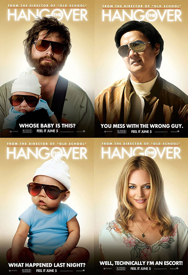
Check out The Hangover posters above for a classic example. None are particularly beautiful, nor are they real iconic designs, but they're very effective at getting people to look.
The flashy gradient background, head-and-shoulders character pictures (which can improve response rate,) and bright lighting make it difficult not to stare at one of these posters.
2. Iconography – showing without telling.
The most effective movie posters are iconic, presenting the themes in the film without resorting to flat out saying what it's about.
They use imagery, whether a close-up of a character or item that's a major plot point, or a simple graphic, to establish the film's plot. Combined with an eye-grabbing design, this can be an incredibly effective way to gain attention and create interest at once.
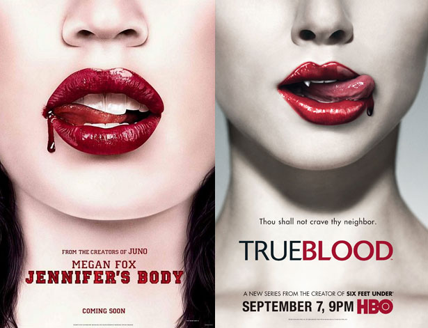
The Jennifer's Body poster above is a classic example of this, albeit one that borrows quite heavily from True Blood.
It uses tactics honed in on by advertisers over the decades – sex appeal, contrast, and spacing – to grab your attention.
At the same time, it also gives a glimpse into what the film is about. This allows it to market to casual observers and horror fans at once, all through imagery.
3. Interest – create an incentive to see the film.
When using icons and more abstract imagery doesn't work with your film – say, for example, it's a serious drama or a thriller that can't be explained with iconography – using an image that provides viewers with an idea of the story is a great idea.
Many of the best modern film posters use pictures that put the viewer in the middle of a scene from the film, creating tension and a major incentive.
The incentive is that in order to resolve the situation, the person looking at the poster needs to see the film and find out what happens.
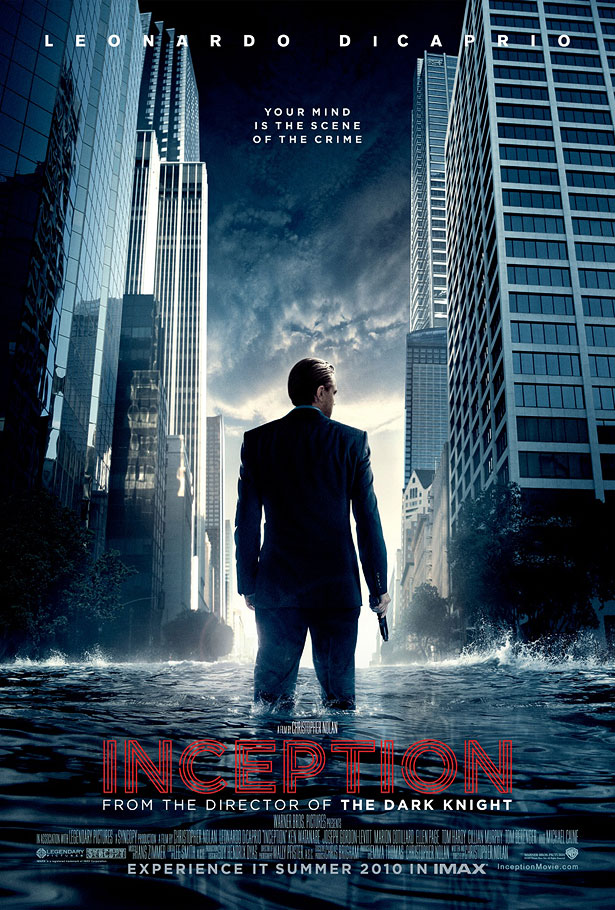
The Inception poster above uses this strategy – it puts viewers in the middle of a scene from the film that can only be explained by seeing what occurs before and after it. As a result, the curiosity created by the poster translates into on-the-spot ticket sales.
This type of design strategy tends to work best with films that cover unrealistic, fantasy-type events, particularly those that deal with the supernatural or psychological.
Since it's hard to offer insight for this type of story using icons and simple colors, a still from the film can work wonders.
4. Appeal – create desire with fans and non-fans alike.
With film studios cranking out comic book adaptations at a rapid pace, it's the 'true fans' that end up last in the marketing line.
Studios can rely on them to see their new releases regardless of its review coverage or promotional materials, since chances are fairly strong they're already aware of it. Great film posters, particularly those for adaptations, use this dual appeal to enhance their advertising.
Look at the Inglourious Basterds poster above. It's made by one of the world's most celebrated and well-known film directors,yet it barely states his involvement on its promotional poster.
The reason is that Quentin Tarantino fans are probably already aware of the film itself – it'd spend several years in production before finally being released – while newer fans are less interested in its history.
Compare this type of promotional poster to the marketing materials used for films that draw appeal from the involvement of a certain actor.
Since fans' ties with actors are generally weaker than those with directors or producers, their names usually appear in large print to grab attention. The stronger the audience's bond, the less important it becomes to highlight features that appeal to current fans.
5. Style – a look that's consistent with the film.
Whether you're marketing an art film or a blockbuster, style matters. Some of the most memorable film posters out there have used bold, unique artistic styles to their advantage.
What separates these posters from their ineffective art-for-art's-sake rivals is that they're consistent with style, in both the movie's promotional materials and throughout the film itself.
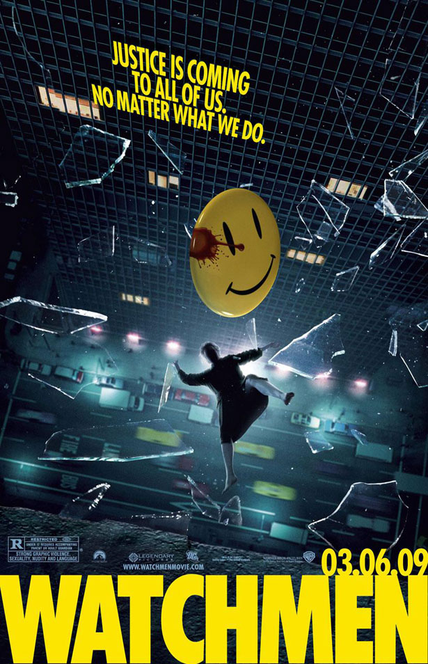
The poster for Watchmen above is a classic example of this technique succeeding. Since it uses an instantly recognizable comic book style, it grabs the attention of fans of the book.
It's accurate too, using the same type of stylized imagery as the film itself. This consistency means that it isn't just a great theater-based marketing tool, but a recognizable image for DVD and other releases.
6. Lasting Appeal – a look that suits other formats.
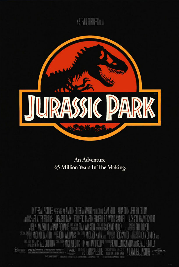
Here's the danger in getting too 'arty' and delicate with your film poster: it's eventually, after release and theater shows, going to be shrunk to a fraction of its original size for the DVD release.
While a growing number of films now use different designs for their DVD cover than their in-theater promo posters, most of the classics and high-budget blockbusters still use the same poster for both.
This means that your imagery, your titles, and your major points of interest need to be just as visible on a small DVD case as they are on a giant movie poster.
The Jurassic Park poster above really gets this feature, using imagery that's just as visible and clear when it's small as when its gargantuan. For your poster to work for the long-term, it needs to have scalable, clear, and lasting design appeal.
7. Recognizability – if it's a sequel, make it obvious.
 From time to time, the entire box office seems to be made up of sequels.
There's a good reason for it too – some of the most financially dependable films are sequels to successful franchises.
From films that dominated both the commercial world and the awards scene to purely commercial releases, few films can guarantee studios income like a good sequel.
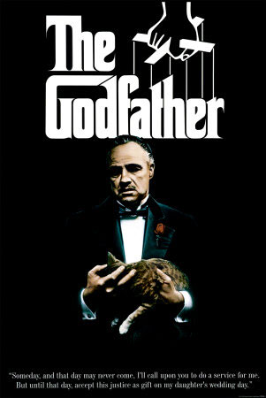
That's why sequel posters tend to be highly related to the first release, generally with a giant title in the top third of the canvas and instantly recognizable imagery throughout it.
The Godfather and the two sequels in the franchise are a great example – all three use the same style and design, using the critical and commercial success of the previous films in the franchise to draw in would-be viewers.
Written exclusively for WDD by Mathew Carpenter. He is an 18-year-old business owner and entrepreneur from Sydney, Australia. Mathew is currently working on Sofa Moolah, a website that teaches you how to make money online. Follow Mathew on Twitter: @matcarpenter. Follow Sofa Moolah on Twitter: @sofamoolah.
What do you think of the importance of these elements on a movie poster? What other elements can make a great movie poster?

