
It’s a classic case of Photoshop versus website. Existing wireframing and prototyping tools are incapable of accurately reflecting the environment of the web.
They produce static designs that can’t be seen through the variable known as the web browser. And when you build the final website, some elements won’t look exactly like their draft counterparts, and the client will notice those minor differences in fonts, positioning, etc.
You may be more comfortable with a graphics program, and rendering the design iterations may seem to take longer if you have to hand-code the HTML.
However, the advantages of creating a wireframe in HTML from the start are beginning to outweigh the alternatives: not only do we have new layout elements in HTML5 and more powerful selectors and styling in CSS3, but by combining them, we can throw together a simple layout quickly.
We’re hearing a new company every day (37Signals, Atomiq and others) explain its adoption of HTML prototyping. Their main reason is that the process is surprisingly easy when you have the right tools in place. You’re about to learn how easy this process can be, and when you’re done, you’ll have a head start on your next build.
Quick layout with HTML5
HTML5 brings a set of excellent new structural elements that make it easier to quickly mock up a document with fewer classes and ids. Once you understand the purpose of these elements, you will be able to create a rough page layout in minutes.
If you’re unfamiliar with these new elements, here’s a quick introduction. The new elements provide a cleaner document structure than before, while freeing you to move away from a heavy use of divs. Lachlan Hunt describes these elements nicely in “A Preview of HTML5”:
- The
articleelement represents an independent section of a document, page or website. It is suitable for content such as news and blog posts, forum posts and individual comments. - The
sectionelement represents a generic section of a document or application, such as a chapter. - The
headerelement represents the header of a section. Headers can contain more than just the section’s heading; for example, it would be reasonable to include sub-headings, version history information and bylines. - The
navelement represents a section of navigation links. It is suitable for both website navigation and a table of contents. - The
asideelement is for content that is tangentially related to the content around it, and it is useful for marking up sidebars. - The
footerelement represents the footer of a section. It typically contains details about that section such as the author’s name, links to related documents and copyright data.
In my example website, I want a centered page, with a header, a sidebar on the left, an area for the main content and a footer. I’ve used HTML5 elements to mark up the structure, with an article element to contain everything.
<!DOCTYPE html>
<html>
<head>
 <meta charset="utf-8">
 <title>Example</title>
</head>
<body>
 <article>
 <header></header>>
 <article>
 <aside></aside>
 <section></section>
 </article>
 <footer></footer>
 </article>
</body>
</html>
These elements and divs are dimensionless and invisible unless you set style attributes or place content in them. To make them workable, we need to temporarily assign heights to them. We should also set the HTML elements to display: block; so that the browser recognizes them (extra work is required for IE).
article, header, nav, aside, section, footer {
display: block;
min-height: 100px; }
Before positioning the elements, we need to be able to visualize the layout. The ideal solution for visualizing the structure without any content would be easy to remove later and would not affect the design.
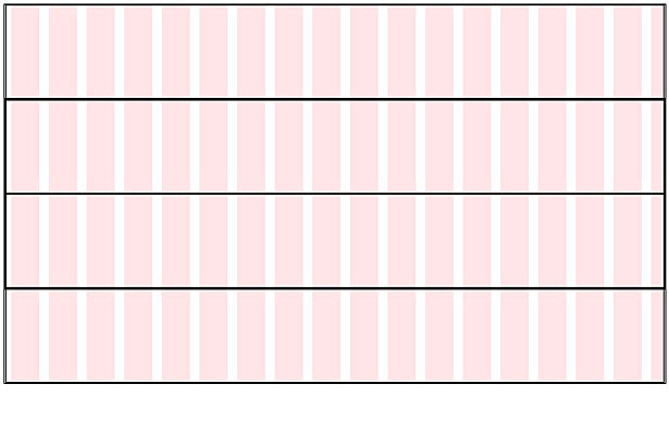
Option 1: Outlines
The outline setting is compatible with all modern browsers and does not affect the width of elements, whereas the border attribute does.
article, header, nav, aside, section, footer {
outline: 1px solid #000; }
Option 2: HSLa
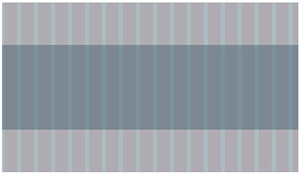
HSLa (or even RGBa) gives you a better representation of the hierarchy of elements because the opacity will make overlapping elements appear darker. But if you plan to have basic background colors in the mock-up, then this method may not work well.
article, header, nav, aside, section, footer {
background: hsla(200, 30%, 30%, .4); }
Positioning
The method for positioning elements is a matter of personal preference, and you have plenty of options: measuring tools in the browser or operating system, background grid images (which I’ve chosen), CSS frameworks with grid and layout assistance, or software like Dreamweaver. Positioning is the most important part and will need to work properly from the beginning. The code you write here will most likely remain in the final product.
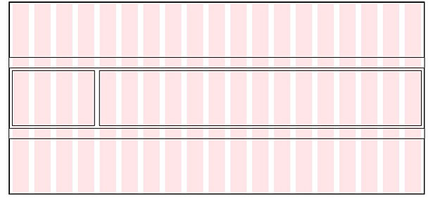
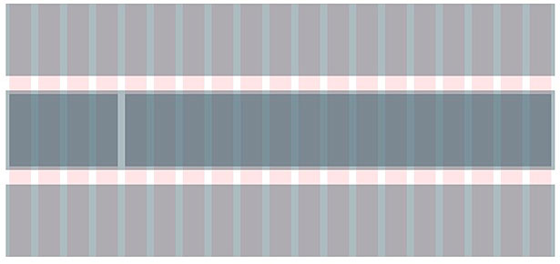
In my example, I’ve given the page a fixed width, with a sidebar on the left and content on the right, both between the header and footer.
body > article {
width: 760px;
margin: 0 auto; }

article article {
overflow: hidden;
width: 750px;
margin: 20px 0;
padding: 5px; }

aside {
width: 150px;
float: left; }

section {
float: right;
width: 590px; }
Throughout the entire process, I am able to see each section and see where it will appear. Here is the result:
Don’t worry about browser compatibility until you get to the final product. I strongly recommend leaving notes via CSS comments, marking which areas you need to come back to (which will primarily be the selectors and attributes that require additional care for certain browsers).
Prototyping content
When the layout is complete, you may need to add sample content. The most common method today is to throw chunks of Lorem Ipsum and watermarked stock photography onto the page. Why reinvent the wheel?
HTML Ipsum is an excellent website that wraps Lorem Ipsum text in common mark-up. Being able to grab everything on one page couldn’t be any easier.
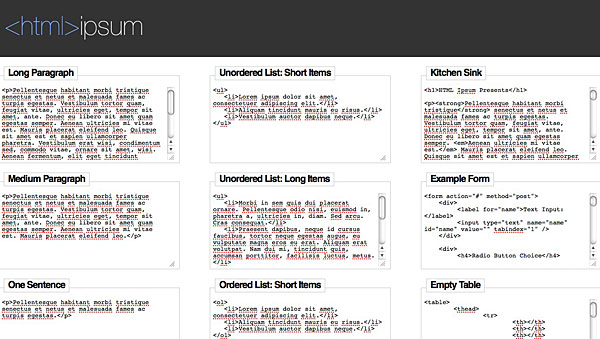
PlaceHold.it offers placeholder images at any size you need by calling each image via a URL request (such as https://placehold.it/350x150, where the first value is the width and the second the height):
PlaceKitten works exactly like PlaceHold.it, except with cuter images:
Rather than adding advanced JavaScript for maps, you can pull in a basic map as an image via Google Static Maps. An API key or unique signature is required, but you’ll have to get that anyway if the final product will contain a map.
Simulating behavior
Modern websites contain functionality that is difficult to communicate through static wireframes: expanding and collapsing elements, transitions, drag and drop, dynamic menus, etc. You’ll have to use a JavaScript library eventually anyway, so loading a library now and scripting in some basic functionality wouldn’t hurt.
You can avoid a download by loading jQuery from its content network. Mimic the intended behavior with a few functions instead of writing the actual code. For example, if an element should appear when a link is clicked (say, a log-in window or contact form), then build a quick wireframe of the window, hide it by default, and then use jQuery to reveal it on click.
As long as you do just enough work to mimic the behavior, the client will be able to see the result for themselves, rather than having to pour over a series of flow charts or explanations.
Simulating states
If you’re creating wireframes for a web application rather than a website, you may want to be able to quickly show several states of a single page. You could create different copies of the wireframe, each altered to show a particular state, or you could use PolyPage.
PolyPage is a jQuery plug-in that enables you to use classes in your mark-up to represent elements that would be present for different states (for example, logged in and logged out). You can toggle each state with a link, thus helping you easily demo the differences to the client without needing several pages.
Final thoughts
While the original designs always look gorgeous on paper or in PDF, building the HTML pages right from the start has several advantages.
You save the time that you would have spent recreating the design in code. You avoid the confusion of wondering why the final product does not look exactly like the original. And you save both you and the client time, money and nerves.
Michael Botsko is a web developer and web technology instructor in Portland, Oregon. He enjoys working on both client and open-source projects with Botsko.net, LLC. When not working, he enjoys spending time with his two children and wonderful wife.
Which rapid layout and prototyping tools have I overlooked? What are the benefits of designing first and building later?


