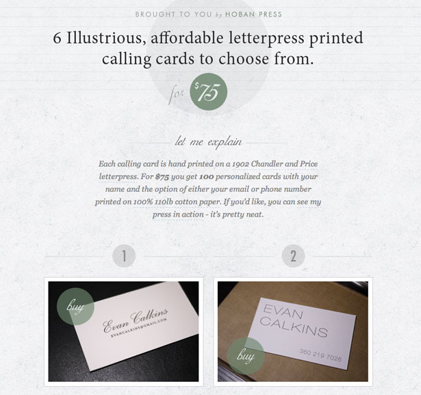
Symmetry is an age-old device of the visual artist. The word refers to two halves that perfectly mirror each other. In design, symmetry is closely tied to balance. A perfectly symmetrical design achieves balance and a sense of stability.
There is also asymmetrical design, where the two halves are balanced but do not mirror each other perfectly. The majority of websites have an asymmetrical layout.
Most often we find the logo in the top left, balanced by some navigational elements on the right. In the body, the side columns are usually balanced by either the main content or other columns.
While perfect symmetry is certainly not new to the web, it is gaining momentum. Expanding screen sizes and the proliferation of platforms and viewing options are making it a more attractive option. By mirroring the halves of a design, you not only get a greater sense of balance, but also improve the flow from top to bottom.
Icora

Icora is a perfect example of how symmetry contributes to the vertical flow of a website. I love how a story is being told here. Instead of throwing a bunch of stuff on the page and letting the user choose where to go, the designer encourages the user to scroll through the content. The designer takes you on a set journey in what is essentially a carefully planned sales pitch.
Pixel Bleed

Pixel Bleed is the type of website that often totally perplexes me. Nothing about it fits the norm. The logo and navigation are at the bottom, which just feels wrong… and yet it works! The symmetry lends an interesting balance to the design. And with the visually heaviest elements at the bottom of the page, the layout feels grounded.
Duuel

Symmetry can occasionally play into the subject of the website. In the case of Duuel, the idea of two designers dueling makes sense. The designers are evenly skilled and evenly equipped, and the symmetry subtly reinforces this idea.
Clocks

Symmetry is also great when you simply don’t have much to say. The makers of Clocks don’t need much to explain their product. One word does the job. In fact, saying more would almost defeat the point. Of course, a clock is symmetrical anyway and so is ideal for a layout like this.
Ryan M. Stryker

One powerful aspect of symmetry is its ability to direct the user’s focus. With everything balanced on the vertical axis, attention naturally goes there. Ryan M. Stryker’s name here is in this pivotal location, ensuring you don’t miss it. The website functions almost like an elevator pitch, starting with the name and flowing into a summary of the designer’s work. Critical information is carefully controlled and powerfully conveyed. The design doesn’t have to be overbearing either; the symmetry does most of the work.
Questionable Characters

Symmetry also allows you to communicate two equally important sets of information. Perhaps your product has two target audiences. Or perhaps two products are the lifeblood of your company. As we see with Questionable Characters, symmetry can ensure equal air time for two halves of a whole.
Foodily

Symmetry is also useful for keeping clutter out of a design. While this is not reason alone to use it, Foodily does make a strong case for it, with its clean and elegant layout. While most recipe websites overflow with content, this one is remarkably simple. Consider your own content and what you would remove if you had to make the layout symmetrical.
Thread’s Not Dead

Thread’s Not Dead combines a few of the principles we’ve seen above, but with some twists. I’m intrigued that the top-most item in this symmetrical layout is a product testimonial. No doubt, testimonials are useful for online marketing, and here one occupies the most prominent part of the page. Nevertheless, the area directly below carries the most visual weight and contains all of the critical information and calls to action. The result is perfectly balanced content that cuts right to the chase. Sometimes, leaving out the heavy extras and getting straight to the point is the best approach.
13 more symmetrical websites
The principles explored above also apply to the designs below. Consider how symmetry helps to control the user experience on these websites.


Conclusion
Symmetry is a basic feature of design and yet is easy to lose sight of. I love thinking about how the basic elements of design apply to the real world. It is often these most basic elements that reveal powerful ways to communicate information.
Have you had an abiding love for symmetrical design? Do you think this style has its limits?
Patrick McNeil
Patrick McNeil is a designer, developer and writer; but above all things he is a passionate educator. He is a Professor of Graphic Design at the University of Missouri St. Louis where he focuses on teaching UX Design methods and front end development techniques. Patrick is also the author of the bestselling book series The Web Designer's Idea Book and the curator of DesignMeltdown.com. For more information about Patrick visit his personal site, pmcneil.com, or follow him on Twitter @designmeltdown.


