
 Logos are often considered the image of a product or service and is thought of as the center of all branding endeavors. If you are trying to be a legitimate company, you've probably had someone (or yourself) create a logo.
We don't always get logo design right. And sometimes it's just time for a newer, trendier logo. We may see it a couple months or years later and decide that it's time to redesign or update what we have.
Redesigning a logo can be just as hard as creating a new one. Some questions you may ask yourself are: How much do you want to change it? What elements should be kept? And will the redesign still be recognizable as your brand?
Once you go through your list of questions and figure out what's necessary, here are five ideas you can use to spruce up your logo design.
Logos are often considered the image of a product or service and is thought of as the center of all branding endeavors. If you are trying to be a legitimate company, you've probably had someone (or yourself) create a logo.
We don't always get logo design right. And sometimes it's just time for a newer, trendier logo. We may see it a couple months or years later and decide that it's time to redesign or update what we have.
Redesigning a logo can be just as hard as creating a new one. Some questions you may ask yourself are: How much do you want to change it? What elements should be kept? And will the redesign still be recognizable as your brand?
Once you go through your list of questions and figure out what's necessary, here are five ideas you can use to spruce up your logo design.
1. Strip it Down
We are living in a time where minimalism is a huge trend, not just because it looks good but because it works and it makes sense. The main idea is to get rid of the excess so that your audience isn't confused about what's going on—in terms of a logo you want your audience to be sure of what is being sold and what a logo represents. Stripping down your logo design can ultimately end up being beneficial because a simple design is much easier to recognize than a busier design. If your current logo design has a lot of elements, try to figure out which ones are excess. For example, you may have a simple text logo with a couple of swooshes or a design element on it. What if, for instance, you decided to drop the text, and have the design element remain as your logo, or vice versa. Thus, you could rework or redesign only that one element as your logo.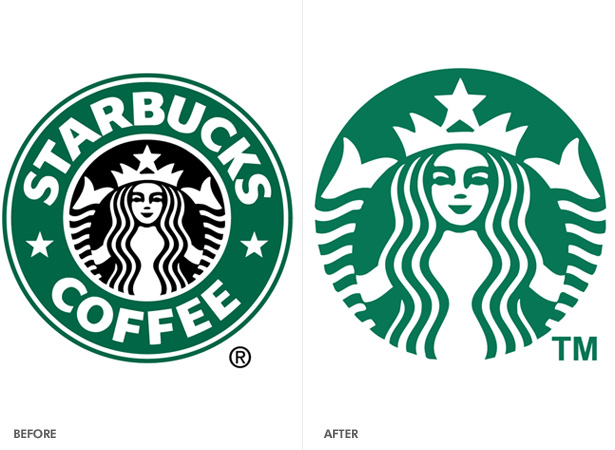 My favorite example of this type of technique is the Starbucks logo. From the logo's inception, the company has always had a pretty stripped down logo. Recently they went even further with their old logo, and it makes so much sense and looks very good as well. The idea behind removing the "Starbucks Coffee" around the previous logo was because the company plans on creating more ventures outside of coffee—it wouldn't make sense to sell bottled water or wine with a logo that says "coffee" on it. This logo remains completely recognizable from the last and it simply works.
2. Change the font
Another pretty simple and subtle fix for when you pretty much like everything you've got on your logo. Perhaps you just need one thing to really change it but not too much. The question is, if you like everything on your logo, why would you change the font? Picking a new font for your logo is kind of like the meeting of two new worlds. Let's say for instance, you have a logo that is mainly all text and for the original you used a serif. Perhaps you did that because you wanted it to appeal to an older generation or you wanted your audience to take you seriously. But now you need a new redesign that appeals to younger folks and is a bit more modern—what would you do? Probably change my font from a serif to a sans-serif.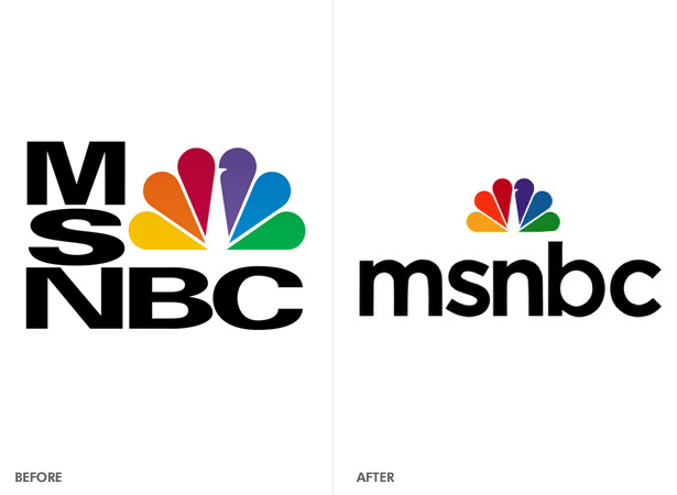 A logo redesign that works well here is the MSNBC logomark. The original design had this uppercase, super heavy typeface that would make any good typographer cringe. It was extremely strong and powerful—which isn't always the greatest idea for a media news station. The newer logo flaunts a lowercase, more aesthetically pleasing typeface that makes more sense. It's as if they went from being a big-headed and wrong news channel, to be a humble and approachable one.
3. Simplify the design
This is quite similar to our first point, but here I want you to consider a complete redesign by simplifying what you have. A lot of times, original logos can end up being extremely busy, as well as generic. The idea here is to break down the design, simplify it and come out with something extraordinary for your brand.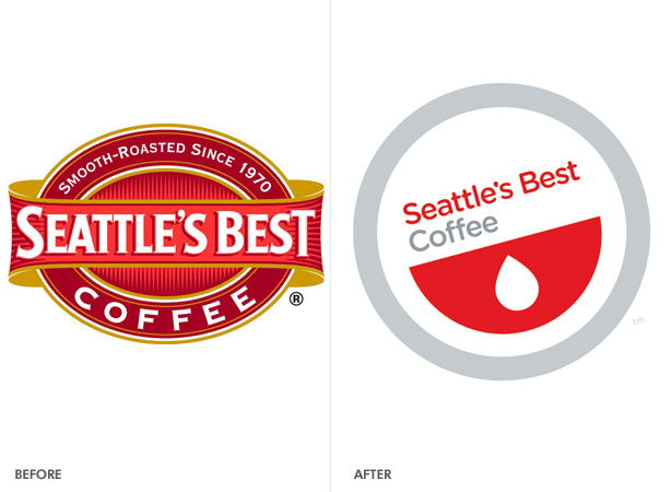 Modernizing the logo is also another way to simplify the design. For example, let's look at the "Seattle's Best Coffee" logo. While there's a split amongst those who favor the redesign and don't, I definitely agree with the redesign and what it stands for. The previous logo is a bit busy, seems a bit older, and isn't that different. There are tons of logos featuring seals, especially when we're thinking about coffee.
Seattle's Best Coffee, however, has decided to open it's playing field from not just coffee shops, but convenience. They want to partner with more fast food chains, offer pre-made beverages in stores, and even have vending machines. This simplified redesign conveys the move from your hometown coffee shop to a more convenient coffee brand.
Modernizing the logo is also another way to simplify the design. For example, let's look at the "Seattle's Best Coffee" logo. While there's a split amongst those who favor the redesign and don't, I definitely agree with the redesign and what it stands for. The previous logo is a bit busy, seems a bit older, and isn't that different. There are tons of logos featuring seals, especially when we're thinking about coffee.
Seattle's Best Coffee, however, has decided to open it's playing field from not just coffee shops, but convenience. They want to partner with more fast food chains, offer pre-made beverages in stores, and even have vending machines. This simplified redesign conveys the move from your hometown coffee shop to a more convenient coffee brand.
4. Change the colors
Picking the right colors for anything can mean success. We tend to relate colors to certain emotions and feelings as well as certain things. For example, blue is a cool color and is often regarded as welcoming. Red is a warmer color that is seen as being feisty or energetic. Changing the colors on your logo can end up being either a subtle or dramatic change, depending on what it is you want to do.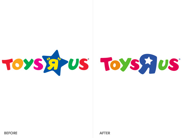 Even a small change, like a bit less saturation can do the trick. Toys R Us redesigned their logo a while ago. They cleaned it up a bit (a la idea #1), but they also changed the colors around. They ended up being a lot less primary and standard. While the logo just seemed to be due for a redesign, they kept everything else pretty much the same. The color change, however, helped the brand seem a bit more childlike and fun.
5. Company/Product-centric
Sometimes we create logos that do too much and are way too busy. Then there is a completely different spectrum of logo design where our logos don't do nearly enough. It's easy to get caught up in the idea that minimalism is the way to go—but the truth is, it's not appropriate for every company or product. We sometimes want to be so clean and just create a logomark with some nice typography. That's not a bad idea if it's necessary, but sometimes a logo needs a bit of excitement to go along with what the company is doing. If you're logo is super boring, you may want to apply more of a theme to it that is central to the company or what the product does.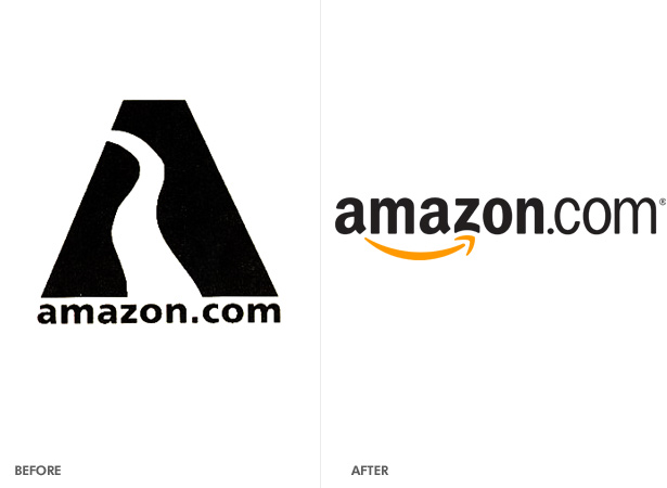 Perhaps your logo isn't boring, but perhaps it doesn't quite make sense. Years ago, Amazon.com used a logo that referenced the Amazon River. If you've ever been to Amazon.com, then you know they have nothing to do with the Amazon River—it misses the mark entirely. Fortunately, they redesigned their logo to the clever one we've got now, which has an arrow stemming from the 'A' to the 'Z' (they've got everything from A to Z), and it also looks to me like a smile. If you've ever gotten a deal from Amazon.com (i.e., textbooks), you know exactly how I feel.
Out with the old, in with the new
Redesigning a logo is definitely a timely thing, but usually has to be done at some point. Determine what it is you are trying to do and use at least one, if not a combination, of the ideas presented. Always keep in mind what the client wants and needs and even what the competition is doing. Remain creative and inspired and you're sure to create a great logo! With your experience in logo redesign, what are some techniques you enjoy using?Kendra Gaines
Kendra Gaines is a freelance designer from Virginia, USA. Connect with her.


Read Next

3 Essential Design Trends, November 2024
Touchable texture, distinct grids, and two-column designs are some of the most trending website design elements of…

20 Best New Websites, October 2024
Something we’re seeing more and more of is the ‘customizable’ site. Most often, this means a button to swap between…

Exciting New Tools for Designers, October 2024
We’ve got goodies for designers, developers, SEO-ers, content managers, and those of you who wear multiple hats. And,…

15 Best New Fonts, September 2024
Welcome to our roundup of the best new fonts we’ve found on the web in the previous four weeks. In this month’s edition…
By Simon Sterne

3 Essential Design Trends, October 2024
This article is brought to you by Constantino, a renowned company offering premium and affordable website design
You…

A Beginner’s Guide to Using BlueSky for Business Success
In today’s fast-paced digital world, businesses are always on the lookout for new ways to connect with their audience.…
By Louise North

The Importance of Title Tags: Tips and Tricks to Optimize for SEO
When it comes to on-page SEO, there’s one element that plays a pivotal role in both search engine rankings and user…
By Simon Sterne

20 Best New Websites, September 2024
We have a mixed bag for you with both minimalist and maximalist designs, and single pagers alongside much bigger, but…

Exciting New Tools for Designers, September 2024
This time around we are aiming to simplify life, with some light and fast analytics, an all-in-one productivity…

3 Essential Design Trends, September 2024
September's web design trends have a fun, fall feeling ... and we love it. See what's trending in website design this…

Crafting Personalized Experiences with AI
Picture this: You open Netflix, and it’s like the platform just knows what you’re in the mood for. Or maybe you’re…
By Simon Sterne

15 Best New Fonts, August 2024
Welcome to August’s roundup of the best fonts we’ve found over the last few weeks. 2024’s trend for flowing curves and…
By Ben Moss