 Whether you just want to create a slightly customized theme or something completely unique, creating a WordPress child theme can greatly speed up the development process.
Child themes let you start with the basics of an existing theme, so you're not having to reinvent the wheel. You can pick a theme that has the functionality and basic layout you need, but then customize everything about it as you would designing a theme from scratch.
For this tutorial, we'll be creating a child theme based on the newest WordPress default theme, Twenty Eleven. We'll also be using some handy plugins and other tricks to make it even easier to create a child theme.
You'll need some very basic HTML and CSS knowledge, but the good news is that for a basic child theme, you don't need to know any PHP! The theme created is very basic, but it will give you the building blocks you need to get started creating your own themes, even if you've never created a WordPress theme before!
The theme we'll be creating
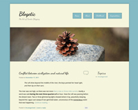
Here's a brief look at the final theme we'll be creating: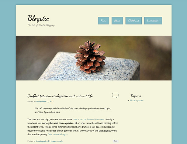
A word about parent themes
Probably the most important step in creating a child theme is picking out your parent theme. For this tutorial, as already mentioned, we'll be using Twenty Eleven. The reasons for this include the fact that it's easily accessible, free, is probably already installed on any updated WP install, and is well-coded. That last one is the most important thing to consider when picking your parent theme: make sure that it is well coded. The main reason for this is that if your parent theme is well-coded, it will be infinitely easier to create a child theme that is well-coded, because you won't have to employ hacks to make things work.
Any time you want to make customizations to a theme, you're better off to use a child theme instead of editing the parent theme directly. This way, if an update for the original theme is issued, your theme won't break. And if both the parent theme and your theme are coded well, you likely won't notice any differences in the updated theme on your site's front-end.
One-Click Child Theme
The quickest and easiest way to get started with a child theme is to use the One-Click Child Theme plugin. Just install it, activate the parent theme you want your child theme to be based on (if it isn't active already), and click on "Child Theme" under Appearance in the WP dashboard. From there, enter a name for your new child theme, a short description, and your name, and click on "Create Child". That's all there is to it. One word or warning: I got an error message after clicking "Create Child", but the child theme was created without a hitch. Alternatively, you can create a child theme from scratch. To do that, open up your text or code editor of choice and enter the following information (this is taking into account that you'll be using the Twenty Eleven parent theme):/*
Theme Name: Your Child Theme's Name
Description: Your theme's description.
Author: Your Name Here
Template: twentyeleven
(optional values you can add: Theme URI, Author URI, Version)
*/
@import url("../twentyeleven/style.css");
The "Template" portion is what makes this a child theme rather than a regular theme, so make sure you properly identify the theme's parent.
Setting Theme Options
Before you start customizing your new child theme's CSS, make sure you check out the theme options and do some customizations there. It's better to make changes within the existing framework of the theme if that's an option, as it makes it easier to manage your theme's code. For this customization, I've selected a content-on-left layout with a single sidebar, and left the color scheme and default link color (for now). I've also left the background white, the header with one of the default images, and the header text color black. Note: If you want to disable the color selection in theme options, add!important to the color specifications in your CSS.
Basics of editing your theme
If you go to the WordPress theme editor, you'll see a mostly-blank style sheet for your new child theme. The first line of your new CSS file (after the child theme info) is importing the stylesheet from the parent theme. This is vital, and it has to remain at the top of your sheet or the parent stylesheet will be invalidated and won't import. One thing you may want to do at this point is install a better code editor plugin for theme editing. Color-coded syntax makes it significantly easier to code directly in WP, and will especially be useful for those who are used to colored syntax with outside editors. My personal choice is Advanced Code Editor. You'll also want some kind of text editor for setting up our functions.php file, preferably one with syntax highlighting.Finding the code to change
This can be one of the most frustrating parts of child theme development: finding which parts of the code need to be edited and which can be left alone. The entire point of a child theme is to make theme creation and maintenance easier. To that end, we want to create as little new code as possible. To make this a lot easier, you'll want to do is install a plugin like Firebug. This will allow you to click on a part of your page design and view the associateddiv and CSS classes. You can also try out code to see what works, and then copy and paste it into your theme's CSS. I've found that keeping your front-end theme open in one tab alongside another tab with the WP dashboard where you're editing files is the most efficient way to edit your code.
The basics
Let's start by defining things like the body background color, the typography, and other basics that will give us the basis for our child theme. This code sets up everything in the header, with the exception of moving our navigation menu. Let's break it down into a few different steps. This first block of code gives us all of our basic typography (we'll be pulling in "Droid Sans" and "Dancing Script" from Google Web Fonts; more on that in the section onfunctions.php):
body, input, textarea, p {
 color: #000000;
 font-family: 'Droid Sans', sans-serif;
}
p {
 font-size: 14px;
 line-height: 24px;
}
h1, h2, h3, h4, h5, h6 {
 font-family: 'Dancing Script', cursive;
}
This next section sets up the main content background and drop shadow.
#page {
 background: #f5f5dc;
 -moz-box-shadow: 0 0 10px #67949c;
 -webkit-box-shadow: 0 0 10px #67949c;
 box-shadow: 0 0 10px #67949c;
}
Then we'll make some adjustments on our blog title and description, as well as changing the top border of the header and removing the search form (which will be replaced with our navigation menu in the next step).
#site-title a {
 font-size: 48px;
 font-weight: 700;
 line-height: 60px;
}
#branding {
 border-top: 2px solid #67949c;
}
#branding #searchform {
 display: none;
}
#site-description {
 font-size: 18px;
 margin: 0 270px 3em 0;
}
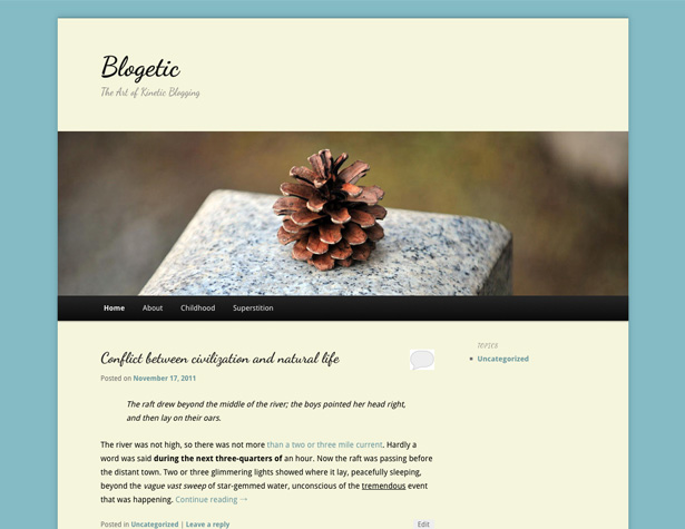
This gives us a header that looks like this:
Move the main navigation menu
The next change we want to make is to move the navigation menu from its default position under the header image to the upper right, opposite the blog title or logo. This format works best for sites that only have a small number of pages. Larger sites, or sites with sub-pages, will need additional consideration, and likely won't work well with this kind of layout. Here's the code you'll need:#access {
clear: both;
display: block;
float: right;
margin: 0 auto 6px;
position: relative;
top: -410px;
width: 500px;
background: none;
box-shadow: none;
}
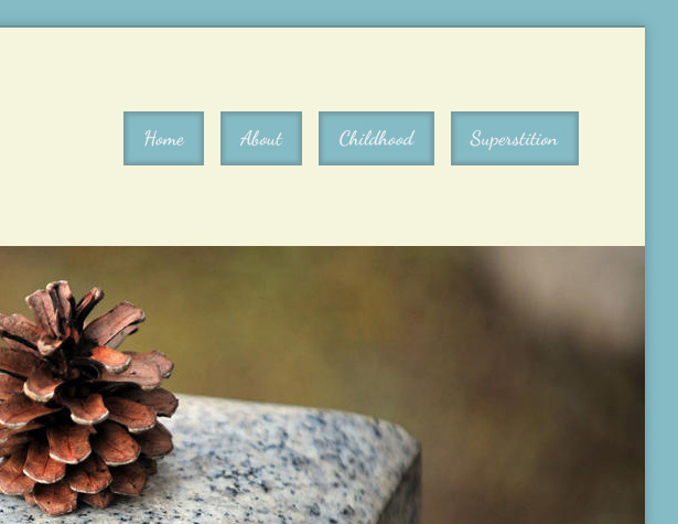
Your navigation menu should now be sitting up above the header image, adjacent to your logo. Next we'll add some styles to our navigation and turn them into buttons instead of a solid bar. Here's the code for the basic font styling:
 #access a {
 font-family: 'Dancing Script', 'Helvetica Neue',Helvetica,Arial,sans-serif;
 font-size: 1.4em;
 font-weight: 700;
 padding: 0 1em;
 line-height: 2.666em;
}
Here's the basic formatting for the button behind the text, including a nice inner shadow:
#access li {
 background: #84bbc5;
 margin-right: 15px;
 -moz-box-shadow: inset 0 0 3px 3px #739ca3;
 -webkit-box-shadow: inset 0 0 3px 3px #739ca3;
 box-shadow: inset 0 0 3px 3px #739ca3;
}
And here's the code for adding a drop shadow behind the buttons when they're hovered over (which actually gives the impression of an animation effect in use):
#access li:hover > a, #access a:focus {
 background: #84bbc5;
 color: #EEEEEE;
 -moz-box-shadow: 0 0 3px 3px #739ca3;
 -webkit-box-shadow: 0 0 3px 3px #739ca3;
 box-shadow: 0 0 3px 3px #739ca3;
}
Now your header will look like this:
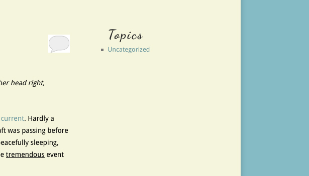
Basic styling for your sidebar
Let's add some very basic styles for your sidebar. The changes we're making here are primarily to make the sidebars match the design of the rest of the site. Here's the code:.widget a {
font-weight: 400;
font-family: 'Droid Sans', sans-serif !important;
}
.widget-title {
color: #282828;
letter-spacing: 0.1em;
line-height: 1.5em;
text-transform: none;
}
The .widget-title is already in an H3 tag, so it takes on the font already specified there.
And here's how that looks:
Changes to the post format
First we want to change the padding for the top of the posts, so the first post lines up with the top of the sidebar..entry-title {
padding-top: 0px;
}
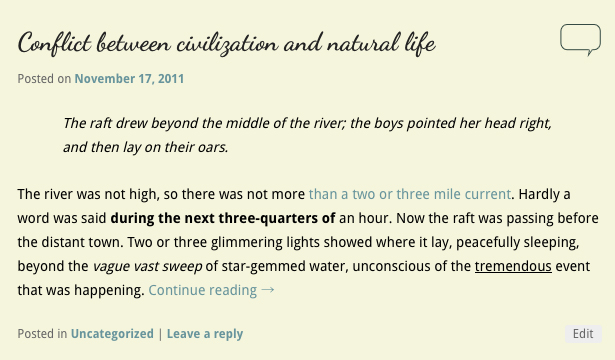
Next we'll change the comment icon that appears next to the post title on the home page. This one is simple: just create your new icon (I've created versions for active and inactive versions) and then upload them using WP's media uploader. Take the URL for each, and insert them like this:
.entry-header .comments-link a {
 background: url("https://blogetic.com/site/wp-content/uploads/2011/11/comment-link.png") no-repeat scroll 0 0;
 top: 0;
}
.entry-header .comments-link a:hover, .entry-header .comments-link a:focus, .entry-header .comments-link a:active {
 background: url("https://blogetic.com/site/wp-content/uploads/2011/11/comment-active.png") no-repeat scroll 0 0;
 background-color: #f5f5dc !important;
}
You'll need to add the !important to the background-color attribute for the hover state in order to override the styling done to links elsewhere in the theme. The hover image is a filled-in text bubble, while the normal state is just an outline. Here's the result:
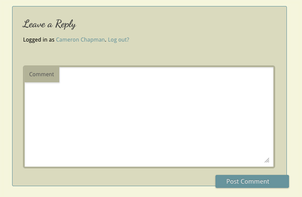
 Next we'll work on the comments styling. This is simple, as all we're doing is changing the color scheme. Here's the code:
#respond {
 background: none repeat scroll 0 0 #dadabe;
 border: 1px solid #67949c;
}
#respond input[type="text"], #respond textarea {
 background: none repeat scroll 0 0 #FFFFFF;
 border: 4px solid #b3b398;
}
#respond .comment-form-author label, #respond .comment-form-email label, #respond .comment-form-url label, #respond .comment-form-comment label {
 background: none repeat scroll 0 0 #b3b398;
 box-shadow: 1px 2px 2px rgba(204, 204, 204, 0.8);
 color: #555555;
}
#respond input#submit {
 background: none repeat scroll 0 0 #67949c;
}
And here's the end result:
Inserting code into your head or elsewhere in your theme
This is probably the most technical part of creating a child theme, and is only necessary if you wannt to do something like add Google Web Fonts to your site. That's exactly what we're going to do here. This is the only time in creating your child theme that you'll need to work with PHP, and if you don't need to insert anything into your theme's header or elsewhere, you won't need to work with PHP at all. First, create a functions.php file in your text or code editor of choice. The basic code you'll use will look something like this:<?php function customfunctionname() { ?>
<script type="text/javascript">
Whatever your JavaScript is
</script>
<?php }
add_action('wp_head', 'customfunctionname');
?>
For the child theme above, we needed to insert code into our header to link the appropriate Google Web Fonts so we could call them into our CSS. Here's how we do that (you can get the link directly from Google with whichever fonts you want to use):
<?php function googlefonts() { ?>
 <link href='http://fonts.googleapis.com/css?family=Dancing+Script:400,700' rel='stylesheet' type='text/css'>
<?php }
add_action('wp_head', 'googlefonts');
?>
Now your fonts should all be working properly! And all the functions that were included in the original parent theme will still be working, too.
Download the theme files
If you want to see all of the code for both the CSS and the functions.php file, you can download them here. Also included are the comment bubble icons.Conclusion
Creating a child theme is incredibly simple when compared to designing and coding a theme from scratch. With some basic CSS knowledge and just a little bit of PHP, you can create basically any kind of theme you want. Child themes, in many cases, can also be used commercially (as long as the parent theme allows for such use) or sold as stock themes (just remember to let your buyers know that the theme requires a parent theme). Make sure that your code is well-written, commented, and organized. This way, if your parent theme is updated, your child theme is unlikely to break. The child theme we've created in this tutorial is very, very basic. But it gives you the information you need to start designing your own themes. Start with basic restyling to get your feet wet, and then start exploring the things you can do with PHP in your functions.php file. Child themes, when built on a great parent theme, can be as powerful as any other theme available. For more information on child themes, check out the WordPress Codex. Have more tips for creating great child themes? Let us know in the comments!Read Next
3 Essential Design Trends, November 2024
Touchable texture, distinct grids, and two-column designs are some of the most trending website design elements of…
20 Best New Websites, October 2024
Something we’re seeing more and more of is the ‘customizable’ site. Most often, this means a button to swap between…
Exciting New Tools for Designers, October 2024
We’ve got goodies for designers, developers, SEO-ers, content managers, and those of you who wear multiple hats. And,…
15 Best New Fonts, September 2024
Welcome to our roundup of the best new fonts we’ve found on the web in the previous four weeks. In this month’s edition…
By Simon Sterne
3 Essential Design Trends, October 2024
This article is brought to you by Constantino, a renowned company offering premium and affordable website design
You…
A Beginner’s Guide to Using BlueSky for Business Success
In today’s fast-paced digital world, businesses are always on the lookout for new ways to connect with their audience.…
By Louise North
The Importance of Title Tags: Tips and Tricks to Optimize for SEO
When it comes to on-page SEO, there’s one element that plays a pivotal role in both search engine rankings and user…
By Simon Sterne
20 Best New Websites, September 2024
We have a mixed bag for you with both minimalist and maximalist designs, and single pagers alongside much bigger, but…
Exciting New Tools for Designers, September 2024
This time around we are aiming to simplify life, with some light and fast analytics, an all-in-one productivity…
3 Essential Design Trends, September 2024
September's web design trends have a fun, fall feeling ... and we love it. See what's trending in website design this…
Crafting Personalized Experiences with AI
Picture this: You open Netflix, and it’s like the platform just knows what you’re in the mood for. Or maybe you’re…
By Simon Sterne
15 Best New Fonts, August 2024
Welcome to August’s roundup of the best fonts we’ve found over the last few weeks. 2024’s trend for flowing curves and…
By Ben Moss


