 In the wonderful world of web design, it has become normal practice to create designs that utilize background patterns that don't draw a ton of attention, but have a bit of variation within them. Even if you are not creating website designs, it should be good practice to want to create patterns that are subtle, yet beautiful, and easy to use for any occasion.
Of course, it's easy to find these types of patterns online so all you have to do is save them and use them, but wouldn't you love to know how to make them from scratch—to add a little bit of personality to your web design? Well today we have put together 5 short tutorials to help you make five different types of subtle backgrounds.
These are Photoshop tutorials that are best for beginner to intermediate users—I'll be explaining many of the steps quickly as if you already have some knowledge of Photoshop short cuts and short codes. Either way, I hope you are able to follow along, find out something you didn't know before, and learn how to make five subtle and seamless background patterns.
First pattern
For this first pattern, I wanted to mimic something that was a little grungy with a bit of texture.Step 1.
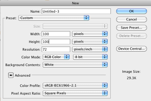 The first thing you want to do, of course, is create your new document. This time around we are going to start with a document size of 100 pixels by 100 pixels.
Step 2.
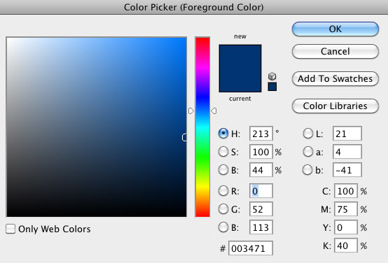 Once you make your document, you want to choose the color of your background. You can choose from the swatches or bring up your Color Picker dialog box. I wanted to go with a nice dark blue color this time around.
Step 3.
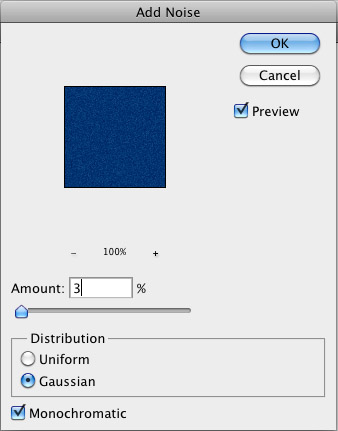 The first thing we are going to do to create our background is to add some Noise. Go to Filter > Noise > Add Noise to open this dialog box. Change your Amount (of noise) to 3%, with a Guassian Distribution and make sure the Monochromatic box is checked.
Step 4.
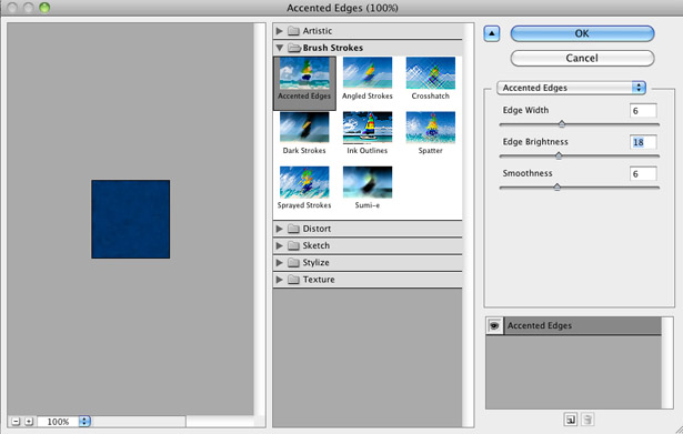 Next, we are going to apply the filter necessary in creating the remainder of the grunge look. Go to Filters > Brush Strokes > Accented Edges. The Filter Gallery dialog box will pop and look like this. You want to play around with the settings until you find something you like. The settings I used: Edge Width of 6, Edge Brightness of 18, and Smoothness of 6.
Step 5.
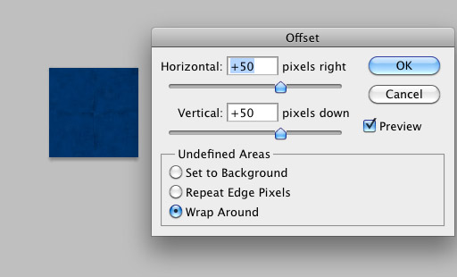 In order to make this pattern seamless, what we are going to do is wrap the pixels around the edges. By going to Filter > Other > Offset, we bring up a dialog box that is ready to help us move the pixels about. What you want to do is use an amount that is half the size of your length and/or width. Our length and width is 100px each, so we want to wrap it around at 50 pixels like so.
Step 6.
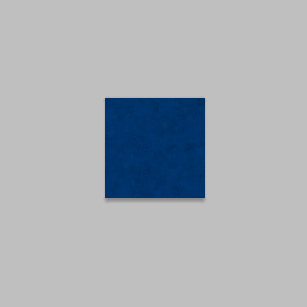 As you can see in Step 5, when you choose to Offset your pixels, you can actually see where the pixels start and stop. To clean this up, you want to grab your Healing Brush (J) on your palette, Alt+Left Click a spot on your background and paint over it. Once you smooth it out with your Healing brush, it should look much like the above picture.
Step 7.
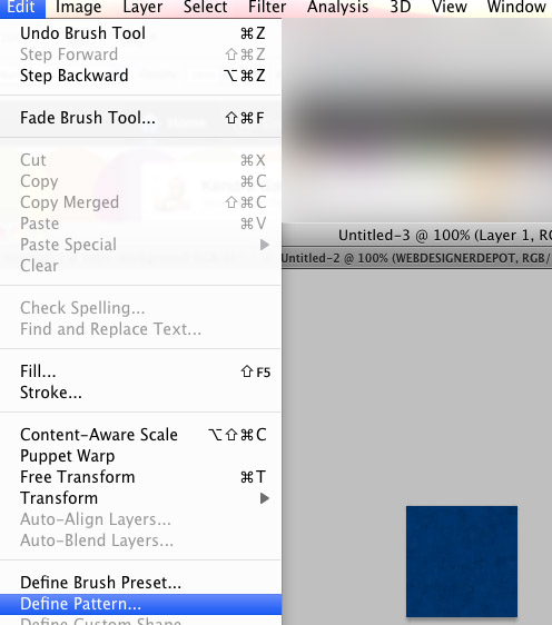 The final step in creating a pattern is to define your pattern. Go to Edit > Define Pattern and a dialog box will pop up asking you to name your pattern. Name it whatever you would like. To retrieve your pattern grab your Paint Bucket (G) and make sure it's in pattern mode. Your newest pattern will most likely be the last pattern. Select it and fill your canvas with the pattern.
Final image

Second pattern
This second pattern allows us to use some geometrics with a subtle grunge flavor.Step 1.
 Again, of course we are going to create our new document by following the steps in the previous short tutorial. We are also using the same canvas size of 100px by 100px. This time we will choose two different gray colors. For the first color, we choose a light gray (#d7d7d7). Fill your canvas with the lighter color.
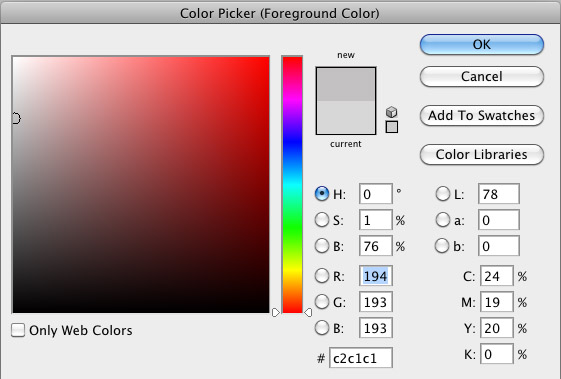 For the second color we are choosing a darker gray (#c2c1c1). Later, we will use this color for lines.
Step 2.
Step 3.
 Create a New Layer (Ctrl/Cmd + Shift + N). Left click and drag your line tool diagonally from corner to corner (hold Shift to make your light exact).
Step 4.
 Create another New Layer. Do the same with your line tool for the other side. Once I finished my lines and got them placed correctly, I found it easiest to merge these two layers. If you are in Shape Mode it should be as easy as highlighting the most recent (top) layer and clicking Ctrl/Cmd + E to merge it with the layer underneath it.
Step 5.
 To make things easy, I like to use the Trim option to remove all the excess stuff you can't see. To do this go to Image > Trim, and typically you should be able to push OK and everything you can't see is deleted.
Step 6.
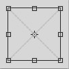 With your lines merged, you want to scale them down so there is a bit of space between the 'X' and the edges. To do this, you want to push Control/Cmd + T and hold the Shift and Alt keys to keep the proportions and scale it down from the center. Scale it down as you please.
Step 7.
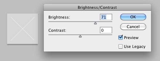 I wanted to make my 'X' look a bit embossed, so I duplicated the layer (Control + J) and decided to make it lighter by going to Image > Image Adjustments > Brightness/Contrast. I turned my Brightness all the way up until it was a nice light gray/white color. When you have a color you approve of, press OK.
Step 8.
 Next, you want to adjust your lighter layer whichever way you please. Grab your arrow tool (V), and nudge your layers around by clicking the arrow buttons. I also moved my layers around to change the look. Play around with it until you get something you like. (I ended up putting my lighter 'X' layer under the other and nudging it down just once).
Step 9.
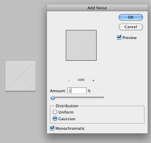 Once you are finished figuring out how you want to position your lighter and darker 'X', add some noise to the gray background. It's too be very subtle so go to Filter > Noise > Add Noise and only add 1% of Noise. Keep the distribution Gaussian and make sure the Monochromatic box is checked.
Step 10.
 Once you do that, you are going to want to change the size of your image. Go to Adjustments > Image Size and scale it down as small as you'd like. I set mine to 75px by 75px. And again, you're going to want to define your pattern by going to Edit > Define Pattern, naming your pattern, and pushing OK. Below is what the final image would like.
Final image

Third pattern
This pattern is still a bit geometric with less of a noticeable variation.Step 1.
 For this pattern, I started out with a larger canvas size of 150px by 150px because we are going to be a bit more precise here. Start off by choosing a really dark gray to fill your canvas.
Step 2.
 As in the previous pattern, we are going to use the Line Tool (U). Choose a lighter gray color to create your lines. It doesn't have to be perfect. Something like the above will do fine.
Step 3.
 Next you want to get your Brush Tool (B) and get a soft brush to paint a soft brushed larger line over the second light gray line. I used a darker color here (black) for my line. Feel free to experiment with different types of colors.
Step 4.
 Now we are going to shrink the size of this pattern by going to Image > Image Size; I changed it to 10px by 10px. Once you've changed the size, you want to go to Edit > Define Pattern > name your pattern and then click OK.
Step 5.
 Create a new document—this time I chose the size 615px by 450px, though yours doesn't have to be that big. Anything bigger than 200px on each side should work. Grab your Paint Bucket (G), make sure it's in Pattern Mode (there will be a drop down menu with the options 'Foreground' and 'Pattern') and grab the pattern you just made. Fill your canvas with that pattern like the above image.
Step 6.
 Now we would normally be done, but we want to make some changes to the look of the lines. Go to Filter > Brush Strokes > Angled Strokes to get the effect we are going for. Again, I encourage you to play around until you find something you like but here are the settings I used: Direction Balance of 73, Stroke Length of 6, and Sharpness of 4. Press OK to submit the changes.
Step 7.
 That is the final outcome, but in order to make it a seamless pattern, I grabbed my Crop Tool (C), and selected a square area (Shift + Left Click) that seemed to be pretty consistent to me. It's easy to eyeball things like this--you just want to make sure your left side begins where your right side ends and your top begins where your bottom ends. Again, when you've found a suitable region, Edit > Define Pattern and try it out.
Final image

Fourth pattern
More of a little bit of dirt with a consistent repetitive, yet subtle, value.Step 1.
 For our fourth pattern we are going to use another line type of base. Again we are going to start with a New Document with a size of 100px by 100px. For the color, I have a regular white background and I chose a very light gray for the line color. We are going to grab our Line Tool (U) and draw a horizontal line at the very top, as well as a line in the middle.
Step 2.
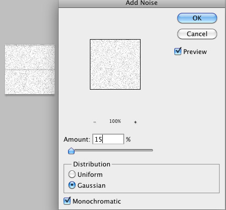 Now this one is going to be a bit more 'dirty' than the rest so we want to add a bunch of noise to it. With the white background layer selected, go to Filter > Noise > Add Noise and change the Amount to 15%, Distribution to Gaussian, and check the Monochromatic box.
Step 3.
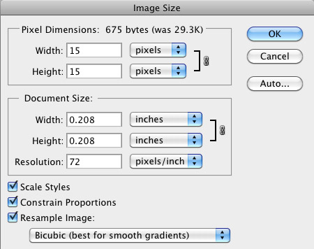 For this one, again we are going to make the size a bit smaller, so we will go to Image > Image Size and for this one, I changed the size to 15 pixels by 15 pixels. Once you've done that, create your pattern by Edit > Define Pattern > naming your pattern and submitting the changes. Use as you please! Keep in mind, however, if you want your pattern to look less repetitive, try increasing the canvas size so that you can increase your variation.
Final image

Fifth pattern
For this last pattern, I wanted to attempt something dark, with just a bit of a texture.Step 1.
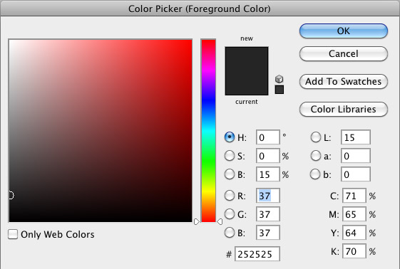 Once again, I've created a new document with a canvas size of 100 pixels by 100 pixels. For this last pattern, we are going to choose a very dark gray color for our background.
Step 2.
 To jump right in, we are going to add some very useful noise by going to Filters > Noise > Add Noise: Amount 5%, Uniform Distribution, with Monochromatic enabled.
Step 3.
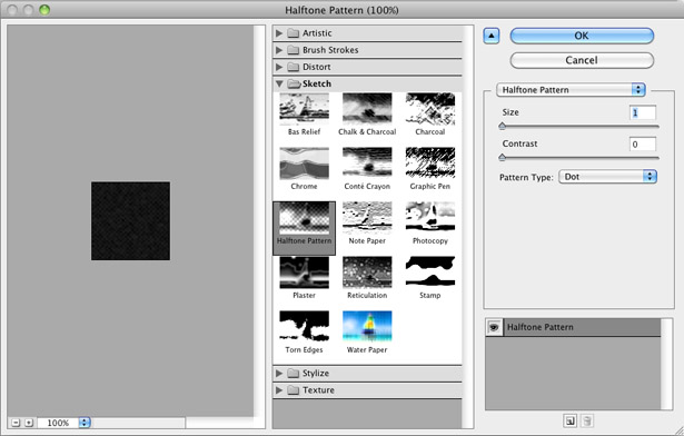 To create the desired effect here, we are going to go to Filters > Sketch > Halftone Pattern. Feel free to play around here, but the values I used were: Size of 1, Contrast of 0, Pattern Type of Dot.
Step 4.
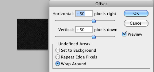 We previously used this Offset feature to help us make a seamless pattern. We are going to do the same thing again. Go to Filter > Other > Offset and enter the half of your height and width value. Make sure your Undefined Areas are set to Wrap Around and Press OK. Once this happens you will want to use the Healing Brush (J) again to try to smooth out the areas that are less seamless. Once you have gotten it to a place you like it, go to Edit > Define Pattern > name your pattern, press OK and use your new pattern.
Final image

Keep in mind...
When you are creating these patterns, feel free to experiment so that you can find something you really like and that's unique. As you can see, there are a couple of Filters and Filter families that can really help you in creating unique subtle backgrounds for your next web design project. Also, if you want more variation in your patterns, use larger canvas sizes and again, don't be afraid to explore with different things. What are some techniques you like to use to create your own subtle backgrounds?Kendra Gaines
Kendra Gaines is a freelance designer from Virginia, USA. Connect with her.
Read Next
3 Essential Design Trends, November 2024
Touchable texture, distinct grids, and two-column designs are some of the most trending website design elements of…
20 Best New Websites, October 2024
Something we’re seeing more and more of is the ‘customizable’ site. Most often, this means a button to swap between…
Exciting New Tools for Designers, October 2024
We’ve got goodies for designers, developers, SEO-ers, content managers, and those of you who wear multiple hats. And,…
15 Best New Fonts, September 2024
Welcome to our roundup of the best new fonts we’ve found on the web in the previous four weeks. In this month’s edition…
By Simon Sterne
3 Essential Design Trends, October 2024
This article is brought to you by Constantino, a renowned company offering premium and affordable website design
You…
A Beginner’s Guide to Using BlueSky for Business Success
In today’s fast-paced digital world, businesses are always on the lookout for new ways to connect with their audience.…
By Louise North
The Importance of Title Tags: Tips and Tricks to Optimize for SEO
When it comes to on-page SEO, there’s one element that plays a pivotal role in both search engine rankings and user…
By Simon Sterne
20 Best New Websites, September 2024
We have a mixed bag for you with both minimalist and maximalist designs, and single pagers alongside much bigger, but…
Exciting New Tools for Designers, September 2024
This time around we are aiming to simplify life, with some light and fast analytics, an all-in-one productivity…
3 Essential Design Trends, September 2024
September's web design trends have a fun, fall feeling ... and we love it. See what's trending in website design this…
Crafting Personalized Experiences with AI
Picture this: You open Netflix, and it’s like the platform just knows what you’re in the mood for. Or maybe you’re…
By Simon Sterne
15 Best New Fonts, August 2024
Welcome to August’s roundup of the best fonts we’ve found over the last few weeks. 2024’s trend for flowing curves and…
By Ben Moss


