 I started my career as an illustrator until a motorcycle accident took my career. My smashed hand, arm, and spirit never recovered to the point I could handle a drawing tool again. I always tried to reach for impact…shock…lasting impressions…some said nightmares.
Luckily, my hand could hold a computer mouse very nicely and, with a lot of study and experience, I moved into the design field and became an art director, sitting across the desk from illustrators as my vendors.
There was a great difference between the people I use to service as clients and myself—I allowed greater freedom to the artist and encouraged them to go a step or two farther with the visual impact. I argued the points with editors to publish art that meant something. Not just to compliment a story but to push it forward and have it stick in the reader’s mind.
To be creative, in my thinking, was to let go of convention and reach, even to test your abilities to make visual images that would speak volumes and make lifelong impressions in people’s minds.
Fast forward to recent days and publishing has turned into online content and illustrations are all stock purchases. Think about what you see on web sites. Images of business people shaking hands, sitting at computers, shaking computers with other business people, blah, blah, blah. If I see the same Getty image of the young businessman offering his hand towards the viewer, I’m getty-ing the heck out of this business!
 At least this stock photo of businessmen shaking hands from 123rf.com has them jumping in the air.
What is “too far” with an image?
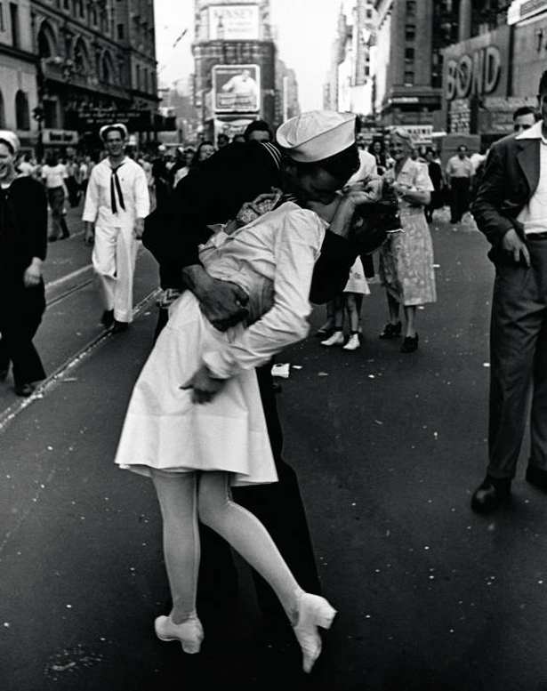
How do people decide what is “too far?” It’s usually subjective. The “taste filter” falls upon the final decision maker and there’s nothing an illustrator, designer, or photographer can do about it. Suck it up and move on. If you fail to get past the “taste filter” enough, you are not a reliable vendor. I believe in going as far as possible in my thought process and being pulled back by editors, rather than self-editing and second-guessing my client. I want them to have my best. If they think my best isn’t for them, then the working relationship won’t produce a great product for them, I won’t be happy doing the work, and it will show. Let’s face it: the money isn’t enough these days to worry about losing a client. The only upside to crappy fees is the strength it gives you to walk away proudly. Certain images that shocked people decades ago aren't seen as even a bit disturbing today. In the Second World War, Life magazine ran the first photo of the bodies of dead American Marines, lying on a beach in the South Pacific (inset image). Obviously, the larger image of the beach at Tarawa is even more disturbing. Had that image been released to the public, who knows what the effect would have been on the morale of the American public.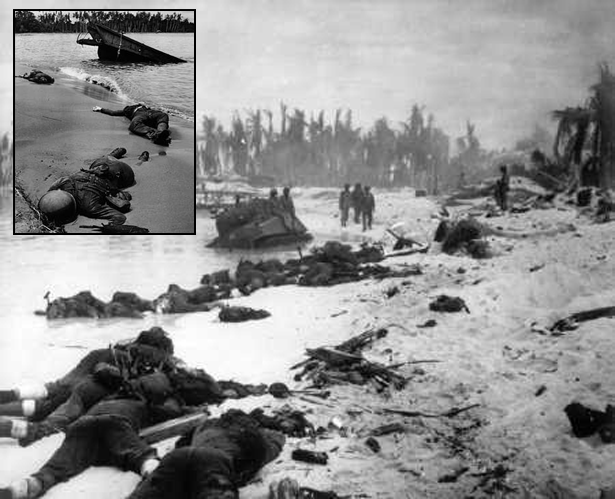 Certainly there were thousands of violently sickening images that came out of that war, as it does with any war. One image of joy and celebration has become iconic with the end of hostility. After several decades, the sailor and unsuspecting nurse he accosted in Times Square in Alfred Eisenstaedt’s photo were identified. Yet another happy ending and photo opportunity.
 The Vietnam War was fondly called "the war we watched from our living rooms." The nightly news aired footage from the battlefield while people ate their dinner and waited for prime time TV shows to come on. Still, as with every war, iconic images were published that stirred anti-war sentiments.
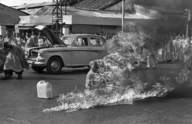 Early in the war, a Buddhist monk immolates himself in protest to the treatment of Buddhists by the South Vietnamese government. After this incident, Americans were suspicious of the South Vietnamese government.
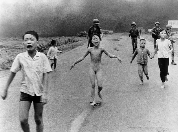 Children running from a napalm attack, one with her clothes burned off, brought attention to the American public of the involvement of civilians in the conflict. It put a face of the innocent victims of the U.S. bombing.
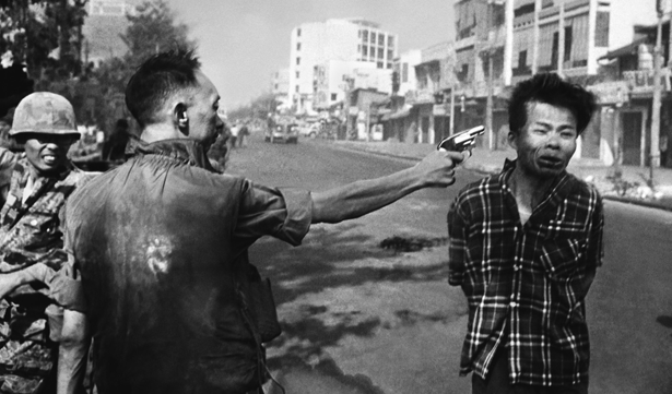 One of the best known images from the war was the execution of a suspected VC soldier in the street. The image was shocking and also deteriorated support of the war.
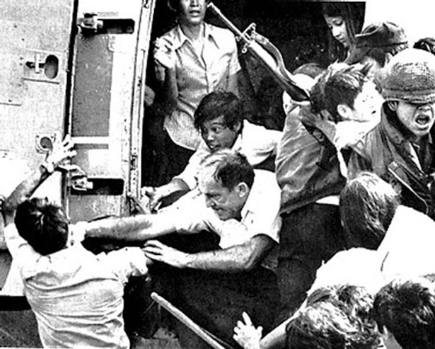 The last chopper out of Saigon in 1975. A U.S. diplomat punches a Vietnamese man to keep him from overloading the aircraft as women and children were still boarding. The man behind him obviously is trying to help the man get on board. It spoke to emotions of desperation and sorrow. It was also an end to over a decade of disturbing images that haunted Americans and the world each and every day.
Images need to motivate!
The web moves in the blink of an eye and mistakes can be fixed faster than a retraction can be printed. It is also possible that, as we saw with the recent turmoil in the Middle East, news has become immediate with people able to post images globally. It is important, as professionals, to know the product/consumer/reader and create appropriately. The wrong image posted to a site will become viral, be shown on Web Soup and Tosh.0 and become a PR nightmare for a company or publication. A recent viral blunder was a famous clothier that put a picture of a pair of pants with a male model who was rather…“excited” to be wearing the pants. Splashed all over the internet, I believe it to be the best form of advertising, but obviously I’m not the best when it comes to being a “taste filter.” Aside from little mishaps that occur, usually in print, it is important to remember the power magazines that featured photos and illustrations had to the public. LIFE magazine was the premier, over-sized magazine that gave people a view of events and people around the world. National Geographic showed scenes few would ever witness and became the favorite of teenage boys with shots of bare-breasted tribal women. That, of course, was before the days of the internet when a simple click on a “I’m over 18” button led to a portal of porn videos. The New Yorker, although revered for its brilliant writing, is probably more popular for the cartoons it publishes, even though most of them make absolutely no sense whatsoever. Power of the image!Diane Arbus, Richard Avedon…
Pronounced “Dee-ann,” Diane Arbus (1923-1971) was a photographer from a privileged upbringing but known for her stark images of “unusual subjects.” Her images were, stark but truthful and they gave life and a humanity to her subjects who were…shunned by society as “imperfect,” “odd,” and “freakish.”

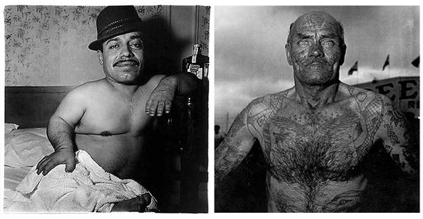
 Photos ©Diane Arbus
It was said of Arbus, however, "in photographing the retarded, [Arbus] waits for the moment of fullest expression of disability: she shows people who are slack-jawed, vacant, drooling, uncoordinated, uncontrolled, demented-looking. She does not flinch from the truth that difference is different, and therefore frightening, threatening, disgusting. She does not put herself above us—she implicates herself in the accusation."
Arbus was brilliant and her images live on long after her. She committed suicide in 1971. An end shared, unfortunately, by many who photograph the harsh realities of life.
Richard Avedon (1923-2004) outlived Arbus and was also known for his stark images of people but he gained notoriety for capturing thoughtful shots of the famous and beautiful. Heavily into fashion and celebrity, he photographed presidents, actors, models, and the common person, giving them all the same treatment through his camera lens. Unlike Arbus’ real, on-the-spot shots of her subjects in their surroundings, which told more of their stories as real people, Avedon took the famous and lowered them to the status of real people by capturing them in stark and empty surroundings. Arbus’ subjects were freaks and outcasts and her images gave them an air of joy and normalcy. Avedon’s subjects, who had everything in the world at their fingertips, became lonely, sullen people surrounded by nothing.
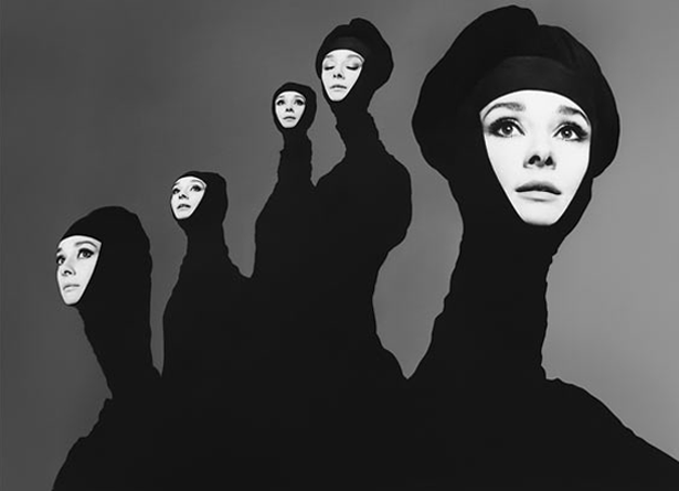
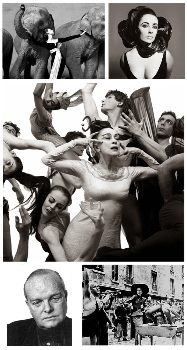
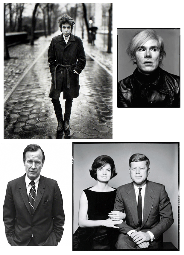 Photos © Richard Avedon
It’s odd that two contemporaries, at different ends of the spectrum in the same field, took their subjects and had them meet in the middle. Freak or famous, these two photographers elevated and lowered all of them into a certain nakedness that equalized them all.
Sickening or fascinating?
In March 1993, photographer Kevin Carter made a trip to southern Sudan, where he took the now iconic photo of a vulture preying upon an emaciated Sudanese toddler near the village of Ayod. Carter said he waited about 20 minutes, hoping that the vulture would spread its wings. It didn’t. Carter snapped the haunting photograph and chased the vulture away. Carter won the Pulitzer Prize for this photo, but he was also haunted by it. “I’m really, really sorry I didn’t pick the child up,” he confided to a friend. Journalists in the Sudan were told not to touch the famine victims, because of the risk of transmitting disease.
Some called him a “predator” for not helping the child (he did make many attempts to find out the fate of the child after the picture was published in the New York Times). Consumed with the terrible violence he’d witnessed, and haunted by the questions as to the little girl’s fate, he committed suicide several months later. Ironically, shortly after his death, a package arrived with messages from Japanese school children, telling him how much the photo had affected them and that it had caused them to see the world in a different light.
As with this image and millions of photos of dead bodies and suffering victims, we are reminded, while sitting in the comfort of our clean and peaceful homes, of the violence and cruelty that surrounds us, and it serves to remind us of what may strike at any moment. It jabs a knife into our gut to show us that we are human and cannot ignore our own humanity. It makes us uneasy and sticks with us for a lifetime. Not click by click, moving on to some new distraction—iconic images…change us.
Taking images a step further
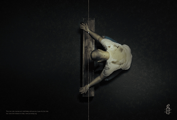
Amnesty International is known for not holding back. For obvious reasons, they cannot. For the creatives at advertising agencies, AI is a dream client. One can push beyond convention and reach for the strongest impact and visuals that will have an impact that will stick with the viewer for as long as possible, if not forever. These print ads by JWT, UAE incorporate not only powerful images of torture, but the placement in the magazine's center spread used the staples in the victim's wrists as part of the message.
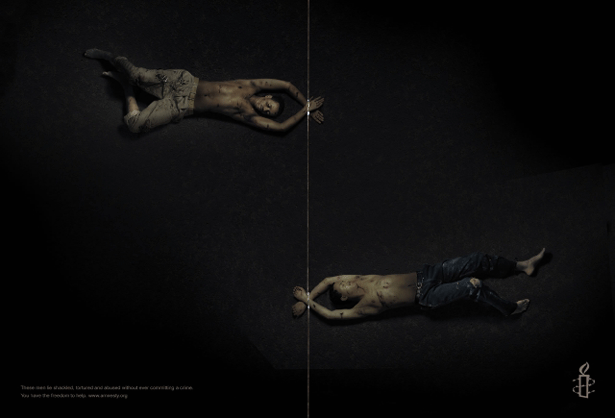
 This environmental ad for Amnesty International by TBWA, Paris uses the brick wall to drive home the message.
 While good causes have created stronger messages through shocking images, PETA has come under huge criticism for "missing the mark" with their anti-fur ads but even the "kinder" and "gentler" World Wildlife Fund took a step into the shock zone with some images with Photoshopping to strengthen the message.


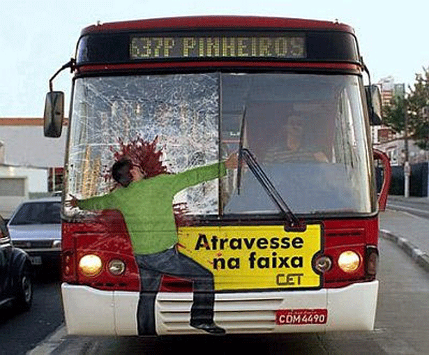
 The Brazilian Government doesn't hold back with their message on pedestrian safety. Quite an example of environmental advertising.
 An odd image with a message I don't quite get, is this one for PSP by Sir JJ Institute of Applied Art Advertising in Mumbai, India. Is the message that you can have fun killing people on PSP games or is it that video games are desensitizing us to violence. I hope it's the latter as the image would work well for such a message. If it supports PSP as a "fun" killing machine, then I weep for the creatives that thought that one up.
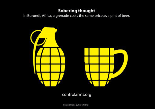
 Simple and straightforward, these ads by Efekt, USA, say it all in a simple and bold fashion.
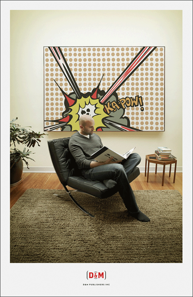
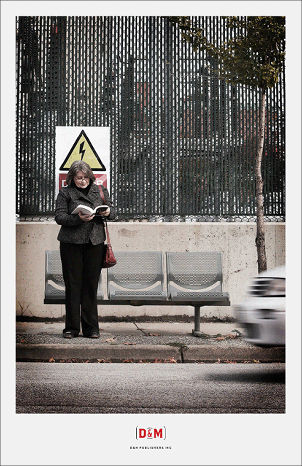
 Not all images need to tug at the emotions of the viewer. In a global economy, advertisers need to embrace the image that speaks to every language on the face of the Earth. These ads by D&M Publishers send a fun but clear message about reading.

What about video?
Do I have to go into the power of video? With the advent of affordable video cameras, ordinary people caught incidents that shocked the world. The Rodney King beating by Los Angeles police was one of the roots of the L.A. riots that spawned even more shocking video of violence that found its way into living rooms across the globe. Now that every cell phone has video cameras, images are uploaded to Youtube by the millions. One of my favorite public service ads from decades ago was one by the American Cancer Society. Search as I can, it just doesn't seem to be on any web site or Youtube. It started with an elegant, beautiful woman smoking a cigarette. As she continues smoking, she is further covered by tar until she is completely covered and screaming in horror. The tag line was, "if what happens on your inside happened on the outside, you would quit smoking." It was so disturbing that it didn't run long. The public's sensibilities back then couldn't handle such a strong message. A shame, as it was very powerful and well thought out...except for just how strong of a message it was. Another favorite of many was this commercial that ran for many, many years... But shock, horror and sorrow isn't the only strong message. There's enough of that in our daily lives. As a former member of the Usual Gang of Idiots at MAD Magazine, I believe that humor has a strong message, too. My favorite commercial from the "Got Milk" people was this one... Unfortunately, the humor must have been a bit too over the top for the American public and the commercial didn't get a lot of play. I thought it was brilliant but I have weird sense of humor. Thumbnail image ©Nick VeaseySpeider Schneider
Speider Schneider is a former member of The Usual Gang of Idiots at MAD Magazine and has designed products for Disney/Pixar, Warner Bros., Harley-Davidson, ESPN, Mattel, DC and Marvel Comics, Cartoon Network and Nickelodeon among other notable companies. Speider is a former member of the board for the Graphic Artists Guild, co-chair of the GAG Professional Practices Committee and a former board member of the Society of Illustrators. Follow him on Twitter @speider or add him on Google+
Read Next
3 Essential Design Trends, November 2024
Touchable texture, distinct grids, and two-column designs are some of the most trending website design elements of…
20 Best New Websites, October 2024
Something we’re seeing more and more of is the ‘customizable’ site. Most often, this means a button to swap between…
Exciting New Tools for Designers, October 2024
We’ve got goodies for designers, developers, SEO-ers, content managers, and those of you who wear multiple hats. And,…
15 Best New Fonts, September 2024
Welcome to our roundup of the best new fonts we’ve found on the web in the previous four weeks. In this month’s edition…
By Simon Sterne
3 Essential Design Trends, October 2024
This article is brought to you by Constantino, a renowned company offering premium and affordable website design
You…
A Beginner’s Guide to Using BlueSky for Business Success
In today’s fast-paced digital world, businesses are always on the lookout for new ways to connect with their audience.…
By Louise North
The Importance of Title Tags: Tips and Tricks to Optimize for SEO
When it comes to on-page SEO, there’s one element that plays a pivotal role in both search engine rankings and user…
By Simon Sterne
20 Best New Websites, September 2024
We have a mixed bag for you with both minimalist and maximalist designs, and single pagers alongside much bigger, but…
Exciting New Tools for Designers, September 2024
This time around we are aiming to simplify life, with some light and fast analytics, an all-in-one productivity…
3 Essential Design Trends, September 2024
September's web design trends have a fun, fall feeling ... and we love it. See what's trending in website design this…
Crafting Personalized Experiences with AI
Picture this: You open Netflix, and it’s like the platform just knows what you’re in the mood for. Or maybe you’re…
By Simon Sterne
15 Best New Fonts, August 2024
Welcome to August’s roundup of the best fonts we’ve found over the last few weeks. 2024’s trend for flowing curves and…
By Ben Moss


