 Dieter Rams, a German industrial engineer, is one of the most influential designers of the 20th and 21st centuries. He is best known for his work with Braun consumer products.
Among them are the T3 pocket radio — on which the design of the Apple iPod was based — and the 606 universal shelving system.
One day, as the story goes, he asked himself, "Is my design good design?" His answer to that question gave rise to his famous ten principles. His ethos is the mantra of modern designers: Less and More.
These principles were born in the realm of industrial engineering, but can equally be applied to web design.
Good design is innovative
Innovative design exists to provide long-lasting, robust solutions to problems that constantly evolve. For example, at the beginning of the mobile revolution, creating a separate website for mobile display was the norm, until responsive web design came along. Responsive web design enables a website to seemingly "adjust itself" to any screen size through CSS media queries.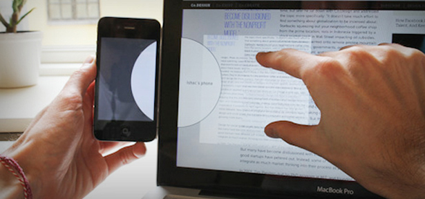 Ishac Bertran devises a clever, more intuitive way to synchronize media across many devices. In this picture, a white circle appears when the phone is placed alongside the monitor. The user here attempts to save a web article for later reading by highlighting the content with his fingers and dragging them into the circle. The cloud takes care of the data transfer in the background.
Innovative design is also feasible and actionable. It's simple, and it does what it's supposed to do. At the same time, innovative design is stylish and aesthetically pleasing.
How can you produce innovative design? Do not let trends trap you. Steal ideas and improve them. Do not copy; rather, be inspired by the work of others. What you create does not have to spark a Renaissance, but it has to stand out.
Convention is your friend, but do not let it hinder your creativity. It's okay to be guided by rules and guidelines, but it's also alright to break them for the sake of innovation.
 Think outside the box.
Good design makes a product useful
What use is a very pretty website if users do not find it useful? The old version of Yahoo is hideous by today's standards, but, despite the browser limitations of its time, it was highly usable. It functions as it should: an online directory of information.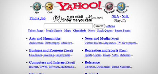 The Yahoo! Homepage circa 1997
Study first; design later. Understand the goals, needs and behavior of your target users. Place yourself in their shoes.
Make your designs simple, but not empty. Do not add more features for the sake of adding features. Use decorative elements to show the crucial aspects of a web page, not to display your Photoshop talents.
Make content readable. Learn the principles of good typography. Use 2-4 typefaces at most. Design your page along a baseline grid.
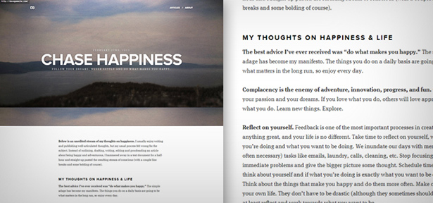 Dave Gamache's blog uses effective typography to help users focus on what he has to say.
Good design is aesthetic
Aesthetics is visual harmony. It doesn't just refer to being "pretty." Each element of a webpage should be positioned, sized or colored for a reason. If it serves no purpose, it will only clutter up the page, not add aesthetic value to it. How do you create aesthetic design? To start, use meaningful colors. Decide on your color schemes carefully; don't be afraid to try other palettes. The colors that you choose for your website defines part of the experience it delivers. Study color theory and the psychology of hues.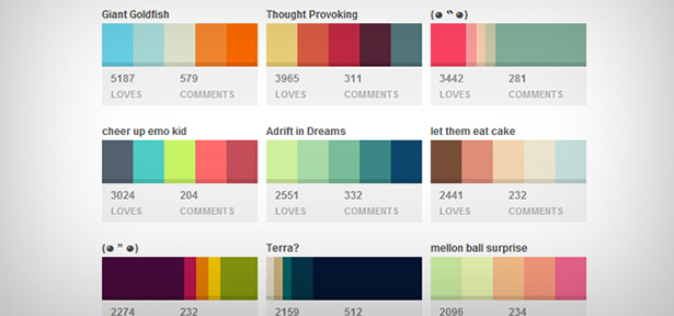 Colourlovers is a great place to get color inspiration. Create your own palettes and save them for later.
Nature also has an uncanny talent for constructing color schemes -- sunsets, plants, animals and landscapes. These objects in nature (including human features) that follow the golden ratio are things we find beautiful.
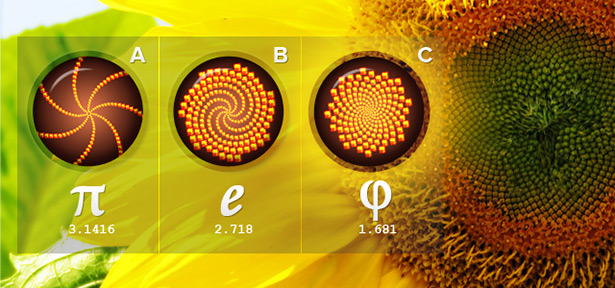 The pattern of seeds in this beautiful sunflower is controlled by the golden ratio. Patterns A and B on the left are what the seed spirals would look like if Nature had used a different irrational number. Pattern C shows the golden ratio at work.
Good design makes a product understandable
If you want to know how to make something understandable, take a look at the iPhone's lock screen. Have you ever noticed the subtle glow along the slider that moves in the direction in which you should slide? Subtle yet helpful.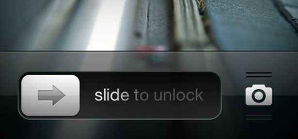 The arrow and the animated glow will tell you that you need to slide the button to the right to unlock your phone.
Navigation is the first thing a user will look for when visiting a website. Online users have short attention spans and fragile temperaments; if they don't understand how the home page works in just a few seconds, they leave. When that happens, the last emotion they will associate with your brand is frustration, which (obviously) is detrimental to business.
Make menus noticeable, and use concise labels. It's also a good idea to illustrate processes or steps, rather than dictate them. Gauge your target users' level of expertise first though. Tone things down for kids; be straightforward when dealing with a smarter demographic.
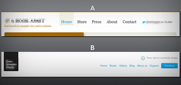 Two similar websites with different personalities. Judging by the navigation menu alone, can you tell which one is more customer-centric?
Good design is unobtrusive
A good website design never draws more attention to itself than necessary. Rather, it should enforce user goals. Users need to be able to find what they need on the website easily. Let's take the case of Victoria Secret's case; a Victoria's Secret outlet is designed to have the cashier located at the back of the store. This gives the customer plenty of opportunities -- unsolicited ones -- to look at other products in the store and get distracted by items that are on sale. This increases the chances that they'll add something to their basket. Online, it's different. The checkout process is straightforward, secure and quick. The goal is to get the customer to buy what she wants as quickly as possible. No dilly-dallying required. The brick and mortar Victoria's Secret experience de-emphasizes the checkout process. Photo by Dwight Burdette.
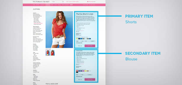 Customers don't have to search for the blouse that the model in the picture is wearing. Many ecommerce websites lack this. The process of having to search for another item is itself obtrusive: it deters the customer from buying and may even lead to frustration.
As a designer, you can either control attention or let it wander around aimlessly. Don't use colors that clash on pages that contain important information. Instead, use colors to paint a path for the eyes to follow and lead users to what's important. Aim for succinctness and simplicity. In the example above, the Victoria's Secret website does not have any ads and it sports a clean design. The navigation, though extensive, is intentionally subtle. This keeps the customer focused on two aspects: the product and the act of buying.
Good design is honest
Some websites incorporate elements that subliminally lead visitors to hidden pages or trick customers into taking unwanted actions. For example, think of complicated opt-out clauses on subscription forms. The double-talk and multiple negatives must be parsed, then tiny checkboxes (hidden within the paragraph, of course) located and checked or unchecked. It's perfectly acceptable to use design principles to aid users in making decisions and point them in a certain direction, but always be careful not to take it too far. It's unethical to use these principles to outright make decisions for visitors. Suggesting an up sell is helpful; using default options to sneak it into their cart just before checkout is deceptive. Honest design should be like a shopping assistant in an upscale department store -- not like a carnival barker. The subliminal force is strong on this page. Notice how three arrows (including the shape of the photo) point to the sign up box, while one points up to "Buying A New Home." These are called directional cues. They are subliminal but not misleading.
This honesty means providing an open approach to the user by giving them choices and clarifying the purpose of elements. Links in navigation should always lead to the right pages. Titles should reflect the actual content. Never use dark patterns; doing so is unethical and will burn you in the long run.
 A variant of the "sneak into basket" anti-pattern. According to this user, upon his second visit to the Ryanair website, the fare for the same ticket almost doubles. Clearing browser cookies sets the price back to its original value.
Good design is long lasting
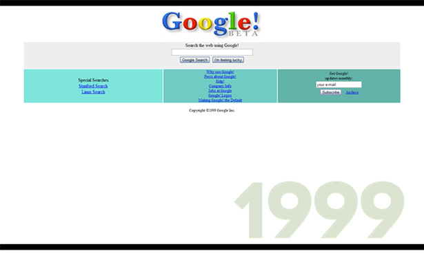
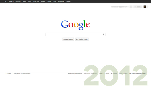
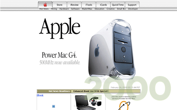
There is a thin line between what's trendy and what's good. Many trends are justified, but one thing remains certain: they always feel outdated after a while. Good design, on the other hand, is robust and evergreen. How do you create lasting designs? Avoid trends like the plague! Maintain basic usability and structure. Web trends come and go, but the principles of usability and user experience remain the same. Take a gander at some websites that have maintained their basic structure over the years. Coincidentally, they are also among the world's most influential brands.Amazon
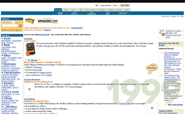
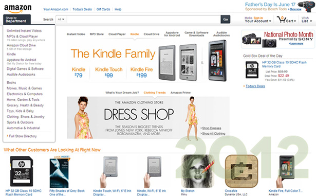
Apple
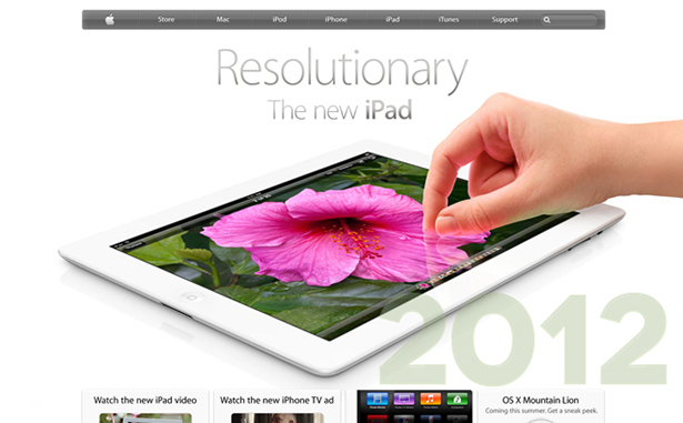
Good design is thorough, down to the last detail
Each element on a web page should exist for a reason. Nothing should be created, positioned or changed on a whim. Thoroughness gives birth to elegance, robustness and timelessness. To be thorough, give each element the same care and attention that you would the entire page. Every pixel should be important to you as a designer. Rectify your mistakes -- don't hide them. Create a design process that works for you and follow it by heart.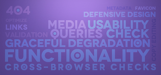 Use a checklist if you have to.
Good design is environmentally friendly
Optimize without sacrificing user experience. Reduce the amount of bandwidth it takes to load an entire page by using optimized markup, web-optimized images, and minified JavaScript and CSS. The less time users spend waiting for your website to load, the more time they have to enjoy it. At the same time, you might even help reduce the energy consumed in serving and rendering your website, thus reducing its "carbon footprint." A website should remain usable and aesthetic regardless of the device, platform and browser environment in which it is displayed. User experience changes as environments change, and your design should be able to cope. Apply the principles of responsive web design, graceful degradation or progressive enhancement.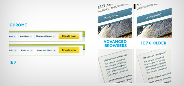 Graceful degradation is the practice of building a website so that it provides a good level of user experience in modern browsers, while degrading gracefully for those using older browsers. The design may not be as pleasant or pretty, but older systems will still be able to enjoy basic functionality. Though it is possible to "force" older browsers to adapt (e.g. rounded corners), it can only be achieved at a cost.
Good design is as little as possible
Less is more. For many designers though, it's very easy to get carried away with adding decorative detail.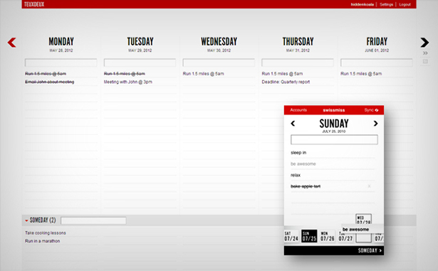 TeuxDeux is an online task management application that sports a very clean, minimal yet highly intuitive interface. Here's a screenshot of it in action along with its iPhone app.
Minimizing clutter in a design takes great effort -- even more effort than it takes to add elements. The key to achieving simplicity is sticking to the fundamentals of your design. Remove anything that does not contribute to a better experience for your user. With less, you can achieve more.
Define your site's purpose beforehand. Your website needs to have a strong focal point. As you add design elements to your site, continue to ask yourself questions about their purpose. Will this reinforce or compliment my site's goals? How will its absence affect the overall design? Is this element needed or am I just trying to fill up space?
Simplify your color choices. Creating a minimal design doesn't mean you're stuck with a black and white palette. Use small pops of color to paint a path for your users' eyes to follow.
Locate trouble spots. Grab a volunteer or some professional testers and give them a list of tasks (i.e. purchase a book from your store, contact you for an inquiry or subscribe to your blog). Watch closely and see if these are easily accomplished. Don't give them any hints or tips; just observe. Did they know where to click? How many times did they click on the "Back" button? Did they get lost? How long did it take for them to accomplish a task?
Conclusion
Good design is the synthesis of all these principles. Applied in web design, these can be powerful tools in creating unique, memorable and effective experiences for your users. Learn them by heart.Dana Winslow
Dana Winslow (aka Dana on Drupal) is a member of the DWUser.com education team. DWUser.com offers software tools for developers and designers, including an easy and free jQuery slider builder, EasyRotator.
Read Next
3 Essential Design Trends, November 2024
Touchable texture, distinct grids, and two-column designs are some of the most trending website design elements of…
20 Best New Websites, October 2024
Something we’re seeing more and more of is the ‘customizable’ site. Most often, this means a button to swap between…
Exciting New Tools for Designers, October 2024
We’ve got goodies for designers, developers, SEO-ers, content managers, and those of you who wear multiple hats. And,…
15 Best New Fonts, September 2024
Welcome to our roundup of the best new fonts we’ve found on the web in the previous four weeks. In this month’s edition…
By Simon Sterne
3 Essential Design Trends, October 2024
This article is brought to you by Constantino, a renowned company offering premium and affordable website design
You…
A Beginner’s Guide to Using BlueSky for Business Success
In today’s fast-paced digital world, businesses are always on the lookout for new ways to connect with their audience.…
By Louise North
The Importance of Title Tags: Tips and Tricks to Optimize for SEO
When it comes to on-page SEO, there’s one element that plays a pivotal role in both search engine rankings and user…
By Simon Sterne
20 Best New Websites, September 2024
We have a mixed bag for you with both minimalist and maximalist designs, and single pagers alongside much bigger, but…
Exciting New Tools for Designers, September 2024
This time around we are aiming to simplify life, with some light and fast analytics, an all-in-one productivity…
3 Essential Design Trends, September 2024
September's web design trends have a fun, fall feeling ... and we love it. See what's trending in website design this…
Crafting Personalized Experiences with AI
Picture this: You open Netflix, and it’s like the platform just knows what you’re in the mood for. Or maybe you’re…
By Simon Sterne
15 Best New Fonts, August 2024
Welcome to August’s roundup of the best fonts we’ve found over the last few weeks. 2024’s trend for flowing curves and…
By Ben Moss


