 The psychology of logo design is one of the most oversimplified aspects behind the process of creating a logo. It's usually associated exclusively with the choice of colors but is actually much more than that.
While "logo design" refers to the activity of creating a logo, and the term "logo" is used to refer to any symbol created for the purpose of identification, the "psychology of logo design" is the study of any meaning that can be seen in a logo other than the meaning of identification.
In this article, I’ll cover the essence of the topic, bring my own personal perspective to the discussion and hopefully help to create a captivating debate around the subject.
Defining psychology in the logo design process
Before proceeding any further we must take a step back and understand the precise meaning of "psychology" in the logo design process.
Bearing that in mind during the design process, will help you gain at least to some level, control of what this extra meaning is going to be. Essentially, what you need to remember is that every attribute that allows creation of additional meaning, can be used to create meaning, and will eventually — whether you intend it or not — be used to create meaning.
Here's a curious fact that helps a lot to understand what I'm talking about: The term "logo" derives from the Greek word "logos", which literally means "word". So when you're designing a logo, think in these terms, you are actually creating a visual "word" that will be used by people to identify the business for whom you are creating the logo.

The spelling of "logo" in Greek.
People will understand and interact with your logo, the same way they do with words: from their own personal perspective. Which is ultimately led by their own cultural views and personal experiences. If people with distinct levels of education see different meanings for the same word, the chances are they will do the same with your logo.
What you want to do is to think of each part of your logo as an attribute, and then reflect on what each attribute might mean and how people will interpret it. The more time you spend working on the meaning of these attributes, the more control will you have on what people understand when reading your logo.
Since every potential attribute of a logo is virtually infinite, and renders the writing of this article an impossible task, I'm going to focus on the two most common attributes people use to create added meaning: color and shape.
What is the role of color?
The role of color in the psychology of logo design is often misunderstood, usually by the clients themselves, but not without reason. Considering the sheer amount of articles on the web stating that red is “this” and yellow is “that”. It becomes self-evident the result is going to be catastrophic. The oversimplification of the meaning of color is the main generator of this typical briefing: “I want my logo red, yellow, green, purple and brown because...”
Somewhere, in a mystical place, a fairy dies every time I hear this sort of request.
Yes, colors do have additional meaning, but they aren't set in stone. People have been giving meaning to colors throughout the centuries, and the continuous process of attributing the same meaning to the same colors again and again is what ends up solidifying it.
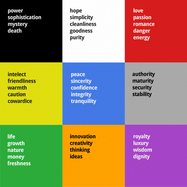
Choosing the right color for your logo is going to get you one step ahead in the added meaning game, but beware; different colors have different meanings in different societies. The image below show the most common interpretations people give to colors in western countries.

But please don't take this at face value. My main advice when picking a color for your logo is to pick just one. That's it, just one color.
Choosing a single color gives you more control of what people will see in your logo, and on top of that, you can also use it as your branding strategy. With time people will start to associate the color with your brand. Check out these examples:

One final piece of advice before I proceed to the next point. Whatever color you choose, make sure that your logo works well in black on a white background, and also in white on a black background. Why? First because that's good practice and is going to help you build a strong identity, but from a psychology point-of-view, whatever meaning you are adding with color, should always be complementary, and never essential to the understanding of your logo.
What is the role of shape?
From a psychological perspective, there's nothing more relevant than shape. The human brain is hardwired to understand and memorize shapes. It's the way we learn things. A distinctive shape is remembered long after we have seen it. Do you remember the shape of Nike's logo? The McDonalds sign? Or perhaps the Olympic Games symbol?

We often create a big distinction between type and mark, but if you think about it, letters are nothing but shapes we associate with a meaning and a sound. When designing a logo, you should work on the shape of each letterform individually, looking to add meaning to the finest of details. Following this recipe often results in a powerful and memorable logo.
Let's take a look at the good, the bad, and the ugly of the psychology of shape in logo design.
The good

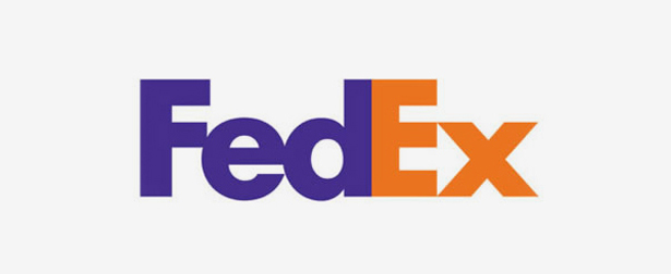
Can you see an arrow in the Fedex logo?
This is one of the best examples of the use of psychology in the design of a logo. The arrow shape created by the negative space formed by the letter "E" and "X" is as far as my opinion goes, the work of a genius, I wish I had designed that logo myself.
Lindon Leader knew exactly what he was doing by adding a hidden arrow in the Fedex logo. In an interview he said: "I thought that, if I could develop this concept of an arrow it could be promoted as a symbol for speed and precision, both FedEx communicative attributes."
More often than not, designers are guilty of designing with only aesthetics in mind, and this is the main reason behind some of the most disastrous logos ever designed, but when the psychology of design is taken in consideration, that's logo heaven.
The bad
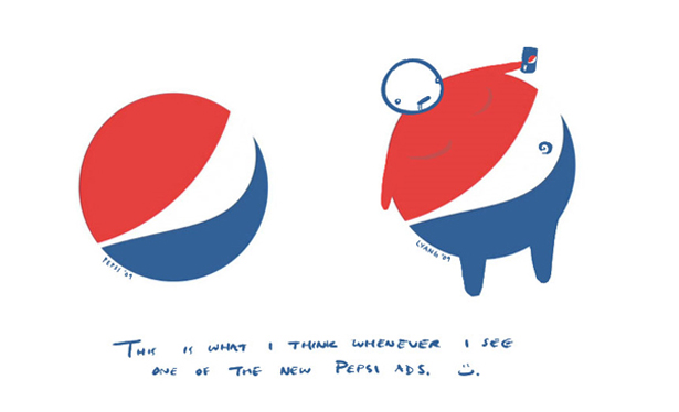
Done! Once you see that, you can never take it back.
This is a very interesting case. Pepsi paid $1 million for the design of a new logo, which was created by the brand strategy agency Arnell Group. The image above shows what San Francisco-based artist Lawrence Yang thought when he first saw the shape of the new logo.
If only they had thought about that before!
Here's where I get back to my initial statement, everything that can be used to create meaning, will eventually, whether you want it to be or not. Even if you pay $1 million for the design of your logo, you're not safe. However thinking about the psychology of shape during the design process may save you some pride.
The ugly
Please, for goodness sake, if not for anything else, and even if you dislike thinking beyond the aesthetic, pay attention to the psychology of logo design to avoid this sort of disaster.

With a logo like this I wonder what else these doctors specialize in.
According to researchers from Ohio State University men think about sex an average of 20 times a day, and women just about 10. Considering this fact alone, it becomes blatantly obvious that if your design leaves enough space for a naughty interpretation, people will see what you don't want them to see.
If you don't think about that during the design process, you deserve to be misinterpreted.
A case in point (Twitter's new logo)
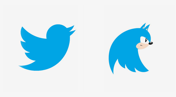
One recent example of the application of psychology to add value in logo design, is the new Twitter logo. The new version was simplified, retouched and re-angled. Now Larry the bird, is looking up; denoting growth, looking into a bright future, as a potential Twitter IPO must be in sight; and in a much more distinctive shape, rendered more memorable.

But there's no escape, as people interact with the new logo, new meaning is created.

Gizmodo reader Ben Flores uncovered a new meaning for the new Twitter logo.
Is there anything else?
Yes. If there's one very specific situation where the psychology of logo design is more effective than any other is when designing a logo for a young audience. It seems that as we get older, we tend to develop a sort of shield to protect us against a never-ending stream of marketing shenanigans, but that's not the case for young consumers.
This is where the psychology of logo design becomes controversial. As we design logos for companies, products and services aimed at children, we must maintain a certain level of integrity, and avoid overusing techniques which are designed to manipulate.
Conclusion
There are very few things that are more relevant to my design process than what feelings and emotions my work will evoke in viewers, more specifically the primary target of my clients.
Choosing the right combination of color, type and mark can easily become a purely aesthetic exercise, but is when you give the time to think about the psychology behind the design that the best work tends to come out.
Feature image by Shutterstock
Have you ever communicated something you weren't intending to? Is there a point at which using psychology to affect our audience becomes unethical? Let us know what you think in the comments.
Ray Vellest
Ray Vellest is a brand identity specialist based in London and working with organizations and individuals from all over the world. Ray’s approach to identity design position his clients as leaders of their industries while creating a valuable long-term asset for their businesses. Follow @rayvellest on Twitter to keep up with his latest updates.


