 Your portfolio website sucks.
You built it to showcase your cumbersome genius, the work on there is spectacular, and it should be the envy of the entire web community.
It was designed to bring in new clients, get you picked up on design blogs, win the respect of your peers, prove to your ex-boss that you do have what it takes afterall, and impress your Mum.
And yet it still sucks. Today we're going to tell you why, covering the three most common mistakes in portfolio websites.
Reason 1: no one, bar none, likes small thumbnail images
You will never pique anyone's curiosity with a tiny thumbnail. If you are using them, your options are:- Cram everything into a very small space so the full meaning is lost
- Crop to an interesting part of the image so the full meaning is lost
Reason 2: no one cares about your client's name
If you're not making the thumbnail image mistake there is a good chance you are making the other big portfolio mistake: the stack of names. You have created a minimal website where the type is the art. Jan Tschichold would be proud of you. But unless you are working for globally recognized brands likes Adidas, Radiohead and the UN, it's unlikely the list of clients you have means anything to anyone. They may even have local recognition where you are, but the web is a global community and if users see a list including Torque Hole, Sminky's and RadPad, it will mean nothing to them. And yet potential clients are coming to your website to see what a great designer you are. They want to see work that resonates with them. After a few clicks on names that sound hollow and made up, they will get tired and bored. You are taking away the user's choice to view what they would like to view. As with the thumbnails problem, users will get clicking fatigue if they have to click on a whole raft of meaningless names. You should let the work speak for itself. In a previous design life I made the same mistake with my portfolio — the result? A drop-off rate that would make you wince. Visitors would spend seconds on the site and very quickly get bored of the clicking — or be appalled by the work — and leave. Mercifully, for the good of the internet, that site no longer exists.Reason 3: half the world can't view Flash anymore
It's time to move on.What you can do about it
Have your portfolio images writ large from the first moment users land on your site. Make them available and knowable at first glance. If people want to find out more about a project then they can choose to, and you can give them a tour of that job. If you have to have thumbnails, have large thumbnails or have a rollover option to make the work pop so that your visitors can then make their informed choice. Here are some examples of incredibly talented people who have made good use of web space to make their projects sing for their visitors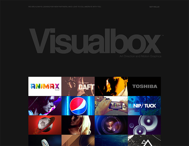 Buenos Aires-based motion graphics studio Visual Box is a superb example to kick off with. They have a large and sumptuous thumbnail set from which you can choose to view more, or you can just simply scroll down and get a good overall view of their entire portfolio. That way you can get a fantastic overview of their work without going to the monumental effort of a single mouse click.
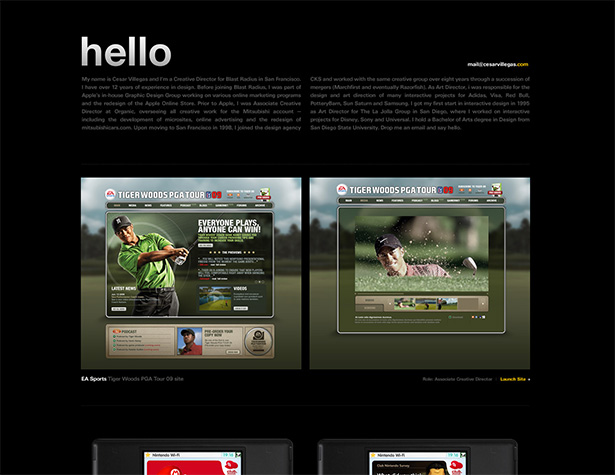 Similarly, Cesar Villegas has all his work on the first page with images set large, and you can scroll down to view projects or click on them to view more.
Another great example is Teacake Design,
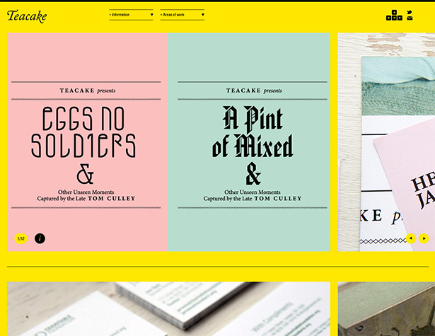 bold and beautiful, it's a joy to spend time on this site.
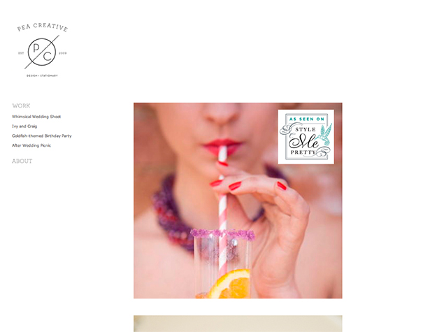 Pea Creative's site does employ the minimal Stack of Names, but the landing page drops you right into the work — and each beautiful and well sized image represents another project, giving the user a chance to organize their visit by the sound or the look of what they like.
But then we don't all want to have portfolios that just have large images and that scroll down now do we? We don't want clients to look at sites differentiated only by typeface choice. Here are some sites that make good use of the large thumbnail.
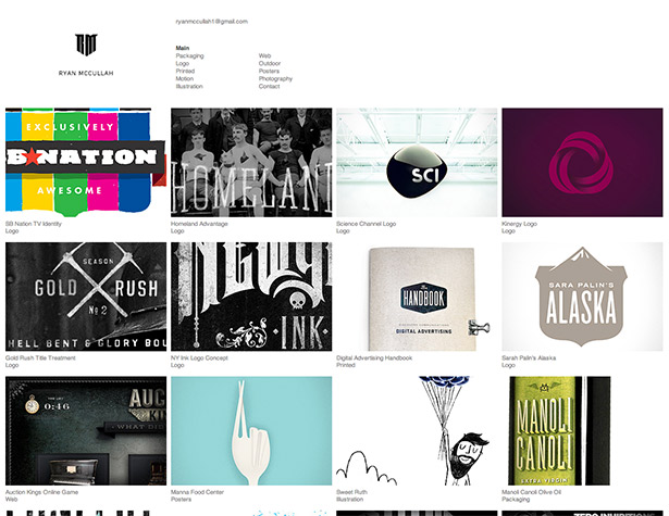 Large enough to get a good look at the work, small enough to get 15 images above the fold when viewed on an average screen. Ryan McCullah has an amazing portfolio of work too, the kind of design work that makes you ache that you didn't think of it first.
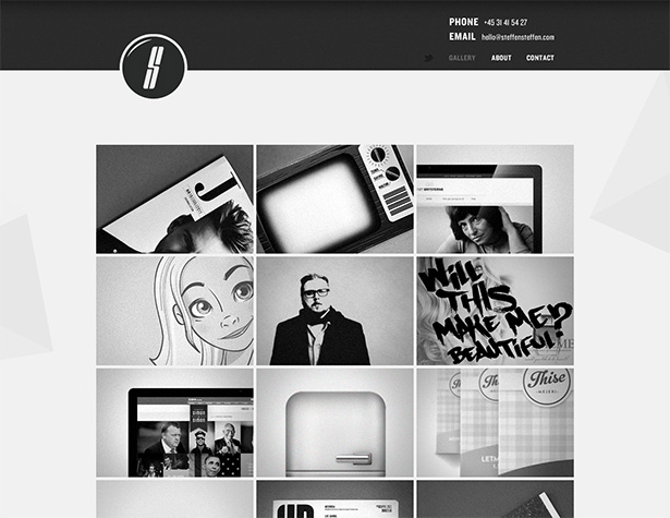 Steffen Christiansen uses a clean, simple two-color site to exude a quiet confidence.
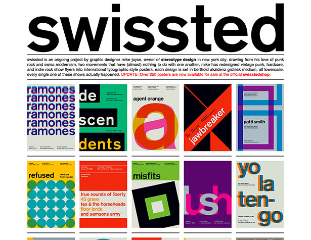 A design resource in itself, the swissted site is the perfect example of a tasty large thumbnail.
So I hope in this article I have shown you what you can do to ensure you make the best use of your work. You need to give people what you already know they want: to get the information they need as quickly as possible. Why make them wait to find out? You are a great designer. Let them feast on your talent.
Mike Kammerling
Mike Kammerling is Creative Director of London-based graphic design studio Tinder + Sparks. You can read his blog here, and follow him on Twitter here.
Read Next
3 Essential Design Trends, November 2024
Touchable texture, distinct grids, and two-column designs are some of the most trending website design elements of…
20 Best New Websites, October 2024
Something we’re seeing more and more of is the ‘customizable’ site. Most often, this means a button to swap between…
Exciting New Tools for Designers, October 2024
We’ve got goodies for designers, developers, SEO-ers, content managers, and those of you who wear multiple hats. And,…
15 Best New Fonts, September 2024
Welcome to our roundup of the best new fonts we’ve found on the web in the previous four weeks. In this month’s edition…
By Simon Sterne
3 Essential Design Trends, October 2024
This article is brought to you by Constantino, a renowned company offering premium and affordable website design
You…
A Beginner’s Guide to Using BlueSky for Business Success
In today’s fast-paced digital world, businesses are always on the lookout for new ways to connect with their audience.…
By Louise North
The Importance of Title Tags: Tips and Tricks to Optimize for SEO
When it comes to on-page SEO, there’s one element that plays a pivotal role in both search engine rankings and user…
By Simon Sterne
20 Best New Websites, September 2024
We have a mixed bag for you with both minimalist and maximalist designs, and single pagers alongside much bigger, but…
Exciting New Tools for Designers, September 2024
This time around we are aiming to simplify life, with some light and fast analytics, an all-in-one productivity…
3 Essential Design Trends, September 2024
September's web design trends have a fun, fall feeling ... and we love it. See what's trending in website design this…
Crafting Personalized Experiences with AI
Picture this: You open Netflix, and it’s like the platform just knows what you’re in the mood for. Or maybe you’re…
By Simon Sterne
15 Best New Fonts, August 2024
Welcome to August’s roundup of the best fonts we’ve found over the last few weeks. 2024’s trend for flowing curves and…
By Ben Moss


