 Amongst all the new features and improvements that the recent WordPress 3.4 release has introduced, there is a hidden gem. The Custom Header Image feature has been supported by WordPress for some time, however previously its fixed dimensions made it too immobile to be of much use in the age of responsive design.
The new release makes it flexible and introduces easier and cleaner code for this popular option. As theme developers we can now go further, taking into consideration the need to optimize for mobile visitors.
Previously the dimensions of a header image were predefined and managed with the HEADER_IMAGE_HEIGHT and HEADER_IMAGE_WIDTH constants and the uploaded file was cropped to fit these constraints. But since version 3.4 the custom header image supports flexible widths and heights and frees us from these ugly constants. Sounds intriguing, doesn't it? Let's see how it can be done.
What we are going to achieve
First of all we should decide which of the available (and widely discussed) responsive image techniques will suit us. We can afford ourselves any custom markup for this image, taking into consideration its importance for the site's branding and at the same time its independence from a post's structure or markup. From this point of view, the "noscript" technique looks really promising. To summarise the technique, it works as follows:
<noscript data-large='picture-large.jpg' data-small='picture-small.jpg' data-alt='alt text'><img src='picture.jpg' alt='alt text' /></noscript>
We specify alternative image references for chosen breakpoints as data attributes of a <noscript> tag. We then detect the available window width with JavaScript and replace the code with an appropriate image. If JavaScript is disabled the browser will display the image specified inside the <noscript> tag. To manage such replacement we will use the jQuery Picture plugin, written by Abban Dunne, that allows us to support at least three break points. The markup required by the plugin looks like this:
<figure id="header-image" data-media="picture-small.jpg" data-media440="picture-medium.jpg" data-media600="picture-large.jpg" title="alt text">
 <noscript>
 <img src="picture-large.jpg" alt="alt text">
 </noscript>
</figure>
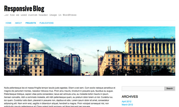
It should be accompanied by appropriate CSS styling and a script that puts jQuery Picture to work. Apart from that we would like to have a set of predefined header images to be chosen from (the same way we have it in the Twenty Eleven theme). Moreover, we'd like to give the user the ability to upload their own image in the admin panel. Assuming that a full sized version of the image is uploaded we will create the necessary intermediate sizes with the built-in WordPress thumbnail support combined with header flexible sizes. Our custom header should eventually look like this:
Enough talk, let's dive into code.
Step 1: register custom header with your theme
$default_url = get_template_directory_uri().'/_inc/img/city-large.jpg';
$args = array(
	'default-image' => $default_url,
	'random-default' => false,
	'width' => 1000,
	'height' => 300,
	'flex-height' => true,
	'flex-width' => true,
	'header-text' => false,
	'default-text-color' => '',
	'uploads' => true,
	'wp-head-callback' => 'frl_header_image_style',
	'admin-head-callback' => 'frl_admin_header_image_style',
 'admin-preview-callback' => 'frl_admin_header_image_markup',
);
add_theme_support('custom-header', $args);
This is a new registration code introduced in WordPress 3.4. You can see the whole set of parameters for it in the Codex, but for our task the following are the most important:
default-image- url to the full size of default image in the theme's folderwidth,height- maximum values supported by our themeflex-height,flex-width- set as "true" this parameters allows the image to have flexible sizesheader-text- we're not going to show text over image in our themeuploads- enable uploads in adminwp-head-callback- function to be called in theme head sectionadmin-head-callback- function to be called in preview page head sectionadmin-preview-callback- function to produce preview markup in the admin screen
If you have used a custom header image in your theme before and are wondering how the techniques compare, here is a list of equivalents between old constants and new parameters (the array's keys):
HEADER_IMAGE -> 'default-image'
HEADER_IMAGE_WIDTH -> 'width'
HEADER_IMAGE_HEIGHT -> 'height'
NO_HEADER_TEXT -> 'header-text'
HEADER_TEXTCOLOR -> 'default-text-color'
Step 2: register default images to choose from
In our example we'll provide two predefined images as options for the header and each of them should have three variants: -large.jpg, -medium.jpg and -thumb.jpg for the corresponding range of window widths. The smallest size will also be used as a thumbnail in the admin interface.
register_default_headers(array(
 'city' => array(
 'url' => '%s/_inc/img/city-large.jpg',
 'thumbnail_url' => '%s/_inc/img/city-thumb.jpg',
 'description' => 'City'
 ),
 'forest' => array(
 'url' => '%s/_inc/img/forest-large.jpg',
 'thumbnail_url' => '%s/_inc/img/forest-thumb.jpg',
 'description' => 'Forest'
 )
));
The code is quite self-explanatory, the only detail that requires attention is a correct url for the images:-large.jpg for full size and -thumb.jpg for thumbnail (%s - is a placeholder for the active theme folder that will be automatically replaced by WordPress).
Step 3: register additional image sizes
add_image_size('header_medium', 600, 900, false);
add_image_size('header_minimal', 430, 900, false);
Registering these additional sizes with our theme will instruct WordPress to create a variant for each of them when uploading an image for the custom header. The appropriate variant can be obtained later using the name. The trick is to specify quite a large height value, doing so forces the image to be resized by width and leaves its height to be derived from the aspect ratio.
Step 4: markup for the front-end
function frl_header_image_markup(){

/* get full-size image */
$custom_header = get_custom_header();
$large = esc_url($custom_header->url);
$mininal = $medium = '';

/* get smaller sizes of image */
if(isset($custom_header->attachment_id))
{ //uploaded image

$medium_src = wp_get_attachment_image_src(intval($custom_header->attachment_id), 'header_medium', false);
if(isset($medium_src[0]))
 $medium = esc_url($medium_src[0]);

$minimal_src = wp_get_attachment_image_src(intval($custom_header->attachment_id), 'header_minimal', false);
if(isset($minimal_src[0]))
 $mininal = esc_url($minimal_src[0]);

}
else
{ //default image

$medium = esc_url(str_replace('-large', '-small', $custom_header->url));
$mininal = esc_url(str_replace('-large', '-thumb', $custom_header->url));
}

/* fallback for some unexpected errors */
if(empty($medium))
 $medium = $large;

if(empty($mininal))
 $mininal = $large;
?>

<figure id="header-image" data-media="<?php echo $mininal;?>" data-media440="<?php echo $medium;?>" data-media600="<?php echo $large;?>">
 <noscript>
 <img src="<?php echo $large;?>">
 </noscript>
</figure>

<?php
}

function frl_header_image_style() {

$src = get_template_directory_uri().'/_inc/js/jquery-picture-min.js';
wp_enqueue_script('jquery-picture', $src, array('jquery'), 0.9, true);
?>

<style type="text/css">
 #header-image {
 padding: 0.5em 0; }

 #header-image img {
 vertical-align: bottom;
 width: 100%;
 height: auto; }
</style>

<script>
 jQuery(document).ready(function($){
 $('#header-image').picture();
 });
</script>

<?php
}
Again, everything is straightforward. With the frl_header_image_markup function we create the markup needed for our responsive technique to work. The most interesting part here is obtaining image URLs for large, medium and small states. The WordPress 3.4 function get_custom_header returns a custom header object that contains all necessary data. If $custom_header has a properly set attachment_id property, we're dealing with an uploaded image and should get intermediate sizes using wp_get_attachment_image_src. If there is no such property, we're dealing with one of our default images so we can obtain intermediate sizes based on our own naming convention.
With frl_header_image_style we inject the CSS and JavaScript that make our image responsive. This function will be called automatically because we've specified it as a custom header registration parameter. But the _markup function should be called directly in the theme — obviously somewhere inside the header.php
<?php frl_header_image_markup(); ?>
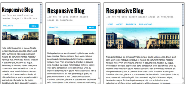
After this step we've already had our first default header image displayed in a responsive manner.
Step 5: markup for admin preview
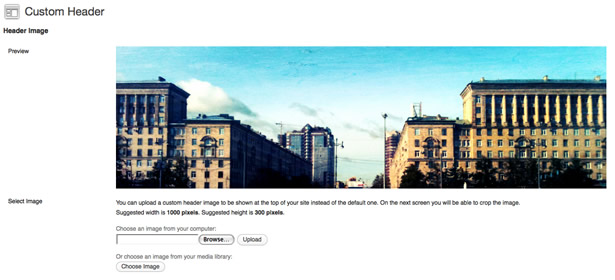
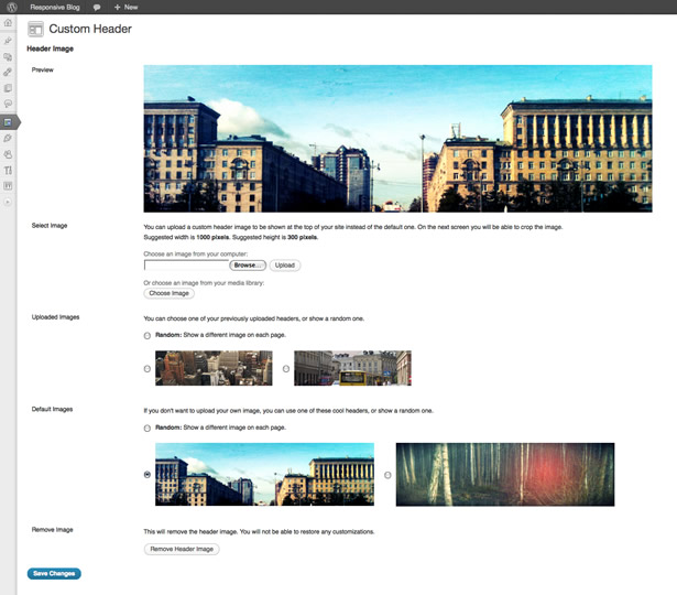
Under Appearance -> Header menu we now have a screen, that allows us to change the custom header image by choosing one from predefined options or uploading a new picture. We are going to have the header look simple.
function frl_admin_header_image_markup() {

$image = get_header_image();
?>

<div id="header-image">
<?php if($image): ?>
 <img src="<?php echo esc_url($image); ?>" alt="" />
<?php endif; ?>
</div>

<?php
}

function frl_admin_header_image_style() {
?>

<style>
#header-image {
 max-width: 1000px;
 max-height: 400px; }

#header-image img {
 vertical-align: bottom;
 width: 100%;
 height: auto; }
</style>

<?php
}
In admin we use only one image size (full) in our markup and obtain its URL with the get_header_image function (frl_admin_header_image_markup is responsible for that). But we should provide an appropriate styling for the preview so that it represents the responsive behavior (frl_admin_header_image_style is responsible for that). Both functions will be called automatically because we've specified them as custom header registration parameters. Now we can enjoy absolute freedom, setting a custom header image.
A word of caution
With freedom comes responsibility. Giving a user the flexibility to upload custom images we have no control over the size and proportions of the image. If an uploaded image exceeds the width and height limits we've provided it should be cropped. But if all this happens in the new Live Theme Customizer instead of the Appearance -> Header screen, the header image will not be cropped (at least for now). The Live Theme Customizer is a quite new feature so future improvements seem likely, but for the present we should be careful.
Another problem could arise if an uploaded image has a smaller width than is intended by our theme design. Our code will stretch it to fill the whole container width so the quality of the picture could suffer. The truth is anything customizable can, by its nature, be broken. Providing solid guidelines for your users will help, but to some extent, you have to let them do as they will.
Conclusion
To summarize: we have now implemented new functions introduced in the resent WordPress 3.4 to support a custom header image. We made it responsive using the "noscript" technique that allows us to not only adjust the size of a picture in accordance with browser width, but also serve different sized images for various widths. We supply our theme with two predefined variants, but any image could be uploaded through an admin interface and our header will still be responsive.
You can download the code and sample images used in this article from here.
Have you worked with custom headers in WordPress? What refinements in version 3.4 are impacting how you work with WordPress? Join the conversation below.


