 With the right fonts, we can do anything, and create anything.
Fonts help portray a mood or emotion. Your font choice can make or break your designs, so you must careful in choosing the right one. Typography matters not just because it looks good, but because what's being said is extremely important.
Typography in web design is becoming huge. We can now embed and show all sorts of fonts on our websites that we probably weren't able to a few years ago. Developments in CSS have created this wonderful thing called '@fontface'. It basically allows you to use many decorative fonts you wouldn't be able to use online.
For those of you tired of the typical Arial or Georgia fonts, you're going to like this. Today, we're coming to you with 30 of the best @fontface kits to bring a little pizzazz to your website. Whether you want to add something to your headers or your body text, there's probably something for you. So let's get to the goods.
Decorative
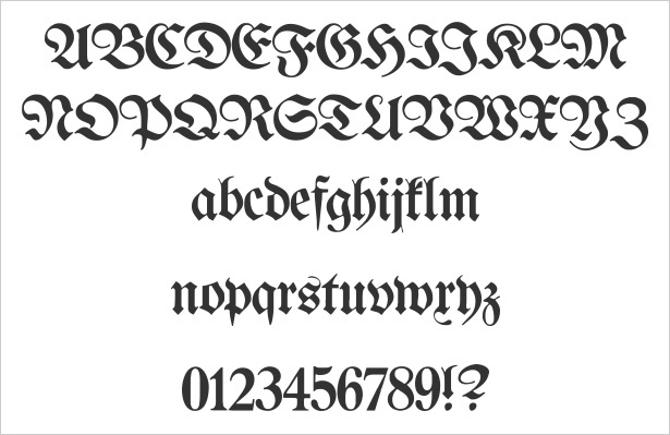
Proclamate
While the legibility of Proclamate is questionable, there's no doubt that this font would be great for drop caps. Sometimes, you may have a website that deserves an old timey or story book type of feel. This would be a great font to use.
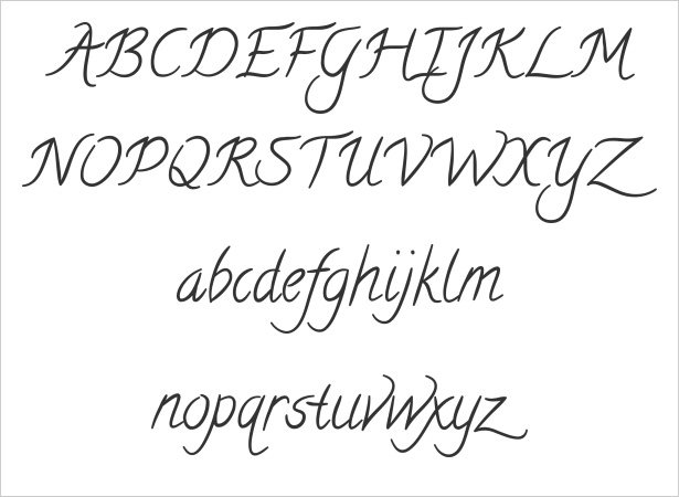
Calligraffiti
Not too hand written and not too scripty is what makes Calligraffiti so great. Again, if you're looking for a bit of a decorative font, this would be great for really large headers.
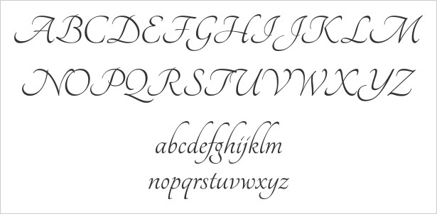
Tangerine
Tangerine is one of the rare script-like, whimsical fonts that is actually pretty easy to read. Whether you want to use this for drop caps or for a simple header, this font is sure to be effective and create the beautiful look you're probably going for.
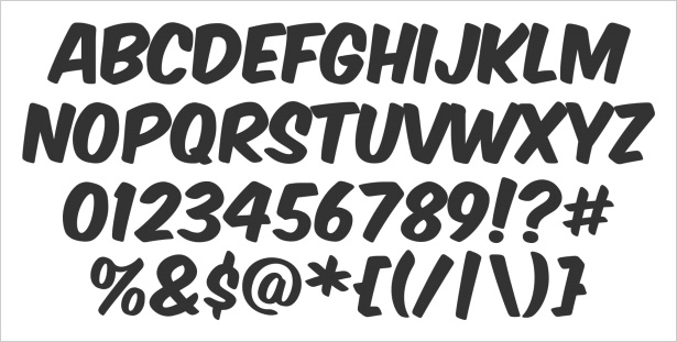
Komika Axis
Maybe you run a site with a fun, comic book feel. Komika Axis is a light-spirited and bold; ideal for headers. Pairing this with bright colors and attractive images could do wonders for a website design.
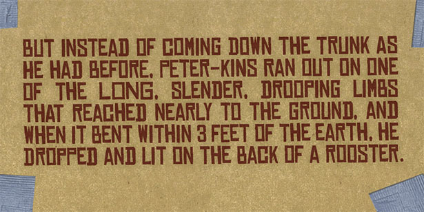
Chinese Rocks
Asian calligraphy and culture has a strong influence on many designers. If you are that designer, Chinese Rocks is a great font for you. It has that influence but maintains that boldness necessary for headlines.
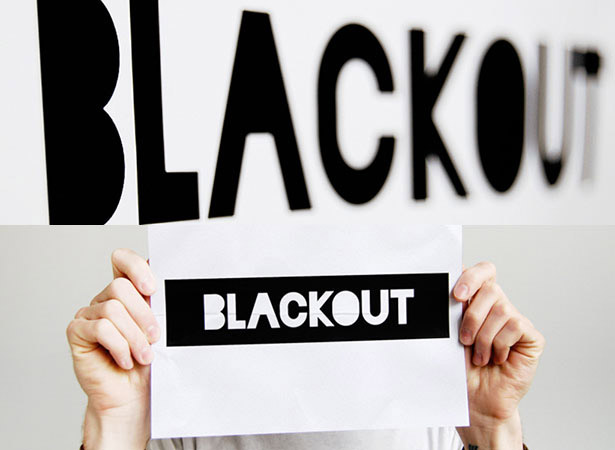
Blackout
Sometimes we want something that's bold but doesn't reinvent the wheel too much. Blackout is a great font for when you want to make a very strong, differentiated statement that has some grunge appeal.
Dubtronic
Dubtronic is a really cool and fun font that's heavy with a light spirit. Much like Komika, when paired with bright colors this is sure to add another level of boldness and fun to a website — great for an electronic feel.
Octin College
Octin College seems to be a pretty normal sans serif font, but it actually has a bit of decoration to it. It's simple, strong, easy to read but does have that little flair, for detail oriented website designs.
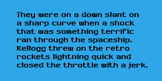
Chargen
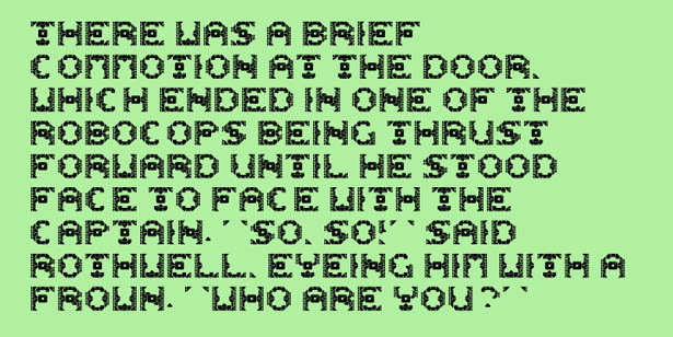
An ode to the retro stylings of typography! Chargen is great for that old techno, nintendo feel. It's not as clichéd as going with an LCD type of font, but does call on some great retro influences.
Dazzle Ships
Dazzle Ships is not quite like any other font I've seen before. It's a bit of a dingbat that makes sense. It's probably for a very target site stylistically but it can be used somewhere to add a bit of a wow factor to a website.
Reklame Script
Of course, we love anything that has a bit of a vintage and lively feel. Reklame Script is great for those of us working on kitchy sites for bakeries or crafts and things like this.
Pacifico
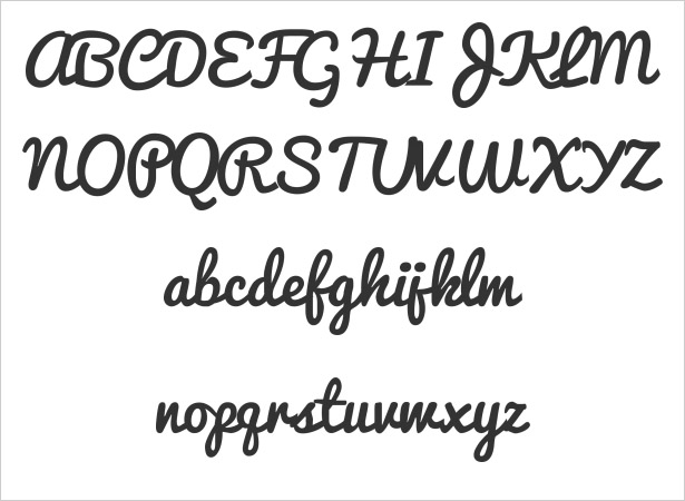
Pacifico is probably one of the most popular handwritten fonts in use right now. It's cute, kind of vintage and extremely high quality for a free font. In the event you've taken a liking to this font, now you're able to use it on your website.
Orbitron
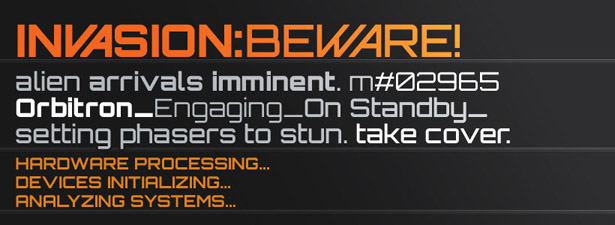
Orbitron is another strong and bold font that puts you in the mindset of a sci-fi thriller. There are some great stylistics to this font with the slanted letters and it comes in different weights.
Serif
DejaVu Serif
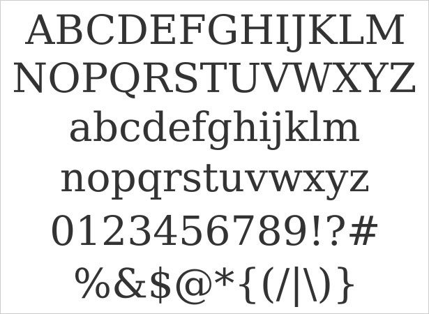
DejaVu Serif is a great font alternative Times New Roman or Georgia or any other serif. It's really clean and straight forward and great for your body copy.
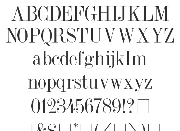
Dubiel
Dubiel is an excellent serif font for when you desire a very regal, upscale look. It really reminds of the fashion and beauty industry and is great for headlines.
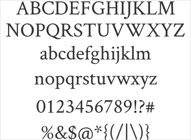
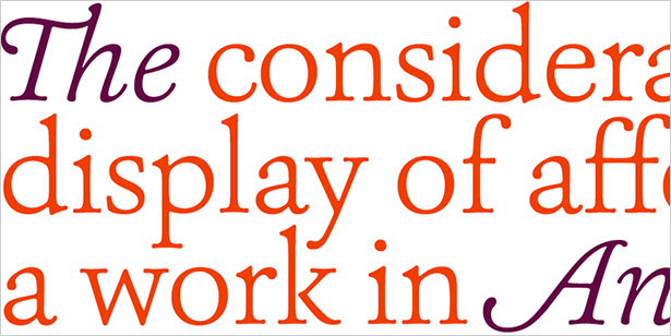
Crimson
Crimson is another font that's a great body copy alternative to the ones we've used since the beginning of time. Crimson happens to have a bit of a vintage feel along with it as well.
Fanwood
Fanwood is a bit of a combination of all our previous serif fonts thus far. It's part regal, part fashionable and just an all around great, clean serif font.
Goudy Bookletter 1911
Sometimes you want a serif font with just enough weight on it to be legible at any size. Goudy Bookletter 1911 is a great example of that style of font.
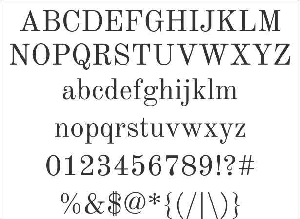
Old Standard TT
Old Standard is a lot like Dubiel, but can be a bit more useful because it has more solid strokes. This allows it to work better as a body font than just a headline.
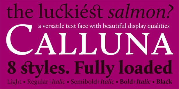
Calluna
Calluna is an accidental spin off of another favored font: Museo. If you want a more serious version of the Museo font, Calluna is obviously the perfect choice.
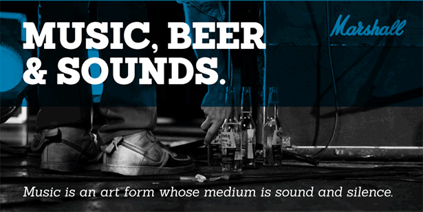
Sanchez
Sanchez is a lot like the Chunk font and similar to the Rockwell font. However, the twist here is rounded corners. It's a fun contrast to play around with in different designs.
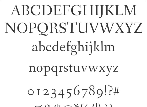
Ashbury
Ashbury is very similar to the font Baskerville that sometimes makes it's way into web design. It's a bit whimsical yet still solid, and obviously inspired by earlier centuries.
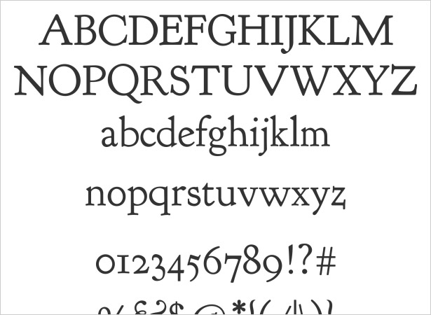
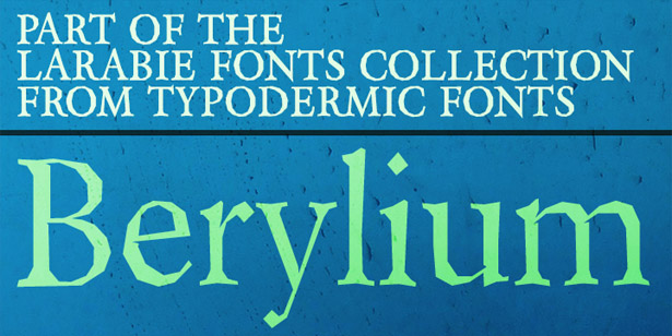
Berylium
If you're looking for a serif with a bit of character Berylium is probably the one for you. It has accents and actually uses a geometric pattern, even with the curved parts of the font. It's very unique.
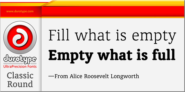
Classic Round
We like round fonts because they are easy to read. Classic Round is everything you would expect of a clean, simple rounded serif font. It's sure to be great for anything.
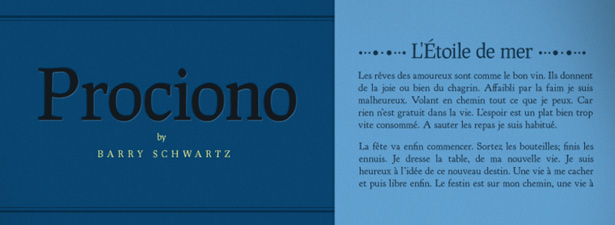
Prociono
As you can see, Prociono is made with books in mind. This makes for a great body font or a font for a storybook themed web design.
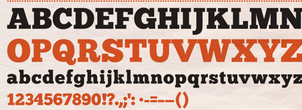
Chunk
When you want a bold seif font that means business, Chunk is the font you want. It's like an update version of the famous Rockwell font.
St. Marie
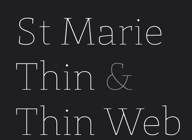
St. Marie is great for a kind of a quirky rendition of the serif font. It looks best when large with proper leading and kerning. It's actually quite adaptable for many different styles.
Sans Serif
League Gothic
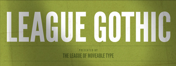
League Gothic has a rich history as it's the revival of some older fonts. It's a strong font that commands attention, which is great for headlines and such. Also comes in many different styles.
Titillium Text
Titillium Text has many different weights and has some good character to it. It can be a bit techno looking or even work in some very minimalist designs. Either way, it's a great font to have.
Bebas Neue
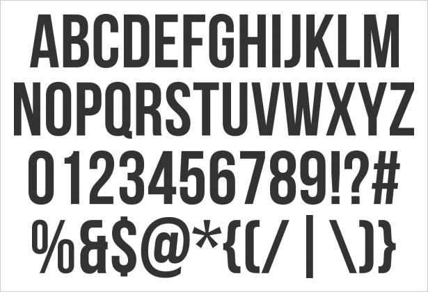
Bebas Neue is similar to League Gothic, however, this one is much cleaner and doesn't have the additional accents the other does. It's still strong, but a little more versatile in styles.
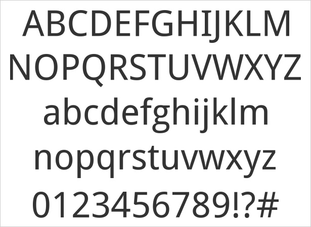
Droid Sans
Droid Sans is a great body font for when you want things to be legible without being oversized or too chunky. It comes in two different weights and is sure to contribute to any design — would be especially great on a blog or content rich site.
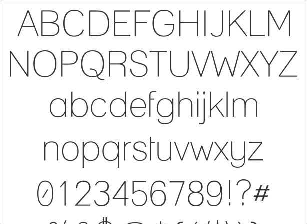
Lane
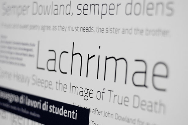
Not everyone isn't keen on the really heavy headlines, Lane is a great alternative for designers who want to go a bit lighter. Lane is perfect for clean designs that require headlines that do the job but don't distract from other elements.
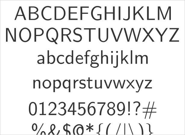
Latin Modern Sans
This font is very similar to Droid Sans which we mentioned but comes in many more weights. It's also more straight forward and has less curves than Droid Sans. Latin Modern Sans is very simple and very effective.
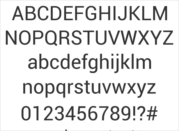
Roboto
If you ever get tired of Arial or Helvetica (which is probably impossible), Roboto is a great alternative. It's a bit taller than Helvetica, but it comes in as many different weights to make it great for different designs.
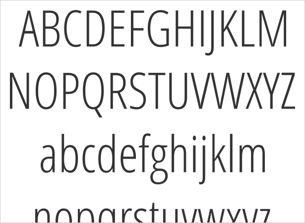
Open Sans Condensed
Open Sans Condensed is actually very fun and comes in many different weights. It kind of reminds me of Futura Condensed and is a great alternative in terms of style.
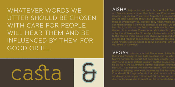
Banda
Banda is a very stylistic and cute font, great for more crafty designs. It's a semi-sans serif with the versatility to work with headlines or content copy.
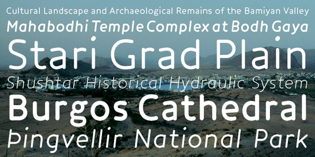
Core Humanist Sans
The strokes on Core Humanist Sans are consistent from top to bottom, making this an extremely clean and simple font. It can have many uses in many different designs.
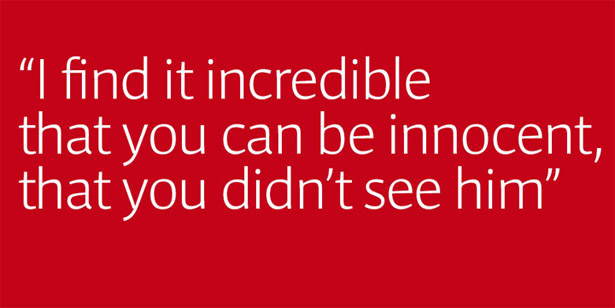
Impara
Impara is a simple sans serif with a ton of character. It could almost be a serif, but it's nice and clean — great for lots of copy that has to remain readable.
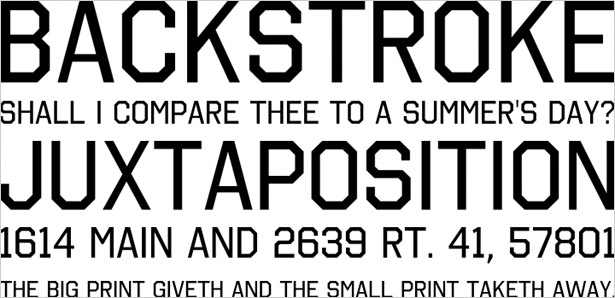
Ostrich Sans
Ostrich Sans is great because it comes in a bunch of different fonts and styles such as rounded and dashed. Of course, this is a great font for strong and clean headlines.
Did we miss any of your favourites? Have you designed any sites with these fonts? Let us know in the comments.

