 When VEVO redesigned their website back in March of 2012 and added Facebook Connect functionality, they saw a 600% increase in the number of Facebook-published or -watched videos. And they saw a 142% increase in new users over the previous month. Impressive numbers all around.
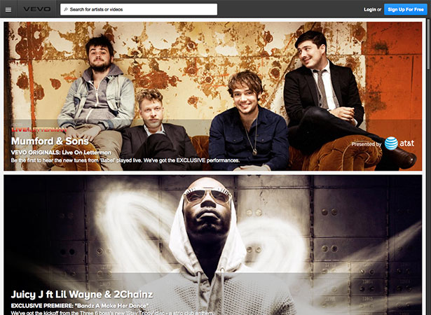
Now they've gone and redesigned the site again. This time they've focused more on visuals than a complete overhaul, particularly on the video watch page.
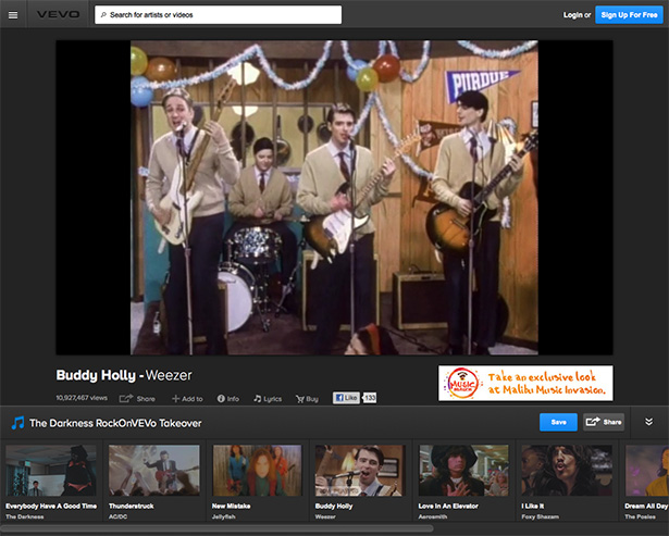
Users get a much more streamlined page to watch videos from, one with a lot fewer distractions. The old version of the site had related clips, playlists, and other content that was unnecessary to the primary function of the video pages: to watch videos. A lot of that content has been moved to artist pages and pop-ups.
The new VEVO homepage is particularly well-designed. Videos stretch the full width of the screen, putting the emphasis exactly where it should be.
Click on a video and you're taken to its watch page, where you can view additional information, including how many views it's had, the song's lyrics, and more. The information link and the lyrics links both display in a panel that appears next to the video (shrinking the video in the process). It's a nice touch, though the video does get very small when viewing these extra items, and doesn't take advantage of extra screen space on a widescreen monitor.
You'll also find links to share the video, like it on Facebook, add it to a playlist, or purchase music from the artist. Below that you'll see related artists, though that's definitely not the emphasis here.
New artist pages are now featured in modal windows. They include artist information, a list of videos on VEVO, tour dates, and artist links (including Twitter, Facebook, official website links, and a link to buy their music on iTunes).
The navigation for curated playlists isn't as simple as it could be. You'll have to click a link to expand the sticky footer once you're in the playlist in order to see the videos included in the playlist. It's not particularly complicated, but it's also not as intuitive as it could be.
Overall, this new VEVO design is an improvement over their previous iteration. It helps place the emphasis more firmly on the entire point of the site — the videos themselves — which is always a good thing.
Do you like the new VEVO design? What were the best improvements? What would you like to see in the next redesign? Let us know in the comments below.


