 Modal boxes are a frequently utilized tool in the web developer's arsenal. Used for, amongst many things, login/register forms; advertisements; or just notifications to the user.
However despite the fact that modal windows frequently contain mission critical information, they are routinely created with JavaScript, which does not sit well with the best-practices of progressive enhancement or graceful degration.
This doesn't need to be a problem, because HTML5 & CSS3 allow us to create modal windows with ease.
Demo
What we are going to do is use CSS3’s transition, opacity, pointer-event, and background gradient properties to create a very beautiful and functional modal box.
You can view a demo here.
The HTML
The first step to creating our modal box is this short but sweet markup:
<a href="#openModal">Open Modal</a>

<div id="openModal" class="modalDialog">

</div>
As you can see, we just have a simple link that says “Open Modal” and links to our openModal div that is placed right below it. We are doing all of our styling here with classes, so we use the ID just as a hook for opening our modal box, and we will style everything using the modalDialog class.
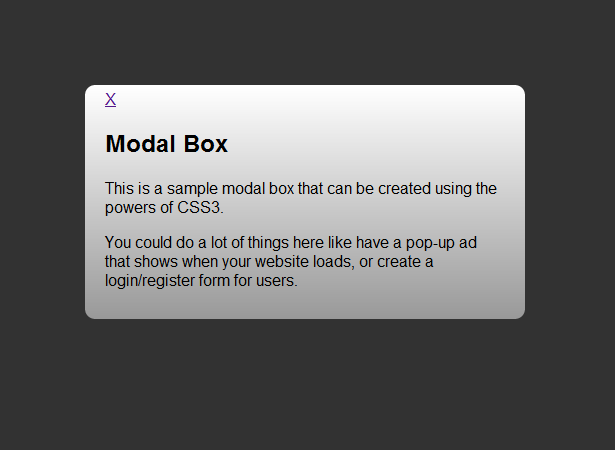
Next, we add a div tag that will hold all of our content in the modal box. Inside of this div we are going to have a link to close the box which we will style with our CSS. We will then put a simple heading with a few paragraphs of text beneath it. Your HTML markup should now look like this:
<a href="#openModal">Open Modal</a>

<div id="openModal" class="modalDialog">
	<div>
		<a href="#close" title="Close" class="close">X</a>
		<h2>Modal Box</h2>
		<p>This is a sample modal box that can be created using the powers of CSS3.</p>
		<p>You could do a lot of things here like have a pop-up ad that shows when your website loads, or create a login/register form for users.</p>
	</div>
</div>
Starting styling
Right now we just have a link with a div showing beneath it. We will begin styling our box and making it actually functional. Let’s first create our modalDialog classes and start moving forward.
.modalDialog {
	position: fixed;
	font-family: Arial, Helvetica, sans-serif;
	top: 0;
	right: 0;
	bottom: 0;
	left: 0;
	background: rgba(0,0,0,0.8);
	z-index: 99999;
	opacity:0;
	-webkit-transition: opacity 400ms ease-in;
	-moz-transition: opacity 400ms ease-in;
	transition: opacity 400ms ease-in;
	pointer-events: none;
}
The code here is pretty simple. We style our dialog box by giving it a fixed position, meaning it will move down the page, when open, if you scroll. We also set our top, right, bottom, and left edges to 0 so that our dark background will span across the entire monitor.
Since we are going to want the background around the modal box to go dark when it’s open, we set the background to black, and change the opacity slightly. We also make sure that our modal box is sitting on top of everything by setting our z-index property.
Lastly, we set a nice transition for our modal box to show up on the screen, and hide the box when it’s not clicked on by setting the display to none.
You may not be completely familiar with what the pointer-events property, but it allows you to control when you do and don’t want elements to be clickable. We set it for our modalDialog class because we don’t want the link to be clickable until the ":target" pseudo class is fired.
Functionality and looks
Now let’s add our :target pseudo class as well as the styling for our modal box.
.modalDialog:target {
	opacity:1;
	pointer-events: auto;
}

.modalDialog > div {
	width: 400px;
	position: relative;
	margin: 10% auto;
	padding: 5px 20px 13px 20px;
	border-radius: 10px;
	background: #fff;
	background: -moz-linear-gradient(#fff, #999);
	background: -webkit-linear-gradient(#fff, #999);
	background: -o-linear-gradient(#fff, #999);
}
With our target pseudo class, we set our display to block, so that when the link is clicked our modal box will display. We also use our pointer-events property so that when the link is hovered over it's active.
We then style our div tag by setting the width, position, and using our margins to bump the modal box down from the top, and centering it on our page. We then add a little style by creating some padding, setting a nice border radius, and using a gradient of white to dark gray for our background.
Closing it up
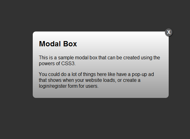
Now that we have styled the modal box and made it functional, the last thing we need to do is get our close button looking good. Using CSS3 and HTML5 can create buttons that look like they are images, but really aren’t. Here’s the CSS we use for this:
.close {
	background: #606061;
	color: #FFFFFF;
	line-height: 25px;
	position: absolute;
	right: -12px;
	text-align: center;
	top: -10px;
	width: 24px;
	text-decoration: none;
	font-weight: bold;
	-webkit-border-radius: 12px;
	-moz-border-radius: 12px;
	border-radius: 12px;
	-moz-box-shadow: 1px 1px 3px #000;
	-webkit-box-shadow: 1px 1px 3px #000;
	box-shadow: 1px 1px 3px #000;
}

.close:hover { background: #00d9ff; }
For our close button we set the background button and position the text using our text-align and line-height. Then we position the button using position absolute, and set our top and right properties. How do we make it a circle and add some depth? We set the border radius to 12 and create a slight drop shadow. Then to add a little user response we change the background to a light blue when you hover over it (other ideas for hovering include adding a linear transition to fade in, changing font text, or expanding the box shadow slightly).
Why our modal box is better
As you’ve probably noticed, the big selling point with this technique is creating a modal box in HTML5 and CSS3. Why is that such a big deal though? Modal boxes in JavaScript are something a beginner could create, there are hundreds of examples and downloads ready to be used. So why do we want to scrap JavaScript in favor of HTML5 and CSS3?
It would be naïve of me to say that one selling point is making sure people with JavaScript can use them; statistics show that only 2% of people worldwide browse without JavaScript, so if that is not an issue, what is? Well we took advantage of CSS3 transitions when creating our modal box. The complete code was:
-webkit-transition: opacity 400ms ease-in;
-moz-transition: opacity 400ms ease-in;
transition: opacity 400ms ease-in;
We only used three lines of code to create our animation. If you compare that to any JavaScript animation library you will be shocked to see how much our code is minimized. This leads into another reason, that is, we have cleaner code. We know what div that the animation is applied to, and that it’s only 3 lines long. This makes it easy for us to modify it or change the div as we see fit, and not have to worry about changing a div in JavaScript as well as the CSS and HTML.
Lastly, HTML5 and CSS3 are the future. Everybody is working to implement them into their designs and projects, and using them helps perpetuate its adoption and ensures you don’t get left behind. You get cleaner code, you don’t have to worry about JavaScript libraries, and you have a whole slew of web designers and developers that are ready to help with any issues you might have because they are excited to learn more about the language as well. HTML5 and CSS3 aren’t going anywhere, so there’s no reason not to use them.
When to use modal boxes
So now that we’ve covered how to make the modal boxes and why you should make them with HTML5 and CSS3, what about when you should use modal boxes?
Login/register form
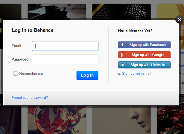
I think that modal boxes are particularly useful when used for login and registration forms. It creates such a streamlined experience for the user, and can really make an impression on your visitors.
Display images/videos
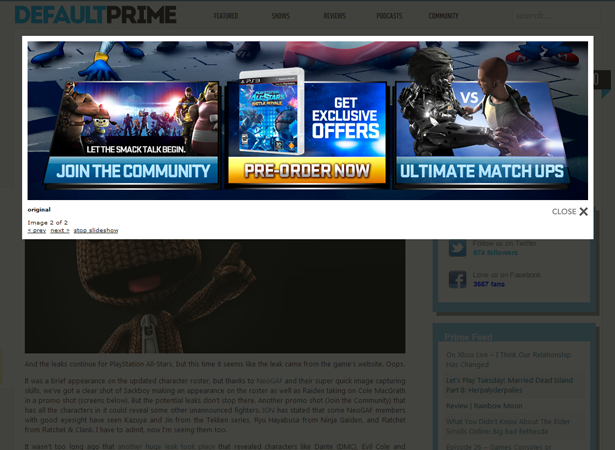
Another excellent use of modal boxes is to display images or videos (commonly known as lightboxes). It allows for the user to view the content of your website without leaving the webpage, thus keeping them further invested in your web experience.
User feedback
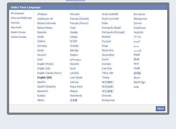
When a user is interacting on your webpage and you want to communicate or alert them about something, what better way to do it than a modal box? Facebook takes great advantage of this for when you want to change your language on their website, or for short blurbs like the “Why do I need to provide my birthday” link when you’re signing up. If it doesn’t have enough text or need to be a whole page, why not use a modal box?
Advertisements
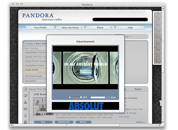
A great example of advertising using modal boxes is the music radio service Pandora. If you are not a member of their premium service, every once in a while you will get an advertisement on your screen. Sometimes these are audio advertisements that look like you’re just listening to a song, and sometimes it’s a popup box for a video. This is a great tactic for people looking to inject advertising into their webpages without always having them on the page.
Conclusion
There you have it, you can now create a simple HTML5 and CSS3 modal box, and you can use it for things like user login/registration forms, advertisements, and much more. You’ve also learned why we should use HTML5 and CSS3 instead of JavaScript, and seen some examples of how sites use modal boxes and how you can implement them into your own designs.
Are you excited by the possibilites of HTML5 & CSS3? Will JavaScript eventually go the way of Flash? Lend us your views in the comments below.
Thumbnail image via Shutterstock.

