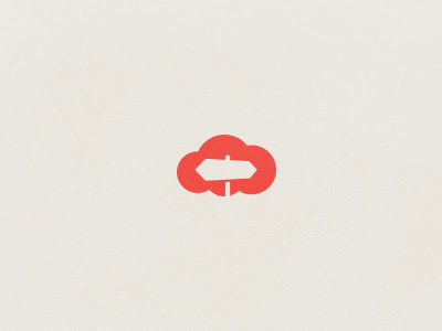
 What is the fascination with clouds? Ever since the first iPhone brought a weather app to our pockets designers have been drawing them.
Perhaps it's because, as British diplomats were taught in the nineteenth century, the weather is the only polite way to start a conversation; a subject that affects us all equally and for which no one can be blamed.
Perhaps it's because clouds are one of the few aspects of the landscape that all human beings experience. The Algonquin may not bump in palm trees regularly, Botswanans may only experience snow on the Discovery Channel, but nowhere on the planet is cloudless.
With the advent of cloud computing, designers have collectively refined the depiction of a cloud into a single recognizable mark, as identifiable a form as a 'play' icon or the letter 'Y'. A cloud, in reality a transient collection of water droplets with no consistent form, is now universally seen as three or four interlocking circles, the outer two symmetrical, the inner two asymmetrical creating a sense of depth.
Despite the formula that has emerged, designers' showcase sites are brimming with a huge variety of cloud icons. Here are some of our favorites:
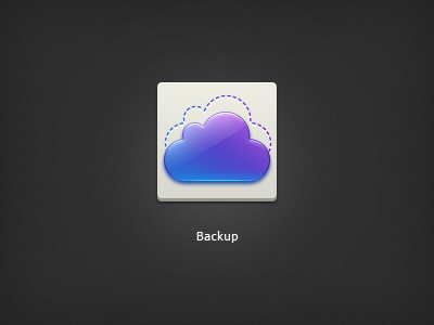
Backup
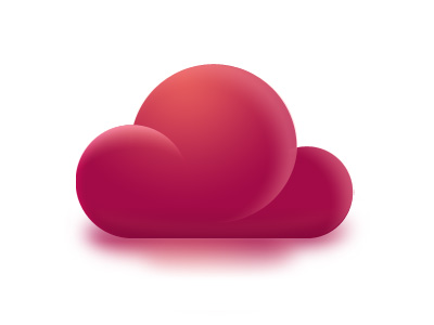
The classic shape, colored in a classic web 2.0 style.
B? Cloud?
A huge variation on the theme, a highly stylized icon, perhaps a little closer to a deflated balloon than a cloud.
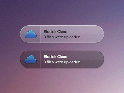
Bluish crowd growl
Simple, classic. This icon is the cloud formula reduced to its essence so that it will reproduce well at small sizes.
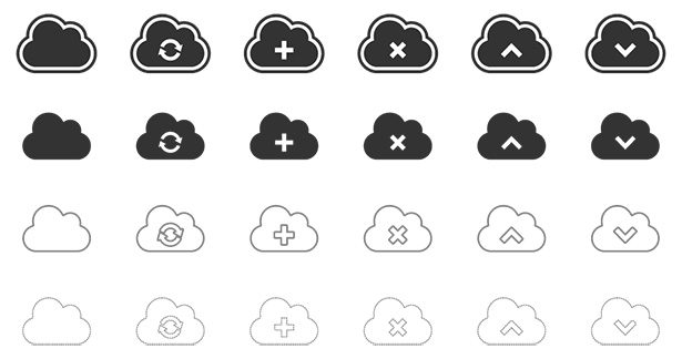
Clouds vector icons
The popularity of the cloud icon means that it's easily used for a variety of purposes.
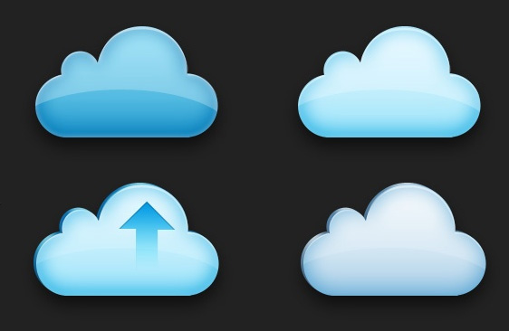
Cloud upload icon
The classic cloud form rendered in three dimensions.
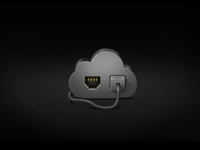
Cloud icon for the Pokki game developer contest
Are you plugged into the cloud yet? If you're not you will be soon.
Cut the cloud icon
The affinity with IT means that cloud icons are regularly colored in blue or purple.
Thermometer
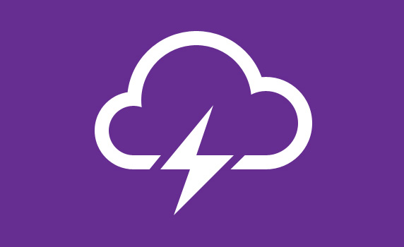
Some of the most beautiful cloud icons use a minimal style, with a thick outline. This is a perfect example.
Cloud storage
An unusually asymmetrical icon, this example seems to speed across the page.
Everyday clouds
Companies worldwide are adopting the cloud as part of their branding.
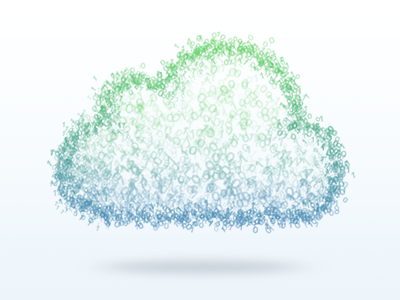
The cloud
Closer to the reality of clouds in nature, this illustration groups tiny letters into a more usual four circle form.
Below the Clouds
A rare example of a mark being constructed from more than a single cloud.
ThisLife website - cloud feature
Although blues and purples are most common, oranges are also popular, particularly with telecommunications companies.
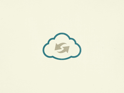
Cloud sync
The cloud is frequently found depicted with arrows to indicate a direction. Usually up for upload or down for download; in this case rotating arrows to indicate syncing.
Cloud and suns
A playful departure from the norm. The classic shape is still recognizable though.
<i> cloud
This is a regular looking minimalist cloud icon. The stunning thing is that it's built entirely with markup and CSS, no Photoshop required.
More UI icons
The cloud is now a staple of most user interface icon sets.
Departures, cloud style
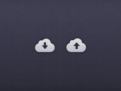
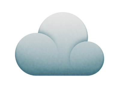
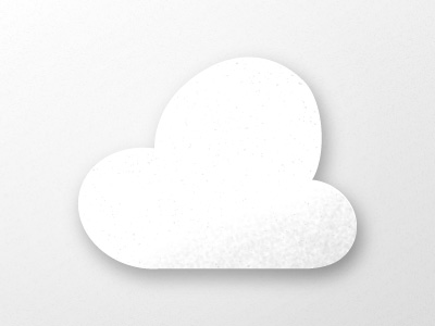
In a break from the over-used web 2.0 style, many designers are now applying rough texture to their cloud designs.
Cloud upload icon
Subtlety of tone is an artform all of itself.
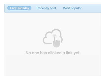
Touching a cloud
You can't do it in real life, but this slightly lop-sided icon makes clicking the cloud seem highly desirable.
Cloud
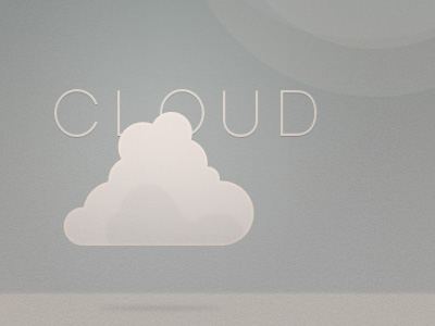
Beauty, we are told, is substantially about symmetry. That seems not to be the case for cloud icons, this cloud icon tries to break from the trend.
Storm cloud icon
Not all cloud icons are simple vectors, some designers favor Photoshop over Illustrator.
Cloud weather icon v3
This could be an effect from a hollywood blockbuster. I half expect an alien ship intent on blowing up the White House to emerge at any second.
Cloud9
Some clouds are drawn mathematically. The golden ratio has a lot to answer for.
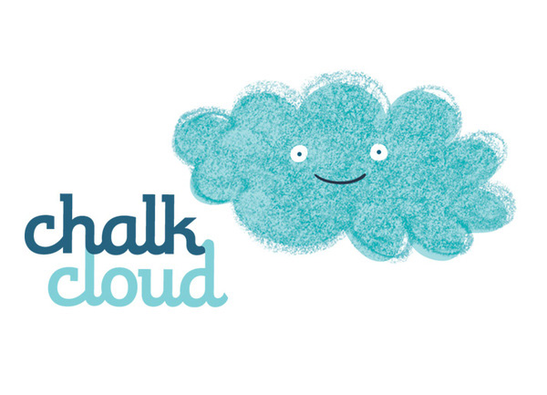
Chalk cloud
A completely original approach, and one that would fit perfectly into the background of a Top Cat cartoon, if it wasn't being used as this company's logo.
Vector cloud icons
More of the web 2.0 style. The Apple gloss effect clearly an influence.
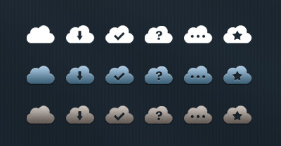
Some cloud icons
There is a wonderful subtlety about these clouds, notice how the billowing circles are lightly extended into the form, cradling the arrows are the center. Lovely attention to detail.
There will be more cloud icons
There will indeed. No icon designer worth his/her salt has failed to produce a set. How many do you think you see a day?
Baker's twine cloud
The classic form is so easily recognized that even this simple piece of string curled into a loop invokes it.
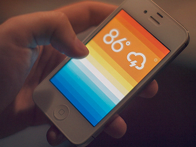
Weather app
One of the great strengths of the cloud form is that it so readily combines with other icons to cover a vast number of applications.
Weather icons
An original approach, the simplicity of this bean-shaped cloud is a joy to see.
The Cloud photo app
Although elongated, this cloud takes a classic shape. The image imposed on the cloud communicates the app's purpose quickly and effectively.
Pretty little cloud
It may look like a pokémon drowning in a glass of milk, but this bulbous cloud form is a daring departure from the predictable form.
SoundCloud
The cloud isn't just for images, what else would we store online if not music?
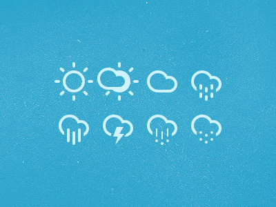
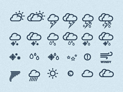
Weather icons
A perfect rendering of the classic cloud shape, the variation of line thickness in these icons harks back to early twentieth century illustrations of clouds.
Cloud
A surreal cloud. Suitable perhaps for a Hanna Barbera cartoon, there's an effortless lightness about this otherwise solid looking cloud.
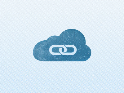
Cloud link simple
A recent variation on the form is the elongation of the classic cloud form, usually to accommodate secondary icons within the shape.
Inspiring Clouds logo
This designer produced a different version of his cloud logo each month, that's how much he loved it.
Clouds so swift, the rain won't lift…
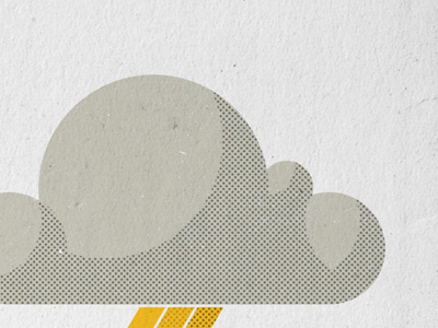
The printed dots in this illustration do a wonderful job of reminding us of what clouds really are.
Cloud badge
The classic cloud shape is so recognizable that even cropped, we know it immediately.
Cloud comment icon
An unusual cloud, in that its base isn't flat. It is the depth of field that makes clouds appear that way, in this case the cloud feels smaller, closer to the speaker.
Cloud
Once Apple's web 2.0 style has been done to death, it's time to move on to Adobe's inner shadow technique. This negative cloud must be full of rain.
Paper cloud
Drop shadows are often found in cloud icons, perhaps because when they float off the page, we see them as light.
Cloud
A wonderful 1930s style cloud illustration.
Cloud
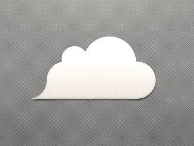
This cloud has an unusual point in the bottom left corner. It creates a sense of movement, but is also reminiscent of medieval depictions of clouds being blown across the sky by personifications of wind, all that's missing is the puffing face.
Rain cloud
Sometimes the form is used to create something simply beautiful.
CloudSt
The success of the cloud icon is largely due to its simplicity. This logo uses the cloud in its simplest form, any less and the meaning would be lost. The elegance of the solution is charming.
How often do you think you encounter the cloud icon? Has the form become so refined that it is now as resolved as it can be? Let us know what you think in the comments.
Featured image Cloud image via Shutterstock.
Ben Moss
Ben Moss has designed and coded work for award-winning startups, and global names including IBM, UBS, and the FBI. When he’s not in front of a screen he’s probably out trail-running.

