 If there is an issue more likely than the fold, to cause web designers to draw battle lines and pick sides, we're yet to hear of it.
The fold is a concept derived from print design, specifically broadsheet newspaper design. Newspapers have a literal fold in the page; above the fold is the masthead, a couple of major headlines and probably an eye catching image; below the fold are minor stories, infographics and a byline or two.
Naturally there is no literal fold in a screen (at least not one that still works) and many web designers feel that the fold does not exist in web design. However that view usually stems from a misunderstanding of what the fold is; in web design, content is deemed to be above the fold if it is visible prior to any user interaction. In other words, if you have to scroll to see it, it's beneath the fold.
Of course, we can't plan for a single fold; the number of devices, particularly since the exponential rise of the mobile web, is too great to establish a fixed horizontal line on a page. But a similar issue exists in print design, a newspaper editor cannot know where the paper boy will fold the paper, or whether he'll fold it in half or in thirds; a print designer doesn't know exactly where the edge of his design ends, printers always ask for a bleed of 2–5mm.
As long as we're aware of the fact that there is a theoretical concept known as 'the fold', we don't need to be precise, do we?
Well actually, we might, because Google has wholeheartedly embraced the concept of the fold.
Google have actually been talking about favoring primary content above the fold since 2011 and the 'above the fold' preference was added to Google's page rank algorithm in January 2012.
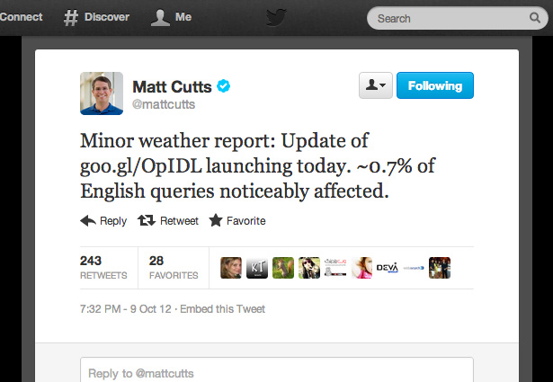
However, it was not until last week that head of webspam for Google, Matt Cutts, announced on his twitter account that an update for 'above the fold' ranking had been pushed out that would affect approximately 0.7% of English language queries.

0.7% is greater than the impact of every single Penguin release, to date, combined.
Whilst commentators generally agree that recovering from an above the fold issue will be easier than a clash with Penguin — as Google will re-poll your site and update rankings more regularly than Penguin is updated — there is precious little advice on exactly how you go about recovering.
The original January announcement from Google stated "This algorithmic change does not affect sites who place ads above-the-fold to a normal degree, but affects sites that go much further to load the top of the page with ads to an excessive degree or that make it hard to find the actual original content on the page".
Note the word 'excessive'. What, is excessive? Excessive is fuzzy logic — a relative term. How can a mathematical formula like Google's page rank algorithm determine what is excessive within any individual design?
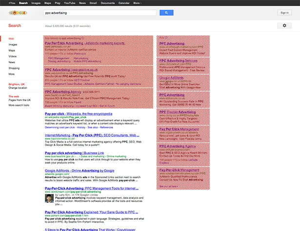
Perhaps we should follow Google's own example: a quick search for the term 'ppc advertising' returns 18 results 'above the fold' on my screen, 11 of which are pay-per-click adverts.

Of course Google could argue that the advertising it places above the fold are highly targeted ads that are relevant to the user. But then, can't we all say the same?
As with all things SEO, we're going to have to hold our collective breath and wait and see. Unless Google choose to quantify exactly how Googlebot positions the fold, we may be left wondering whether that huge jQuery image slider was such a good design decision after all.
Do you permit ads above the fold? Does Google have any right to dictate site design? Does the fold even exist in web design? Let us know in the comments.
Thumbnail is Fold image via Shutterstock.
Ben Moss
Ben Moss has designed and coded work for award-winning startups, and global names including IBM, UBS, and the FBI. When he’s not in front of a screen he’s probably out trail-running.


