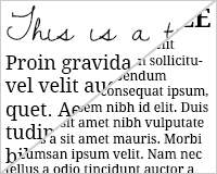
 The vast majority of articles talking about responsive design focus on two main areas: a fluid, flexible grid, and fluid, flexible images. What many of them don't talk about is typography.
And yet, for the majority of websites the text, the content, is the most important element.
Granted, for sites where images or video are the primary content, responsive type is a bit less important, but it still shouldn't be overlooked.
The good news is that responsive typography isn't particularly difficult to achieve. We just need to take some time to think through how our type should respond to changes in screen size, and then implement those changes.
Principles of responsive type
There are two main principles to creating effective responsive typography. The first is resizable type. That means type that not only resizes based on the size of the screen, but that is also resizable by the user.
The second is optimized line lengths, which maintain readability. That means for some screens, keeping the content area smaller and the line lengths shorter makes more sense, even though the content theoretically could stretch wider.
Resizable type using rems
Most designers use either pixels or ems for sizing their type. Ems are a better option, as they allow users to resize type in their browser. But ems are relative to the parent element, meaning they're more complicated to use than pixels, which is only compounded in responsive designs where there are more sizes and relationships to keep track of.
Rems offer a better alternative to ems. They work in an almost identical way, except for one key difference: rem units are relative to the html element, rather than individual parent elements. This makes maintaining proper sizing of your type much more straightforward.
Rem units are now supported in all of the major modern browsers, including Opera from version 11.6 and IE9. While you may want to include fallbacks for earlier browsers, there is wide enough support for rems to use them now.
Since you'll be using rem units for sizing type, make sure you apply the reset to your html element and not your body element. So it should look like this:
html { font-size:100%; } Now your rem units will be applied to the default font size for the device.
Next you'll need to specify the font size for each display size. I recommend experimenting with actual font sizes on various devices to see what looks best. It's largely dependent on the typefaces you've selected, as well as your overall design.
You'll likely want to specify multiple font sizes based on different screen sizes, which is a pretty straight-forward thing to do. As an example, your CSS might look something like this:
@media (max-width: 640px) { body {font-size:1.2rem;} } @media (min-width: 640px) { body {font-size:1rem;} } @media (min-width:960px) { body {font-size:1.2rem;} } @media (min-width:1100px) { body {font-size:1.5rem;} } Granted, this is a simplified code for this article, but gives you a starting point. You might notice that for the smallest screens, a slightly larger font size is specified. This is because larger font sizes are generally easier to read on small screens.
Of course, you'll want to make additional specifications for things like your h1 elements and such. I highly recommend using a tool like Web Font Specimen for seeing how your type will actually look.
Maintaining optimum line lengths
While resizable type is a pretty straightforward concept, maintaining proper line lengths across multiple devices gets a bit tricker. There has been quite a bit of debate as to what the optimum line length is for readability, but according to the Baymard Institute, the consensus seems to be somewhere between 50 and 75 characters per line.
They also recommend using a fixed width container for your content, but that defeats the purpose of a responsive design, so we need to approach things a bit differently if we want to maintain responsiveness with optimized line lengths.
First, look at the different screen sizes you'll be designing for and figure out what size font you should use to get roughly 50 characters on a line. For very small screens, you may need to go below 50 characters per line in order to maintain a readable font size, but 50 should be the goal. This gives us a good starting point for our font size.
We should also set maximum widths (or break points) for text content areas. Look at the size of the type you're using for a given screen size, and then determine the width of the content container when you have roughly 75 characters per line. This isn't going to be exact unless you're using a monospace font, but you should be able to come up with an average pretty easily. That becomes our maximum container width.
Let's say that the default font size for a given device is 16px, and you want your font size to be 20px (let's say we're using a serif typeface like Droid Serif for this example). That means you'll specify the type to be 1.25rem. At that size, you'll want a container width of around 675px wide. This gives us a character count in the 60s on average, which is right in our target width.
To specify the container width, just use this code:
@media (min-width: 950px) { .container {width:675px;} } You can set those maximum line widths for each display size, or just for specific ones. With smaller screens, you may want to leave the container width out and let the type spread across the entire width of the screen.
Now, with much larger screens, you may want to look at splitting your content into multiple columns. Let's say, for example, that you're working with an iPad in landscape view. Your screen width is 2048 pixels. Stretching your lines to fill the screen makes it difficult to read, but centering your content and keeping your line lengths shorter kind of defeats the purpose of viewing content in landscape mode.
So instead, set your type in two columns (or even three, depending on your font size). CSS3's multi-column specification makes it very easy to split your text into multiple columns without having to change your entire layout. Combine that with media queries and you now have a content layout that splits into two or three columns for larger screens, maintaining both a highly legible type size and a highly readable line length.
Again, the code for doing this is pretty simple:
@media (min-width:1140px) { .content { -webkit-column-count: 2; -webkit-column-gap: 1em; -moz-column-count: 2; -moz-column-gap: 1em; column-count: 2; column-gap: 1em; } } Now, on screens larger than 1140 pixels wide, you'll get your content split into two columns, making your line lengths much more readable.
Using alternate typefaces
One thing that's often overlooked when talking about responsive typography, is the idea that different typefaces may not work well at different sizes. This is especially true for display fonts.
Does that mean you should avoid using these fonts in your responsive designs? Of course not. Instead, just specify different fonts for various elements in your larger or smaller layouts.
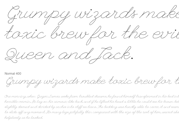
For example, with a design for desktop computers, you might want to use a font like League Script for your headers. But on a smaller display, such as an iPhone, you'll either need to make it so large that it dominates the content, or it will be very hard to read.
What we can do here is use League Script for the larger displays (iPad, desktop, etc.), while switching to a larger version of the body font for smaller displays (like the iPhone or other smartphones).
To do this, you'd simply specify something like this:
@media (min-width:960px) { h1 {font-family:"League Script", script;} } @media (max-width:960px) { h1 {font-family:"Droid Serif", serif;} } Of course this can be done for more than just your headings, too.
Conclusion
While responsive design has largely focused on images and overall layout, typography is just as important as both of those things. The best part is that it's not particularly difficult to adapt and optimize your typography for a responsive design.
It's vital that you put the same time and effort into it that you put into other elements of your design. Maintaining readability of your text content is a vital component to creating an optimal user experience for your visitors.
Do you put as much emphasis on responsive typography in your designs as you do responsive grids and images? Why or why not?


