 If you’ve been involved in today’s conversations about what’s best as far as style goes for websites, and nearly everything else design related, then you know that designers are falling in love or already have with minimalism.
I’m not here to tell those designers that they’re wrong, because they’re not. Minimalist designs are awesome and definitely one of the biggest trends running today.
Although we will take a look at a few examples of where minimalism is applicable, that’s not the goal. What we’re going to cover here is the application of anti-minimalist design, because minimalism is definitely not suited for every situation.
The goal is to get you; the reader, to understand where minimalism is good and where it’s not in web design; particularly to stay focused instead of talking about minimalism in general.
What is minimalism?
Almost every blog article out there on the subject, refers to minimalism as the reduction of elements or features through the process of elimination until only the most essential pieces are left.
Minimalism in web design is more than just the reduction of elements without compromising the purpose of the design. It’s also the proper use of font families, line-heights, kerning and other spacing, known as typography.
What’s more is that white space can make or break a minimalist design as it sets elements apart from one another for easier identification while “eye scrolling”.
Where does minimalism work?
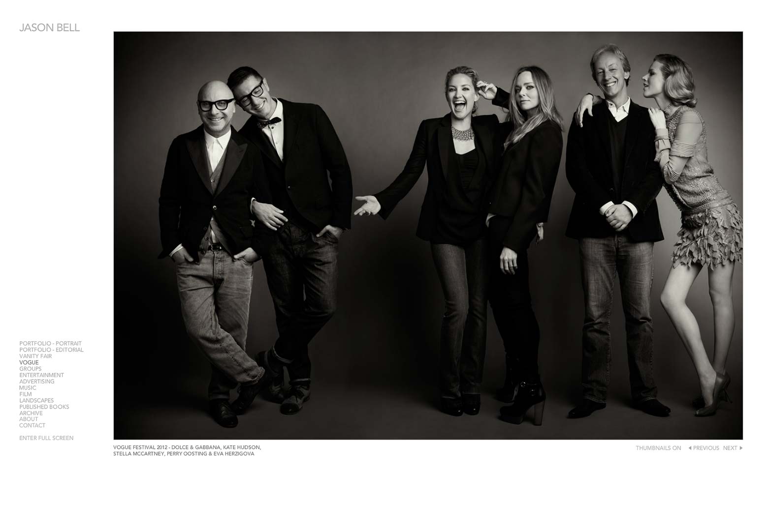
Websites where minimalist designs work are photography such as Jason Bell’s portfolio site.
In Jason’s site, the approach to minimalism is well done. A large image displaying his work on the right, his name on the top left and an easy to read menu on the bottom left are all that’s needed.
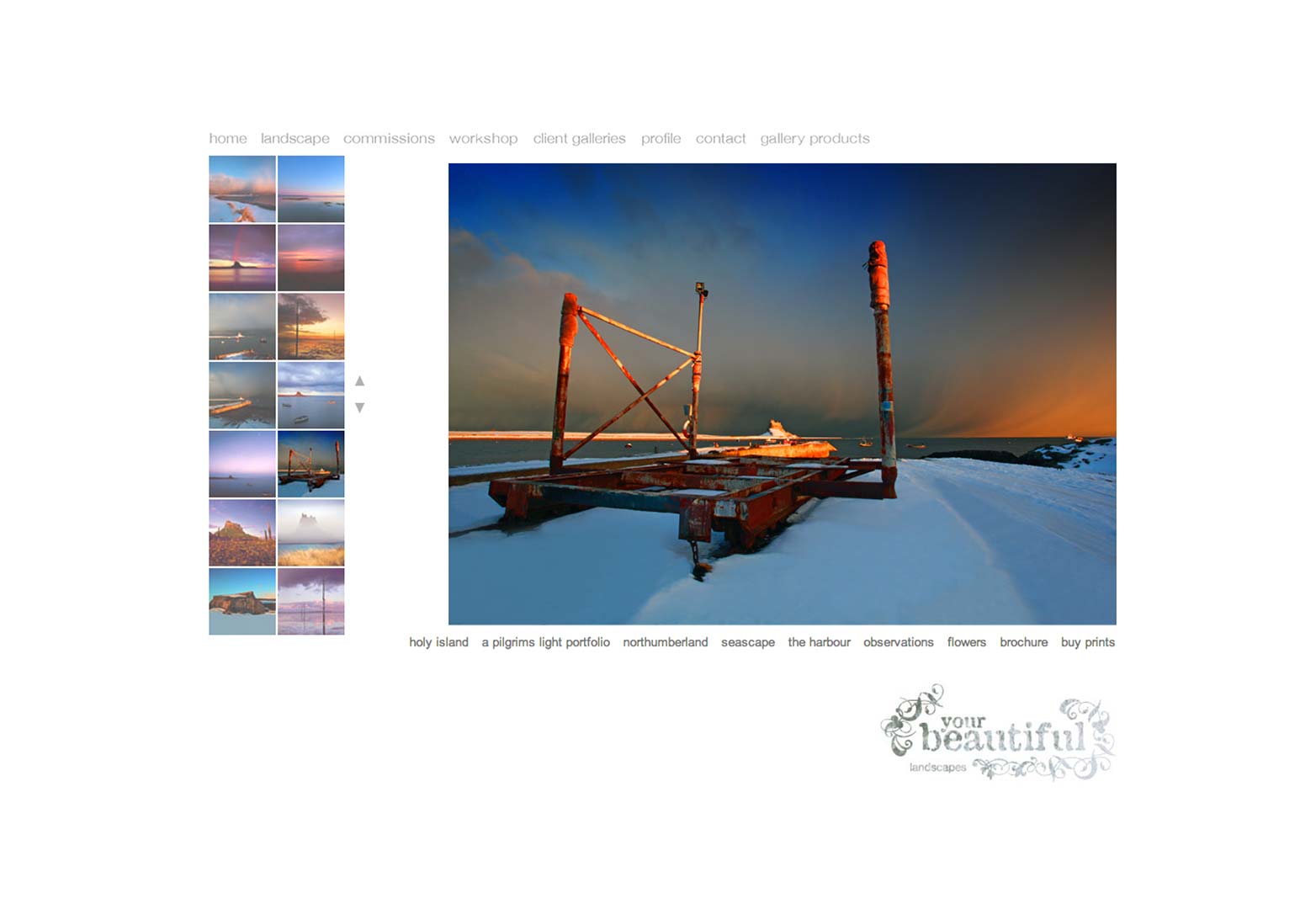
Another good example of minimalism in photography is your beautiful.
The large image in the middle showing off some of the photographer’s best work is a key element to minimalist design. Couple that with the subtle typography and you have a well focused, easy to read and easy to navigate minimalist design.
As you can see in both examples, the need to create focus is paramount. However, if it weren’t for the subtle font colors, background colors, general typography and overall spacing of each element, these examples would look more cluttered and couldn’t be considered minimalist designs.
As mentioned before, just because a website has less doesn’t mean it’s a minimalist design.
Other websites where minimalist design works are graphic design, personal sites, informational sites, fashion, food and wine. That list isn’t all-inclusive obviously but as you can see, there are many cases where minimalist designs work.
Anti-minimalist designs work
Anytime there is a fad, trend, opinion or whatever else, there is the anti or counterpart and web design is no different. If everyone tooted the same horn, life would be uninteresting, the web industry; and every other industry for that matter, would have nothing to debate, we also would not grow as web designers. Let’s take a look at the anti for minimalism and see what it teaches us.
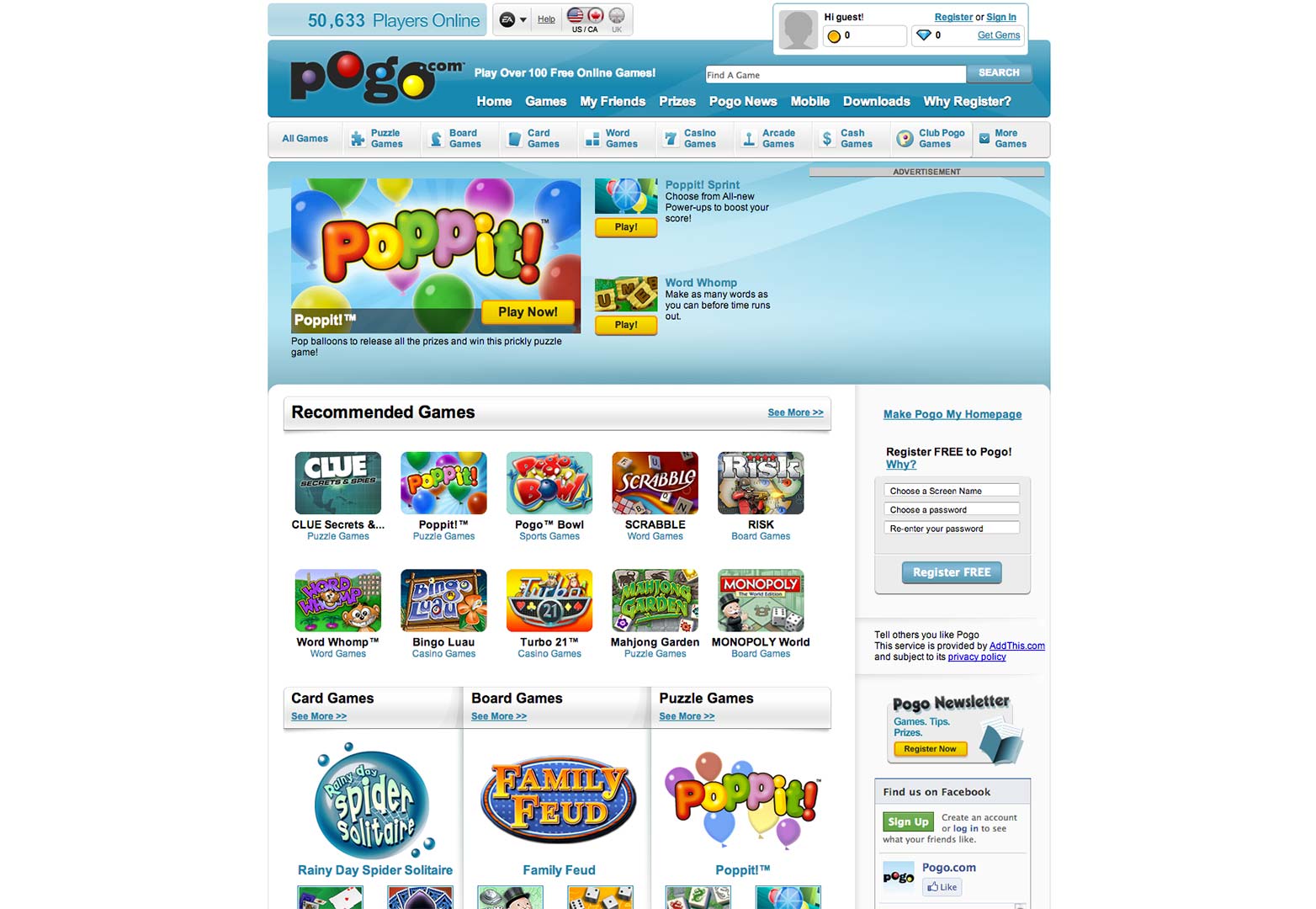
Websites where minimalist designs don’t work so well are gaming sites such as Pogo.
The Pogo website has a lot of information on it. For a gaming website, it would be hard to eliminate a lot of elements because gamers just want to find and play lots of different games. Gaming sites have to provide a large variety of games, pleasing aesthetics and pictures; which attract gamers, and have good content, so they generally have to squeeze in as much stuff as possible without it being overkill.
Usually gaming sites offer free versions or free accounts in conjunction with paid versions and accounts. When things are free, the gaming site has to find a way to generate revenue, this is usually done through ads placed on the site. Ads take up more space and get them even further away from minimalist design.
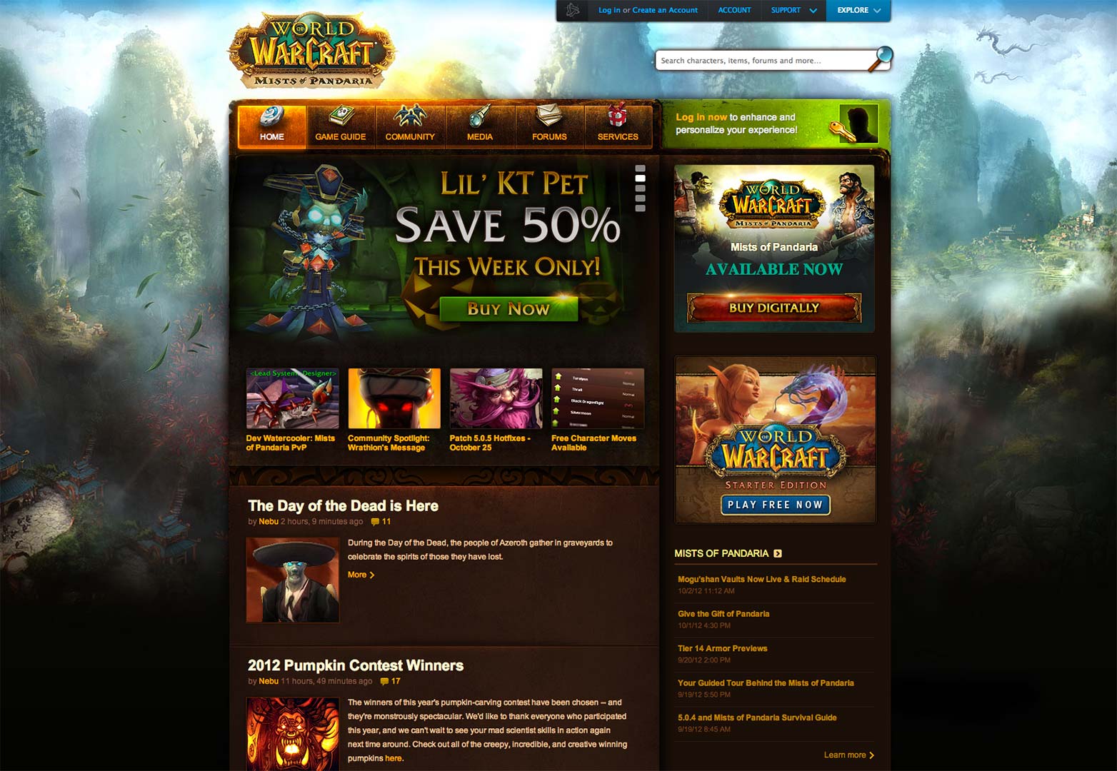
Another gaming site that doesn’t use minimalism because it doesn’t work is the famous World of Warcraft site.
Textures, art, rough edges, small text, glows, these are all prevalent in the World of Warcraft site. The reason there are so many textures, pieces of artwork and a conglomerate of other elements is because that’s what gamers like. Gamers are very, “I want it all right now,” so gaming sites have to cater to that. If one doesn’t have quick examples of artwork through backgrounds, textures, screenshots, videos, etc, then it just won’t work because it’s not giving gamers anything to look forward to and get excited about.
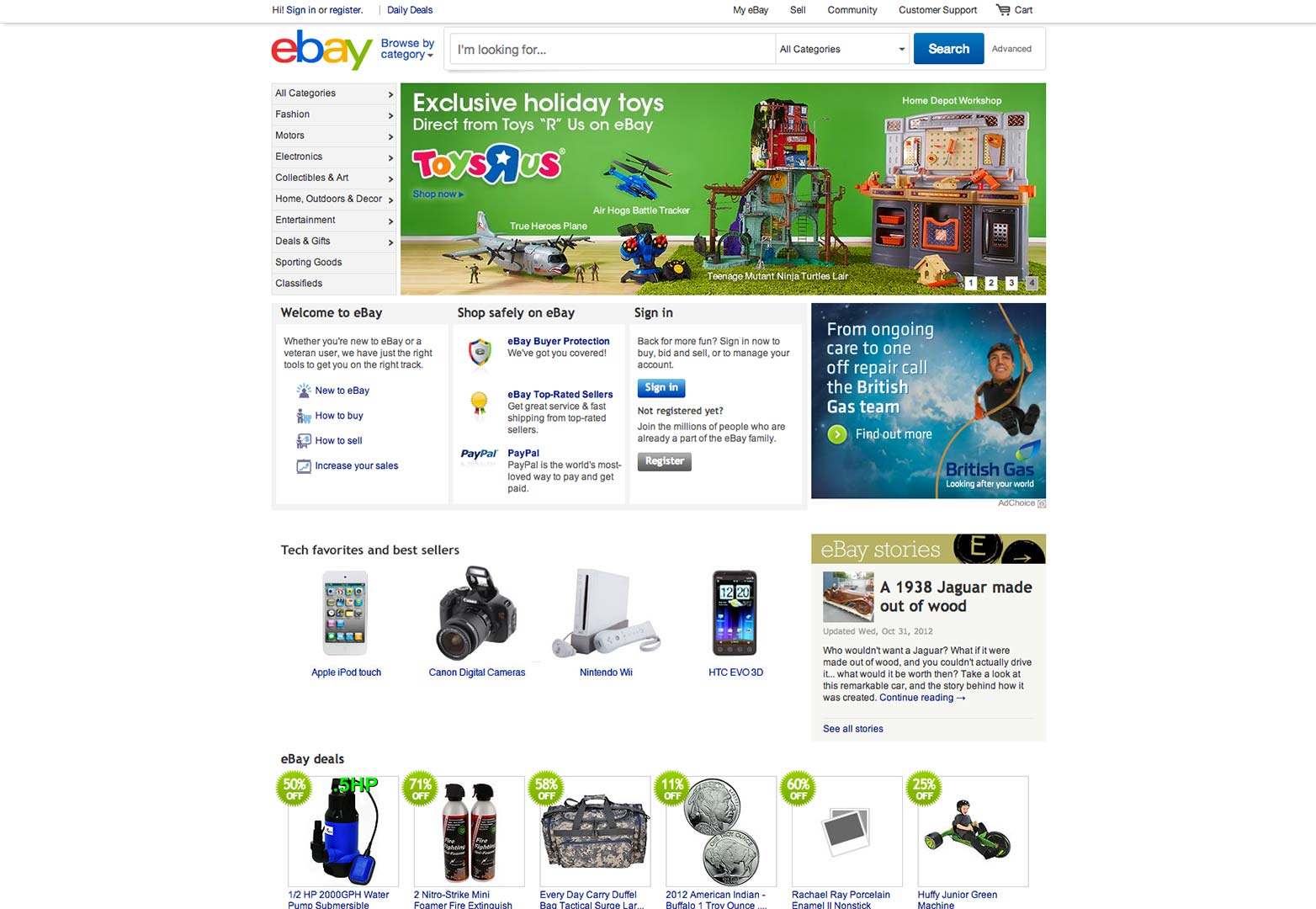
Auctions sites are another good example of where minimalism doesn’t work so well. Take ebay for example:
Ebay and other auction sites run into something similar to that which gaming sites do, they both run on advertisements and need to display a lot of information at once. Auction sites; like many e-commerce sites, have a lot of categories to display and need to satisfy the same urgency gaming websites do because they’re dealing with “I want it now” people; so the more information, categories that don’t intrude on the design, and pictures of products that can be displayed at once, the better.
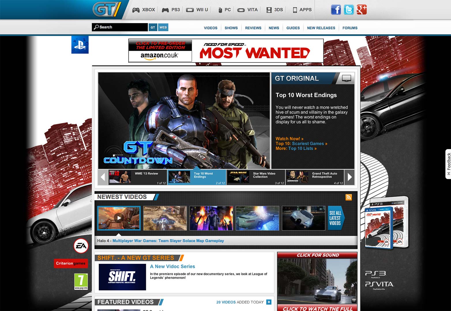
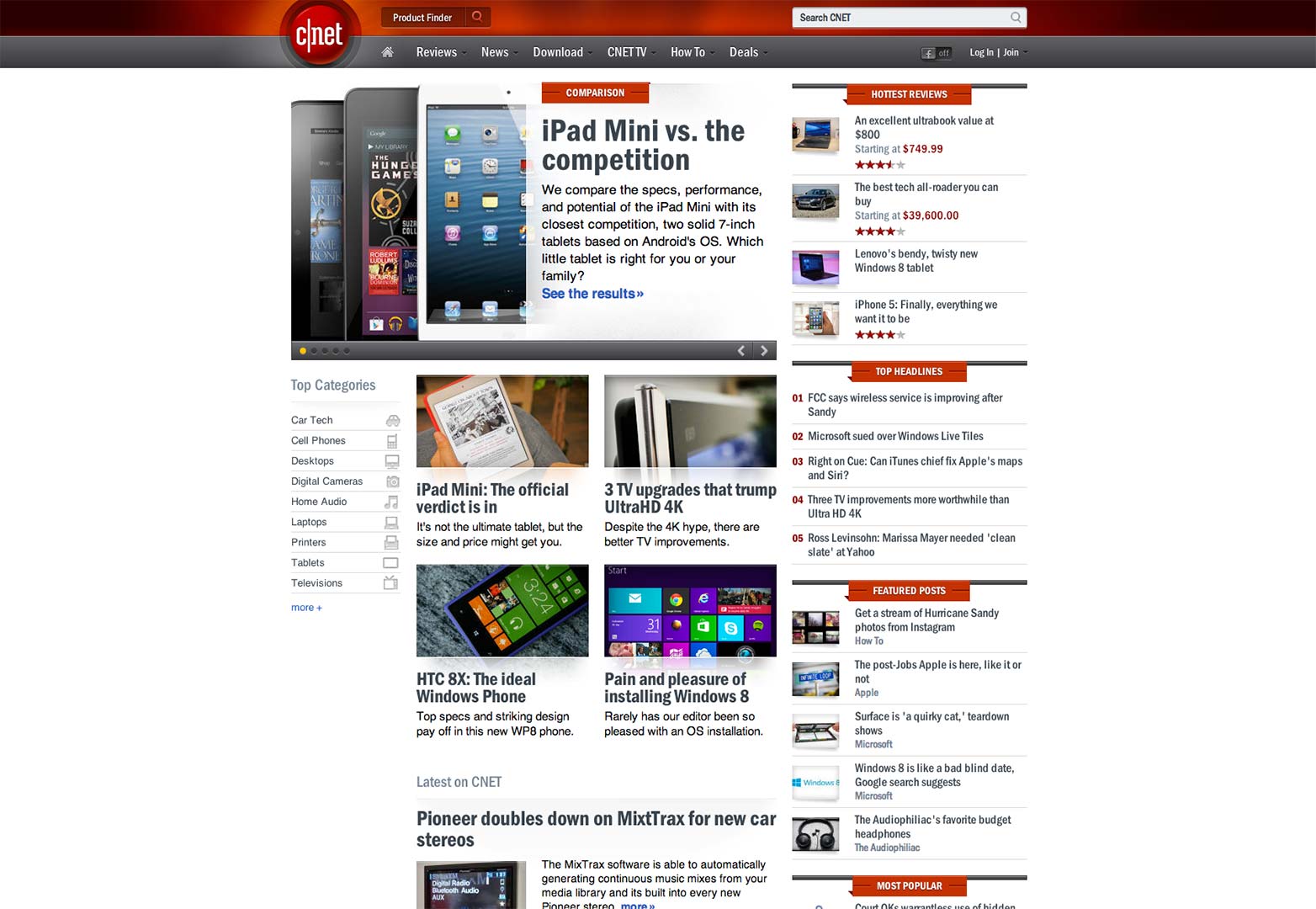
The reasons gaming and auction websites can’t use minimalism effectively are the same for review and news sites, which in many cases are one in the same. GameTrailers and CNET are good examples of this.
So what can we learn from these sites and their reasons for not using the minimalist design approach?
Minimalism doesn’t work here because it’s not practical for these websites' target audiences. It’s not practical because minimalism doesn’t satisfy urgency.
Where minimalism fails
Minimalist design is very good at creating a sense of desire, however it does not satisfy urgency at the same time. Remember that I’m talking about the urgency of needing more information, not to perform a specific action, like a huge phone number in red letters.
It all depends on your target audience whether or not urgency needs to be satisfied. Where portfolios can survive with barebones design, gaming sites cannot. The same goes for fashion sites that can go minimalist, while news sites cannot, especially if it’s mainstream.
Most things that are minimalist are elegant, but not everything can be elegant. Some things are abrasive, powerful, edgy, grungy, cool; there are nearly an unlimited number of adjectives that I could use. Minimalism is a design trend that’s mostly favored by designers themselves and that’s fine, but it can break a brand, the tone of the brand and its voice.
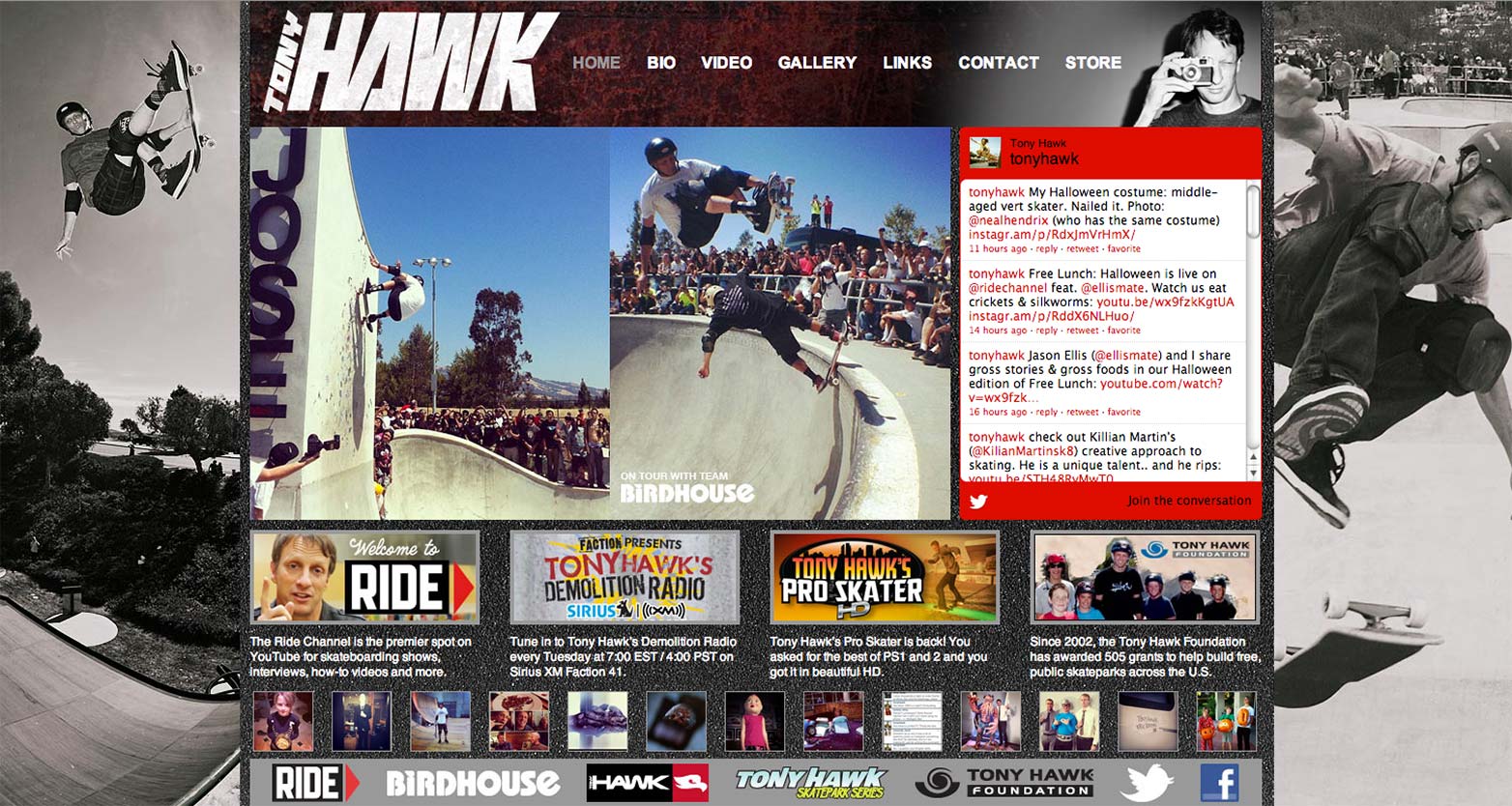
Let’s take Tony Hawks website for example, where there is a clear brand being displayed.
He’s a skater who’s cool with a little bit of grunge. He’s a social figure in the skating world, has a video game and has a lot of other merchandise symbolizing his brand. This feeling of being an awesome skater who’s engaged with his audience, wants you to get involved with him, and has some cool products that you’re going to want needs to be portrayed, and it all needs to be done as quickly as possible otherwise your attention will be lost.
When looking at this website you might feel lost, but there’s a very specific goal here. The user needs to see Tony Hawk featured performing a skate-board trick that only an advanced skate-boarder would be able to do. After defining his presence, a twitter tool shows that Tony is engaged with his audience, then thumbnails show that he is involved in a number of ways with the skater community including charity, which gives Tony Hawk credibility, even if the user knows nothing about him.
On the design side, the hierarchy of Tony Hawk’s website is great and the typography is good enough not to be a deterrent. The spacing isn’t the greatest but the colors are decent, so even though the design itself might look better if these things were improved, the message can’t survive those changes. More spacing, larger fonts and line-heights would mean smaller elements or the same elements being displayed further away. A minimalist approach would also require the elimination of certain elements and that just wouldn’t be feasible here because this website requires information urgency.
Conclusion
Minimalist design is great and it works wonderfully in many different situations; but importantly, not in every situation. You also need to remember; as stated earlier, that the minimalism trend is favored mostly by designers themselves and that’s not who you’re designing for. Design for the person, industry or niche and don’t always do what’s trendy for designers. I would argue that it’s also true to do this in your personal projects, but that’s up to you.
It has been said many times before and I’ll say it again, “stop following design trends and start setting them.” Use current trends to learn from but don’t be a “me too” designer, or a “me too” anything for that matter.
Where does minimalism fail for you? Is it possible to create a sense of urgency and still be minimalist? Let us know in the comments.
Featured image/thumbnail, More image via Shutterstock

