 The way people access information online is evolving. Google reports that by next year (2013) more than half of website visits will come from mobile devices rather than desktops or laptops.
Not only is the medium of accessing the web changing, the needs of most mobile users going online with their smartphone or handheld device is changing as well; becoming more focused and task oriented.
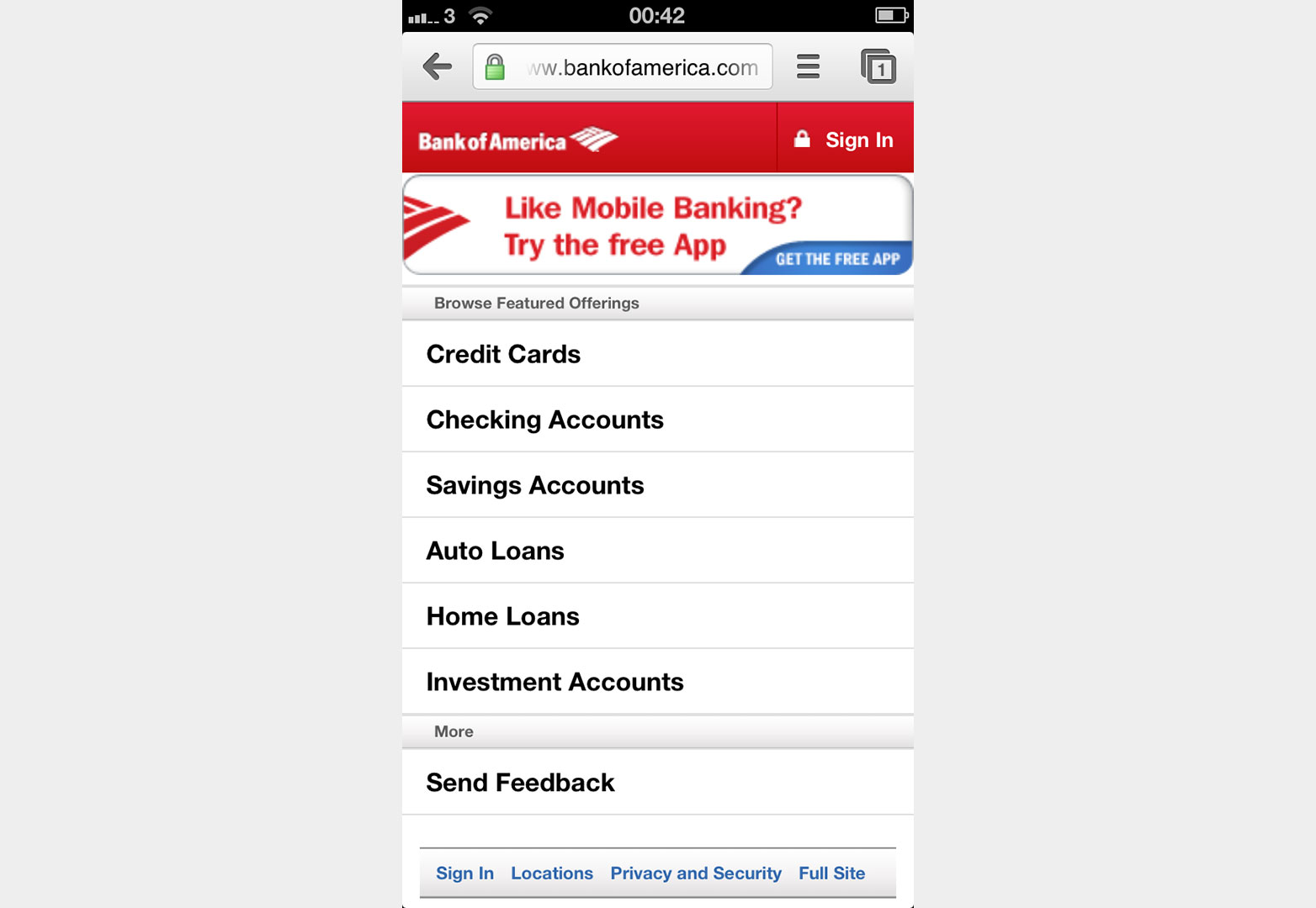
Today’s smartphone owners use their phones to perform specific tasks such as checking locations of destinations, public transit schedules, and bank balances. While internet browsing on handheld devices does occur (especially when standing in really long lines or waiting for a bus) many people prefer to surf the web from the comfort of their home or office.
Screen space is limited on handheld devices, and mobile users are busy, often multi-tasking as they search for information online with one thumb or finger.
For these reasons, mobile site navigation is even more crucial than navigation on a traditional website. Understanding the questions and needs of the typical site visitor, the limitations of their device, and what will frustrate them, is crucial for effective navigation design on a mobile site.
What are mobile users asking when they go online?
Compuware’s 2011 study What Users Want from Mobile found that 95% of users were searching for local information with their smartphones or handheld devices. It would therefore be good practice for bricks and mortar businesses to feature navigation to their location, hours and contact information prominently on mobile sites.
Put yourself in the shoes of the typical site user. Take a look at the analytics for the mobile traffic. Choose the top three or four categories users look for and select category names that reflect the most common searches.
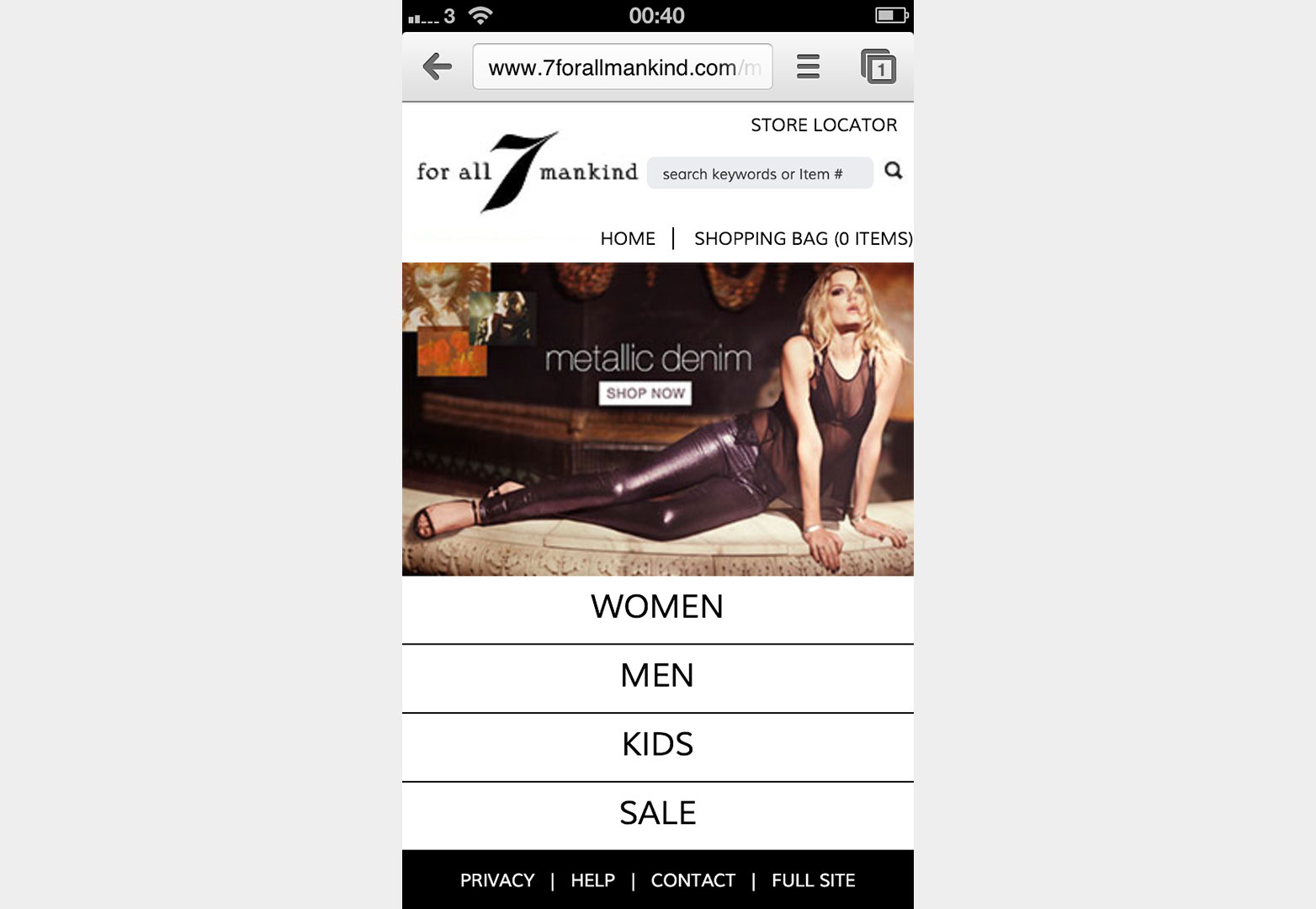
If this is a mobile site for a bricks and mortar business, display a button for location, and contact information prominently.
You can always add a link to “visit our website” and the truly interested can look at a more elaborate version of the mobile site in the comfort of their office or at home with their laptop.
7 For All Mankind know their users.
Designing for a different environment
In addition to the parameters and distractions of the external environment, web designers must also evaluate the devices themselves when designing navigation elements.
An architect wouldn’t advocate exactly the same building design for the middle of the city, desert or forest, a good web designer considers the opportunities and limitations of the mobile environment to create the most usable navigation for mobility.
The problem, of course, is that the designer doesn’t know which device the end user is holding when he visits the site, a situation that can be addressed using responsive design tools such as CSS media queries to address issues of location, size and adaptable content. Whether designing a brand new mobile site using responsive design or adapting an existing site for mobile, there are still certain best practices that hold true for navigation.
Navigation menus for the small screen
Web designers know that mobile users behave differently when accessing the web on their smartphones and handheld devices than they do on their desktop or laptop computers. Finding space for navigation on a small screen can be tricky, but with a little careful planning mobile navigation design is achievable.
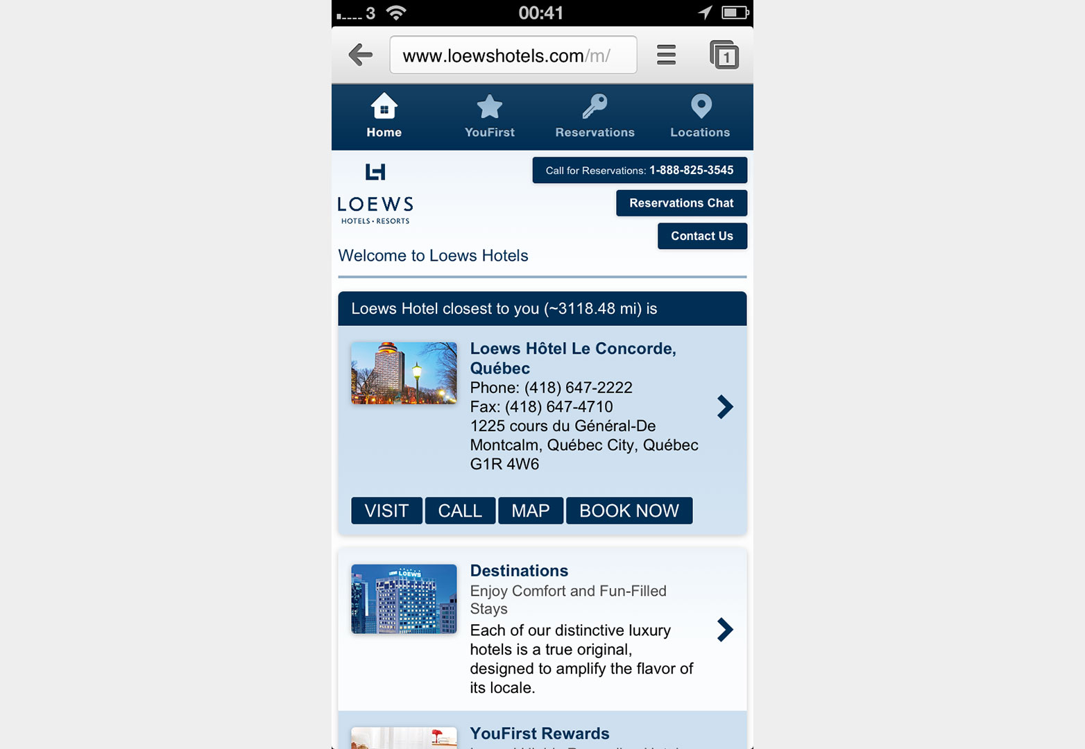
With just four navigation buttons and the toll-free reservation number prominently displayed, Loews Hotels mobile site is user-friendly and easy to navigate.
Best practice 1: reduce the number of menu buttons
This can be tricky when designing a mobile-friendly version of an existing website, particularly one that has many links in the desktop design. Limit your main navigation buttons to five or less, adding nested menus if necessary.
Best practise 2: reduce the number of taps
Keep the number of actions to be performed on a mobile device to the minimum. The fewer taps and clicks to find what the user is looking for the better. It is too easy to make a mistake. Always include an easy to find back button: you don’t want to frustrate the user further.
Best practice 3: scrolling navigation
Keep the most crucial navigation elements at the top. Mobile devices have different screen sizes, so think carefully about the importance of each category as the ones further down the list may require scrolling on smartphones with less screen space.
Best practice 4: stackable buttons
Mobile users see your site in portrait instead of landscape as they do on a desktop. Adapt your navigation for the mobile web by presenting it vertically. Read down instead of across. This works best for sites with no more than five categories in the menu, and when it is unlikely more categories will be added.
Best practice 5: nested menu
Sometimes known as collapsible navigation, this is a good option for sites that require content on the screen as well as a menu, and those that expect to add categories and menu items.
Optimizing mobility navigation for touchscreen and tiny buttons
Touchscreens and tiny buttons mean new considerations for web designers. Mobile users don’t have the luxury of a clickable mouse to pinpoint a tiny menu button or link. They are at the mercy of their fingers and thumbs, which means they are pointing to areas on the screen with much less precision than if they were using a mouse, and can get easily frustrated if their tapping isn’t yielding immediate results.
Web designers can make navigation easier for mobile users by adding more space around menu links, or by replacing the links with buttons for menu categories.
Making it larger makes it easier to find an area quickly and click it with a tiny phone button, or tap it with a finger or thumb. As the average finger requires a clickable area of at least 44px x 44px, this may result in the buttons and navigation areas overshadowing the rest of the content on the screen. However this may suit the purpose of the website and user, especially if the home page content is secondary to the major menu items.
Ideally, the design should allow the touchscreen user to make the navigation button larger if required.
Tips for optimization
- Set the menu at the top or bottom of the screen, depending on the main purpose of site users. If they are looking for content and likely to scroll, putting the menu at the bottom gives them another place to go on your site rather than leaving the site for a search engine or competing site.
- Partially hide the menu to accommodate other content on the screen, revealing the full menu when users tap it. This keeps the menu front and center without obliterating useful content.
- Place a Menu link at the top of the screen, and add a navigation button to the bottom.
- Tall and thin may be great for supermodels, but in mobile web navigation short and wide is beautiful. Wide short navigation also helps when you have longer category titles – text fits better.
- Reduce the height of header images or replace them altogether with a smaller logo to increase space for navigation.
- Keep branding and design issues consistent by paying attention to typography, color, and the style of navigation buttons instead of using up valuable space with large graphics and images.
- Shorten up the text, especially on menu buttons and category titles. In some cases this is extremely difficult, and a stackable menu with room for more text on each line is a preferable alternative.
- Simplify as much as possible. Remove as much from the homepage as possible to focus on only providing the top few items most users want.
Mobile navigation no-nos
Mobile users are busy, distracted, and on the go. They don’t want variety in their choice of which buttons to choose and you don’t want them to become frustrated and leave the site due to analysis paralysis.
Don’t give them a lot of choice.
Avoid horizontal scrolling, and no hovering! Slider menus can also be frustrating to mobile users. In your quest to simplify and streamline navigation, don’t think you have to be boring. Creative navigation isn’t a bad thing, but it must be intuitive. The user should be able to easily see where to go to find the information they want quickly.
Conclusion
The relative newness of mobile devices as a method of accessing the web means that mobile navigation is constantly evolving as different designs are tried, tweaked, or thrown out altogether.
What works for one set of users on one site may be a disaster with a different site as the information the user searches for is completely different. Additionally, the same user approaches different sites with different purposes: a mobile user looking at a news website on her phone most likely wants headlines, not contact information; which is precisely what she does want when she visits the mobile site for her dentist or hair stylist.
While navigation elements for a mobile website may differ from a traditional website, the purpose is the same: web visitors have a question when they go online. Where is the store? What’s happening in the world? What’s my bank account balance? Great navigation leads users to the answers quickly and simply.
Meet their immediate needs and they will return, increasing traffic to the website, making your clients happy and leading to referrals and more mobile web design business for you.
What approaches to mobile navigation do you prefer as a designer? How about as a user? Let us know in the comments.
Featured image/thumbnail, mobile internet image via Shutterstock.


