 As a design professional, you are familiar with (and possibly contributing to) the increased use of circles in all elements of design.
From home décor items such as round-framed mirrors and prints to hand tools at the hardware store, circles are everywhere. Circles have even rolled their way into our websites, appearing in headers, menus and sometimes smack dab in the middle of the page.
A few design sites have even created blog posts including great screenshots of the creative use of circles in web design. However, little has been said about the psychology behind using circles in design, or how the user’s response to circles can be effectively incorporated into the growing phenomenon of mobile use.
We know we like circles, but why? And how can a web designer best use circles to optimize the user experience in responsive design?
Circles and the brain
Cognition and perception
Circles appeal to people because they are easier to understand than shapes and objects with hard lines.
The eye is drawn to circles and the information contained within, and they are faster and easier for the brain to process than hard-edged squares and rectangles.
Swiss mathematician and physicist Jurg Nonni, author of Visual Perception, suggests that removing edges allows us to more quickly perceive an object. According to Nonni, “A rectangle with sharp edges takes indeed a little bit more cognitive visible effort than for example an ellipse of the same size. Our “fovea-eye” is even faster in recording a circle. Edges involve additional neuronal image tools. The process is therefore slowed down.”
Familiar and comforting curves
In addition to the brain’s cognitive ability to process circles more quickly than it can process squares and rectangles, we process familiar information and objects faster than those we don’t recognize.
Everyone recognizes circles, and people learn to connect shapes with specific actions and results, such as the universal red octagon “STOP” sign. According to Apple’s OS X Human Interface Guidelines, “People learn to associate certain behaviours with specific elements based on their appearance. For example, people recognize push buttons by their rounded shape.”
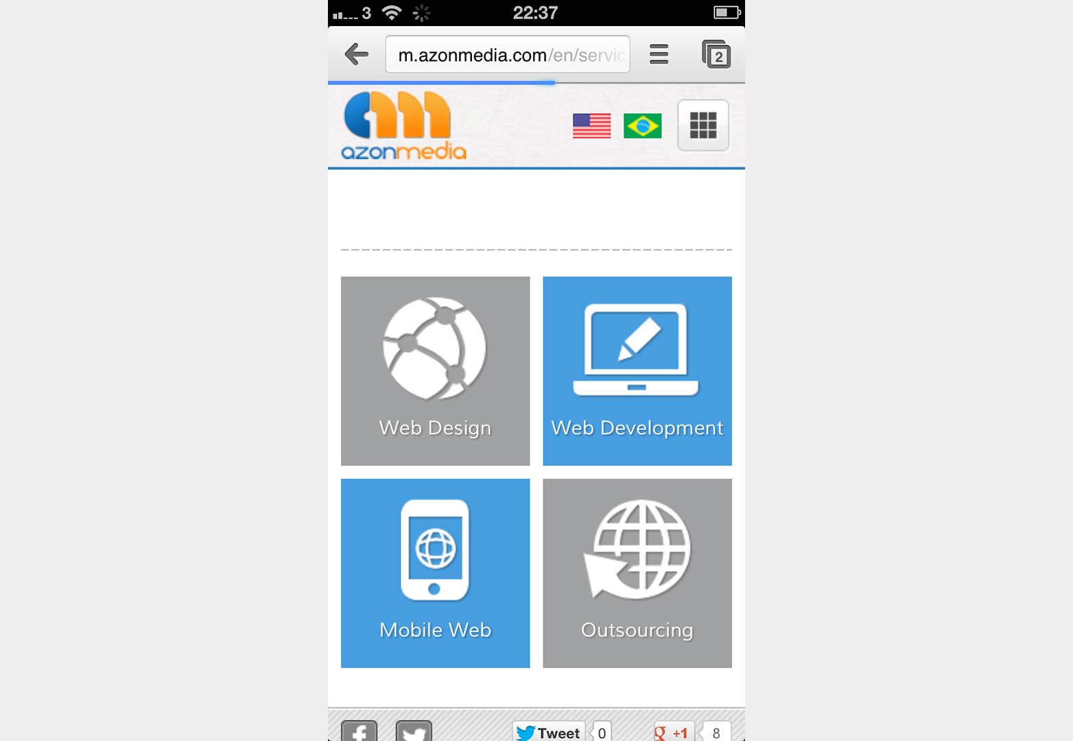
An effective use of circles in iconic menu items on Azonmedia’s services page.
We encounter circles, ovals, and rounded-edged objects in many warm and non-threatening ways across cultures and environments. Clouds, eggs, the sun, and the moon in nature all appear rounded to the naked eye. Smiley faces, cakes, pies, curvy figures are all pleasing to the senses.
Our brains respond well to circles and curves, while perceiving hard edged objects as harsher, more defined and with the potential to be a threat.
Circles and the user experience
Circles are effective in web design for precisely these reasons.
Online users are notoriously impatient, and because circles are more easily perceived and understood, it takes less time to process the information they represent.
Mobile users are even more impatient. They are also busy, often on the move, multi-tasking, and using an index finger or thumb to navigate their handheld device. They want their information NOW. Circles help mobile users pinpoint the information they search for more efficiently.
Circles and thumbs
Another way circles are beneficial in a mobile first and responsive design environment is their suitability as elements in touchscreen interfaces.
As touchscreen smartphones and tablet users finger-tap, slide or thumb their way to the information they seek, it makes sense to use circles to direct the user. Not only do they mimic the fingertip shape, we associate circles and rounded edges with push buttons and our brains quickly process the required actions.
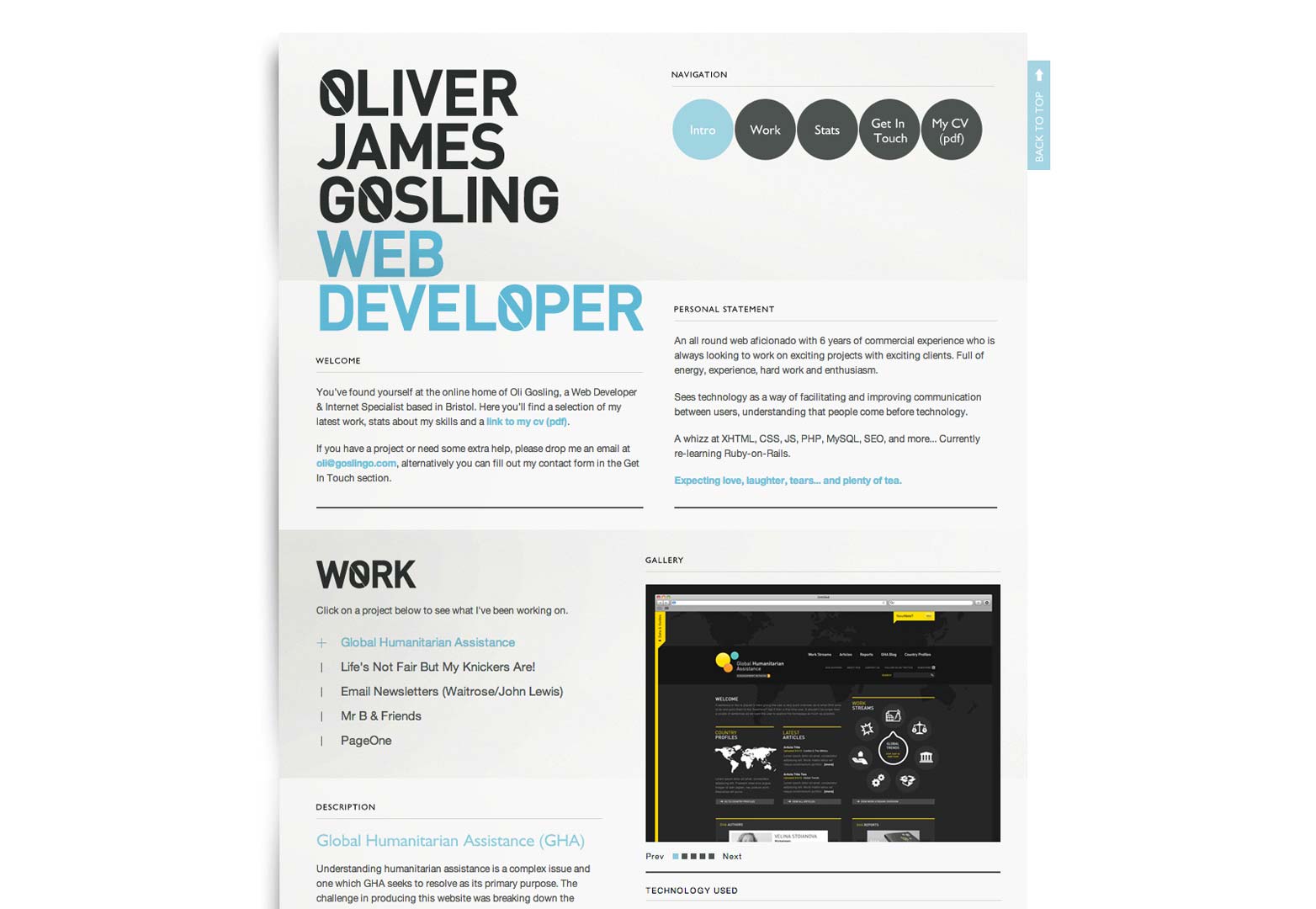
Web developer Oliver James Gosling
When you incorporate circles into a touchscreen mobile interface, design to the smallest screen. Text or images within the circle must still be easily read, and the size must remain at least the size of a fingertip, or 44 pixels.
Circles and screen space
The good news about using circles in responsive design is that CSS3 greatly simplifies the coding requirements.
The bad news is that circles take up a lot of real estate, and result in more open screen area.
As the screen space on smartphones and tablets can be quite small, how can you introduce circles without worrying about them becoming so small they are impossible to read, tap or click?
A simple mobile interface
It helps to keep your mobile interface simple. As the eye is drawn to the circle anyways, there is no point in cluttering up the rest of the screen with content the user will miss.
Unless they are part of the header or logo, keep circle use to a minimum of one or two on each page. Try using a circular search button, or use one for your call to action such as “call here” or “sign up here.”
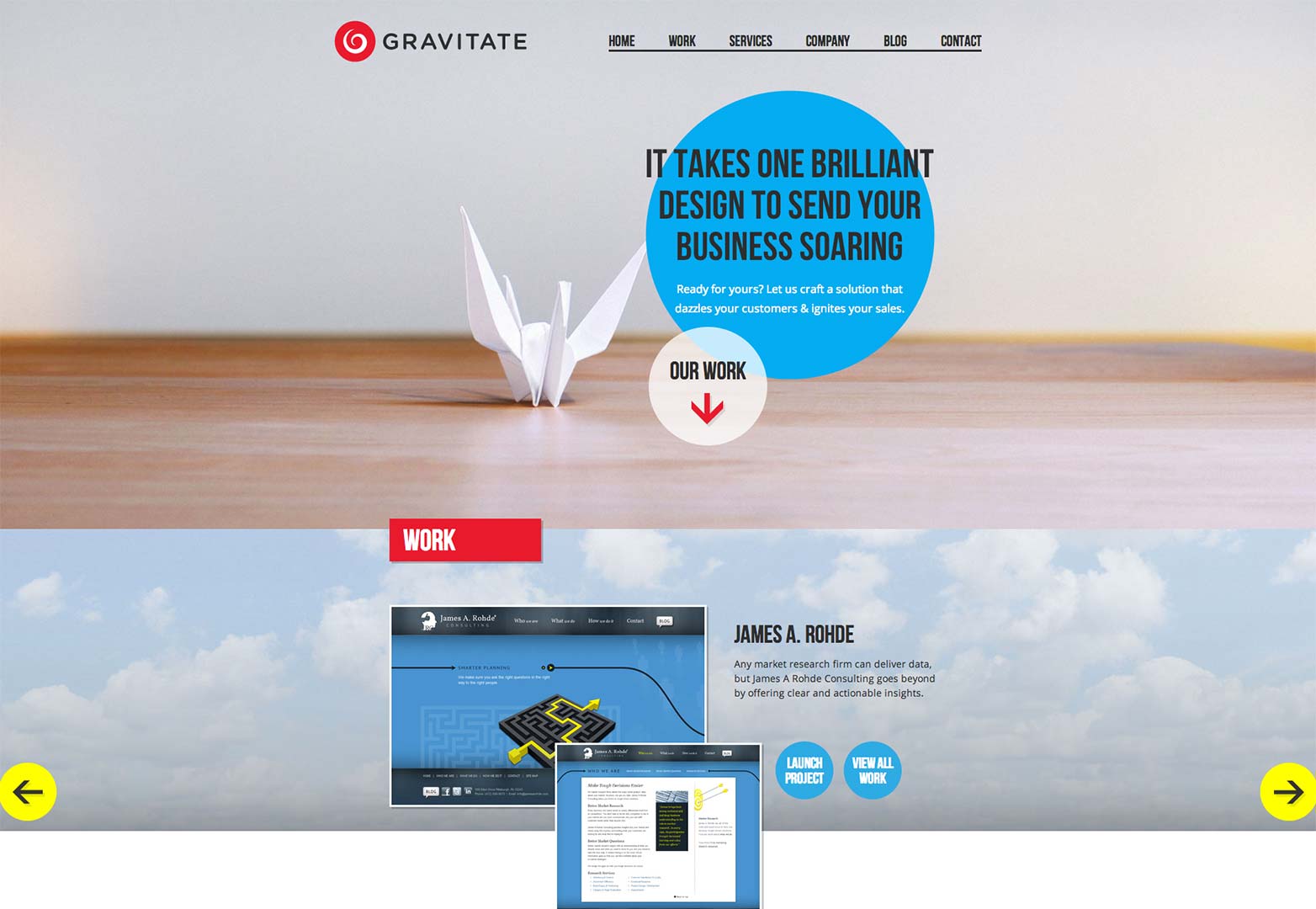
Gravitate Design uses circles and color to attract the eye to the logo, portfolio and text on the homepage.
Backgrounds and share buttons
As with any design element, the use of circles must suit the content, product or service, style, and branding of the site. It should enhance the user experience and simplify the interface.
If using a call-to-action isn’t appropriate for the site, or if the navigation and menu items simply don’t work within a circle, consider incorporating a circle into the background. Use a larger circle in the background to draw the eye to the most important piece of content on the page (semi-transparent behind the text).
Remember, the content is what the mobile user is here for in the first place. Encourage user engagement by choosing round social media share buttons instead of the rectangular options.
Circular icons in responsive design
One of the more popular ways to incorporate circles into websites is as icons in a menu. This suits responsive design well, as it replaces lengthy and/or confusing text with a simpler image.
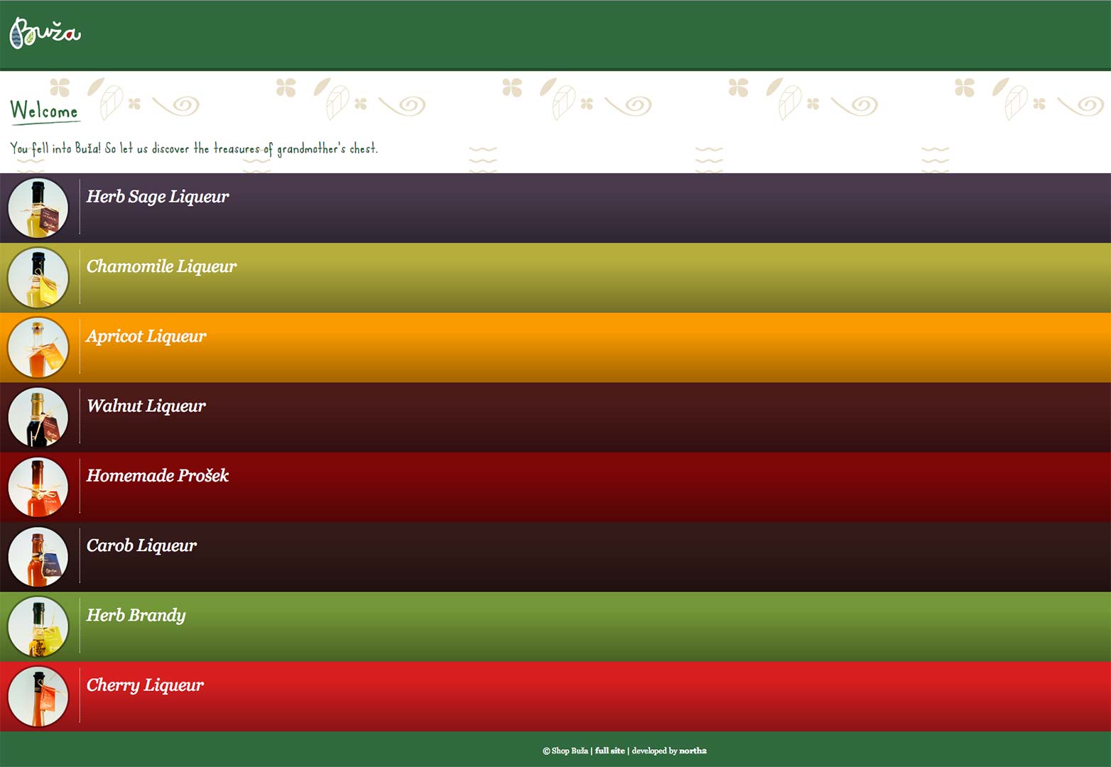
Buza uses circles to complement the vertical mobile menu.
A circular icon takes less space, allowing more room for content. It looks good and the user quickly processes what it represents.
Ovals or rounded rectangles
Maybe you aren’t ready to wrap your arms around a big old circle. That’s okay. But don’t stick with hard-edges.
Add some rounded rectangles or ovals to your responsive design toolkit. The smoothed corners will make it easier to focus on the content within the curves, instead of drawing your attention to outer edges.
Final word
While web designers may spend hours agonizing over the merits of circles or round-edged rectangles versus sharp edges, when it comes to pleasing the user with mobile design, it’s all about the content. The user wants engaging and useful content presented in a simple and easy to find interface. Everything else is secondary.
Though responsive web design seeks to respond to the environment, it should also respond to the needs of the user. Users recognize the circle’s familiar shape, perceive it quickly, and can easily pin-point the clickable point on the screen. Use a simple circle in your next responsive design project. Your users will thank you for it.
Do you use circles for your call-to-actions? Do you play it safe with subtly rounded rectangles? Let us know in the comments below.
Featured image/thumbnail, circles image via Shutterstock


