 In August 2011 7.12% of all website hits worldwide came from a handheld mobile device. By August 2012, that figure had risen to 11.78%.
We can literally watch as tablets and smartphones become our default choice for connecting to the internet. People have long gotten used to the web as an essential part of their lives, not willing to live another day, even another moment without being constantly connected.
This shift away from desktop to mobile requires web designers to refocus. Not necessarily away from desktop design, but certainly towards mobile design. There are several ways to approach a mobile web presence, such as a separate mobile site, or a mobile app. The most recent and increasingly popular approach is responsive web design.
Responsive design solves such a huge problem for web designers that it's easy to lose sight of the fact that it throws up problems of its own.
In this article I’d like to discuss both the opportunities and challenges that come with responsive design. I will shed some light on this new way of thinking and help you to make an informed choice for your next project.
Opportunities presented by responsive web design
Responsive web design is all about keeping it simple. The idea is to create one website to fit literally all screen sizes, be it a desktop or laptop screen, tablet or smartphone in landscape or portrait mode. Responsive websites are designed with a flexible grid. They use media queries to determine the screen size for every individual site visit and rescale the content accordingly.
Let’s take a look at the advantages that come with a responsive design approach.
1. Low maintenance
With a responsive design you only need to maintain one website. While the layout changes, the content stays the same across different devices. You can simultaneously update content or fix bugs for all devices.
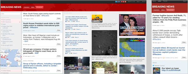
For example, for news sites such as breakingnews.com this is of great advantage. Fast-changing content and frequent updates require very high maintenance. A responsive design not only saves time, but also money.
You can focus on one single website and put all your resources into the optimization and maintenance of that site. No more need to prioritize or handle different versions of your site separately.
2. Brand consistency
With one website that works on both desktop and mobile screens, you will find it much easier to keep up a consistent brand identity. No more style guides that need to be communicated between multiple parties, such as different agencies for the desktop and mobile versions of your site.
The look and feel of a responsive website will be consistent across all screen sizes. spigotdesign.com maintains a unique branding experience on all devices. This makes it very easy for people to recognize the website, no matter where and how they visit.
3. Usability
Responsive web design is highly user friendly. Not only can your visitors better relate to your brand if they recognize your website on mobile, they also know better how to use it. A consistent style and consistent content is important because users don’t expect it to be different just because they use a different device.
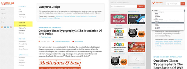
An important aspect of good usability is to meet your user’s expectations. If you manage to do that, they will have less trouble navigating your website. smashingmagazine.com makes it very easy for their readers to navigate the site on all devices, keeping up a positive user experience. A good experience increases the chance of a repeat visit.
4. No redirects
The fact that you only have one website for all devices also means that you have the same page URLs to deliver content to all your users. You don’t need to worry about redirects or incompatibilities between different devices.
When promoting a link, you can be certain that people can access it directly, no matter where they are, or how they visit your site.
For example, when sending out newsletters, chances are high that your readership will open your email on a mobile device. You don’t want them to have to switch to a desktop computer or laptop before they can open your links.
Any content you promote should also be available, be it on mobile or not.
5. Load time
Those visitors, who access your website with a stable wifi or cable connection will have little trouble downloading relatively big chunks of data, such as special animations or big images. Mobile users on the other hand, who use 3G or 4G connections, will be thankful for as little data as possible.
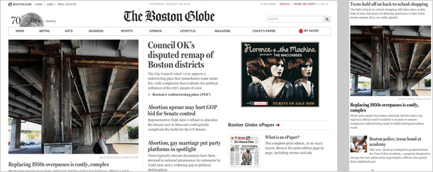
Again, news sites, such as the bostonglobe.com are often used on the go, during a daily commute for example. Responsive design allows them to select very specific content for each device, or to pre-compress images.
Challenges presented by responsive web design
Responsive web design is a relatively new approach to mobile web design. Some say it’s only a trend, others say it is a new way of thinking. Personally, I believe within the framework of the rapidly and constantly changing web, everything can be considered a trend in some sense. Let’s not go into this too deep here. Rather, let’s take a look at the challenges that we need to overcome to build successful responsive websites.
1. Development time
Probably the most obvious minus point about building a responsive website is that it takes more time. Obviously, for a regular desktop site you need way less preparation time, less resources to build it, and also testing it requires less effort.
It usually takes longer to convert an existing website into a responsive one than to build one from scratch. If you are thinking about going mobile, and doing so by making your website responsive, don’t underestimate the work you will also have to put into your existing desktop version.
2. Different devices remain different
The idea that you can simply build one website that works equally well on any device is a myth. Sure, there is only one set of code and your website remains the same regarding content and structure, but different devices require a different way of thinking.
People will browse your website according to their very specific needs and goals, and not to mention their unique context of use.
Designers from choiceresponse.com have clearly prioritized their content for mobile use. While the desktop version can display a lot of content at once, for smaller screens you need to know exactly what matters.
Imagine, you are responsible for a public transportation website. One user might visit the desktop version, browsing patiently, hoping to find a special bargain for his weekend trip. At the same time, someone else might be checking the mobile version, hoping to find out which platform he should run to before his train leaves in less than a minute.
One website, two situations, and two completely different user scenarios. In order to create a great user experience for all your users, you need to consider that people will use different devices in different circumstances and with different goals.
3. Different devices offer different interactions
Your desktop version not only differs from the mobile version in a hypothetical, but also in a very practical way. Interaction that works just fine on one device may be irrelevant on another. That is mainly because the way we interact with desktop and mobile devices differ.
While we use keyboard shortcuts and a very defined mouse pointer to navigate through a website on one device, we have nothing more than our fingers on the other.
While the desktop version of forefathersgroup.com includes several links with a hover-over effect, the designer used these effects only for content that didn’t make it to the mobile version. Again the prioritising of content is very important in responsive design.
4. Limited support of media queries
Responsive websites work with media queries to determine the screen size of every visitor and then display the correct layout.
The problem here is that old browsers, especially Internet Explorer version 8 and older, don’t recognize media queries. Currently about 14% of web users worldwide still use IE8. 14% is a substantial portion of your audience, and depending on your target demographic the figure could be higher.
This does not mean that there is no way to display your website on these older browsers. You just need to be aware of this when working with media queries. There are several ways to avoid the problem, such as using a completely separate stylesheet for IE, or designing your website mobile-first.
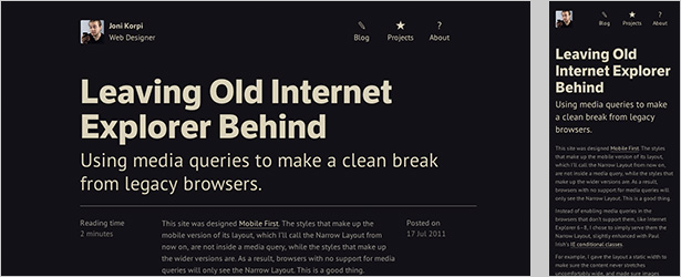
Taking a mobile-first approach means that only styles that should apply to wider versions of the layout are inside a media query, not those for the mobile version. This way, browsers with no support for media queries will only see the mobile version.
5. Scalable images lose details
Another limitation of responsive design is the scaling of images. Scaled images quickly lose details and thus their meaning. Basically, the true limitation here is not the scaling itself, but the fact that scaling happens strictly based on screen size and not on context.
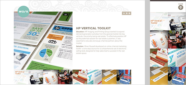
On oliverrussell.com this problem is solved very nicely. Images are rearranged so they can stretch across the entire screen if necessary. This creates enough space to keep most images from being rescaled at all.
An alternative to scaling images might be to crop them. Still their meaning and the experience that comes with it will ultimately be altered.
6. Navigation menus
Last but not least, navigation menus make up for an important part of any website. Especially on more complex desktop websites we are used to multi-layer drop-down menus. On smaller devices you will always encounter limited screen real estate, which makes designing intuitive navigation menus a challenge.
The designers of starbucks.com have decided to hide the navigation menu on smalls screen sizes by default. Only when tabbing a little icon on the top left corner the different content categories appear as finger-friendly buttons.
On any device, the rule of thumb is to strike a balance between easy access to information and an unobtrusive design. Don’t reinvent the wheel if you don’t have to.
Things to consider
Whether to go responsive is ultimately down to you, but if you do decide to give it a try, here are a couple of things you should consider before you get started.
Preparation is key
Thorough responsive web design starts long before your first photoshop mockup. Also long before your first wireframe. Good preparation is the key to successful design. The better you are prepared, the more time and money you will save in the end.
Since your website will vary on different devices, you need to have a clear picture in mind of how you want to structure your content for each of these devices. The smaller the device gets, the more choices you have to make regarding the priority of your content.
Start from scratch
If you already have an existing desktop design and you're considering a mobile presence for the first time, think about this carefully.
You can recycle the design from your old desktop site, but modifying the code may well take longer than starting over from scratch.
Don’t reinvent the wheel
There are plenty of tools and resources online to help you develop a responsive site.
Don't try and reinvent the wheel by creating a new approach. Learning from the mistakes of others will speed up your development time considerably.
Test, test, and test again
This is nothing new, and shouldn't come as a surprise. Early and repetitive user testing is essential for any successful design, responsive or not.
The different behaviour and the challenge to design for both touch and regular screens at the same time will require some excessive testing. Start to test on all the devices you own. If everything works, borrow devices from friends and family and test those. Last but not least, visit an electrical store and try out your site on their devices.
Do you produce responsive designs for your clients? Have you solved these problems? Let us know in the comments.
Featured image/thumbnail, mobile internet image via Shutterstock.

