 It seems that everyone is on the logo change bandwagon. Why are so many companies choosing now to change logos that are no older than their teenage customers?
Take the CBS (a major U.S. commercial broadcasting television network) “eye” logo, that has remained unchanged since it was designed in 1951. The Eye device was conceived by William Golden based on a Pennsylvania Dutch hex sign (while commonly attributed to Golden, there is speculation that at least some design work on the symbol may have been done by another CBS staff designer, Georg Olden, one of the first African-Americans to achieve some notoriety in the postwar graphic design field). Some claim that the eye was inspired by an article in Alexey Brodovitch's portfolio about the subject of Shaker design.
The eye logo made its broadcasting debut on October 20, 1951. The following season, as Golden prepared a new identity, CBS President, Frank Stanton, insisted on keeping the logo and using it as much as possible.
While the ABC (American Broadcasting Company) has also stuck with the same logo for almost as long as CBS, NBC (the National Broadcasting Company) has changed their logo repeatedly over its history in American television.
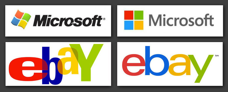
So why are younger companies changing their logos so quickly? Microsoft and eBay recently made headlines with their new logos, or “rebranding,” as some call it, much to the delight of graphic designers who went to town critiquing the designs with negative comments.
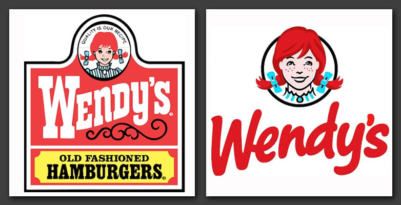
Following closely, were the logo changes from fast food giants, Wendy’s and Arby’s, also much criticized in the design community for not really meeting the branding target announced by the companies.
Is it “freshness” or boredom?
Why go through the trouble and expense (design fees, printing new packaging, new signage, etc.) of redesigning a logo when you are not rebranding the entire company? Is there the impression that consumers become bored with identities that are more than a decade old? Are the fast food changes a limp attempt to compete against McDonald’s?
Why would such established companies as Microsoft and eBay even need to introduce new logos and the familiarity the consuming public has with those identities?
For eBay, Lipincott, the international design firm that handled the rebranding for eBay, released the following in a press release, covered by DesignWeek.com:
Lippincott senior partner Su Mathews says, ‘we wanted to reflect the right amount of change in eBay’s new logo. The design is inspired by today’s vibrant marketplace and sleeker experiences.
We leveraged the iconic color arrangement and approachable form to reflect eBay’s heritage and evolved it with a brighter blue and darker yellow, and a streamlined arrangement to create more visual harmony.
The new brand and refreshed website will reflect ‘a global online market place that offers a cleaner, more contemporary and consistent experience,’ according to eBay.
eBay says, “we retained core elements of our logo, including our iconic color palette. Our vibrant eBay colors and touching letters represent our connected and diverse eBay community.”
The brand has been positioned to reflect eBay’s evolution from selling second hand, vintage and specialist items to also selling new items.
“eBay will become more personalized, tailored to the way you want to shop. We will be local and global” according to eBay which wants to “create better ways to buy and sell.” To this end the new branding “reflects a dynamic future,” says eBay.
Yeah, blah, blah, blah. While a thousand designers rant on chat boards about how they hate the new design, eBay’s stock went from a 52 week low of 28.15 per share to a high of 50.94. Was it due to the new logo? Of course not. The business model works and improves and a picture of fly-laden horse dung would have pushed the stock up. If anything was responsible for eBay’s surge, it was just the new page layout, which is yet another site to copy the Pinterest layout, making viewing easier for the growing illiteracy of the consuming public as education funding is continually lowered. Pictures work!
Does the Arby’s logo influence consumers to eat more of their sodium-infused sandwiches? Is the new Wendy’s logo sexually stimulating with her crazed redheaded visage more prominent? I may be jaded due to marrying a redhead who destroyed my life, as has every “ginger” I’ve ever known but the important thing is that a logo should be the identifier for your business as well as promoting an emotional response, sort of like my fear of “gingies,” although I can’t stay away from them. But I digress.
When change is part of a logo
CBS may have kept the same logo but over the past six decades they have played with color as well as the type that accompanies the eye logo. There have been other identifiers that do the same but I have always been fascinated with logos that incorporate kinetic change into their brand.
Many years ago, I was interviewing with a designer and firm owner, Tom Corey. He asked me what logos did I like and why? I mentioned the strength of the CBS eye but said I LOVED the Nickelodeon logo because it was brilliant in its simplicity. The white type, unchanging, appeared in orange shapes that could be anything, as long as it was the style guide orange.
“I designed that,” he told me. It was 1998, so I wasn’t able to find that out on the internet when researching the company before my interview and I suspect he thought I was just kissing up to him but everything I said was true. Before telling me he would get back to me about the job, he explained how the logo came to be (with additions by Fred Seibert’s article for additional clarification):
"Nickelodeon was owned by Viacom, which also owned MTV. The MTV logo had been sold in with two thoughts. The first was that Rock’N’Roll was a dynamic constantly changing medium and a logo should have a built-in updating mechanism.
"Secondly and more importantly, television was moving pictures. Logos were generally designed by print designers who wanted a perfect image, then handed off to moving image designers who had to figure out how to make the damn thing move. Often, it ended up with a big hunk of metal hurtling through space, 'cause what else were they going to do? We’d argued that in the 1980s that was a dumb thing to do. Why not just design a logo with movement baked into the conceptual frame right from the beginning?"
Tom went on describing how, with MTV, it was anything could appear within the flag being held by the astronaut on the moon (which was their first motion graphic identity spot). Subsequent promos used the same formula.
"With Nickelodeon, I worked with the Fred/Alan office in New York with my partner Scott Nash and heard their pitch for the network. The idea was not to say 'fun' but to be fun. In discussions with Seibert and his partner, Alan Goodman (they were known as 'The Logo Guys'), we borrowed from the MTV logo but this time, instead of the action being contained within the lines, such as it was with the flag, the type would identify the company and the change would occur outside of that."
According to Seibert: "Orange generally clashed with everything and that would make the logo stand out (as long as we didn’t let designers try and make it work “correctly.”) The splat could morph into any image we liked."
Even Nick Jr. (the programming for toddlers) stuck to similar rules of their identity.
That logo was used for 26 years and many critics, unlike with the eBay detractors, rightfully disagreed with the abandonment of that logo.
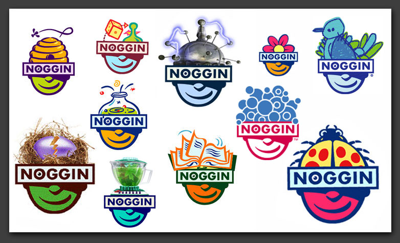
As cable TV expanded and new channels popped up, Corey went on to design the logo for Noggin, which ran from February 2, 1999 until September 28, 2009 (its programming is now part of Nick Jr.). Another brilliant logo that could change at will and still remains basically the same.
The lower part of the face and Noggin banner, with its thick line work, would refresh with the addition of anything replacing the top of the head. While early versions kept to the shape of a head, additional logos went wild but the identity and the sense of fun always remained.
I didn’t get the job with Corey’s firm and he passed away much too soon for such a brilliant designer with a flair for concept but I have since been inspired by the lesson he imparted. Whenever I am allowed to do so, I design logos with the same idea of change without interrupting the basic look and feel.
When I was asked to design new stationery, envelopes and business cards for a well-known museum, I wanted to take advantage of their wonderful collection of odd antiquities. After figuring out the production requirements, I designed it so that each sheet of letterhead, each envelope and every business card would bear a different image of a piece from the museum’s collection. Sort of like collect-‘em-all trading cards, each time someone received a letter or was handed a business card, they would get a different image with a short history of the piece.
The museum’s director loved the concept but said they needed to go through a few thousand reams of existing stationery before they could consider the new designs. Come to think of it, I believe it’s time to contact him and see how much stationery they have left after ten years.
What kind of logo do you prefer? After reading the lesson of Tom Corey, would you try a changing logo or is tried and true the way to go? Let us know what you think in the comments.

