 Nothing is more important than readability when it comes to the text on your website.
Absolutely nothing.
If you can’t read the words, then what good are you doing? Who is getting your message?
Just as important as the words themselves is the design of the text – from fonts, to hyphenation, to how it is all organized on the screen. Part of the design includes the words themselves, how you compose the “big words” on your site can make a difference as well.
Font selection
There are just so many fonts to choose from. It can be quite overwhelming.
Don’t let it be. The best thing you can do when it comes to readability is to keep it simple.
Select one or two typefaces for your site. A good place to start is with one font for the main body copy and another for the big words, such as headers, banners and breakout text. Using a different font for every element is distracting, confusing and difficult to read.
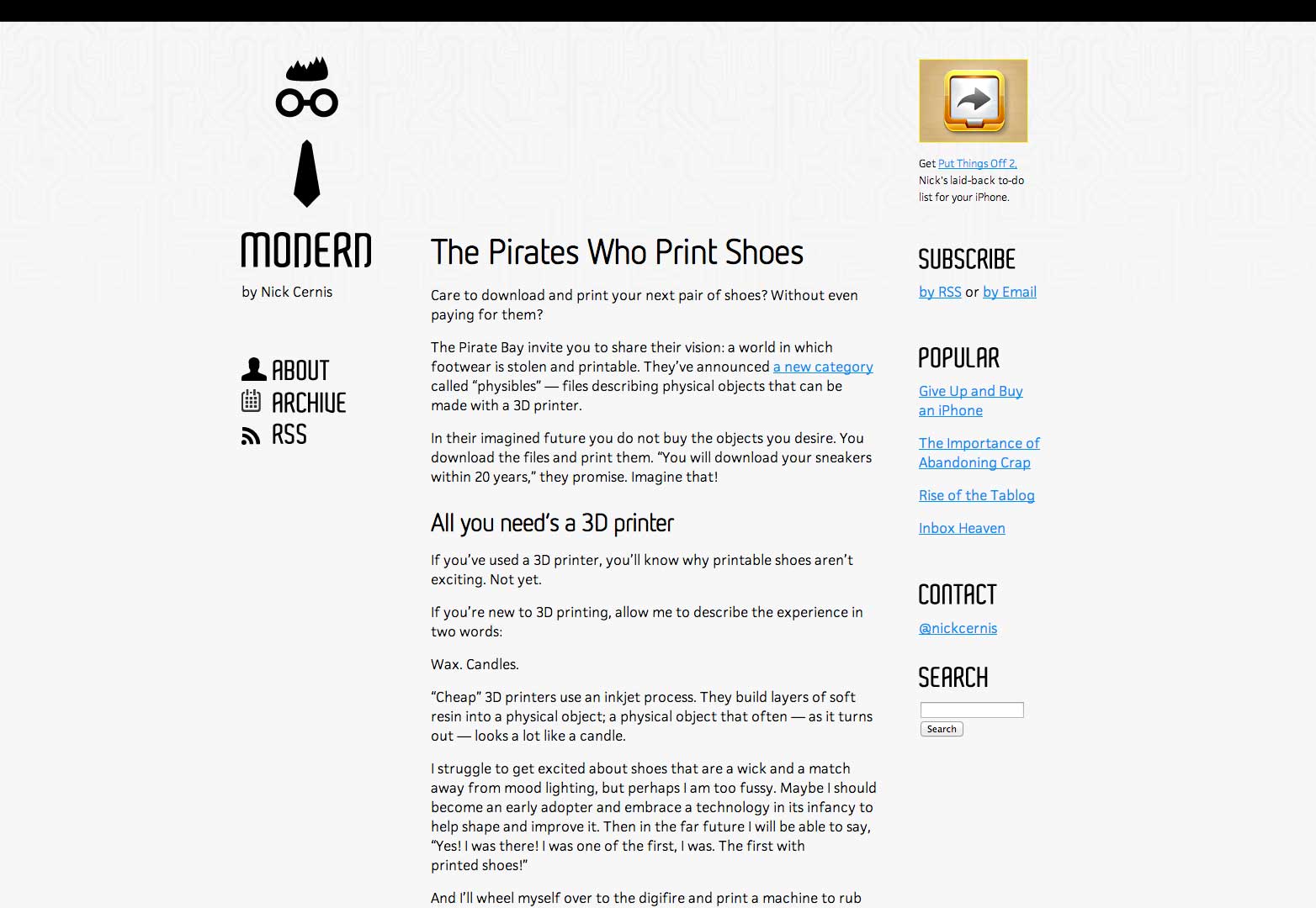
Start with a sans serif font for the main body copy. Sans serifs are the easiest on the eye when it comes to screen reading and tend to work well even at smaller sizes. Serif fonts can start to “run together” or lose their serifs depending on font size, screen resolution and even color contrast between the text and background.
Keep in mind that your body copy will be the most read thing on the site and needs to be easy to digest on computer, tablet or mobile device screens. It is OK to use different styles of this typeface within the copy, but don’t go crazy. Bolding and italics are great for points of emphasis, but large blocks of these styles can be difficult to read.
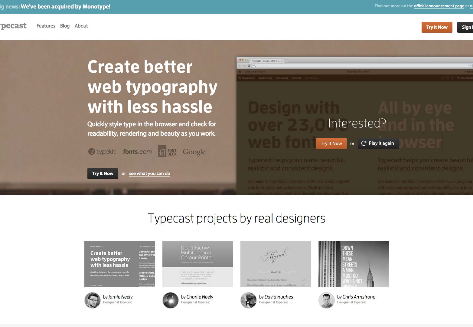
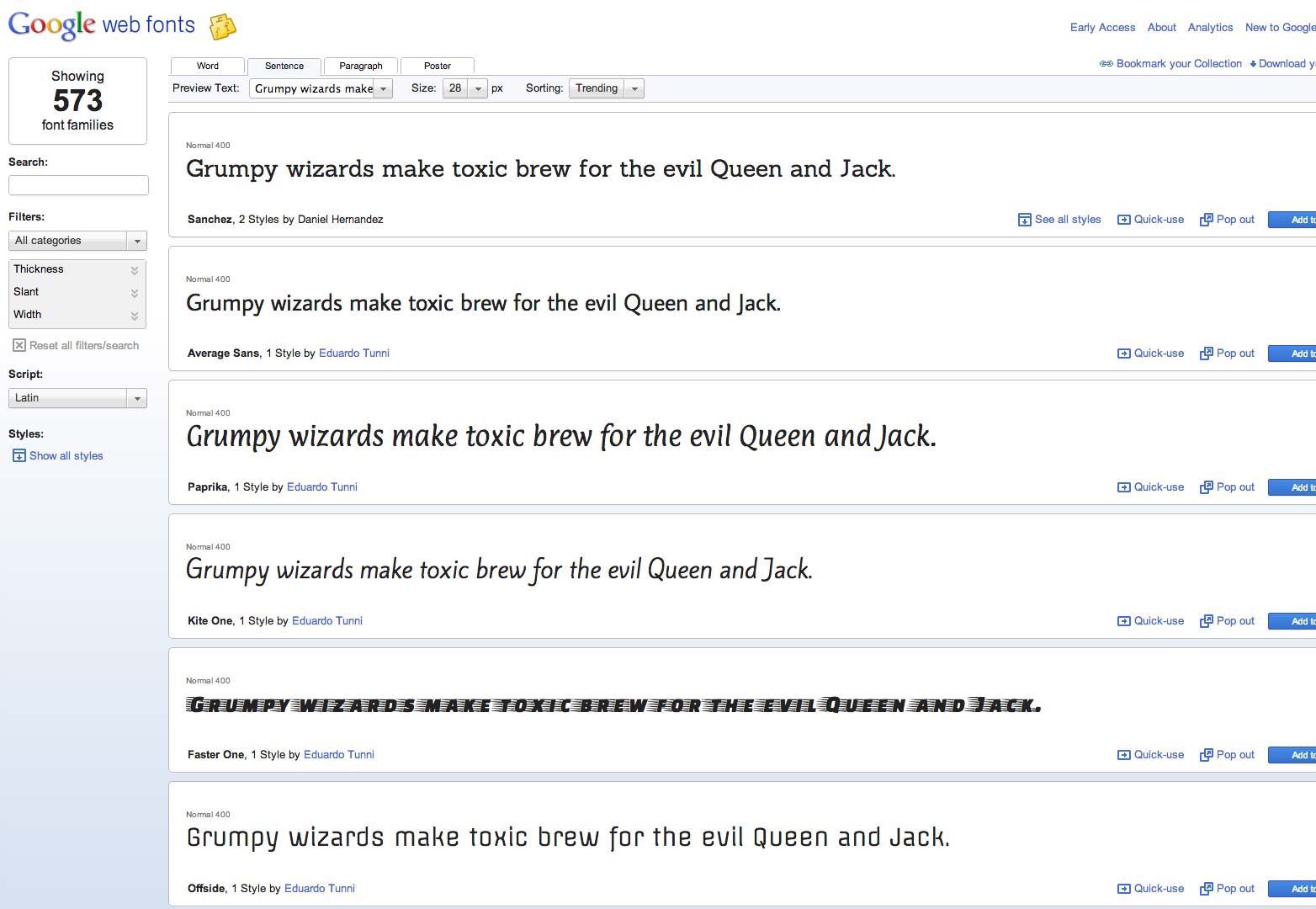
If you need help selecting a typeface trying pairing fonts with online tools such as Google Web Fonts or Typecast.
Hyphenation
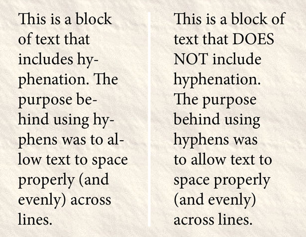
Hyphenation is bad. It’s ugly. It’s ineffective and confusing. (And these problems magnify across platforms.)
Stay away from it.
In case you need a refresher, hyphenation occurs when a word is split at the end of a line causing part of a word to appear at the end of one line and the rest of the word to appear at the beginning of the next. Using hyphenation has pretty much gone out of style when it comes to web design, but you still come across it from time to time. (It is used regularly in print publications, such as newspapers.)
The thinking behind using hyphens was to allow text to space properly (and evenly) across lines. When working with justified text, you can run into odd spacing issues when hyphenation is removed.
But hyphens that break words can make text tough to read. Reading over a hyphen, can cause a person to stumble over or misinterpret a word. Using hyphens can also inadvertently change the emphasis of certain words or their impact in the rest of the copy. Subconsciously a hyphen tells a reader that the word is a little less important than other words which are entirely rendered.
Reserve hyphens only for the words that need them, such as with modifiers, and not to break lines. Text will look cleaner and more professional and have increased readability without all those annoying dashes at the ends of lines.
Justification
Like hyphenation, full justification has fallen out of web-design fashion, although it is still used commonly in print.
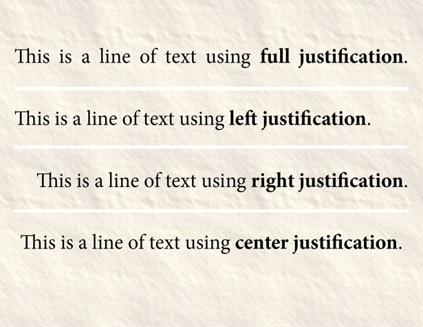
Type using full adjustment fills each line completely from a left margin to the right margin so that every line is the same width. Using full justification creates (and closes) spaces between words so that the spacing is not evenly distributed. Using this type of text alignment can work for some websites, but is not always the most visually-appealing option. Take a look at how your text breaks and trying reading it a few times to gauge whether full justification is a viable option.
There are other types of “justification” or text alignment as well. You can set text so that it lines up on the left margin, on the right margin or down the center.
For English-language websites, left justification is the most common practice. Text aligns to the left margin and has a ragged right edge. The feel is friendly and easy to read. Because this technique is so common, many readers will not even notice how the text is set up. This is your best option for working with large blocks of text.
Right alignment is another option but does not work so well for chunks of text. With text aligned to the right margin and ragged on the left, starting and stopping points are located awkwardly on the screen. The natural reading order is reversed and just the thought of reading text in this way (especially in large quantities) can make a reader uncomfortable. Reserve right-aligned text for small breakouts if you want to incorporate it into your design scheme.
Centered text is a quite popular tool even though it is not recommended for large text blocks. (Granted you will find it used this way all over the web.) The pitfalls of center alignment are much like those associated with right-aligned text – it does not have “natural” starts and stops and can feel awkward on the page. Center aligned text can feel somewhat formal (because it is often used for items such as invitations) and should be reserved for small bits of text where emphasis is important. It is not a good choice for large copy blocks.
Other type effects
Strokes or outlines
Use in moderation on larger text elements as a point of emphasis but avoid in small text.
Strikethrough or underlining
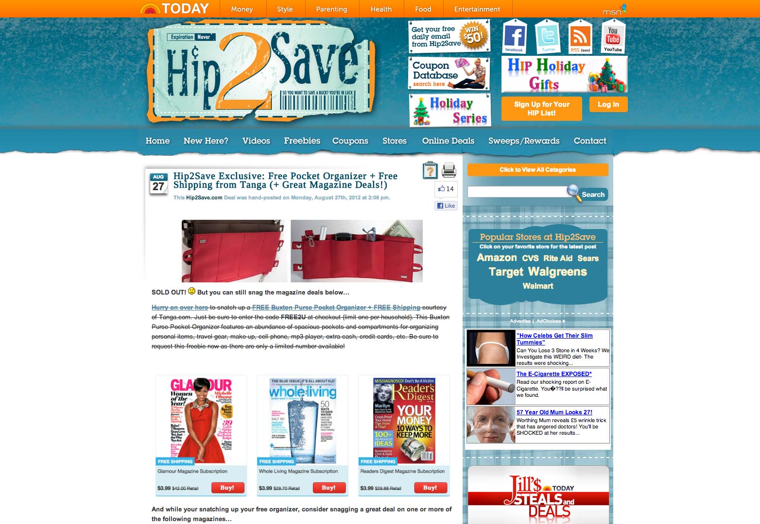
Both of these are commonly used – strikethrough as a notation that something is no longer valid and underlining for emphasis. Keep using these tools but use them sparingly. Both work for small bits of text but cause tremendous readability concerns when spanning more than a few words.
Tilting or distortions
These effects are great when you are using typography as an art form. They are not so effective when you are trying to convey a message. You should avoid text manipulations and distortions on main body copy.
Color
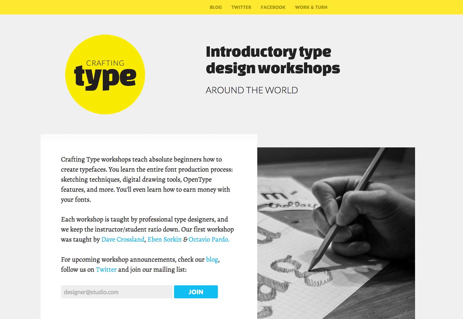
The use of color can be a great tool for providing emphasis for a single word in a block of text. (The most commonly and visually appealing color combinations for blocks of text are black or dark gray on white or white on a dark background.) Aim for colors that stand in sharp contrast to the background so that they are easy to see and read. Super-bright (think yellow or fuchsia) colors can be difficult to read unless they are used with a thick, large typeface. Consider bolding type with color for additional emphasis, but reserve this technique for a limited number of words.
Keeping large text clean
Although hyphenation can be considered a matter of preference in body copy, it should always be avoided in big type. Simple justification styles are a must; left, or center-aligned text are your best options.
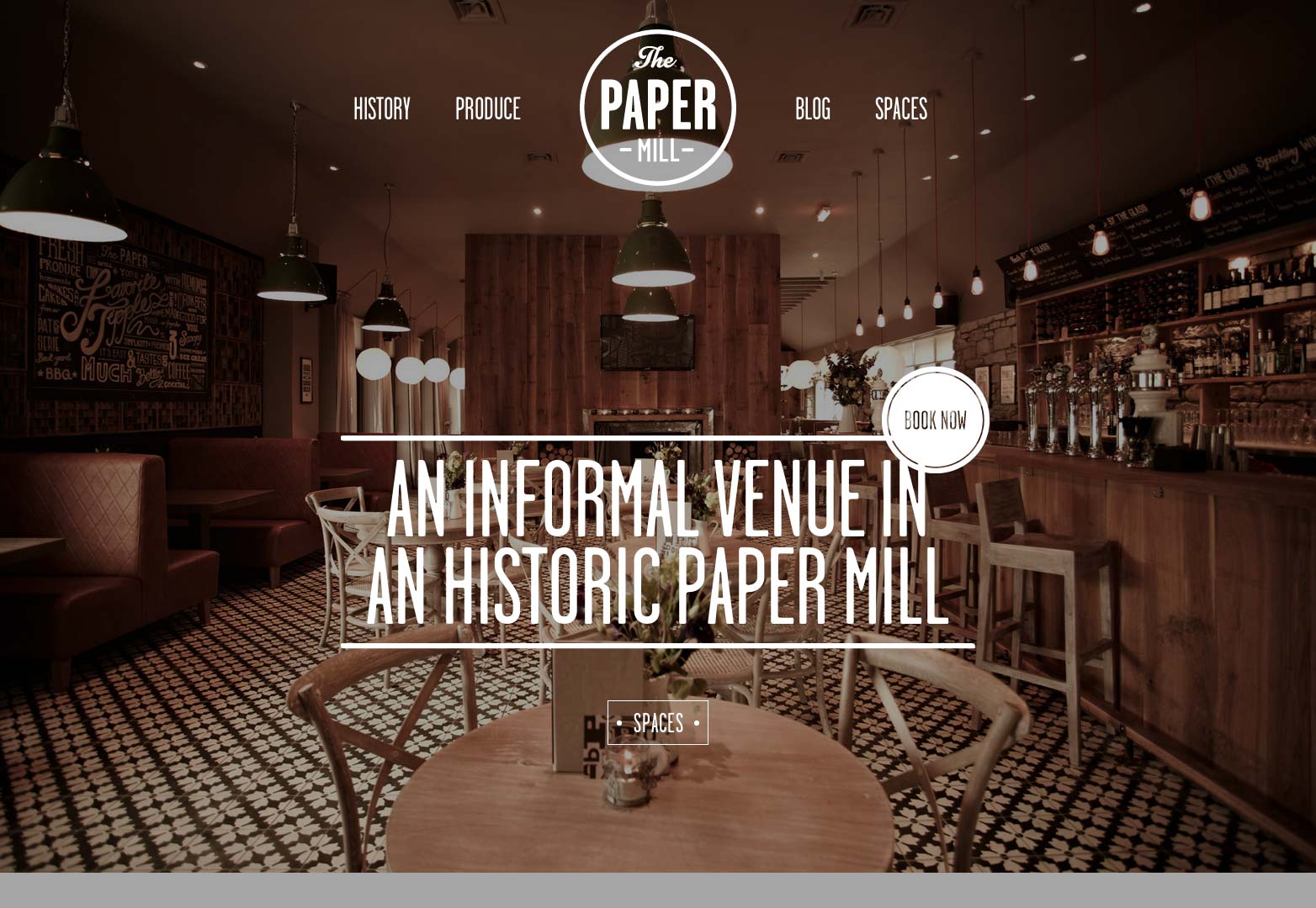
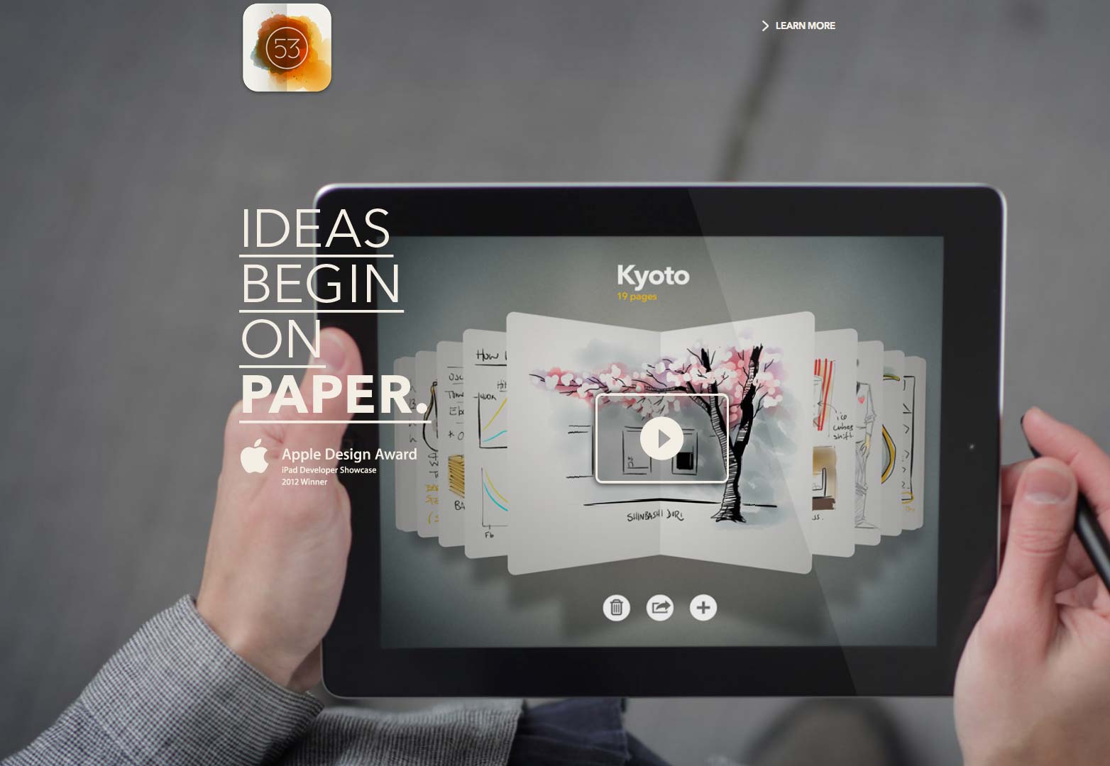
Headers, banners, breakouts and other big type or furniture need to be reader-friendly. Not only are these words used for navigation, they must also be read in order to keep people moving through the content on your website.
Hyphens are stumbling blocks.
Odd alignment will not aid navigation.
There are a few other things to think about as well when plotting the design for your big type.
Think about the size of the type in proportion to the main body copy. Headlines and headers that are significantly larger and bolder will speak loudly to readers, while smaller, thinner furniture will whisper.
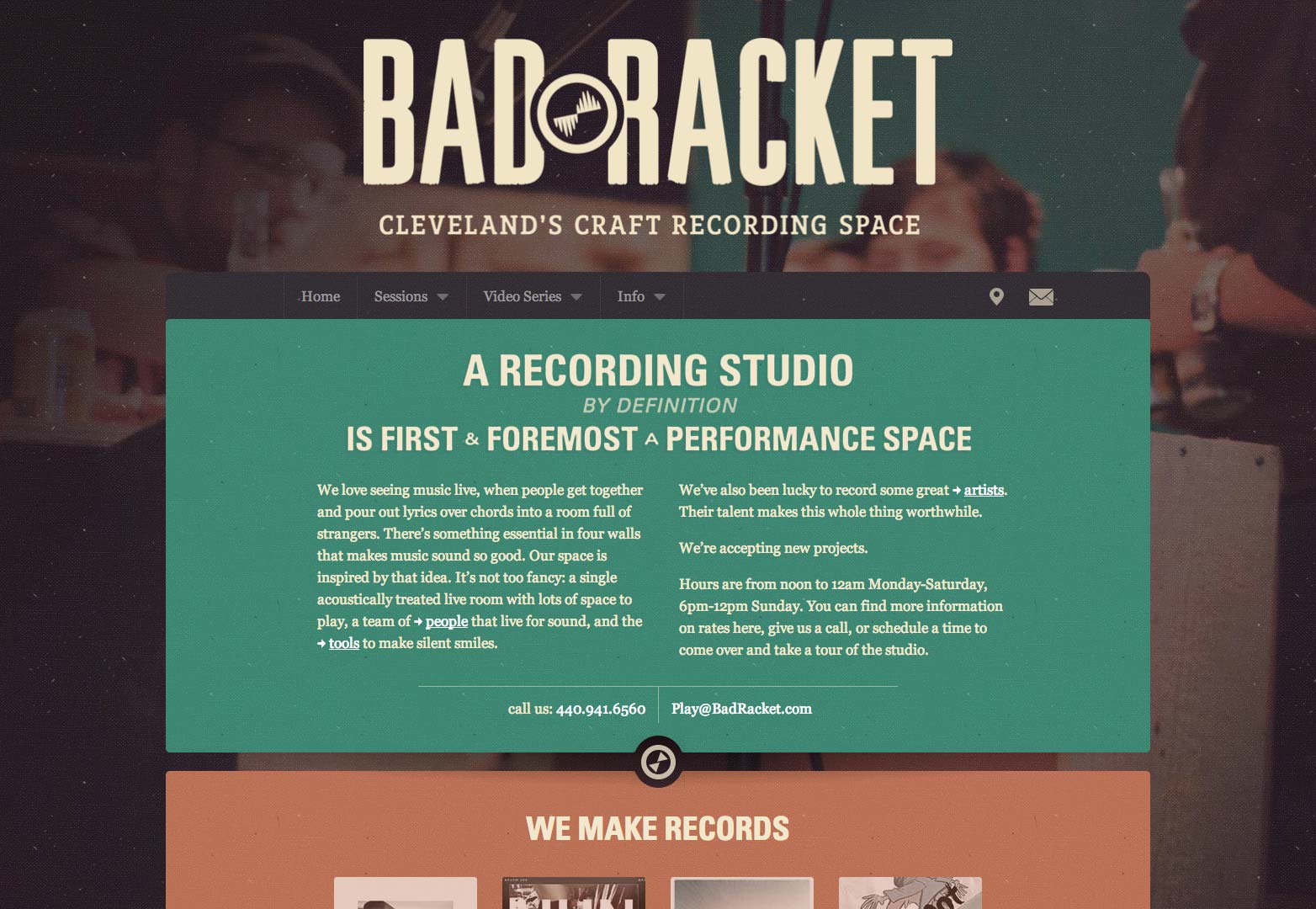
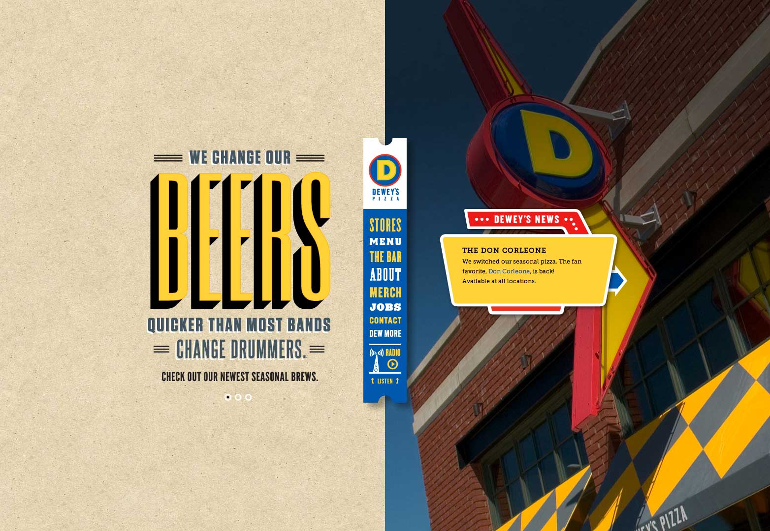
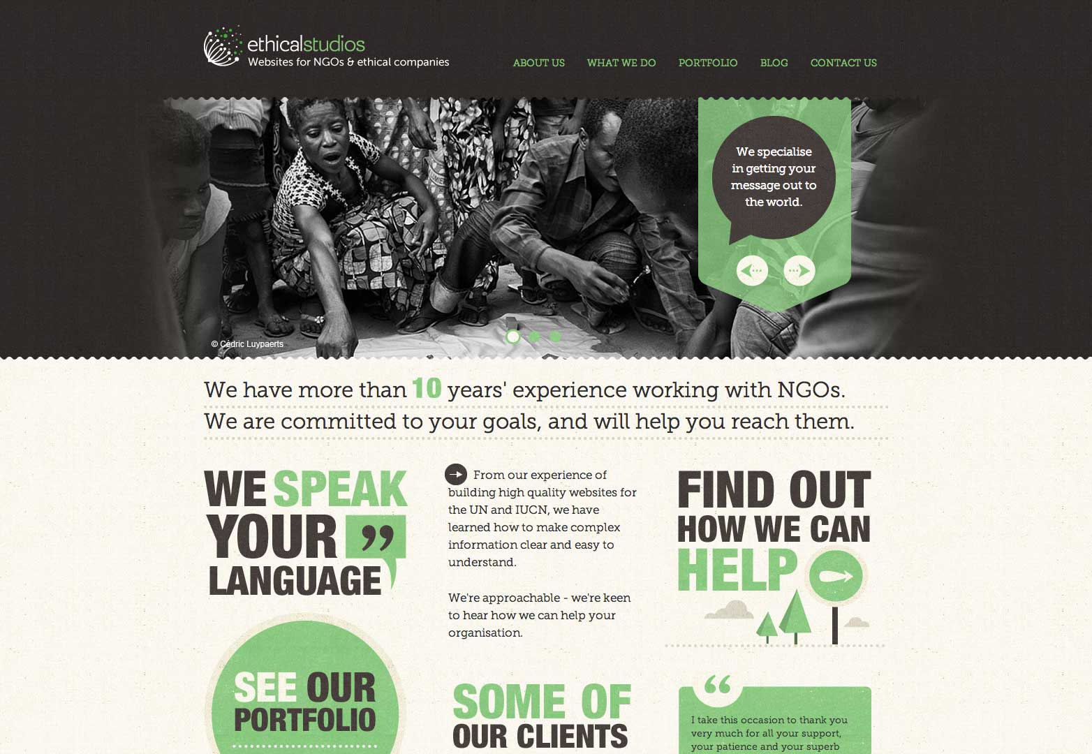
Contrast is of the utmost importance to large words. When choosing fonts, pick something for furniture that is not too similar to the body copy. Consider a serif font, keeping in mind that serifs work best at large sizes so that the terminals and details on each letter do not get lost in the pixels. Another option is to go for color to establish a distinct style and hierarchy for furniture.
Think about the space around the big words as well. Make sure big words rest near the copy they describe. Add extra space above each header or headline and condense the space between it and the copy.
Write to fit
Finally, think about fit.
Look at how the text lines up once you have written the copy for the big words. Does it fill the line? How many lines?
Visually you want to go for headers that have a consistent look. This applies to both the type style and how long the words are. Avoid items that fill one line completely and only a fraction of the next line. Think of furniture in terms of small rectangles; you want everything to fit inside the frame without gaping white spaces.
Create a style for the big words, whether it is a simple header containing just a few words or two-line complete thoughts above each section of text. Consider part of this style to be the type of headline you use – will it ask a question, be a statement of fact, tell readers what to do, showcase how to do something or be more indirect and cute with words and phrasing?
Try to write headers and headlines that are only one line long (two at the most), use active words.
This can be tough to accomplish and be wary of tricks. Don’t grab a thesaurus and substitute a big word for a short one just to make things fit. (You will run the risk of using the wrong word or using a term that your readers might not know the meaning of.) Think conversationally when writing. Compose the words and then revise (cut or add) so that you maintain the integrity of what you want to express and produce clean, easy to read copy.
Conclusion
Clean copy is about more than just simple typefaces and hyphens. It is about writing copy that makes sense and presenting it in a readable manner.
Think about your audience when putting it all together. You would use a different technique and style when writing blog posts about wedding ideas (traditional, feminine feel) versus blogging about tattoos (likely more edgy and dark). Your audience has an impact on visuals, they should also impact your copy.
But most importantly, think about how it all comes together. Strip everything else off of your site design, leaving only the type behind. Is it easy to read? Do you have to zoom in or out? Are you squinting at the screen? These are the real questions you need to answer because at the end of the day, readability is what matters most.
What text do you find hard to read online? What techniques do you use to keep your text readable? Let us know in the comments.
Featured image/thumbnail, text image via Shutterstock.

