 It seems that there has been a line drawn in the sand. A few brave design pioneers have all but denounced skeuomorphic design as yesterday’s news and have voted it off of the proverbial island.
Are we witnessing the turning point of design as we know it, or are these champions simply jumping an imaginary bandwagon?
Let’s take a closer look at the two biggest styles in 2013…
What is flat design?
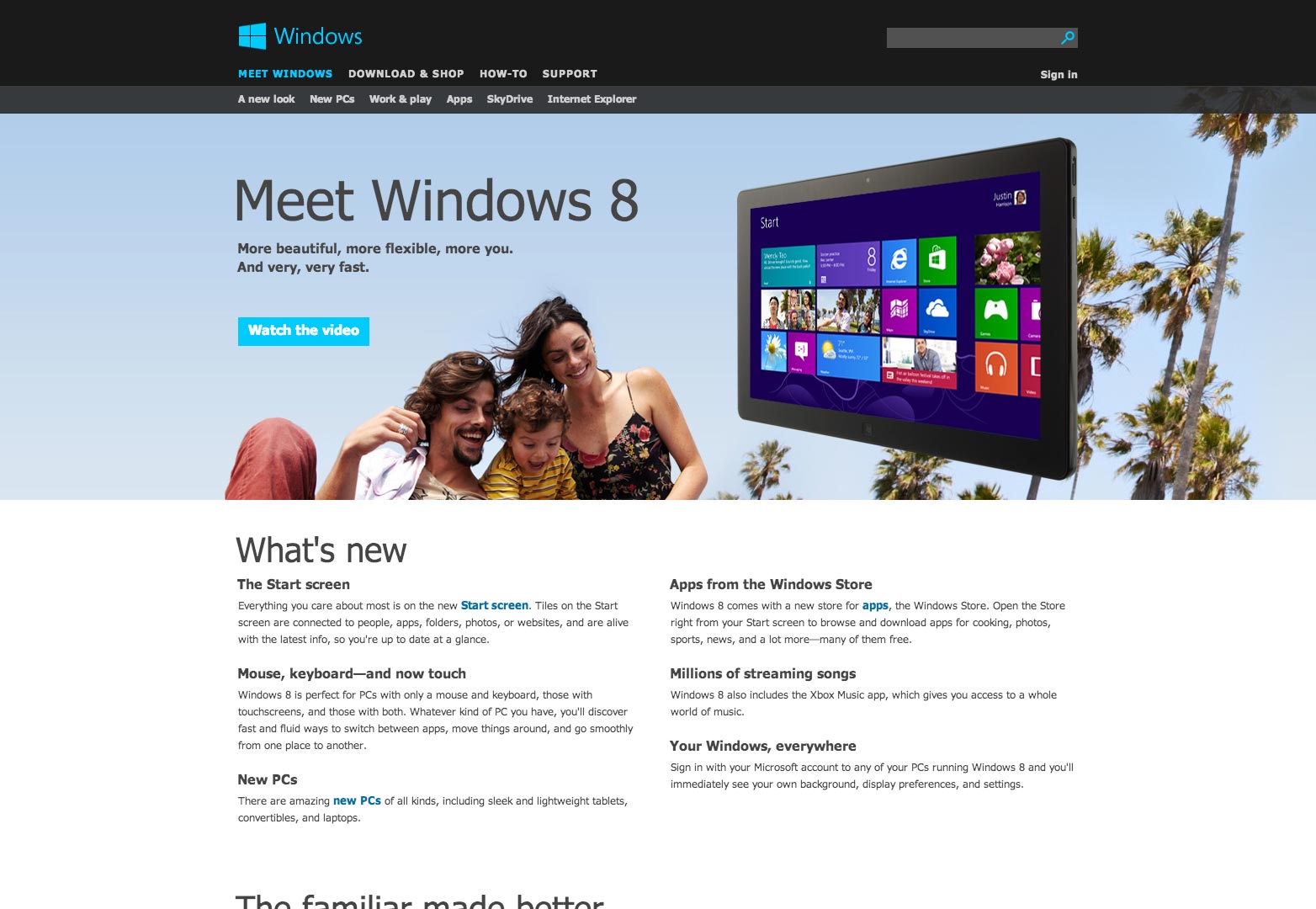
In plain terms, flat design is a style of interface that doesn't employ any three dimensional realism. Windows 8 is the perfect example, being, as it is, entirely flat.
Flat design advocates consider the leather strip across the top of your iPhone's screen in the Notepad app, or the debossed lines in the Reminders app, as examples of skeuomorphism; they are examples of translating features from one discipline to another. Flat design employs no gradients, bevels or shadows to simulate three dimensional design (as screens are two dimensional).
Microsoft's flat design for Windows 8.
Flat design is currently being championed as the revolution that web design has been waiting for: an honest approach to screen-based design. However, flat design is not a new concept; many interfaces have employed a flat design aesthetic for years, Google to name one; Facebook to name another. Is this the key to their success? Is this style easier to use and therefore, better?
Isn't skeuomorphism better?
If our job as designers is to make technologies user-friendly, then why not make them familiar? And as designers we have a responsibility to make interfaces more familiar to all users, not just the most cutting edge techies.
Why not make the notepad look like a legal pad if that will help your average tech user to understand the concept of the application in one glance? (Bear in mind that the average tech user is getting older and technologies are being utilized by the masses en force these days.)
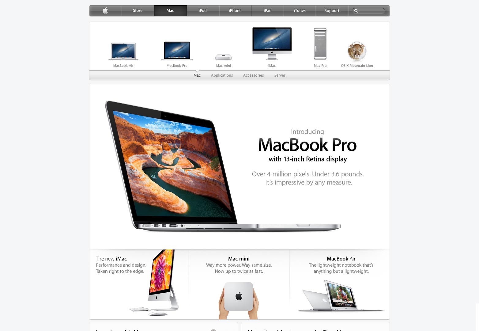
Apple's skeuomorphic design.
To strip away these familiar elements is stripping valuable teaching tools away from the less inclined, average user.
Summing up
When I sit down to design an interface, I ask myself, who am I serving? In some cases, a flat, sleek, modern design is in order, such as an interface that is developed for a tech-savvy project manager looking for a great tool. However, to claim that flat design is what design needs in general is a somewhat narrow opinion that leaves the less experienced users watching from the sidelines. Some users only recognize a button because it looks like its real-world equivalent.
At the time of writing, there has been precious little research conducted on the differential effectiveness of flat design versus skeuomorphic design. As a divide grows between the two schools of thought, it will be interesting to see which approach reveals itself to be more useable.
One thing is for sure: you're going to read a lot more about the debate in the next few months.
Are you a flat design advocate? Do you feel skeuomorphic design helps familiarize users with an interface? Let us know your views in the comments.
Featured image/thumbnail, flat image via Shutterstock.


