 With over 9 billion indexed sites on the web and counting, sites are having to do more to get noticed and encourage users to spend time on them.
With more websites competing for users' attention, color is becoming more and more important in making your page stand out. Here are some sites that do just that: use interesting colors in unusual combinations to stand out from the billions of standard color schemed sites out there.
Layrr
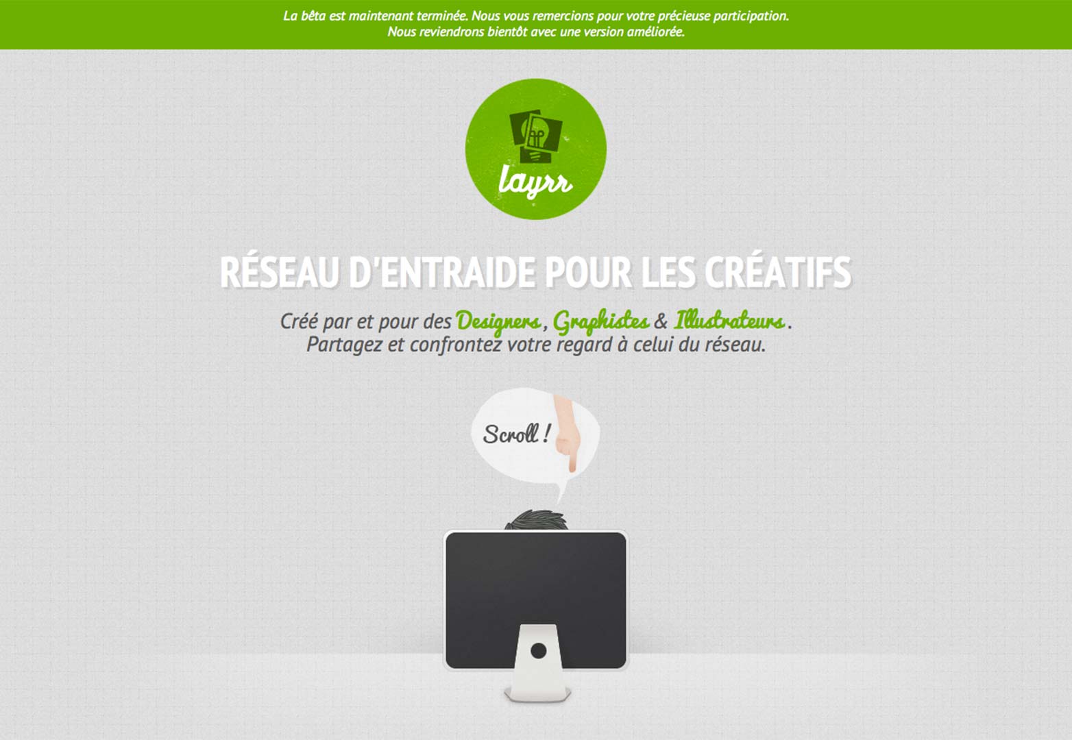
We all know that content comes second in drawing attention, and headlines have been used in newsprint for years to gain interest. Layrr uses understated contrast to achieve this, and even if you don't speak French, I suggest you go check this site out now, it uses small areas of color to create impact against the grey background, and achieves this in an astonishingly beautiful design. No wonder it received an Honorable Mention in the Awwwards design competition.
Havainas
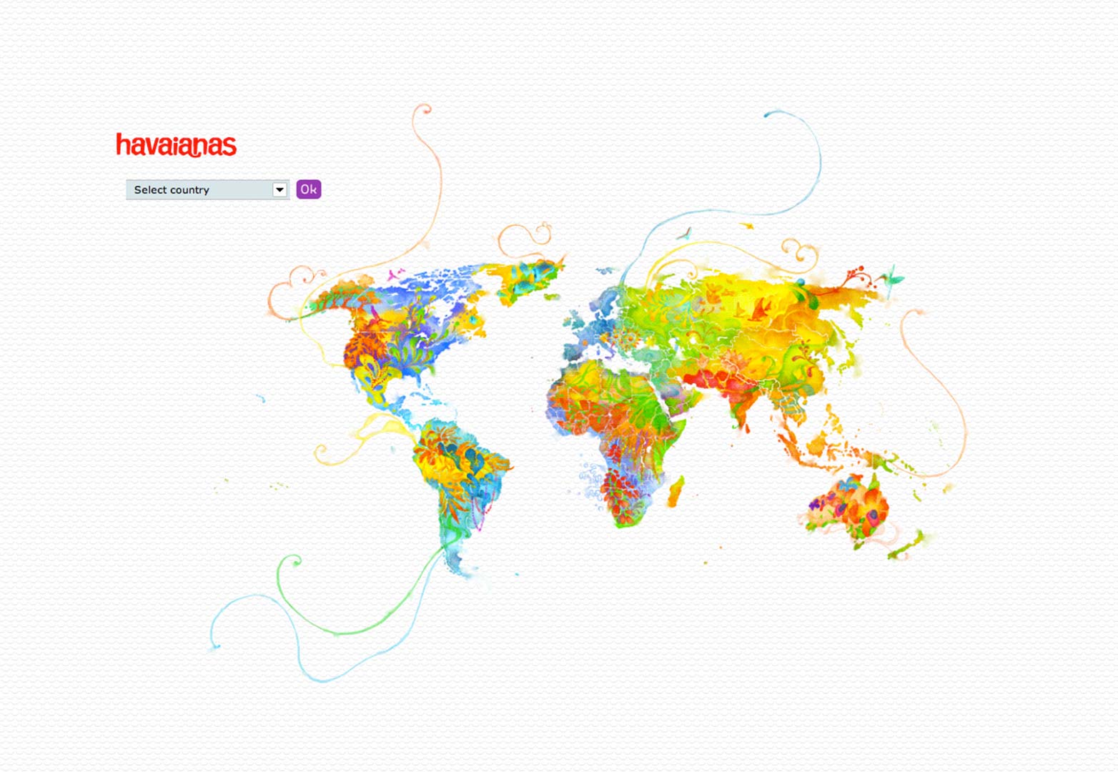
The landing page of Havainas, a very large flip-flops and sandals retailer is surprisingly, and wonderfully, colorful, a trait that extends to the regional pages of the site. The aim of this site is to illustrate their style, along with the bright colours associated with heat and summer, holidays and most importantly, their products. Whilst the color is part of their brand recognition it's refreshing to see the site of a large company that's been well designed color-wise, as you can probably tell by the list of the sites here, good coordination is often left to the little guys.
ColourPixel
Besides being bright and colorful, what really caught my eye in ColourPixel's site, was the use of black, where other sites would have used white. The reason white is used is because the contrast between it and other colours is easier on the eyes, and so more accessible to users, but here larger black boxes have been used to encapsulate text, which is white. This actually achieves the goal of drawing my attention to the text within them, rather than the actual boxes themselves as part of the design. Other than that, the background of the site achieves what the designer calls an 'ethnic' look, using displaced pixels to achieve a tapestry effect. The Rainbows are used rather gratuitously, but offer a nice differentiation of color combined with the subtle curly brackets in the background.
Will Fernandes
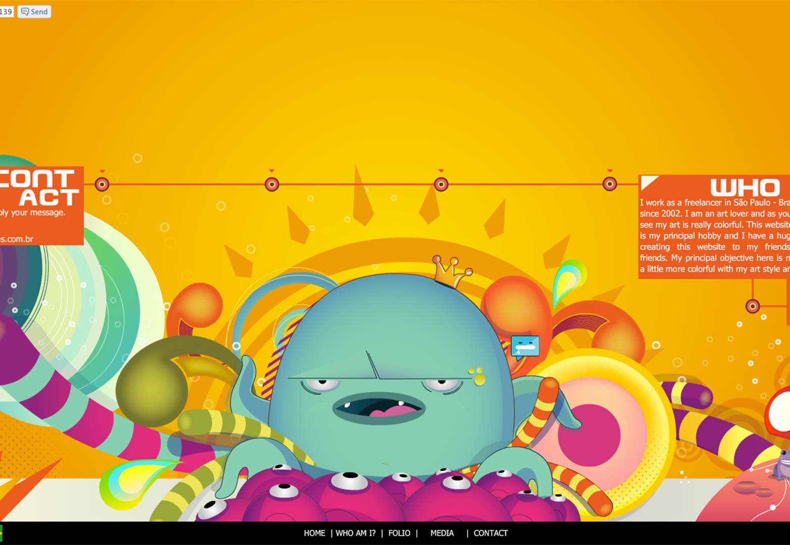
Will Fernandes' site uses many and varied colors, all jostling for attention to achieve his style. He reserves yellow, orange and white for the text and background, and mostly avoids using them in his artwork, to mark a differentiation from that and content. He offers a fullscreen viewing option, which is recommended if you want to view the work of this talented artist and web designer in a fantastic site with brilliant animations. It has obviously been worked on extensively to ensure that the right colours are used for the art and site whilst complementing each other.
Ryan Keiser
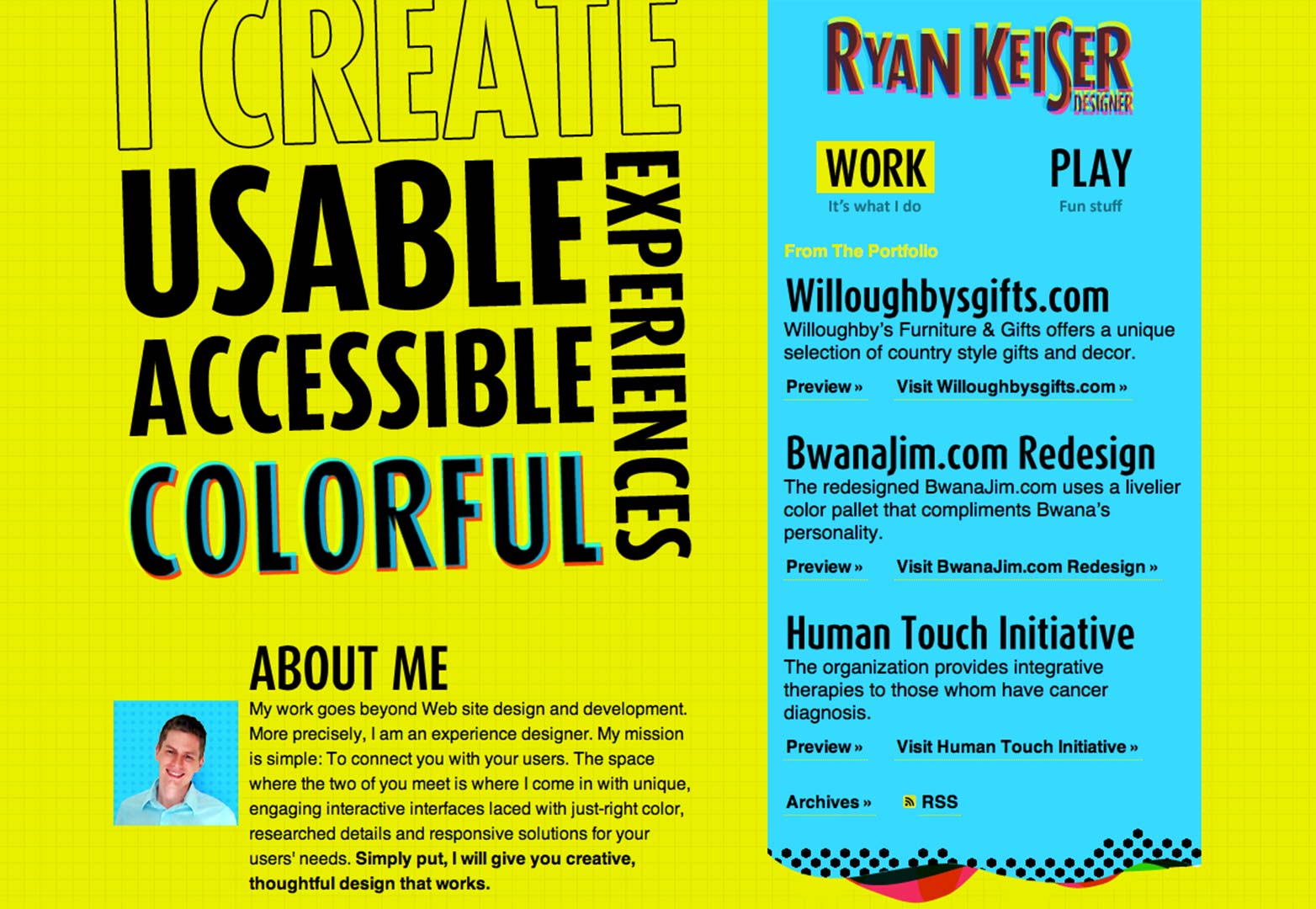
This is the first site we've looked at that deliberately uses offensive, overwhelming colors designed to clash, to achieve a high contrast effect. The designer enjoys using color so much that he has a 'color inspiration' palette at the bottom of the site. Ryan Keiser uses primarily yellow, a color with which much can go wrong if used incorrectly, here with cyan, and to a lesser extent, pink, the whole site pops. On a final note, the Cyan and Pink are very reminiscent of 3D anaglyph glasses, using a color scheme that has very unconventionally been absorbed into our unconscious lives, which one wouldn't normally expect to work but inexplicably does, because we now associate those two colors together.
Ben Markowitz
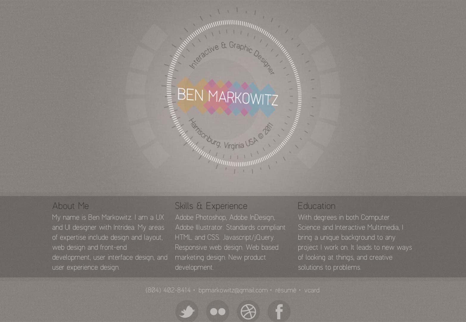
Another very understated site with a very careful use of color, giving the interactive element of the site a machined look. For the design of site like this, using color in this way is unusual, designers usually go one way or the other, but this really adds to the title: 'Ben Markowitz', not only drawing attention, but offering differentiation, using a complementary palette with a large range. The only other use of color I feel this site would benefit from is with the social network icons at the bottom of the page, since they all use very neutral colours and would stand out and be a little more easily identifiable.
Hugs for Monsters
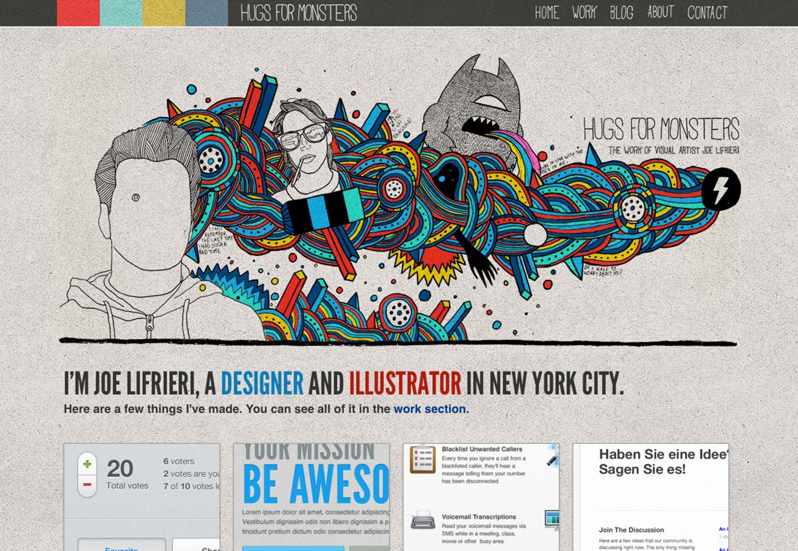
Joe Lifrieri's Hugs for Monsters has the same aim as Will Fernandes' site we looked at earlier, but achieves it in an organic individual style, using color to highlight his unique style. I strongly suggest you have a look at some of his other pages, they all have different art in the same eclectic style you can see here.
Tim Bjørn
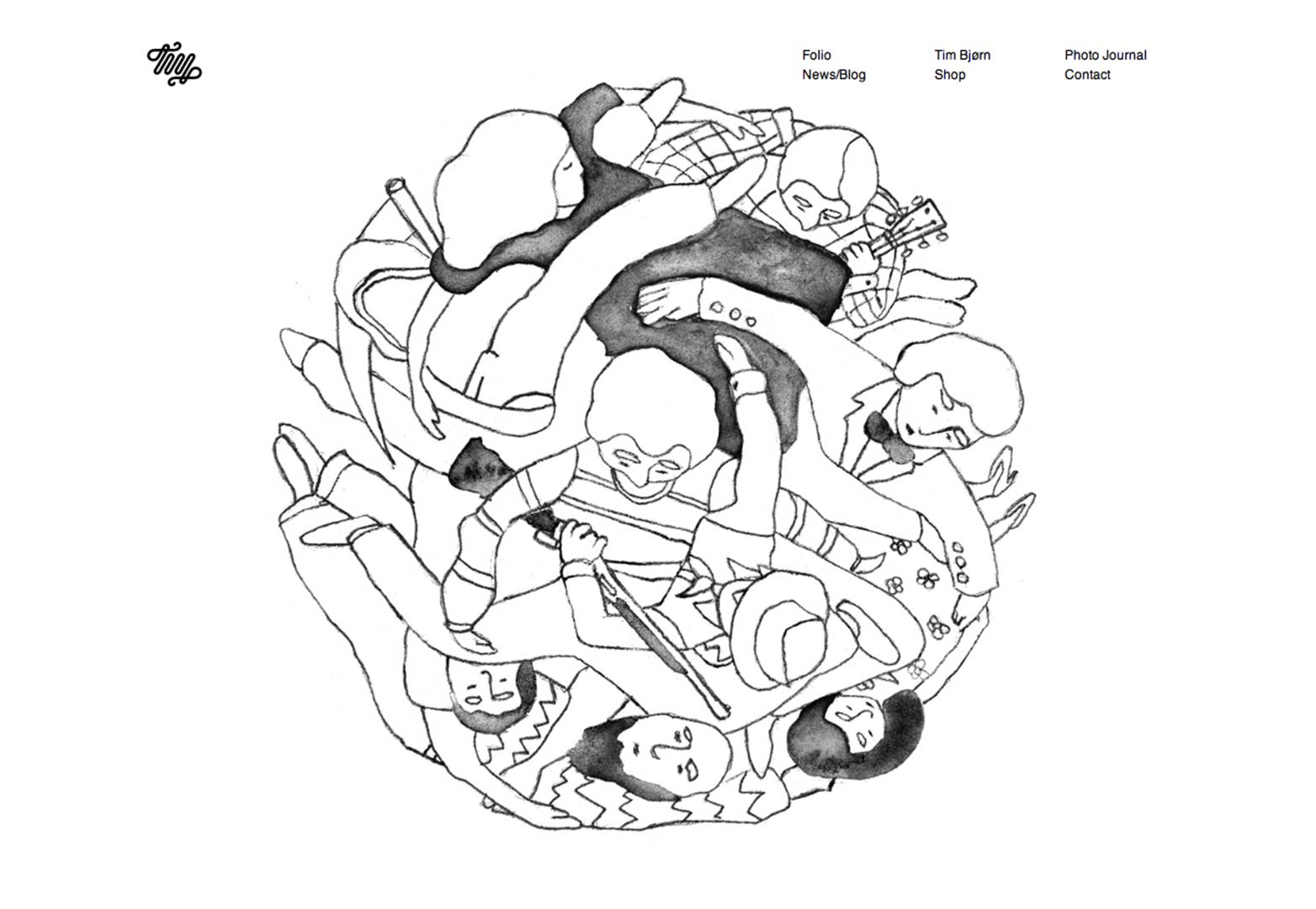
Unlike the others featured here, the landing page of this site is characterised by is lack of color, and by looking at the other work of Tim Bjørn, the artist, he obviously uses color very carefully and sparingly. It's very refreshing to see a site in simple greyscale that doesn't look like it was designed a decade ago! The artwork, like Hugs for Monsters above is very organic, and is the main focal point of the site, with subdued menus and almost the whole landing page devoted to a few key pieces.
For Office Use Only
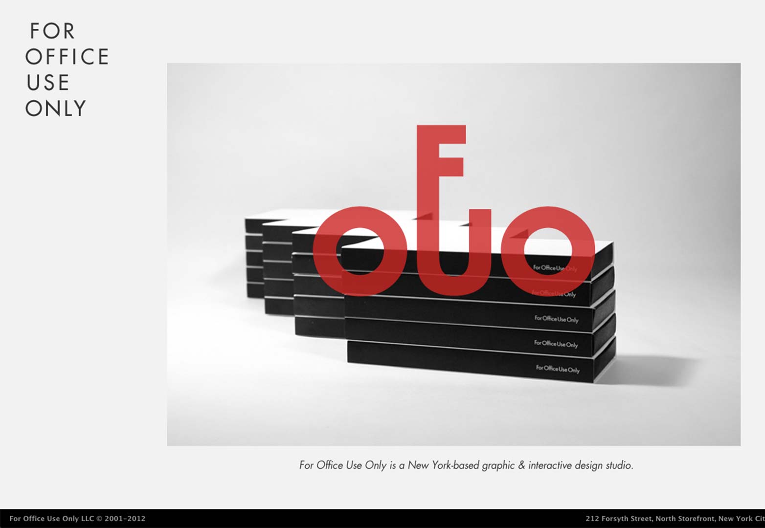
This is another site that uses a small amount of color to achieve high contrast against a greyscale themed site. In particular the case below, where the transparency on the logo creates a dull red against the image behind it. A further look into For Office Use Only shows that these guys know how and when to use color, and do it well.
Method Design Lab
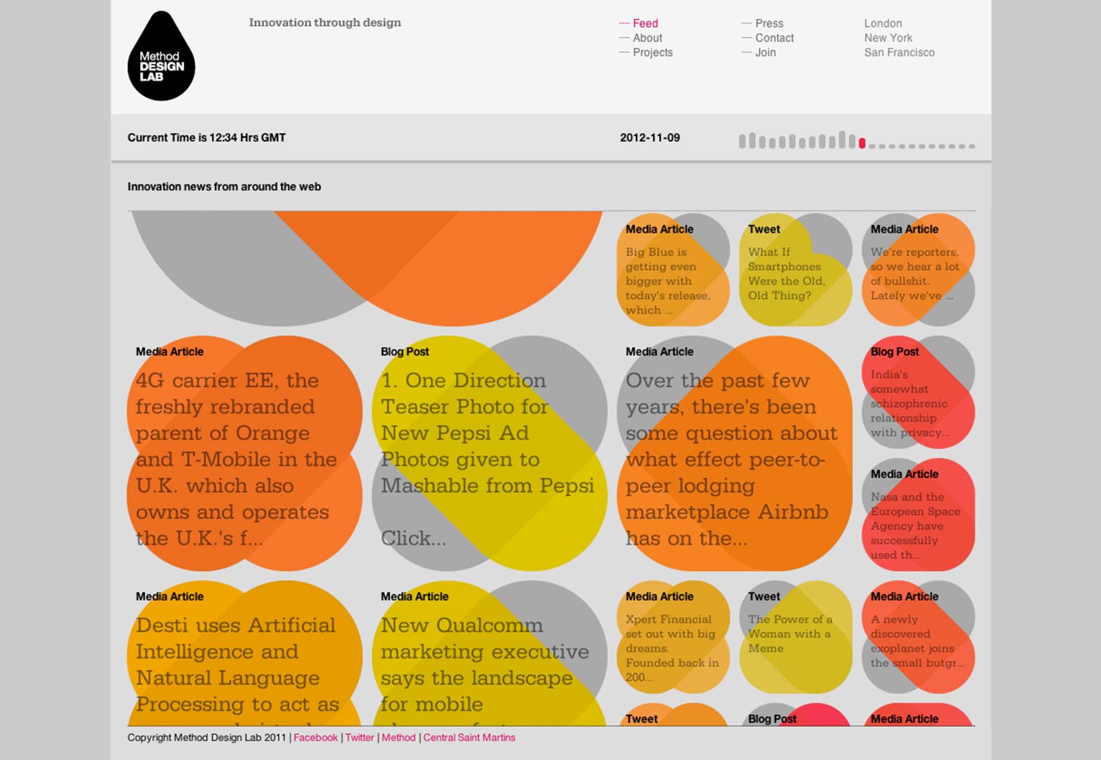
The Method Design Lab's innovative news feed uses color in a fresh way, to signify the 'age' of the news, with an easily identifiable hot and cold color scheme, except the news only ever exists in the 'hot' section of the color scheme, a clever marketing idea, perhaps? Nonetheless, it's very easy to grasp that red is older news from 12+ hours ago, and yellow is more recent. Very well executed, and the color contributes to both the design and the function of the site, not something that can be said of many sites beyond their navigation. After stumbling upon it during research for this article this site found it's way into my bookmarks both for it's content and design.
DesignWise
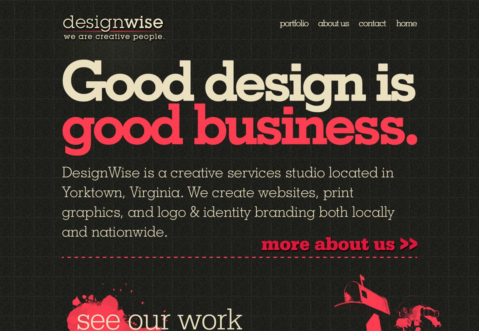
The theme for DesignWise is contrast through simplicity, with a subtle grungy feel, the pink on black works perfectly, and using an off-white for text content offsets the pink without the contrast being to sharp against the black. There is also contrast between the clean, yet textured background, and subtle touches of grunge splashed throughout the site.
Prius Harmony
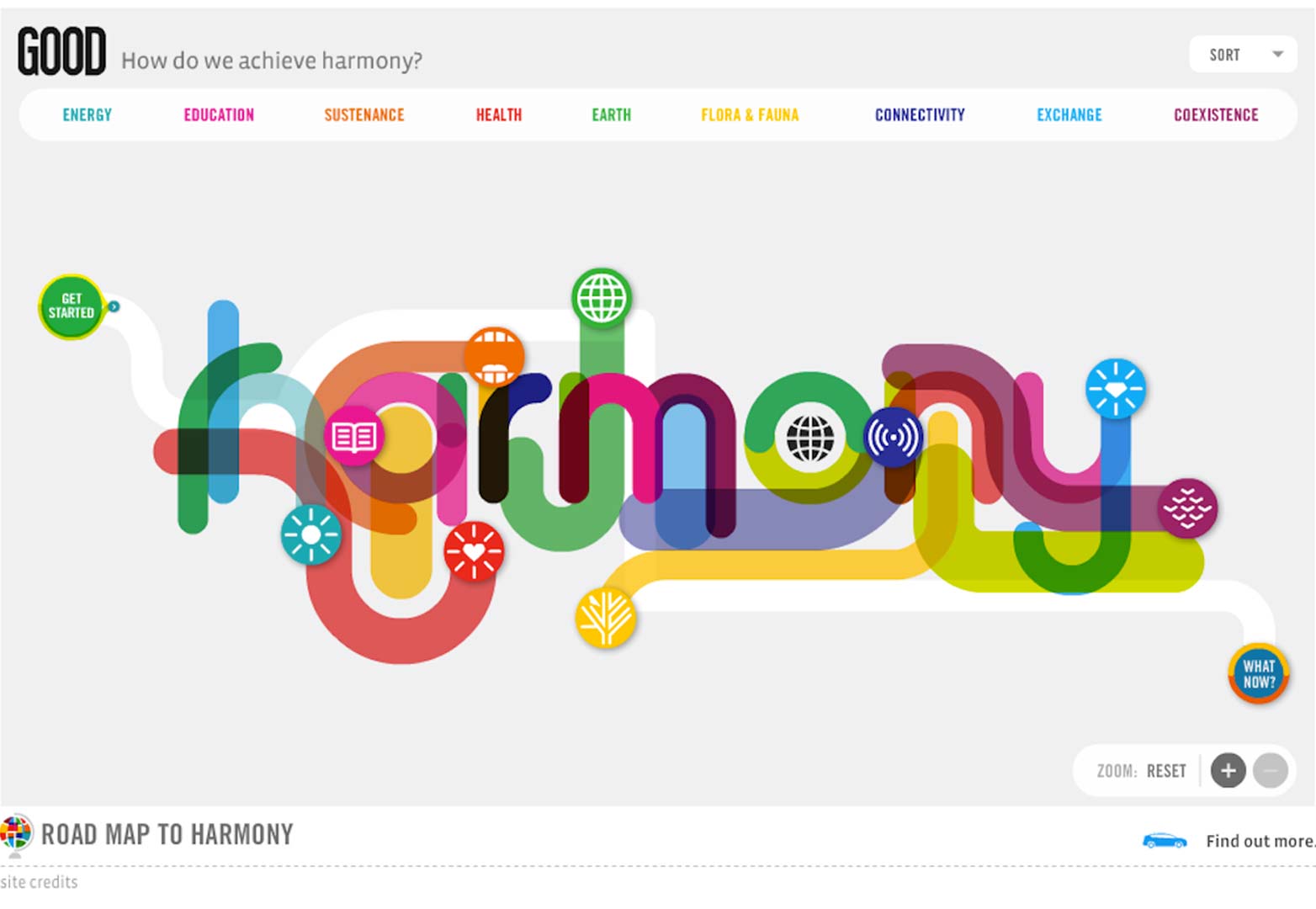
The colors of this infographic are beautifully coordinated, both achieving the obvious mission statement of conveying 'harmony' and communicating the topics related to the colors. Whilst this is effectively a piece of advertising for Prius, it carries off it's job well, and even if you despise Flash, just appreciate it for the colors. This is another site with functionality in color, if only tenuously so, and one of the rare ones which uses block colors with transparency to create variation with the combined colors of two or more others overlapping, conveying (mostly) a sense of harmony, if you ignore the ugly black and brown overcolored and badly coordinated sections.
Organic Grid
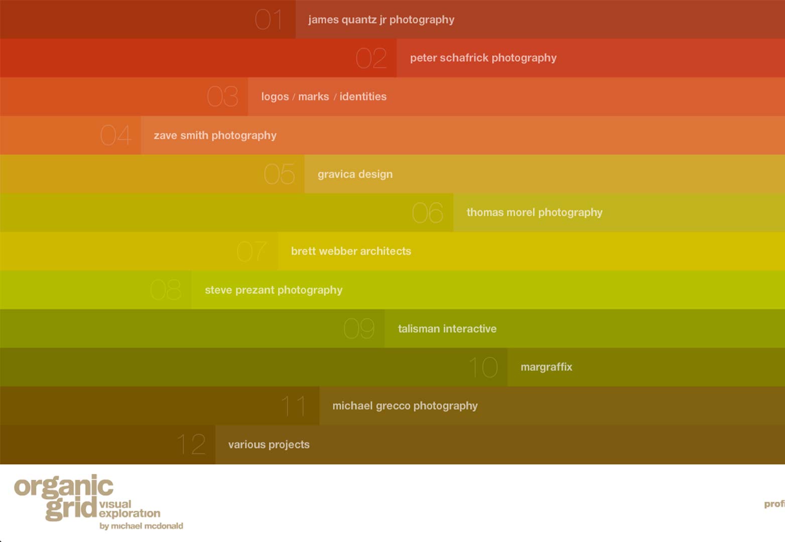
If you can forgive two Flash sites in a row, Organic Grid is a beautiful portfolio that can be forgiven by it's incredible use of color in a menu that'll change its scheme every time you return to it. Unconventional? Yes. Uncoordinated? Definitely not. Go for the colors, put the site in full screen mode, and stay to enjoy the incredible photos and artwork in the portfolios, if you can ignore the load times, that is.
Matt Mullenweg
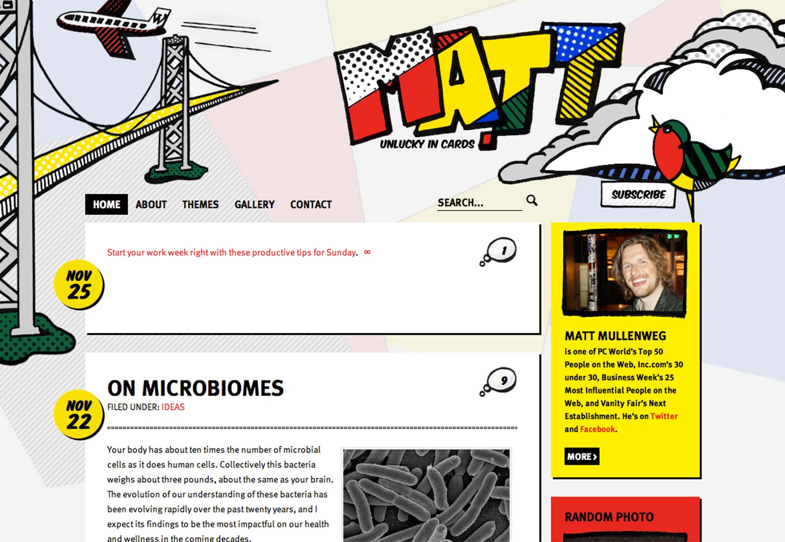
This Lichtenstein inspired site has to be included, if only for the sake of the father of WordPress, Matt Mullenweg's blog brings to life the block colors and cross-hatchings of pop art. Block primary colors can be wonderful if not overused, and this site gives us a dash. There's a brilliant pop art wave at the bottom of the blog, but you won't be able to look at it for long, as Mullenweg has so many posts you'll be scrolling for ever!
Vanity Claire
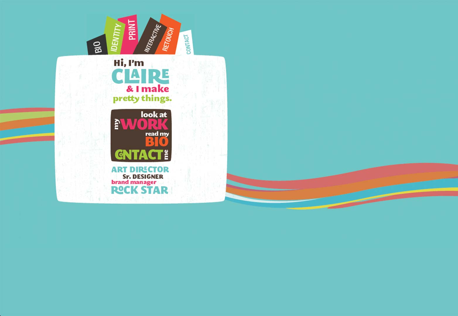
If you can look past the fact that this site has terrible usability, the artwork on every page is done incredibly well. Simple subdued colors are becoming more popular, and Claire's site manages to sneak in a little grunge too. This site is characterised by having a different single block background color on each page with a simple design horizontally across the middle of the page.
Glue
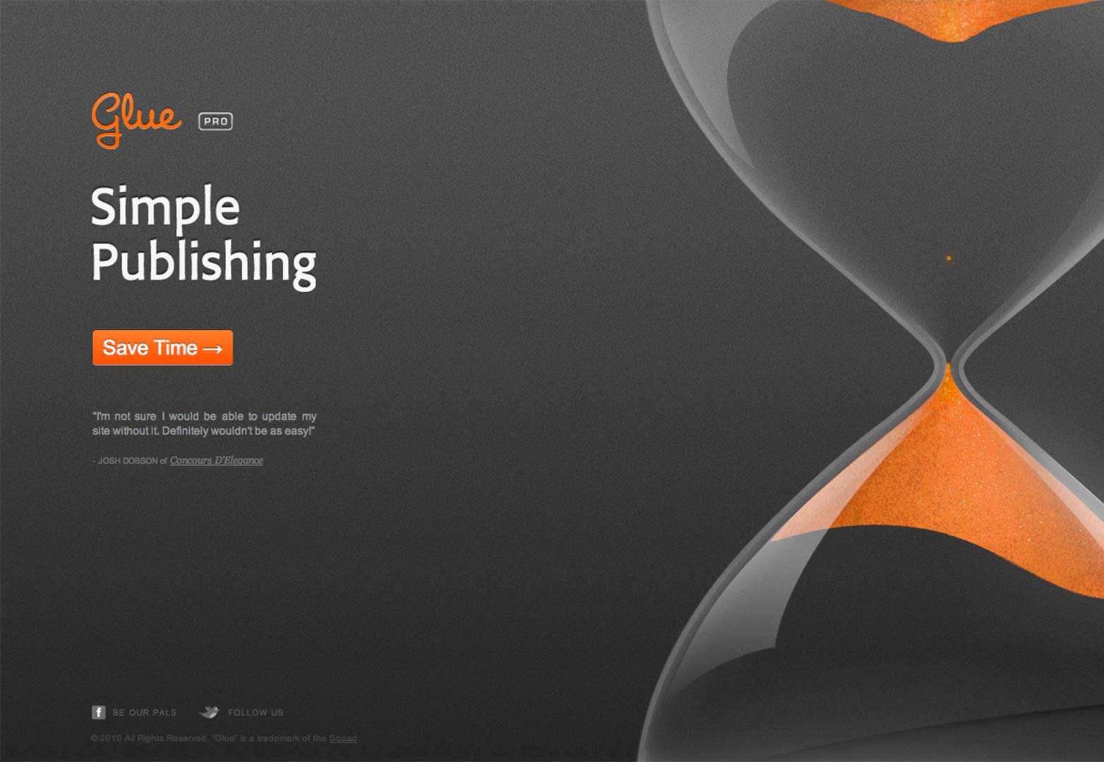
A website that's taken simplicity to a new level, Glue strips back all content in favor of a beautifully executed hourglass, with the sand falling upwards accompanied by the slogan 'Save Time'. The site used to have more content with the gorgeous orange highlights on grey, however has sadly since become invite only.
Microsoft
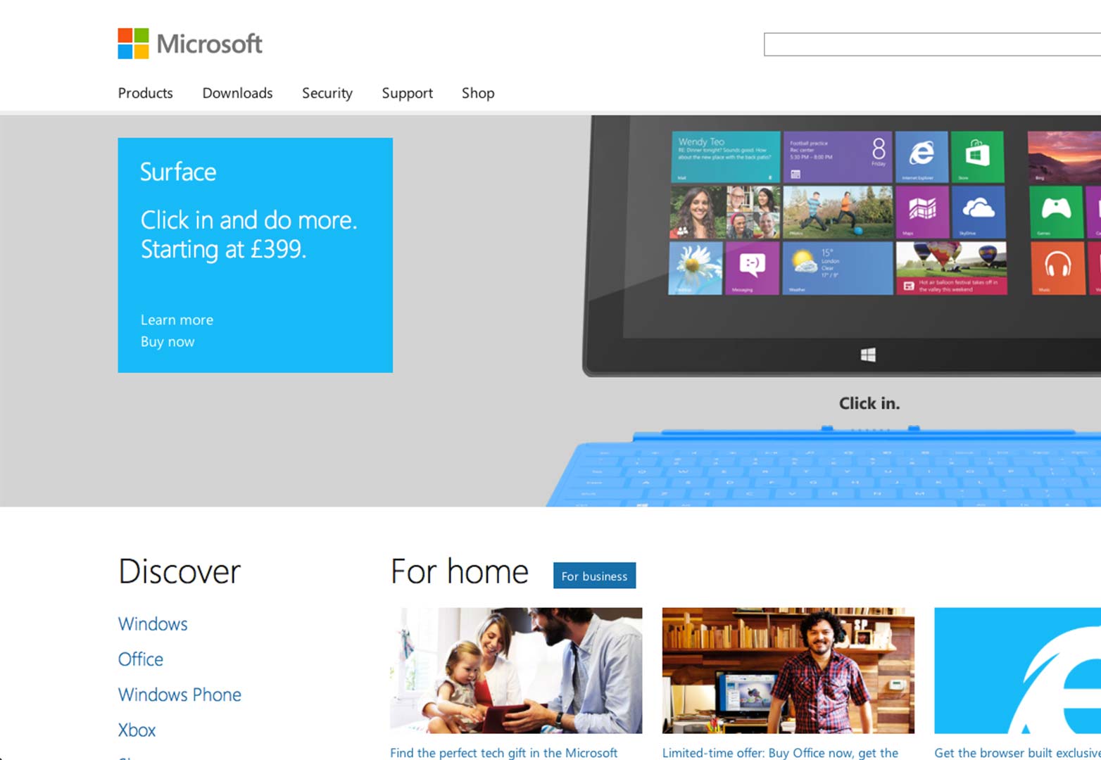
As much as it pains me to include this, as a stalwart apple supporter, Microsoft's online presence has come on leaps and bounds, presumably hand in hand with the surprising advance in Internet Explorer (It would probably have been embarrassing to have had their site date their browser). The tile based 'metro' interface of Windows 8 has clearly had some influence, and I have to say, it looks good. As we've seen with Google Chrome, Skype, and now Microsoft, block colored logos are the future, the days of tacky gradients and using 3D for the sake of it are over.
AdaptD
The inclusion of this site may have had something to do with the fact that it reminded me of a rocket lolly, a favorite childhood treat, or that it simply included color just for the pure joy of it. AdaptD brought a smile to my face simply with the 'something colorful' ribbon across the top of the site, because why not? A beautiful gem in an otherwise standard albeit well designed site.
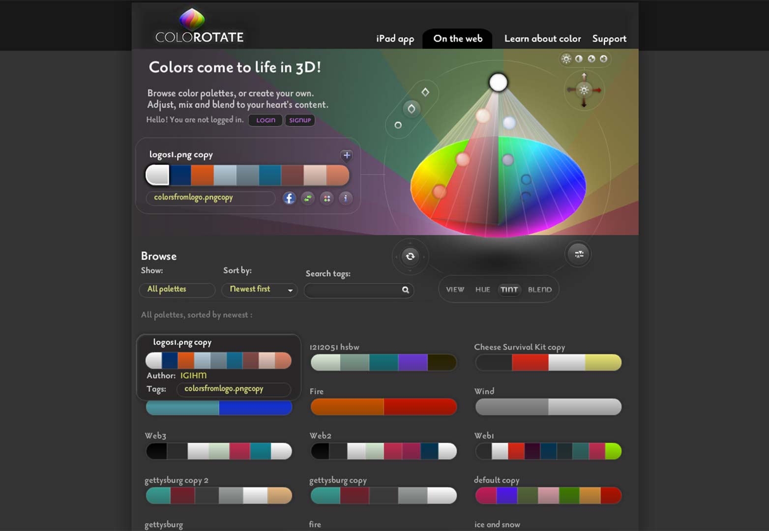
ColoRotate
Finally we finish with a site that doesn't use color as part of it's design, in fact the site design is incredibly bland, but as a function - the site's goal is to help you browse and blend color pallettes. It seems appropriate to end on a site that uses color in this way, so if you decide your site needs a makeover after reading this list, there's nothing stopping you from choosing the perfect color scheme. ColoRotate also has an interesting information page on color if you fancy reading up about 21st century color theory, and how our eyes perceive color.
How do you approach color? Do you play it safe, or strive to stand out? Let us know in the comments.

