 One of the most challenging briefs any designer can take on is to design for a cross-cultural organization that needs to appeal to disparate groups from diverse backgrounds.
As designers we're frequently reliant on communication through an informally agreed symbolism: green is a healthy color; slab-serifs are masculine. Except that when dealing with global audiences the message can be skewed, leaving organizations to run parallel branding; throughout the world the red cross is known for supplying medical aid in warzones, except where the red crescent has to be used instead.
This is the challenge faced by designer James Brown, when he was approached by Global Earthquake Model (GEM). GEM were looking for a rebrand, a new identity and an increased engagement on a worldwide scale.
GEM develops open source tools to assist in earthquake risk assessment worldwide. The last major earthquake hit Japan in March 2011, killing 20,000 people; the most deadly event hit China in 1556 when an estimated 830,000 were killed; and some experts predict that 'The Big One' could hit California at any moment. Research, education and prediction are the most effective ways to combat the natural disaster and GEM's previous output was severely let down by poor design.
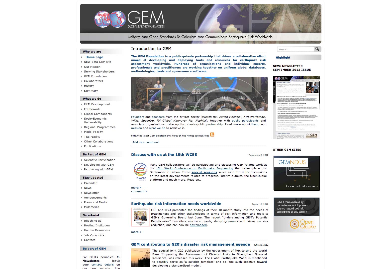
The old GEM website
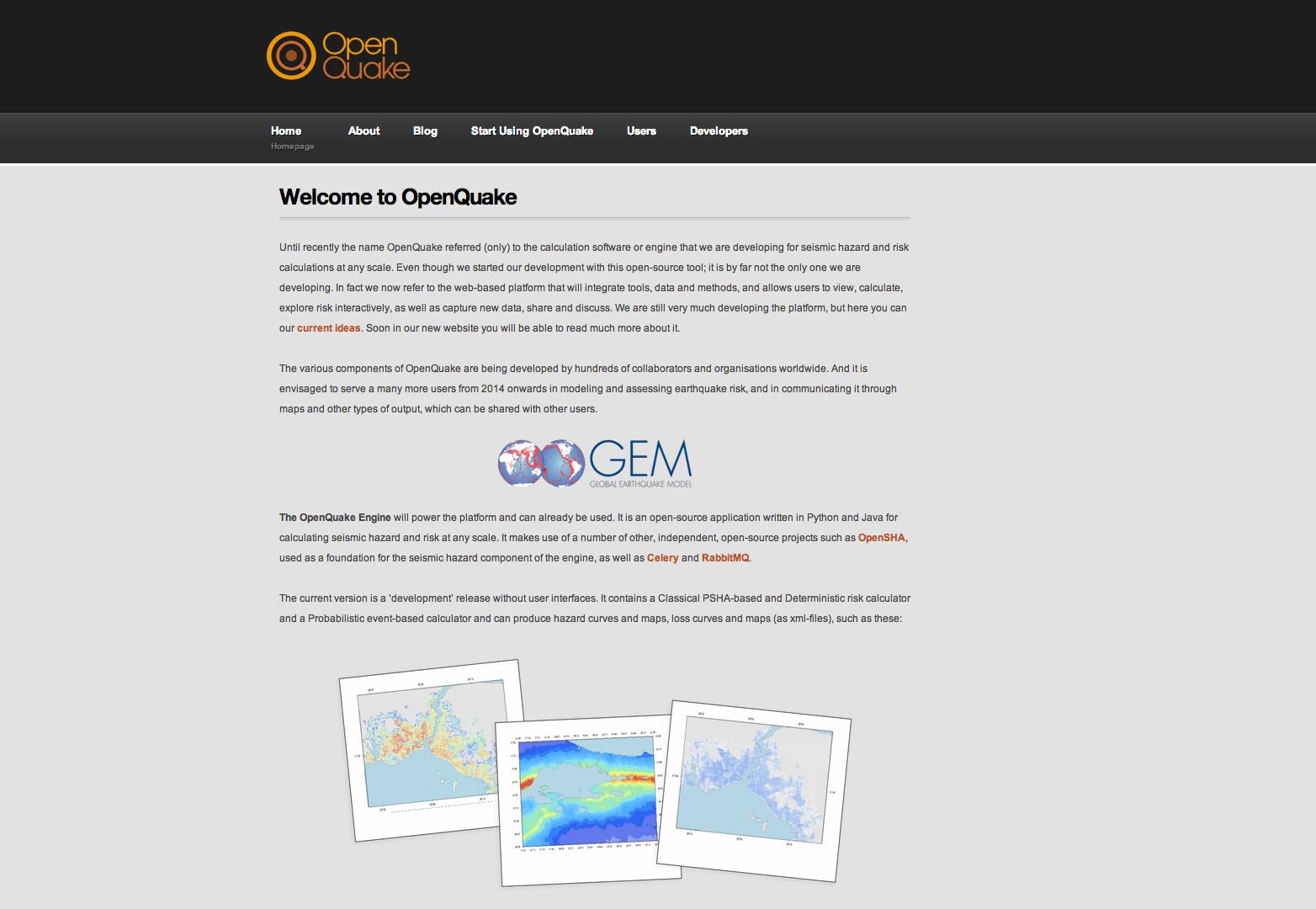
GEM's previous branding was cold and unappealing. Their site resembled a poorly designed science blog and featured little user engagement. The subsite for GEM's flagship OpenQuake software was as bad, uninspiring and anonymous.
The old OpenQuake website.
[GEM's] goal is to get people involved, but they had a very cold and static brand. There are so many audiences, it's a real tightrope…There's the people side, scientists, software developers, and then insurers, and ultimately governments and countries who they're trying to get to use the data — James Brown
The result of Brown's labors over the past 18 months is a beautifully designed presence that simplifies content, updates the brand and engages users.
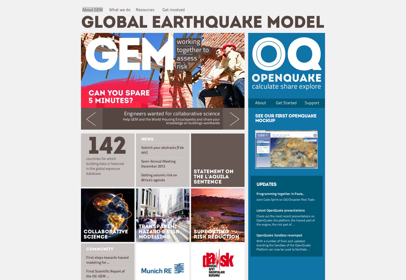
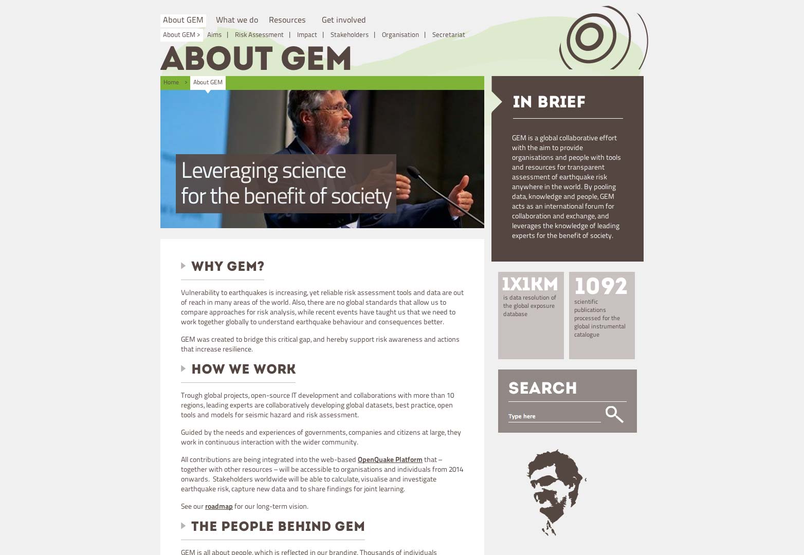
Moving away from the 'poor-man's-nasa' look of the old site, the new look is bold and confident. An earthen palette ties all output together, and with desaturated color coding for specific tasks, feels very modern. The flat-design style is complimented by careful hierarchical typography which lends the information authority.
The new GEM website.
A key design decision has been to move away from stodgy line graphs and illustrations to photos of people. The emphasis on individuals and the role they can play encourages further engagement from the groups GEM is looking to court.
One of the most successful decisions has been to merge the GEM website with the OpenQuake — the GEM's risk assessment software — website. The right-hand column of the new landing page is given over to OpenQuake and the color contrast does a pleasing job of lifting the whole layout as well as highlighting the flagship product.
The new GEM website.
The one failure is a minor lack of technical understanding: the site is neither responsive, nor progressively enhanced; disabling javascript renders the menu — which could have been build with CSS — useless, and the whole site becomes less usable. However, as the site is currently only in beta, we can hope that those problems are currently being addressed.
The redesign of the GEM website is a tremendous example of how non-profit organizations can utilize design to make real changes to the world around us, reposition themselves globally, and ultimately save lives.
What do you think of the GEM redesign? What other non-profit sites need a revamp? Let us know in the comments.
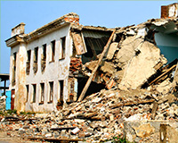
Featured image/thumbnail, earthquake image via Shutterstock.
Ben Moss
Ben Moss has designed and coded work for award-winning startups, and global names including IBM, UBS, and the FBI. When he’s not in front of a screen he’s probably out trail-running.

