 Pinterest have just announced on their blog that they will be experimenting with a new look using a small group of people who sign up as testers.
They are not moving away from the gridded style that so many have become familiar with — and so many have tried to emulate; instead they are looking to make some minor tweaks that they hope will benefit their users.
What's new?
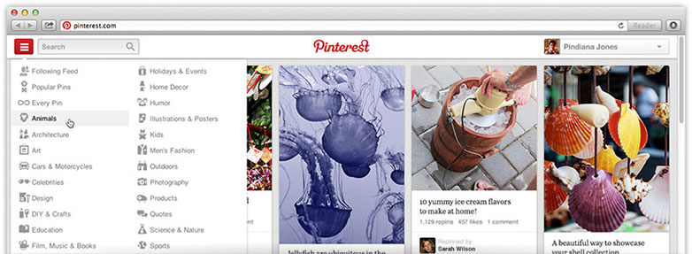
Navigation: to make the navigation more “intuitive” they have moved all of the navigation elements: categories, following, popular and every pin to one location. Instead of having multiple links and one drop down menu housed in the middle of the page, all of these elements will move to fall under a single drop down element on the left-hand side of the page, right next to the search box.

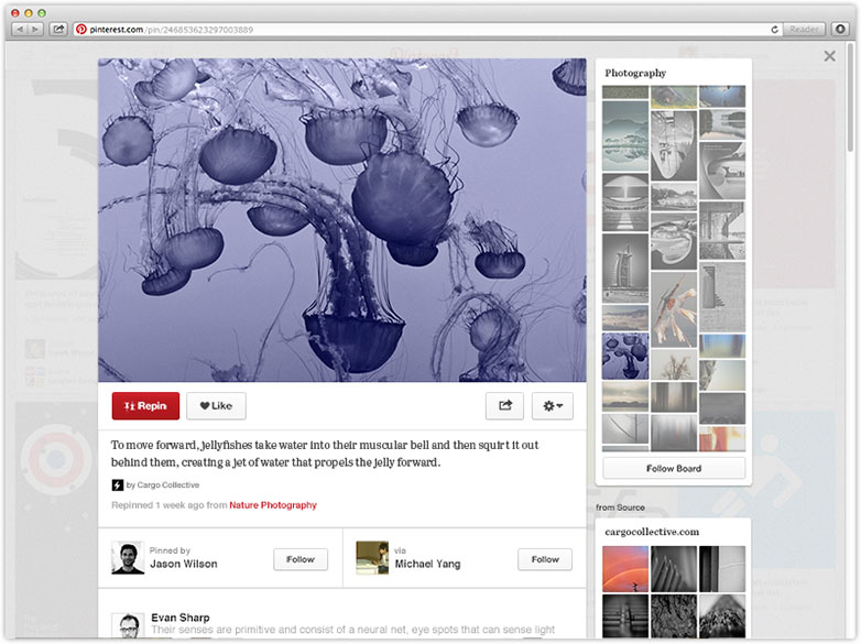
More content: Pinterest was made popular by its use of images. It's what captures a user’s attention and gets them to click. The new site design promises bigger pins that will display pins from the same board, other boards the pin was pinned to and more related pins.
Faster load times: in addition to these design changes, Pinterest also promises some behind the scenes improvements that will make things work faster. For a site built on graphical images, not having to wait around for things to load is ridiculously important.

What can we learn from this?
As web professionals we should always look to see what we can learn when one of the largest web properties makes such drastic changes to their design. But when I first saw this story, I couldn’t think of a thing off the top of my head.
For years web designers have promoted these three tenets as the foundation of any well designed site. You have to design your site so that people can find what they are looking, content needs to add value and your site has to load quickly or you lose visitors. We knew all of this before reading this article, so what can we take away from this?
How about the fact that you’re never too big to make things better for your visitors?
Pinterest ranks #35 on Alexa, just three slots lower than Microsoft.com and one spot above Google Brasil and viewers read a little over nine unique pages every day on average.
Despite some real success, they are still not afraid to look to see what improvements can be made to their site’s overall design. The changes, if any make it past their testing process, will likely upset some users. But in the overall scheme of things, Pinterest will come out ahead. They will promote these changes as enhancements, even though they are what most people would have started with, and users will feel like Pinterest is working towards a better experience for them.
As designers something we should do periodically is review our work to see what, if anything, we can do differently or even better. Both stylistic and technical trends change, standards become obsolete and tags become deprecated so tune ups for our sites should occur from time to time, no matter how successful they are.
What do you think of Pinterest's proposed changes? What other improvements would you like to see them make? Let us know in the comments.
Featured image/thumbnail, pins image via Shutterstock.


