
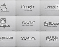
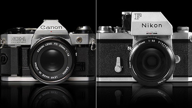
 While Generation Y may be too young to remember, there was a time in the 70s and 80s when the coolest gadgetry was inevitably “Made in Japan” — especially a series of 35 mm SLR cameras that set the industry standard.
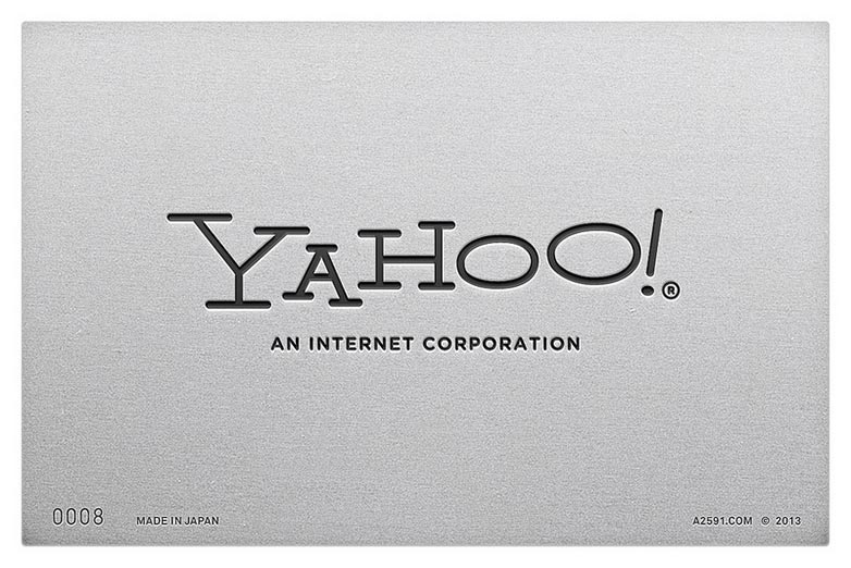
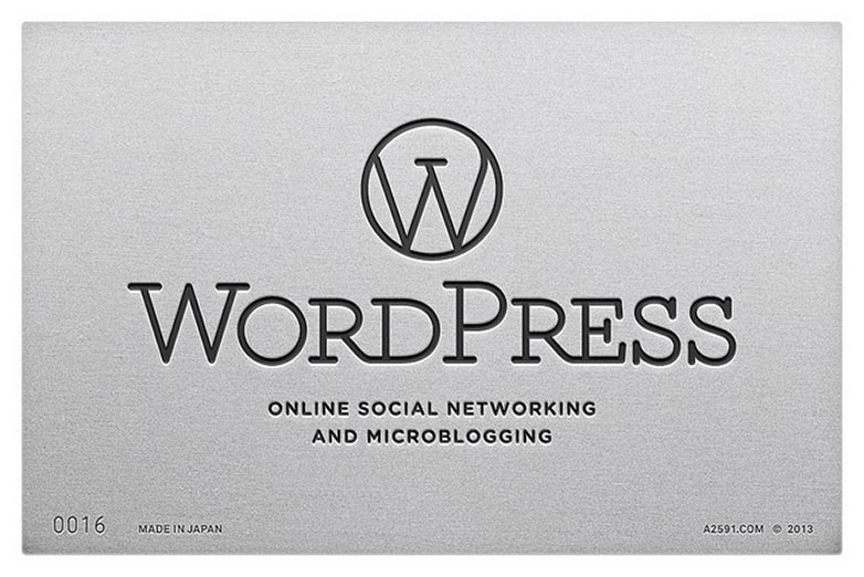
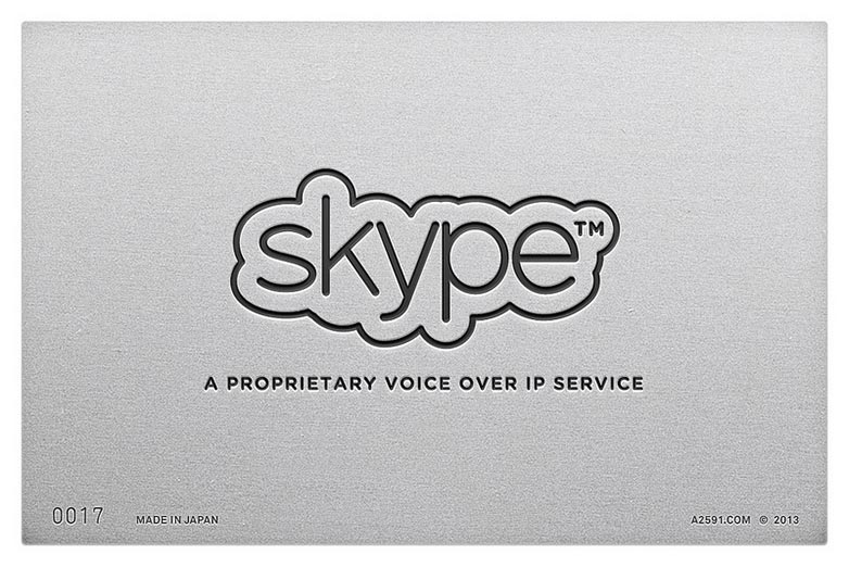
When the design consultancy group Antrepo analyzed the logos and typography of these vintage cameras, they were struck by the line-based logos and extended-outline fonts that designers utilized for the majority of these products. The switch to the “less-bold” typefaces presumably cut down on production costs.
So, like any good creative, the team at Antrepo asked “what if....” Specifically, what if the hottest digital brands of the current day were done in this same vintage style? From there, the Instanbul-based company reimagined logos for such web leaders as Google and Amazon to social media sites like Twitter, and Pinterest.
The result is a cool mashup of modern-day tech with retro branding. It’s also a good reminder of how trends in design are constantly changing and evolving — but that there’s enduring merit in revisiting the ideas of the past.
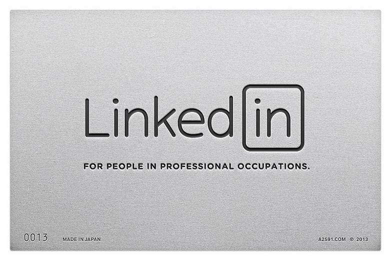
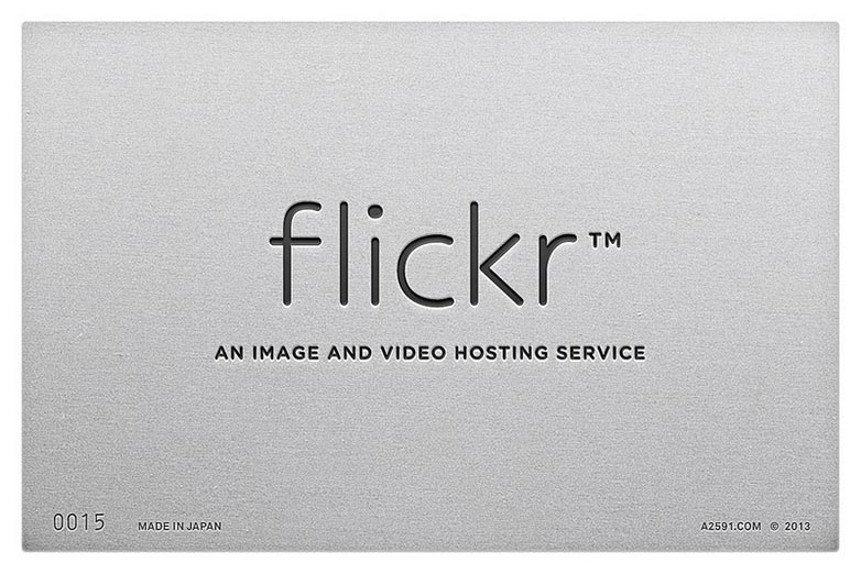
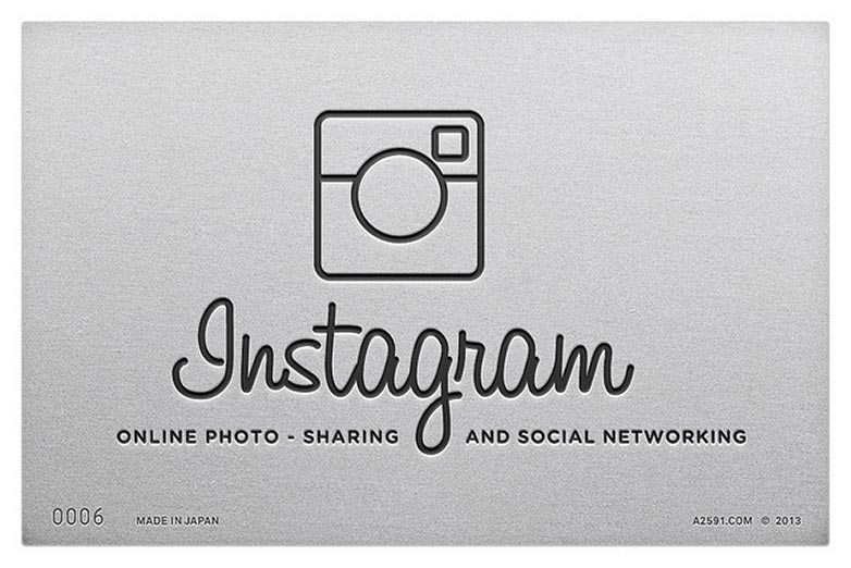
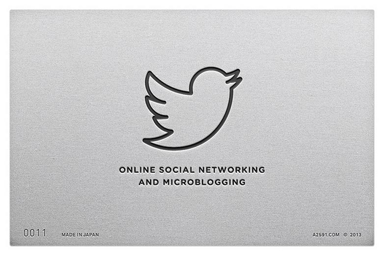
Do any of these logos work better than their real counterparts? What other brands would be suitable for this treatment? Let us know your thoughts in the comments.


