Integrating content marketing strategies and mobile design

 Anyone who’s up on technology has heard of mobile web design and content marketing—two terms used with increasing frequency in the online world.
Can mobile design and a great content marketing strategy be combined without sacrificing either content or design elements? Or does the content of a website suffer because of the restrictions imposed by design for small screens?
The truth is that great content does not have to be sacrificed for mobile design and can even be enhanced by the capabilities of new devices. A properly integrated responsive design and content marketing strategy should produce a phenomenal user experience for visitors to your client’s website.
How can web designers show clients the importance of mobile design and content marketing, and combine them effectively? Chances are that most of your clients are aware of the rapid increase in mobile use. They see their own customers and clients talking, texting and surfing the internet via their mobile devices. They also understand that excellent content is the key to making money directly or indirectly from a website. What many clients don’t understand, though, is that a website that performs well and shows great content on any handheld device can help them gain new customers in the mobile user market. To do this they will need a website that is accessible to all.
Showing clients how their website appears on a variety of handheld devices or Google’s GoMo Meter is a good way to promote the responsive design element. Don’t be surprised, however, if your clients balk when bits of important content are omitted on the tiny screens. This is your chance to explain that you can introduce media queries and responsive design into their existing content strategy, or build a new content marketing strategy using responsive web design techniques to ensure that the most important content appears on every device.
Adhere to the following best practices to show clients that responsive web design that incorporates the unique features of handheld devices and a killer content marketing strategy can work together to create an awesome online experience.
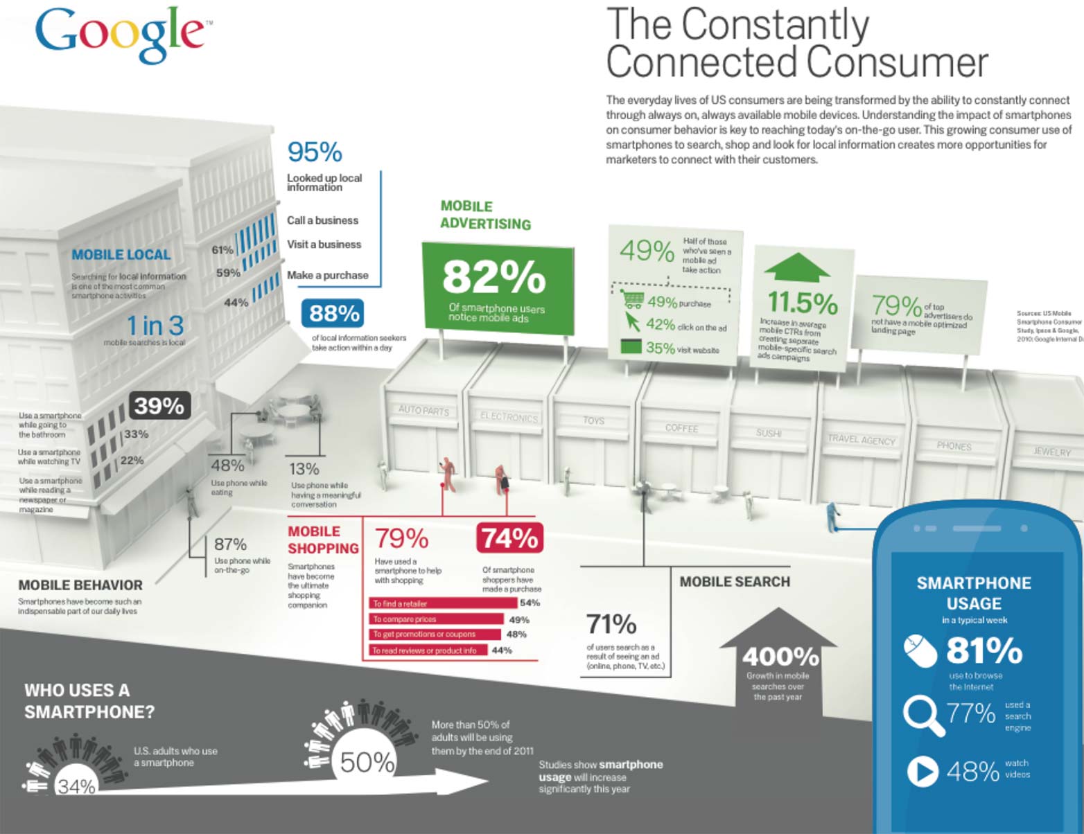
Google’s Mobile Movement infographic presents a strong argument for integrating responsive design into a content marketing strategy.
Work as a team
To properly integrate responsive design and a content marketing strategy, accept that you should work as part of a team that includes marketing professionals, or develop your own content marketing skills. Web designers, web developers and marketing strategists must work together. Your goal is to find creative ways to present content that best meets the objectives of a given website while working within the parameters set by responsive design.
Now for the tough stuff: there isn’t any room for web design divas on this team.
The hard truth is that content is the star of the mobile show. When a smartphone user needs to book dinner reservations while running to catch a bus, he doesn’t have time to explore a beautifully rendered menu with glorious graphics. He just wants to click on the phone number and be connected with the reservation desk.
Expect the marketing professionals to set the content requirements, and design around them. Did you just say you don’t have a marketing department? Never fear. Simply change your hat. Remove the one that says “Wicked Web Designer” and don the one that says “Content Marketing Guru Extraordinaire”.
Outline your strategy
Research, analyze and anticipate the user’s needs on each device
As a team, identify and create content based on user needs, and then optimize the user experience in a mobile environment. This means answering some critical questions at the outset:
- Who wants the information on the website? (Who will be looking for it?)
- What info are they most interested in?
- What devices do they use? How can you improve their user experience?
- When do they access the website?
Let’s use a pizza-delivery business as an example. Say a hungry and busy pizza lover uses his smartphone to order a pizza while riding the train home from work. You can make his experience better by using targeted marketing to present him immediately with the content he wants, and responsive design to present the information in an easy and accessible format.
Identify device capabilities that enhance the user experience
Take advantage of whatever the device offers—GPS, mobile browser, touchscreen, phone and camera features—to build and present your content in a creative, useful, engaging and entertaining way.
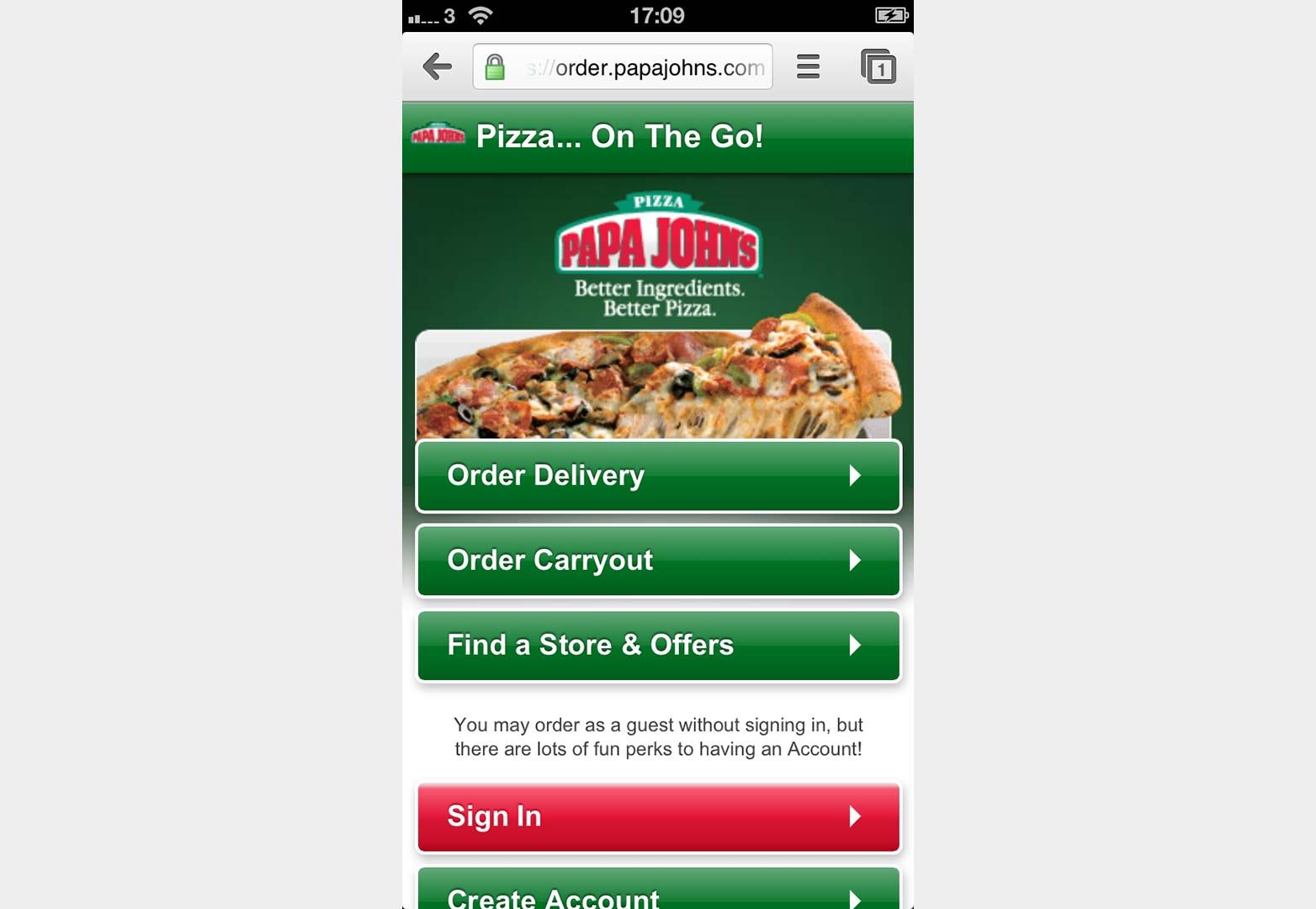
Let’s return to our hungry pizza-ordering customer. When he is on the train, his GPS-enabled smartphone shows him the closest location of his favourite pizza franchise as a pop-up on a map. He taps the link, which leads to the mobile website, and he discovers he can order right from his phone. He selects the toppings and size and places the order online. He then realizes he forgot the pineapple (which his pregnant wife craves) and immediately clicks the “Call Us” button on the touch screen to dial the store’s phone and speak to an employee, who adds the pineapple to his order. The GPS, mobile browser, touchscreen and phone capabilities were instrumental in making the purchase.
PapaJohn’s responsive design makes it simple to order pizza from your smartphone.
Create content that fulfills user needs on each device
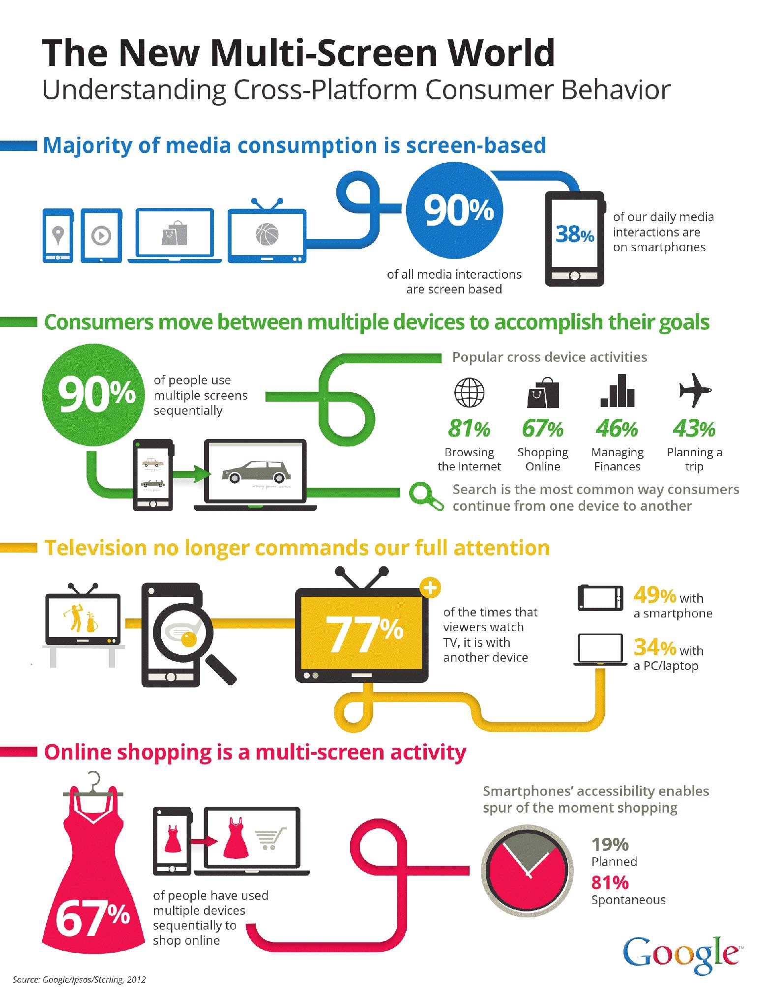
As in traditional web design, the needs of the user dictate content and design. The difference is that when designing websites and choosing content for mobile websites, the user’s needs change based on a variety of factors—in particular, the device they use. According to Google’s 2012 report, “The New Multi-Screen World,” 67% of subjects used more than one device to shop, and they used these devices sequentially, or in steps, to move from browsing to shopping to making the purchase.
Multi-screening occurs sequentially or simultaneously, providing new opportunities for multi-platform content marketing.
To keep your content development and responsive design strategy on track, bear the following in mind:
- User needs dictate responsive design for content. The user may start their online shopping expedition with the smartphone and only need immediate access to this season’s fashion line, for example.
- Acknowledge that today’s consumer increasingly uses multiple devices to complete tasks. When the online shopper continues on to their tablet, they want to see a shopping cart and e-commerce options.
- Extend the content across marketing mediums. Many people multitask, often consuming more than one stream of media simultaneously. They may watch television while using their handheld device to look for more information on whatever it was they just saw advertised. Here’s a suggestion for television commercial producers: include a URL in the commercial that the user can input into their smartphone to sign up for a monthly newsletter with moneysaving offers that will be delivered by email.
- Think of mobile content development as responsive marketing, or creating content that meets the way people use their devices. Use website analytics and data to anticipate the user’s needs.
Work within the responsive design framework set by device limitations
Combining responsive design and a content marketing strategy for optimal benefit forces businesses to throw out unnecessary content and focus on the stuff that is important to customers. If they don’t, users will become frustrated and will simply jump to competitor websites that are easier to navigate.
Mobile design forces designers and content marketers to prioritize and design for the smallest screen on the market. Collaborate with your client and/or other team members to identify the most crucial content on the website, and crosscheck this against data that shows what users of different devices most commonly search for. Pick two or three essential elements, and start there.
Instant gratification builds long-term customers
Handheld devices, especially smartphones, promote instant gratification. They feed the growing desire for immediate information access. Businesses can capitalize on this by using handheld device capabilities in conjunction with online and offline marketing activities. Using print media to encourage social media activity is a growing trend with retailers. The mobile web allows businesses to take their online content marketing strategy right into the place of business through QR codes on posters, banners, product labels and brochures and through applications such as Foursquare.
Conclusion
The way people access content on the Internet is changing. The way we present content must change as well. Restrictions imposed by mobile design (such as small screens and slow load times for graphics) force efficient and affective content, which requires stripping away the excess that exists on traditional websites.
Mobile users are impatient and busy. They don’t want to read novels about widgets on their phones; they want to know where they can buy a novel and what it costs. They need content that is scannable and easy to read in short bursts. They also want the option of accessing more detailed information should they have the time and inclination to read it on their tablets, laptops or desktops.
The best content marketing strategies use responsive design and the unique capabilities of mobile devices to anticipate and answer the user’s needs based on an analysis of typical users. The phone, GPS, camera, video and web access of smartphones and tablets provides unlimited opportunities for creative marketers to present their products and services in innovative ways. With some careful planning, an integrated approach to design and marketing can result in a cutting-edge campaign that excites and engages users and results in more sales leads—and a happy web design client.
Is great content compromised by responsive design? Can the two co-exist happily or will there always be some compromise on mobile devices? Let us know what you think in the comments.
Featured image/thumbnail, mobile image via Shutterstock


