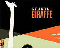
 We launched our new StartupGiraffe website a few months ago, and we've been meaning to write a post about how we did a piece of the frontend for anyone interested.
Our goal was to create a fun and responsive site that showed off our brand. Once our friends at Barrel NY agreed to do the graphic design for the site, we knew we'd also be able to pull of some neat tricks. We'd told them we wanted a really tall giraffe, but we didn't really see all of the possibilities until we got the designs back: there were polygons of different colors, angles and shapes in the background; in the foreground, there were all sorts of elements that could work well in a parallax website…and there was that enormous giraffe.
The challenge for us was to make sure we didn't go too far overboard with the Javascript so as to tax the performance of the site and distract the user experience. Ultimately we decided to scrap the idea of a parallax in favor of a "growing giraffe" effect.
You can see an example of the effect here, and if you'd like to follow along with the code, you can download the source files here.
Site structure
At a basic level, the site contains 3 sibling sections stacked on top of each other. The copy and main content of the site sits on the top layer, the giraffe is on the second layer, and the polygonal background on the back layer:
<section id="background-wrapper">
 <!-- SHAPES! -->
</section>
</section id="giraffe-wrapper">
 <!-- ONE VERY TALL GIRAFFE -->
</section>
<section id="content-wrapper">
 <!-- LOGO, COPY, PHOTOS, SLIDERS, etc -->
</section>
For this demo, we'll omit the background wrapper because there's not much to it.
Growing giraffe effect
Basically, our goal was to fix the "Startup Giraffe" logo in place while the giraffe rises, then release the logo into the normal flow of the page at a certain point. Because the giraffe should start rising as soon as the user starts scrolling, her nose should be just below the fold no matter what the screen height is.
There are really a variety of ways to do this (and we're definitely open to suggestions), but the one we chose uses jQuery.waypoints as a means for detecting and responding to scroll events.
To make sure that the giraffe slides behind the logo, we put the logo in a fixed wrapper inside the "content" section. The giraffe is a sibling of the content section. Both sections are absolutely positioned.
HTML
<section id="giraffe-wrapper">
 <img id="giraffe" src="giraffe.png" />
 </section>
 <section id="content-wrapper">
 <section id="first-content">
 <div id="big-logo-wrapper">
 <img id="big-logo" src="sg_logo_large.png" />
 </div>
 </section>
 </section>
CSS
body {
 background-color: #000;
}
#content-wrapper, #giraffe-wrapper {
 position: absolute;
 top: 0px;
 left: 0px;
 width: 100%;
}
#first-content {
 position: relative;
}
#big-logo-wrapper {
 position:fixed;
 top: 250px;
 width: 100%;
 max-width: 1920px;
}
#big-logo {
 width:465px; height:231px;
 display:block; margin:0 auto;
}
#giraffe {
 position: relative;
 left: 100px;
 height: 3200px;
}
JavaScript
The next step was to set up the giraffe and the logo. We used JavaScript to set the giraffe just below the fold. Then set the height of the first section to be the window height plus the number of pixels we'd like to show for the giraffe before allowing the logo to scroll up.
$(function() {
 var windowHeight = $(window).height(),
 giraffe = $("#giraffe"),
 firstHeight = windowHeight + 380,
 firstContent = $("#first-content");
 giraffe.css("top", windowHeight + "px");
 firstContent.css("height", firstHeight + "px")
});
With the giraffe hidden just below the fold, we could see it scroll up under the fixed logo. Next, we just had to let the logo scroll away so it didn't remain fixed on the page.
The waypoints plugin allows us to call a function when the user scrolls past a certain DOM element. It also lets us detect which direction the user to scrolling. We used these "up" and "down" events to add or remove a class that toggles the logo's position property between fixed and absolute.
We also used the waypoint function's offset property to change the waypoint's position by an integer pixel value. Because the absolute (scrolling logo) class will align the logo to the bottom of its parent, we wanted the offset to be the height of the logo plus the logo's distance from the top of the site minus the total height of the first-content div (that we set on page load).
 var logo = $('#big-logo-wrapper');
 firstContent.waypoint(
 function( direction) {
 if ( direction === 'down' ) {
 logo.addClass("first-scroll");
 } else {
 logo.removeClass('first-scroll');
 }
 },
 {
 offset: logo.height() + (parseInt(logo.css("top"))) - firstHeight
 }
 );
Besides a few other bells and whistles, that's pretty much it. The logo now remains fixed until the giraffe has gotten about 380 pixels up the page.
Got questions? Got a better way to do it? Let us know in the comments.


