 In the web-era, major news sources aren’t restricted to local readership. Whilst a city paper may feature some local news, its sports, national and international news coverage is just as likely to be read by someone on a different continent.
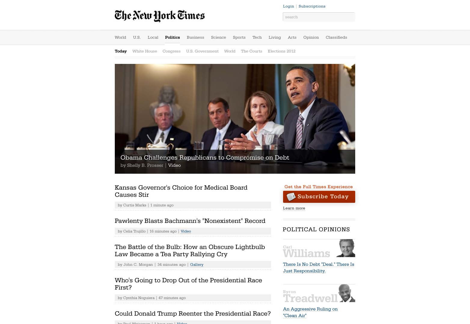
In 2012, The New York Times (44.8m monthly readers) fell behind London’s Daily Mail (45.3m monthly readers) as the popular newspaper website in the world. Largely because, unlike many of its rivals — one of the most notable being The Boston Globe — the NYT has left its online offering firmly rooted in the 2000s (the last major revision to the NYT website was in 2006 and it felt dated then).
The current New York Times website.
Long due an overhaul, in 2011 Andy Rutledge famously carried out an analysis of various news websites, including the NYT and subsequently produced a mock-redesign that stripped out a lot of what was bad in the design. However, as quickly leapt upon by various tweeters, including NYT staff, it also stripped out a lot of practical necessities like advertising, and things readers valued, like summaries and images. A pure-responsive approach was also advocated.
Andy Rutledge's proposed redesign for The New York Times.
Finally the NYT has chosen to engage in a redesign process itself. The redesign has been produced in-house by a team of journalists, designers and developers all lead by Ian Adelman, director of digital design since 2011.
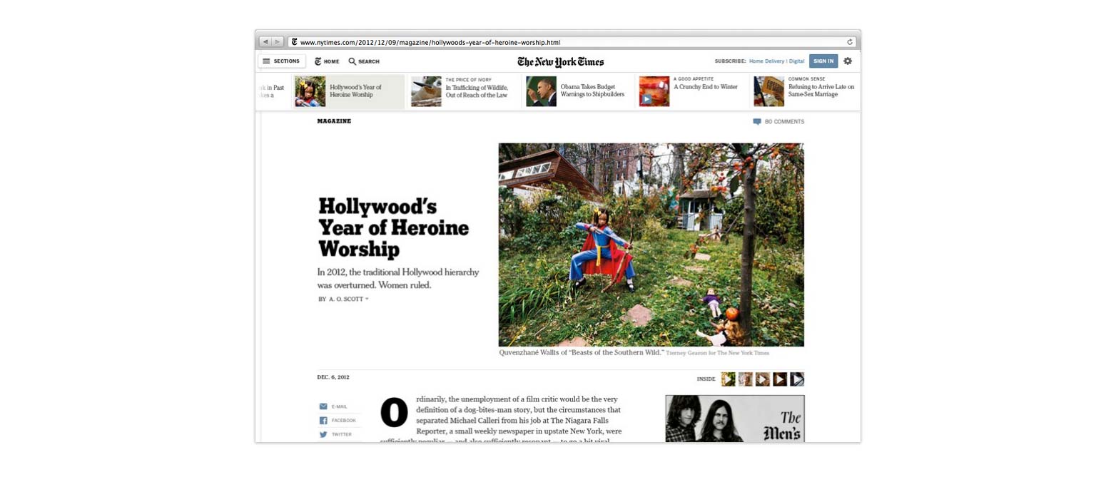
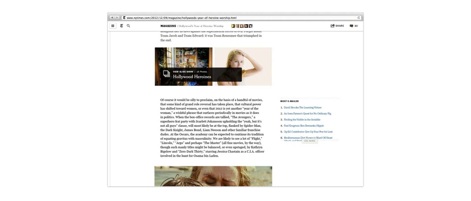
In development for almost a year, the focus of the NYT redesign has been readability. Articles have been de-cluttered, large images, slideshows and video have been retained and captions have been moved to the side; keeping them in context, and ensuring the flow of information isn’t broken.
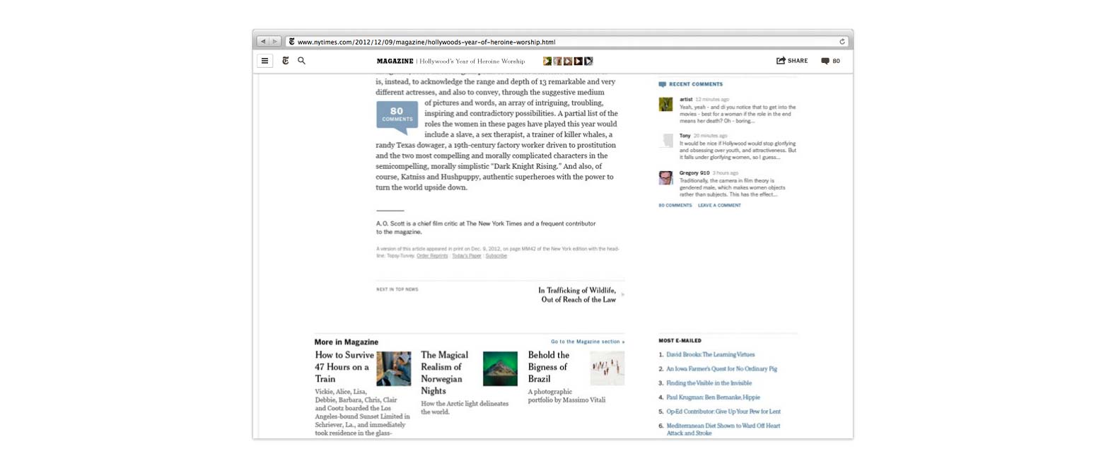
The New York Times' redesign.
A key change is the switch from pagination to a continuos scroll. The single-page approach has been found, according to Adelman, to promote user engagement and the depth of reading measured on the site.
The single biggest change is a move towards responsive design, with the new site resizing portions of its content to adapt to current screen conditions. The new site isn’t wholly responsive however; a mobile specific version is scheduled for launch in 2014 with stripped down content to squeeze as much speed out of browsing on smart phones and tablets as possible.
Currently only in beta, staff inside the paper’s firewall are the first to receive it, with some readers soon to receive invites. The new New York Times website will be launched later this year after further refinements and user feedback.
Perhaps the biggest lesson we, as web professionals, can take from this is that the redesign is an ongoing process: designing, gathering feedback, refining. The NYT team aims to begin work on the next redesign as soon as this version goes fully public. Updating the site just as they update their native apps.
What do you think of The New York Times’ redesign? Are they right to spurn a pure-responsive approach? Let us know your views in the comments.
Featured image/thumbnail, The New York Times image via Stuart Monk / Shutterstock.com
Ben Moss
Ben Moss has designed and coded work for award-winning startups, and global names including IBM, UBS, and the FBI. When he’s not in front of a screen he’s probably out trail-running.


