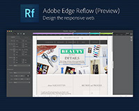
 Edge Reflow is one of the exciting new weapons in Adobe's ever-expanding Creative Suite arsenal; helping to bring the modern web's powerful features within reach for designers.
Reflow is designed to help creatives work towards the holy grail of current web design standards: responsive design. Previously only possible for the HTML-savvy, now everyone can produce sites that rearrange themselves for different devices.
As well as being enormously beneficial to designers, developers looking to quickly prototype more advanced responsive layouts will also find it useful.
In today's guide, we'll be walking through some of the basic tools and techniques you can use in Reflow to create awesome responsive designs quickly and easily. Along the way, you'll learn the following techniques to apply to your own projects:
- Construct a flexible website design using Reflow's box, text and image tools
- Find the "breakpoints" of your design, and adjust your layout to display your content how you wish according to the window width
- Make your design bulletproof to mobile and tablet devices
- Test and trial your responsive layout using Reflow's in-app browser, as well as real-world browsers.
Are you working with Adobe Edge Reflow? How effective a tool have you found it? Let us know in the comments.


