 When it comes to designing a truly intuitive, responsive, and coherent website that’s also unique and interesting, it often feels like it’s difficult to reconcile the two sets of priorities. But in fact, nothing is further from the truth: there are only a few fundamental ideas that need to be employed in order to easily make the best choices in your designs.
The most essential of these concepts is that beautiful, usable designs are not difficult to make when the UX is given precedence, and the design is adapted to suit it. After all, the nature of user experience dictates that there are certain inflexible rules, while design is almost endlessly flexible. Once you learn the ways and means by which you should adapt your designs, you should be well on your way to turning a battle into a peace treaty.
Anticipate user error; lessen user irritation
Always consider what might happen should the user go astray on your webpage. Error messages shouldn’t be obscured in technical jargon, but rather should give an explanation of what the issue might be, and, if applicable, where they should go to get help. Balance these considerations with what might be improved on your end. No matter how beautiful a site may be, if it takes too long to load, it’s not worth the effort. Experts say that if a webpage takes over 3 seconds to load, it needs to be simplified.
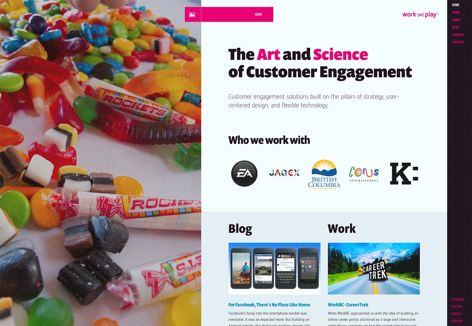
Keep forms as short and unintimidating as possible; if the information isn’t necessary, don’t ask for it. If you don’t already, consider offering an optional log-in through Facebook or Twitter; sites that offer this often find their conversion rates rising because the user finds it more convenient, and is therefore more likely to take the time to sign up. In addition, make sure that the rest of your site has an integrated social media presence, that doesn’t conflict with or overpower your design, but is also easily identifiable, like the Work at Play website. Small additions like this are what add up into a cumulative streamlining of the user experience.
To this end, it’s important to keep in mind a few standards that should remain fairly consistent across any type of website.
Maintain web standards
Some common elements of a site, like footer links or a search bar, can actively suffer from excessive creativity. While there is room for originality in many of these elements, it’s important to maintain them in more or less the same form that you see on every other site, because they’re ubiquitous enough for users to expect them to be presented in a certain way. Follow these guidelines:
- Make sure that clickable areas are immediately identifiable (such as the links on this site) and are large enough to easily activate;
- Break up blocks of text with images and other visual stimulation;
- Use breadcrumbs when applicable;
- Try to avoid spreading the same article or product search across multiple pages;
- Make contact information, FAQ’s, a search bar, and other standard features easy to find and use.
Although Grip Limited's website is eye-catching and exciting, it’s also incredible confusing. While there is an explanation for how to drag the columns to reveal content, it’s lost in the jumble of other typography. A traditional menu is accessible, but only if you spy the tiny drop-down. It’s such a cool site design that some users wouldn’t care how difficult it is to use, but many others would be put off. But if the site incorporated the suggestions above into its design, it could still maintain its cool factor and provide a good UX.
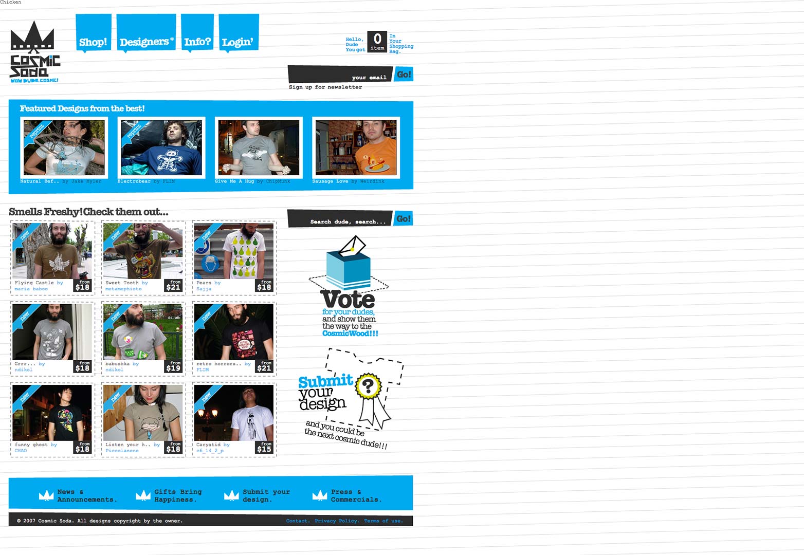
For example, although the Comic Soda website’s other design elements are fairly distracting, the user is still easily able to find the search bar; it’s labeling and position is clear enough that confusion is minimized. These small submissions to user confusion are what make all the difference.
Where to draw the line
There are other UX rules that can be bent but not broken. But at what point does a designer go too far? Navigational elements are a good example to work with, because every site has some form of them. Conventionally, they’re arranged in one of two ways:
- Horizontally along the top of the page; this allows a spacious look for short lists;
- Vertically along the left side of a page; this arrangement can accommodate longer lists.
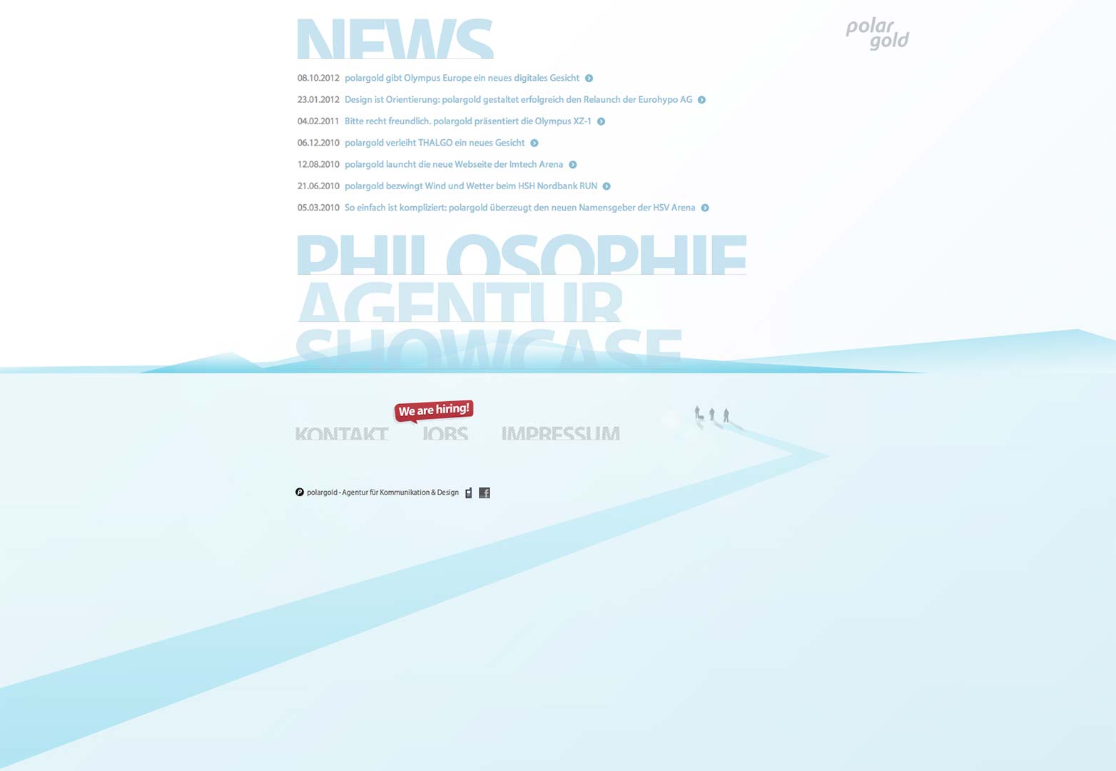
But there are other styles and systems of navigation that can work if they’re used carefully and thoughtfully. For example, this portfolio site has a navigation list that occupies the majority of the page, and each word is partially obscured. Furthermore, the elements don’t remain stationary; they drop down and separate to display the content within each section. All these flourishes might have combined to form a confusing system that would quickly frustrate the user. However, the design avoids being problematic by virtue of being so simple; the words are still readable; the drop-downs have such a small amount of information that the rest of the navigation list is in no danger of being lost. All in all, it’s a daringly different system that narrowly avoids being problematic.
On the other side of the line is a concept that has been referred to as mystery meat navigation, in which the aesthetic considerations of the design completely overwhelm the usability. In the case of the FlatPak website, the navigation has to be rolled over to read what it’s referring to; a terrible usability feature that should never be emulated.
Familiarity versus functionality
In many ways, the real battle of current web design seems to be between fresh new ideas that make for less intuitive interaction, and stodgy old practices that might not be the best solution, but are what users are accustomed to. An example of this problem often arises when you consider skeuomorphic design; which is a style that imitates the predecessor of an item that was made in another medium.
This kind of design happens all the time on the web, from your desktop calculator that looks and functions like its real-life counterpart, to the buttons on a website that have a realistic drop-shadow and bevel effect. It makes sense to a certain point, because the familiarity of these designs makes users feel immediately comfortable using them. However, they’re not necessarily the best solution because they’re incredibly limiting.
The clash between these two priorities can be illustrated by Apple’s realistic “page turn” technology, which is used for digital reading. It’s an appealing idea because it makes the experience feel a little more like turning physical, paper pages, something that users might find comfortingly familiar. However, despite the rather ridiculous lengths the company went to in order to create this effect, it detracts from the user experience. It takes fractionally longer to load, and flicking at the page is a more difficult movement to carry out that a simple push; an unwieldy movement might send the user the wrong way.
Use a clear conversion funnel
If you’re working on a complex website with many navigational pathways, it’s very important to allow the user to move logically through the site, and keep them informed as to where they are in the sitemap as a whole. This is where breadcrumbs and other navigational devices come in handy. The dreaded purple default links don’t need to be employed to show a user that they’ve already visited; there are plenty of other more attractive solutions that accomplish the same effect.
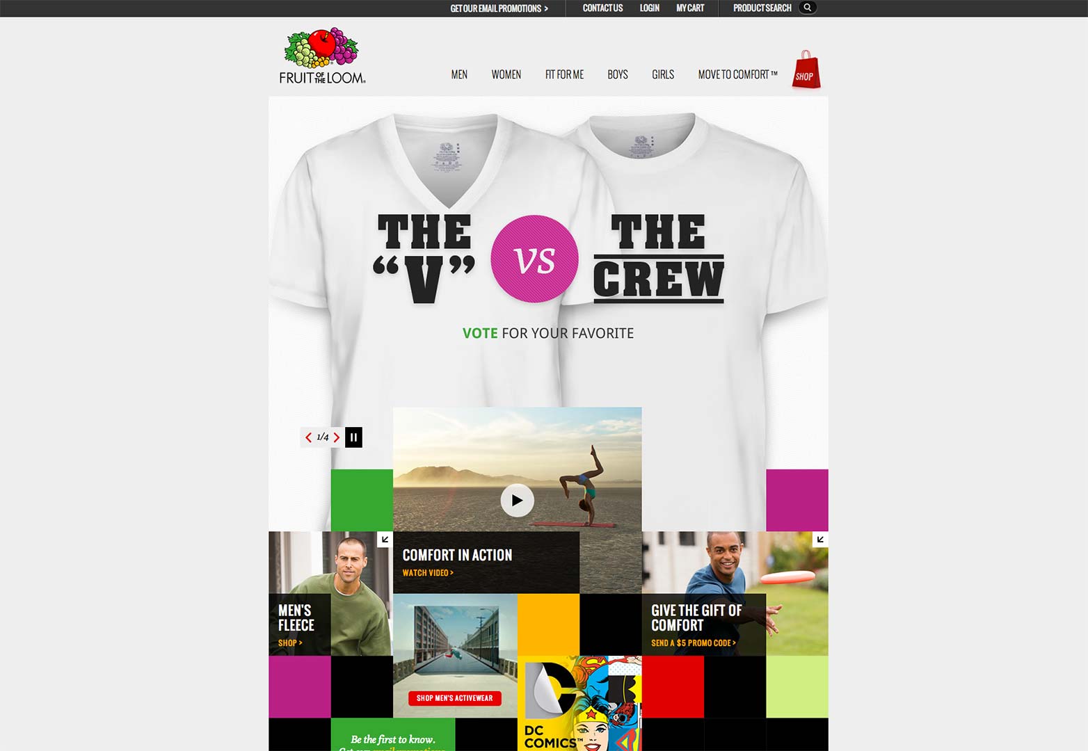
E-commerce sites are usually the ones that get lambasted for their ill-conceived conversion funnels, but there are plenty of great examples out there of beautifully-designed, UX-optimized web stores. Take for instance the Fruit of the Loom site, which has a clean, friendly interface that is still logically constructed. It’s not even the result of customized and complicated backend development; the site was created using simple Amazon ecommerce software, that any small business would be able to take advantage of.
Accommodate scanning and add visual interest
Keep in mind that people read web pages in a different way than print media. Eye tracking studies show that web users skim the entire page (focusing at first on content in the upper left-hand corner), looking for eye-catching elements like headlines, pull-quotes, or images. Then they delve into sections that look interesting. It’s crucial to design for this kind of mindset, and make sure that you employ a visual hierarchy that directs the user where you want them to go.
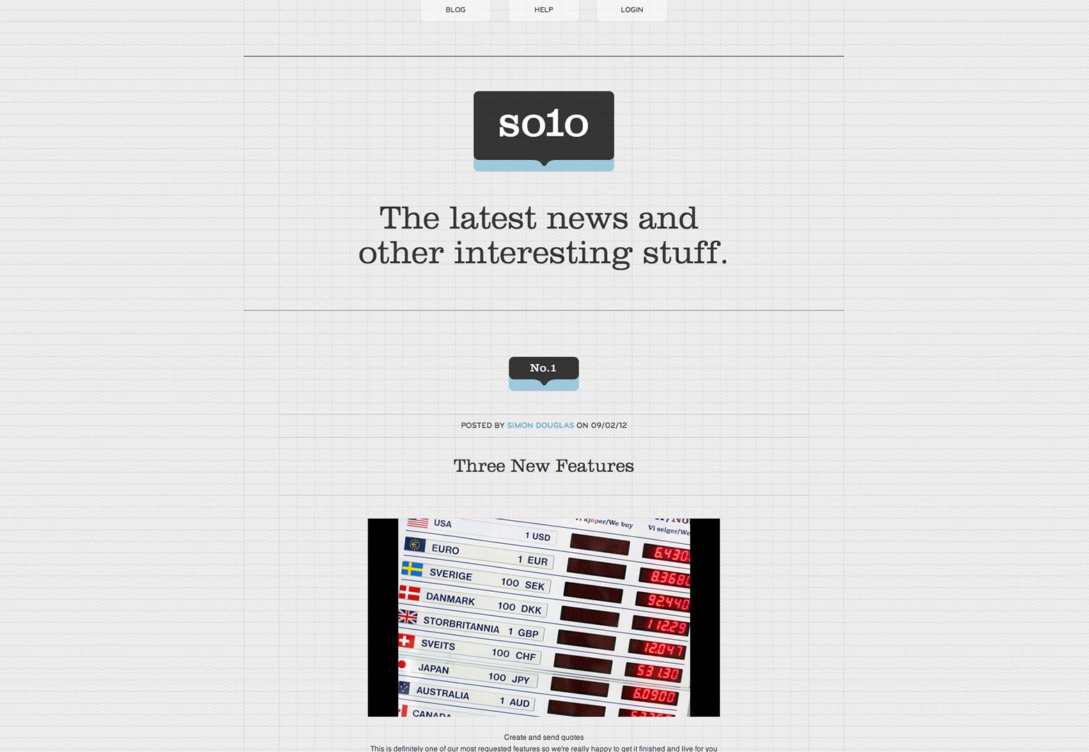
The Thrive Solo blog has plenty of content, but it maintains a spacious, interesting look by using lots of white space, large images, icons, and variegated typefaces. The large, centered titles are especially helpful for scanning viewers.
The bottom line
While the aesthetics of a site create a first impression, the functionality is what gives the user a lasting experience that they’ll hopefully want to return to. There is no situation where considerations of design and functionality can’t be reconciled; in fact, it’s the interplay between these two priorities that ends up creating all the best, most memorable sites on the web.
Do you ever compromise usability for aesthetics? Can design be good without usability? Let us know your thoughts in the comments.
Featured image/thumbnail, functional image via Shutterstock.

