
 The long, painful and drawn-out death of skeuomorphic design lurched forward another step this week with a redesign by the world’s biggest social media site, Facebook.
The new look is spearheaded by a logomark that is a simplified version of the pre-existing one. Although the full Facebook logo will remain unchanged, the round-cornered square with the solitary ‘f’ has been carefully refined.
The blue strip, previously positioned at the bottom of the graphic as a nod towards a light reflection has been dropped. The letter ‘f’ has been enlarged, and the stem now connects with the outer edge of the square, creating the sense that the shape is a window through to something, rather than a box containing it. Conceptually, this tiny change makes a huge difference. The arms of the glyph have also been tweaked, with a longer protrusion on the left and a more acute angle on the right.

Along with the ‘f’ logo mark, other official pages have new icons. Facebook’s icons have always looked like something from a clipart CD circa 1998, so the new designs are a very welcome — and long overdue — update.
Viewed as a group they’re a little imbalanced with, for example, far less detail on the developers' icon than the non-profits'. The only real complaint being that the similarity between security and privacy icons is pronounced.
It’s hard to see the redesign as anything but a positive move for the site.
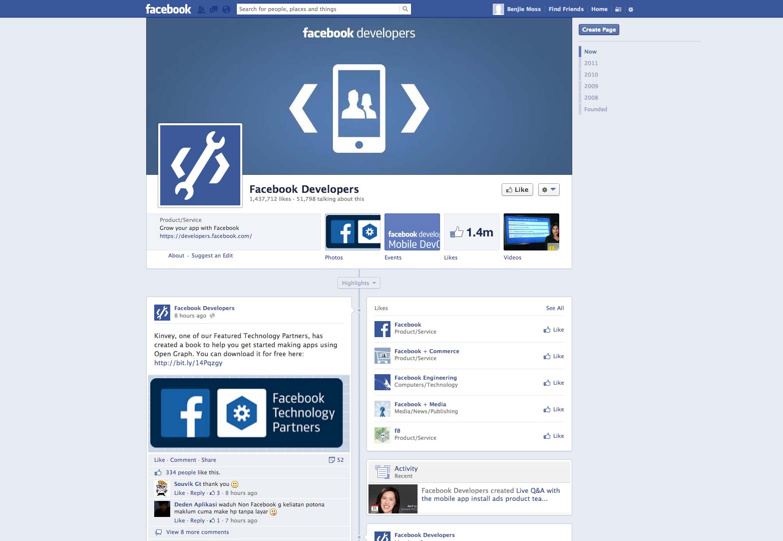
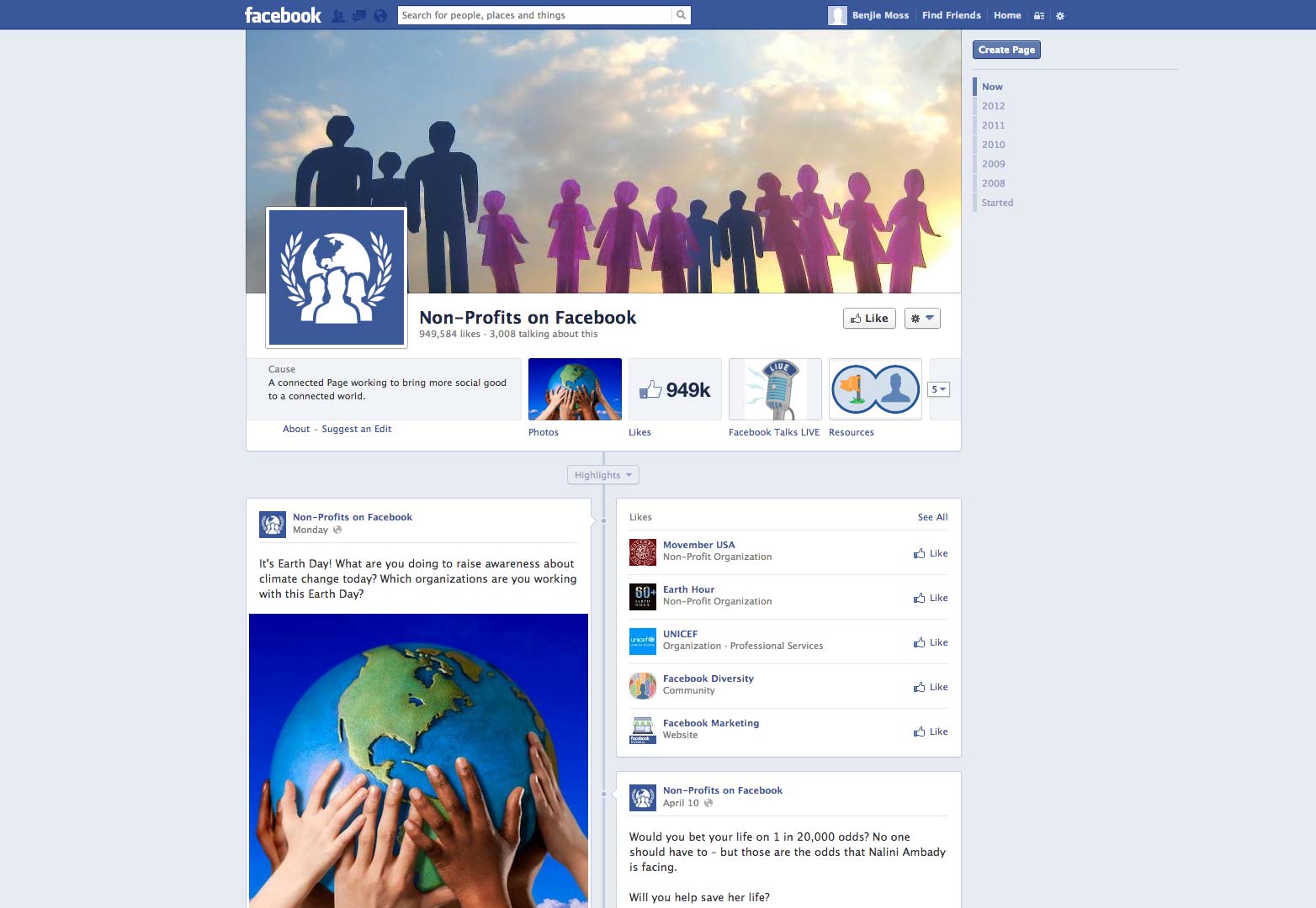



What do you think of the new Facebook icons? Could you identify the icons without the accompanying text? Let us know in the comments.
Featured image/thumbnail, Facebook image via Tomislav Pinter / Shutterstock.com
Ben Moss
Ben Moss has designed and coded work for award-winning startups, and global names including IBM, UBS, and the FBI. When he’s not in front of a screen he’s probably out trail-running.


